Now that we have learned how to define the content of a web page using HTML, it’s time to explore how to enhance the visual presentation of the content. This is where CSS comes into play.
Before we continue, please consider buying the e-book version of this course.
By purchasing this e-book, you will get access to all the accompanied source code. Thank you for your support! Happy coding! 🖥️✨
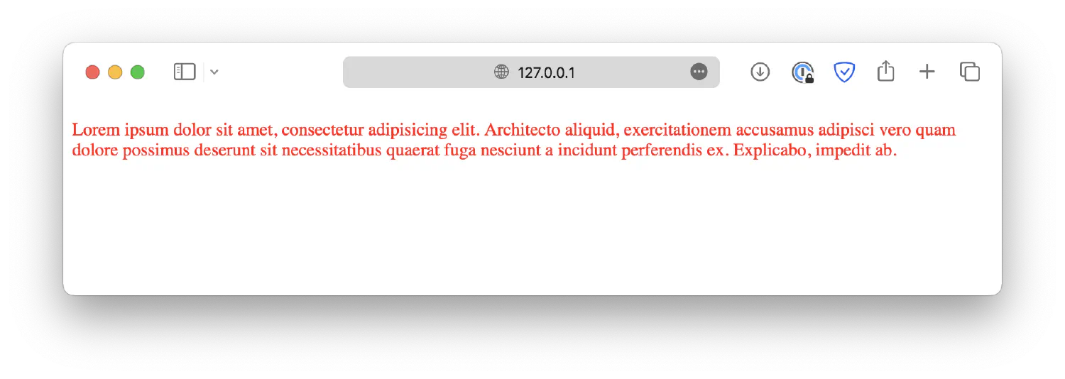
The Cascading Style Sheet (CSS) controls the presentation of the HTML documents, such as the element’s color, spacing, size, and more. In HTML, the default appearance of an element can be altered by specifying a style attribute. For example, if you want to change the color of a paragraph, this is what you can do:
1
<pstyle="color: red;">Lorem ipsum dolor sit amet . . .</p>
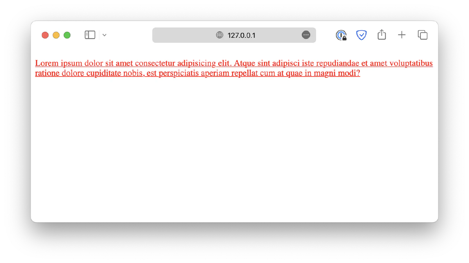
The style declaration statement follows the format <key>: <value>;. You may define another style after the semicolon.
1
<pstyle="color: red; text-decoration: underline;">Lorem ipsum . . .</p>
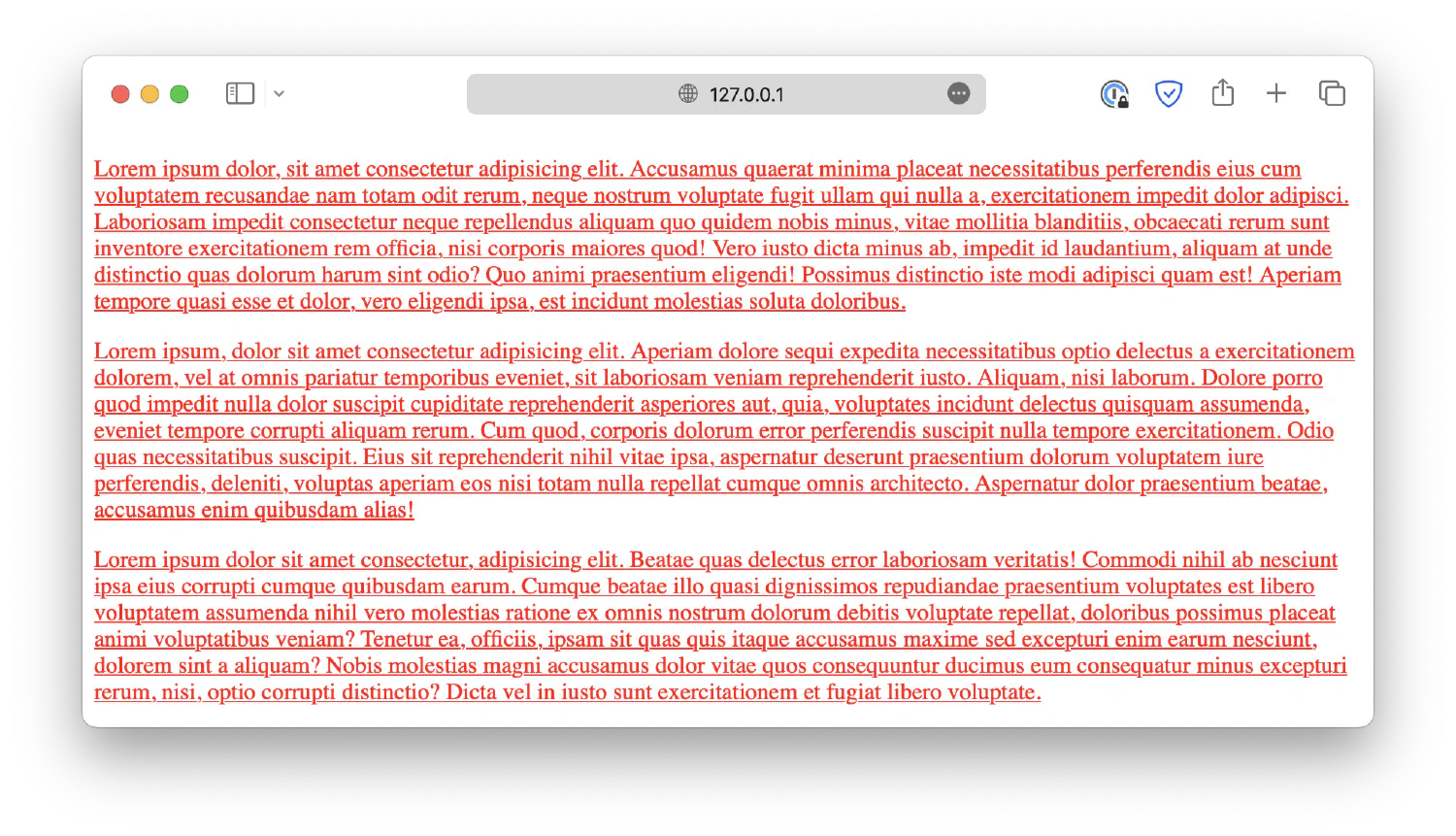
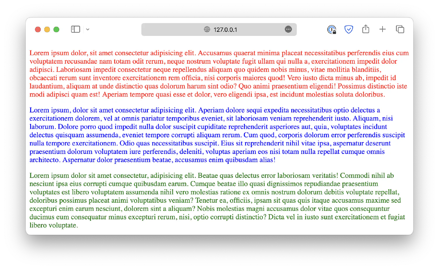
However, this is an inefficient way of managing styles, as a real-life webpage could have hundreds of different elements. It will become a disaster if you try to micromanage all of them. A better option would be assigning the same set of styles to different elements. This can be achieved either by creating a <style> element in the <head> section like this:
This is how you can add CSS code to your webpage, and as you can see, both paragraphs have been assigned the same style.
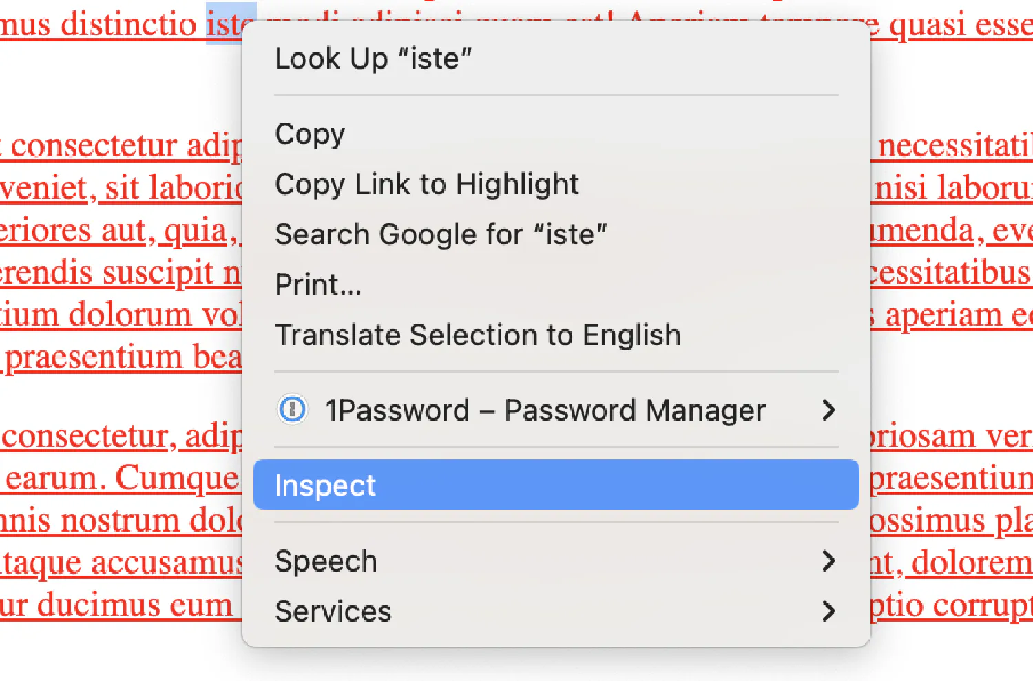
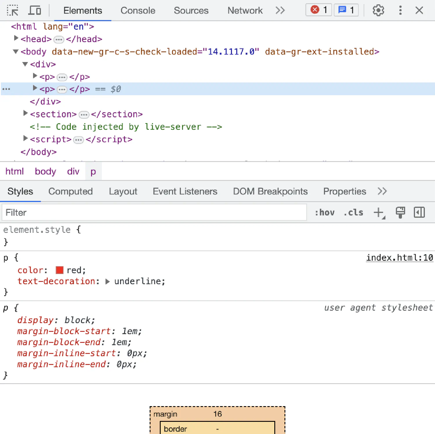
Here is a small tip when designing your webpages. You can check the styles assigned to each element through the developer tools built into your browser. For example, if you use Google Chrome, right click on the webpage, and select Inspect.
A side panel should pop up, showing you the source code. You can select any element to check what CSS styles are applied. You can also uncheck certain styles to see what would happen to the page without it.
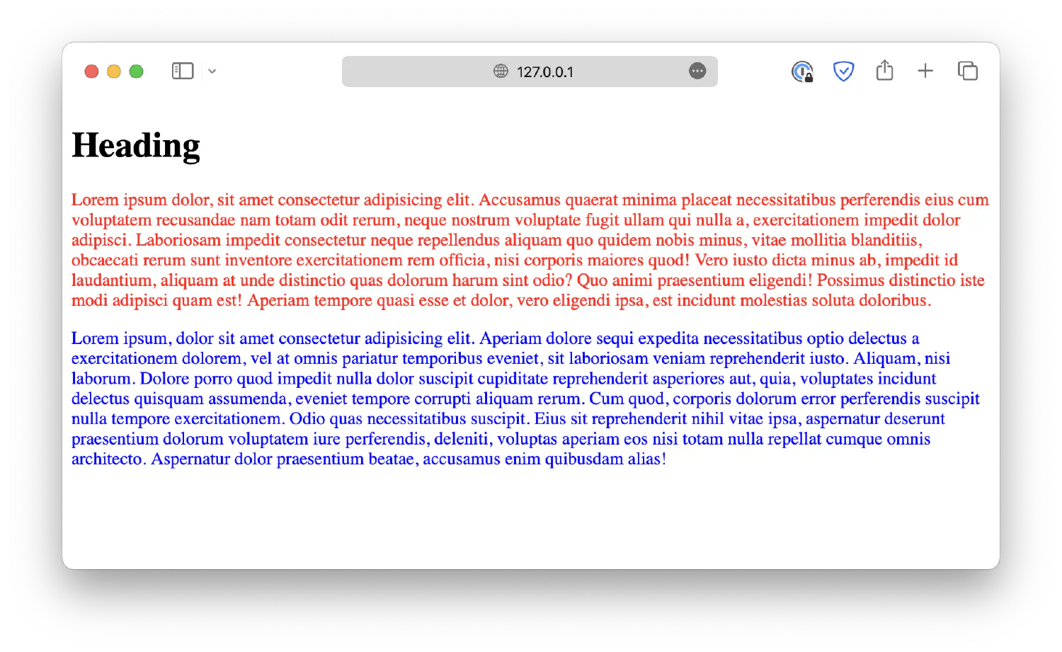
p is a selector that selects all <p> elements in the HTML document. The styles defined inside the curly braces ({}) will be assigned to all the selected elements.
However, what if you have a more complex HTML structure? For example, here we have two blocks, <div> and <section>, each with its own paragraphs. What should you do if you need the paragraphs to have different styles?
1
2
3
4
5
6
7
8
9
<body>
<div>
<p>Lorem ipsum . . .</p>
<p>Lorem ipsum . . .</p>
</div>
<section>
<p>Lorem ipsum . . .</p>
</section>
</body>
To answer this question, we must discuss two essential HTML attributes, id and class. In an HTML document, each element can be assigned an id, which must be unique throughout the entire document.
You can then use an id selector to give each paragraph a unique style. An id selector starts with a hash character (#), followed by the id of the element you wish to select.
However, as you can see, this method also requires micromanaging individual elements. So, instead, you can use class to categorize different HTML elements, regardless of their types.
Next, use class selectors to select HTML elements under that particular class. class selectors start with a dot (.), followed by the class you wish to select.
Individual HTML elements can also be placed under multiple classes separated by space characters. This enables you to create different combinations. For example, you can make the text bold and displayed in red by assigning the element to red-text and bold classes.
Lastly, it is possible to select elements of a particular type under a particular class. For example, this is how you can select all <p> elements with the class red-text.
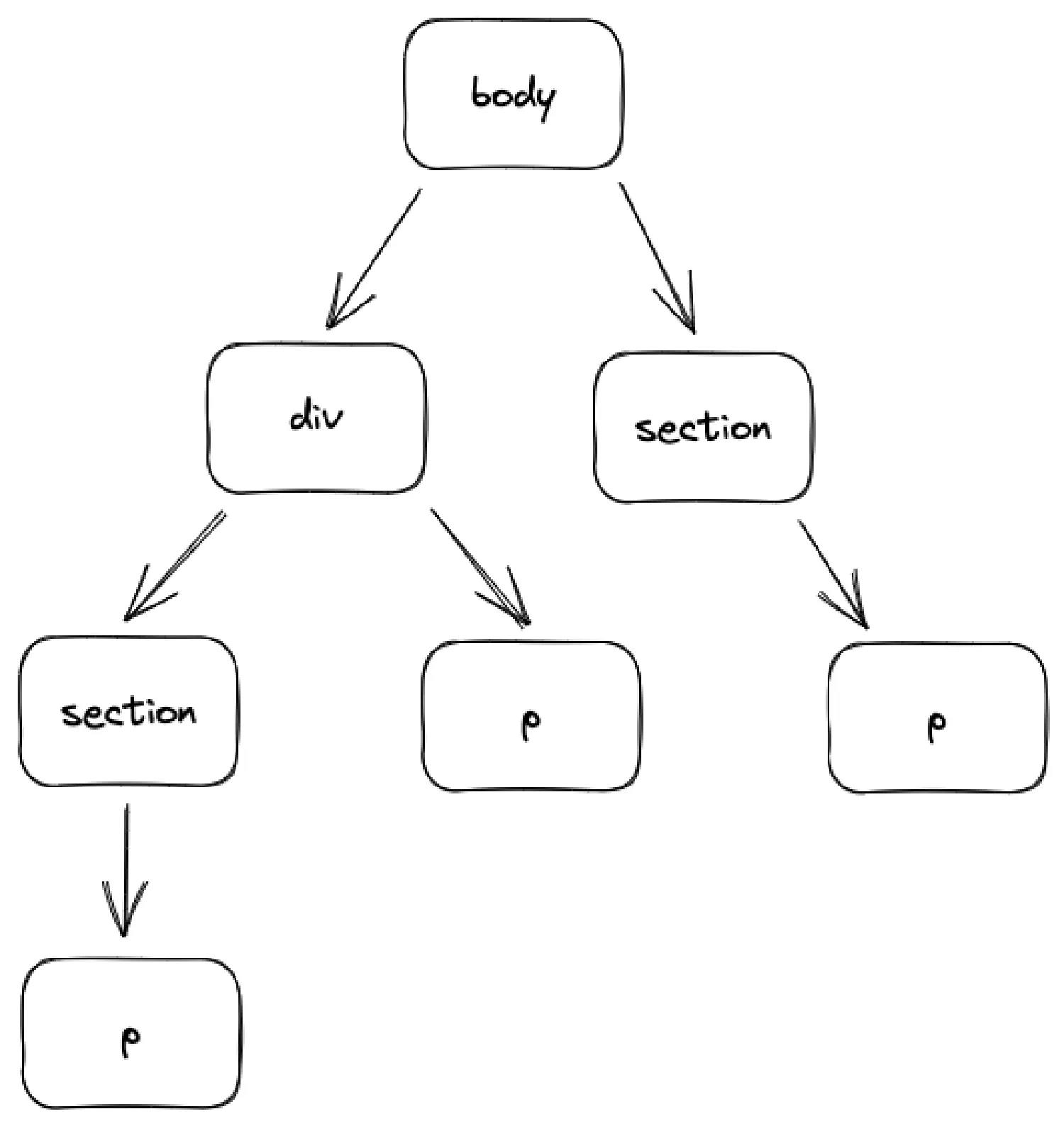
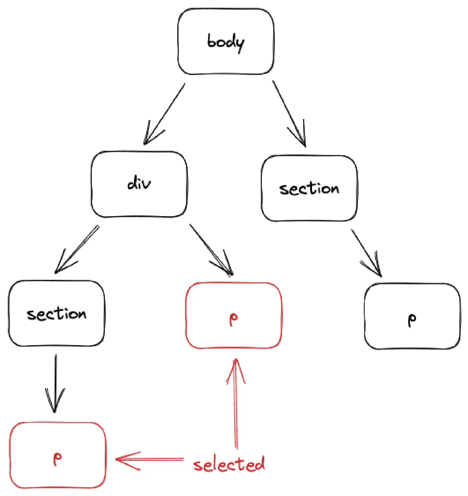
This HTML document will create a tree structure like this:
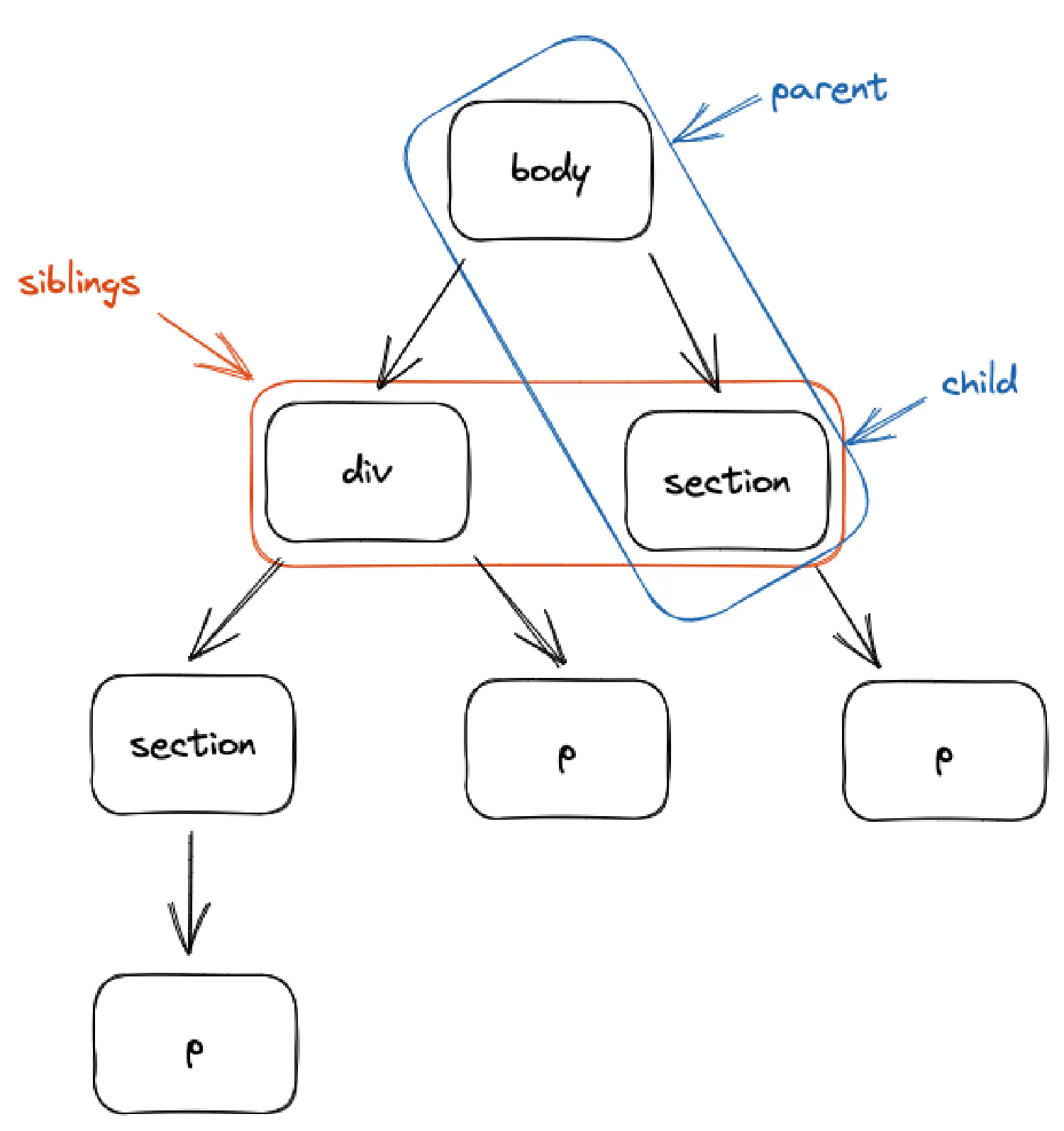
This is referred to as a DOM (Document Object Model) tree, meaning the elements will have hierarchical relations with each other. For instance, if we start from <body>, the parent, it has two children, <div> and <section>, who are siblings to each other.
You may utilize these relations between elements to select the desired components. These selectors are called combinator selectors.
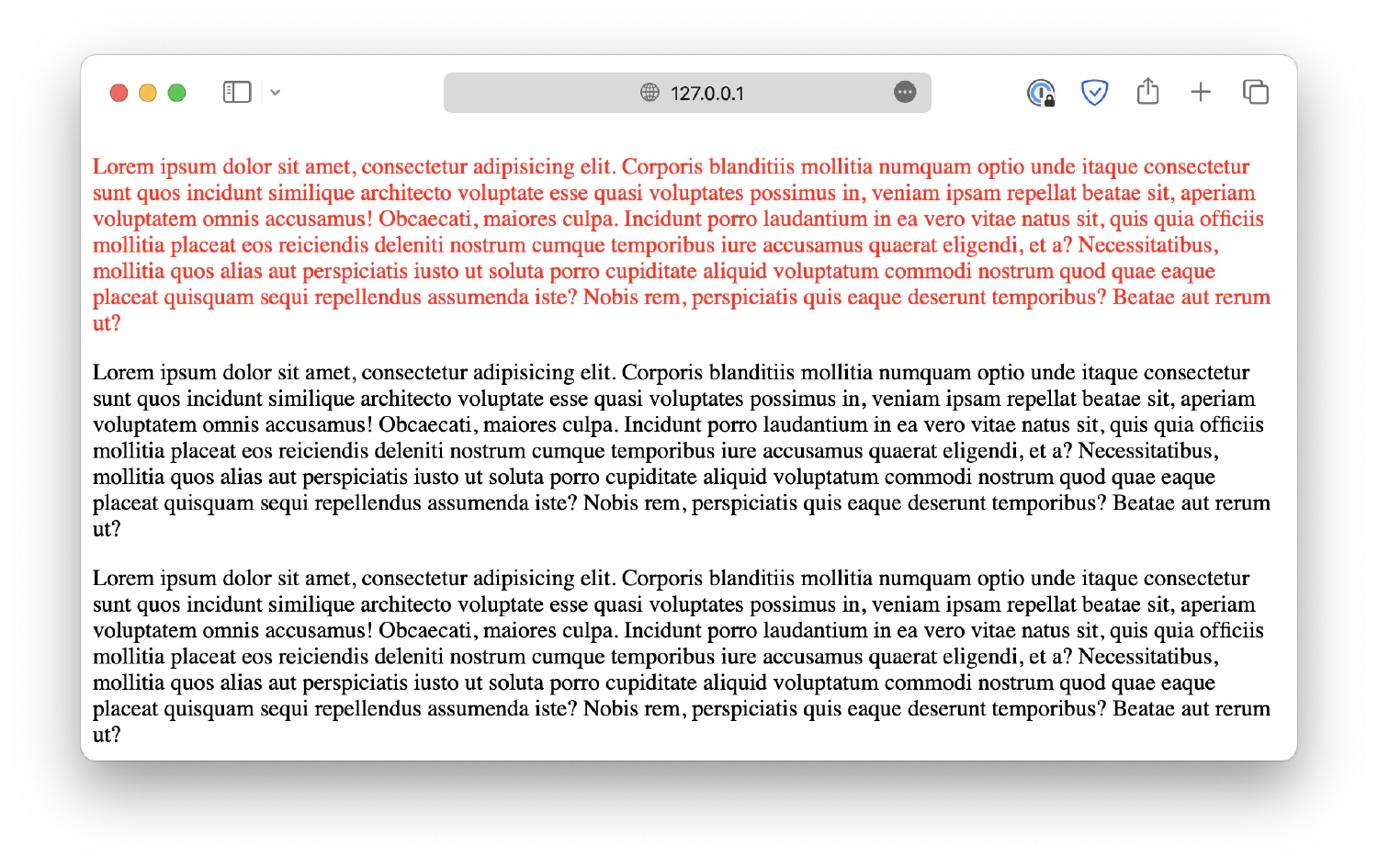
For example, you can use a space character to select the descendants of an element.
1
2
3
divp {
color: red;
}
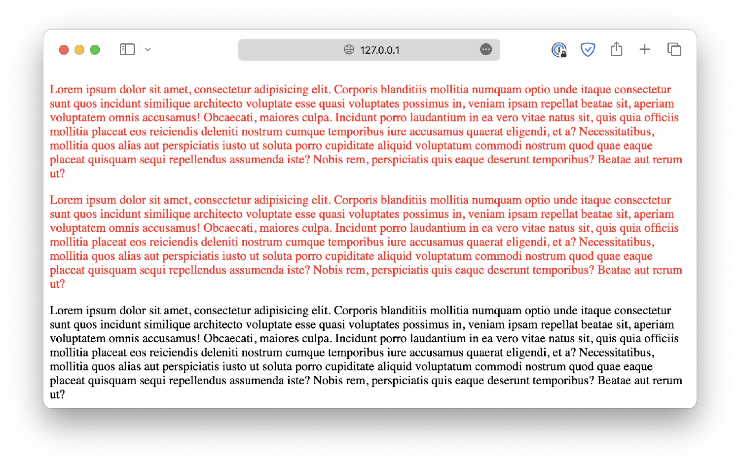
Notice that two paragraphs, both direct and indirect descendants of <div> are selected.
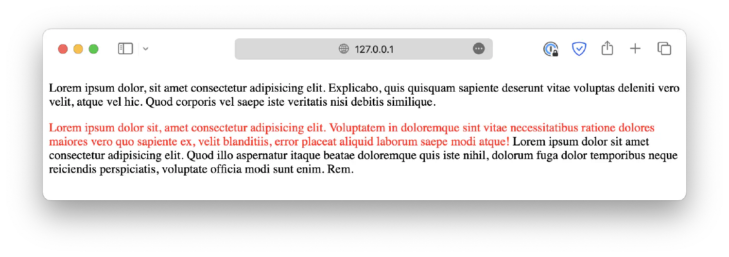
If the structure of the DOM tree gets more complex, it can be challenging to keep track of everything. To minimize the risk of errors, you can use a child selector (>) to limit your selections to direct descendants only.
1
2
3
div>p {
color: red;
}
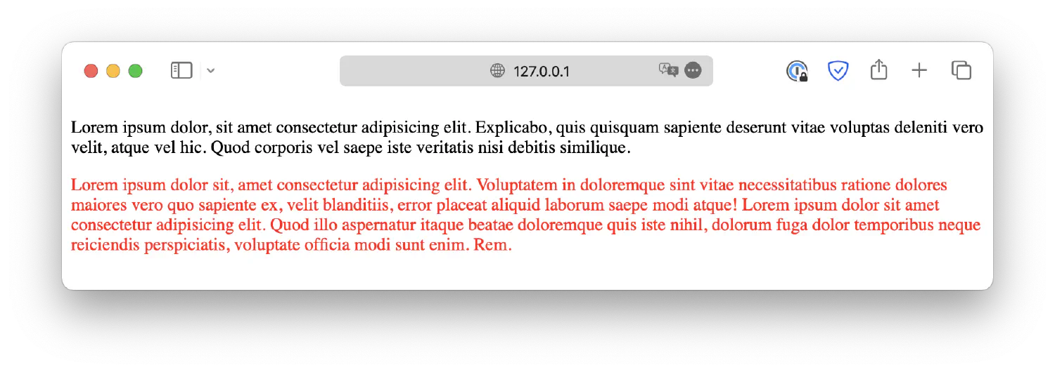
Besides selecting descendants, you can also select siblings using + or ~ selectors.
+ selects the sibling directly after the specific element:
1
2
3
p+span {
color: red;
}
~ selects all siblings:
1
2
3
p~span {
color: red;
}
You can combine different combinator selectors to create a complex selector such as div > p + span. However, this is not recommended as it is very easy to lose track of things.
Lastly, it is also possible to use class selectors along with combinator selectors. For example, you can select the <p> elements that are descendants of elements under the class .intro.
1
.introp {. . .}
In this case, the browser will start from elements under class intro, and then see if they have any paragraph elements as their descendants.
Pseudo-selectors are used to target HTML elements based on their specific states or parts. There are two types of pseudo-selectors available: pseudo-class selectors and pseudo-element selectors.
Let’s begin with the pseudo-class selectors. These selectors allow you to style an element based on its state. For instance, let’s consider the <a> element, which represents a hyperlink in a webpage. Initially, it appears blue. Once clicked, it turns red, and after being visited, it turns purple. Despite being the same element, different styles are applied to it depending on its state.
Pseudo-class selectors are the key to achieving this effect. They target elements only when they are in specific states. The hyperlink element starts without any state. When you move the cursor over it, it is given the :hover state, and when clicked, it acquires the :active state. Lastly, after being visited, it is given the :visited state. These states allow you to apply different styles to the same element under different circumstances. This feature is crucial for frontend design because it enables the webpage to respond dynamically to user actions.
There are many other pseudo-class selectors available, and different elements may have different states. We are not going to cover all of them in this chapter, but if you are interested, here is a list of all pseudo-class selectors from W3Schools.
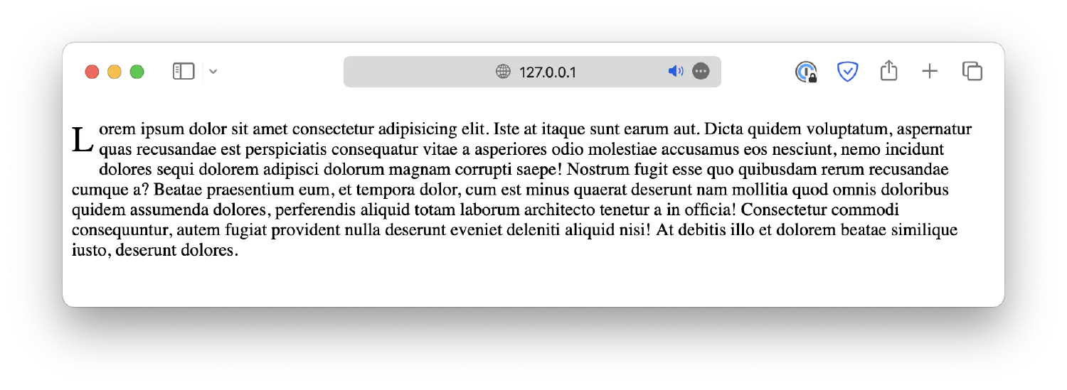
Pseudo-element selectors, on the other hand, are used to select parts of an element. For example, drop cap is a common type of decoration for many webpages used to indicate the beginning of an article. Without the pseudo-element selector, you will have to wrap the first letter of the paragraph inside a <span> element and then apply styles to that <span>.
1
<p><span>L</span>orem ipsum dolor sit . . .</p>
However, there is a shortcut. You can simply use the ::first-letter selector, which selects the first letter of the element.
1
<pclass="cap-drop">Lorem ipsum dolor sit . . .</p>
.cap-drop locates the elements under the class cap-drop, and then ::first-letter locates the first letter of the selected elements. Notice that pseudo-element selectors start with two colons (::). This saves you the trouble of isolating the first letter with a <span> element.
There are other pseudo-element selectors available in CSS. Please visit the linked page for details.
Sometimes, you might need to apply the same styles to all elements in the webpage, such as unifying the font or text alignment. In this case, instead of repeating the same style for all elements, you can simply use the universal selector (*), which matches all elements in the webpage.
1
2
3
* {
font-family: Arial, sans-serif;
}
Or, if you wish to select only a subset of elements, you can also use a group selector. It allows you to combine multiple selectors together, separated by a comma (,).
1
2
3
4
5
6
h1,h2,h3,p {
font-family: Arial, sans-serif;
}
Lastly, CSS also allows you to select elements based on attributes. For instance, the following example selects all <p> elements with the attribute lang.
1
p[lang] {. . .}
Or specify a desired value for that attribute.
1
p[lang="en"] {. . .}
And now, only the <p> elements with the attribute lang="en" will be selected.
Now that we know how to select HTML elements, let’s discuss how to apply styles to them.
Let’s start easy, you can define a color for almost any element using CSS. For instance, as we’ve seen before, you can change the color of the text by specifying a color property.
1
2
3
p {
color: red;
}
Or a background color:
1
2
3
p {
background-color: darkorange;
}
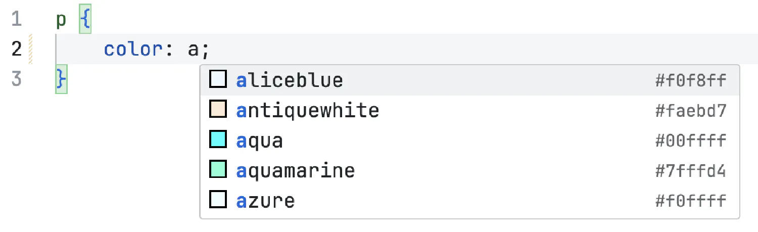
The color property can be customized using descriptive words such as red, darkorange, and many more. There are numerous other options available to set the color attribute.
However, there are countless different colors in the world, and not all of them can be described with simple words. Luckily, CSS also offers more accurate ways of specifying colors, including RGB, HEX, and HSL.
RGB stands for Red, Green, and Blue. They are the fundamental colors in computer science, and when mixed together, they can create every color in the world. The RGB color is defined with the function:
1
rgb(<red>, <green>, <blue>)
The parameters red, green, and blue define the intensity of each color, using integer values between 0 and 255. 0 is the weakest, and 255 is the strongest. For example, the following example is the same as color: red;.
1
2
3
p {
color: rgb(255, 0, 0);
}
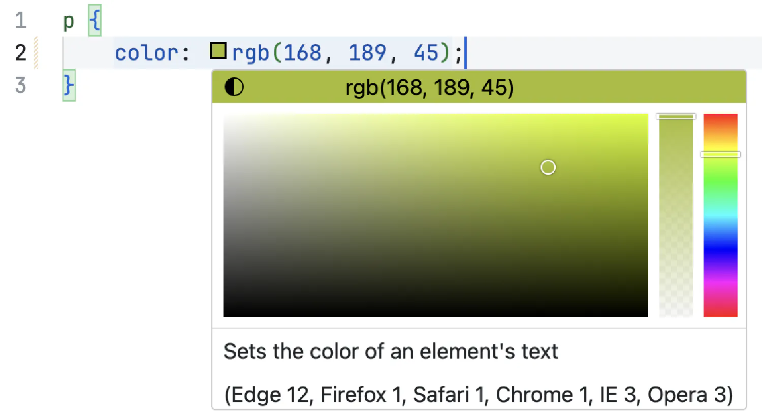
If you mix the colors together, you will be able to create all kinds of different colors.
1
2
3
p {
color: rgb(168, 189, 45);
}
I recommend using VS Code to help you find the desired color because it is difficult to imagine the resulting color just from the numbers.
There is also a sibling function called rgba(), which takes an extra parameter.
1
2
3
p {
color: rgba(<red>, <green>, <blue>, <alpha>);
}
The last parameter, alpha, defines the transparency of the element. It accepts values from 0 to 1, 0 being completely transparent, and 1 being completely solid.
The hex color code always starts with a #, and it is essentially a shorthand for the rgb() formula. Each variable, rr, gg, and bb, accepts a hex value from 00 to ff, corresponding to decimal numbers from 0 to 255. For example:
1
2
3
p {
color: #ff0000;
}
This example is the same as color: rgb(255, 0, 0); and color: red;.
Similarly, you can specify an alpha value to control the transparency of the element.
1
#rrggbbaa
aa also takes values from 00 to ff, which are remapped to decimal values between 0 and 1.
1
2
3
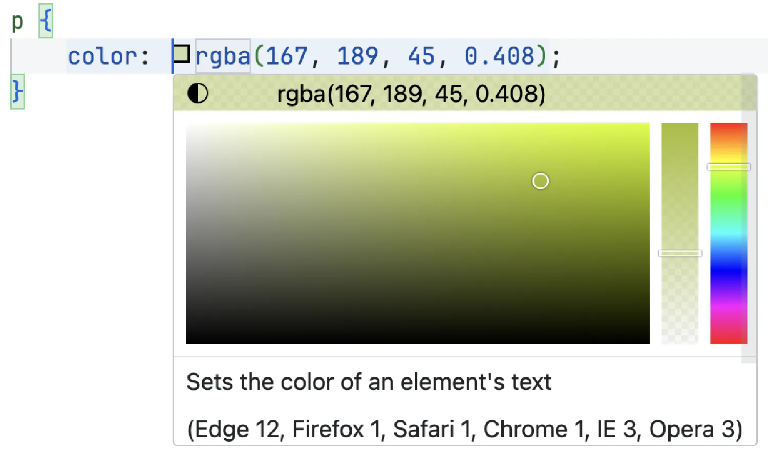
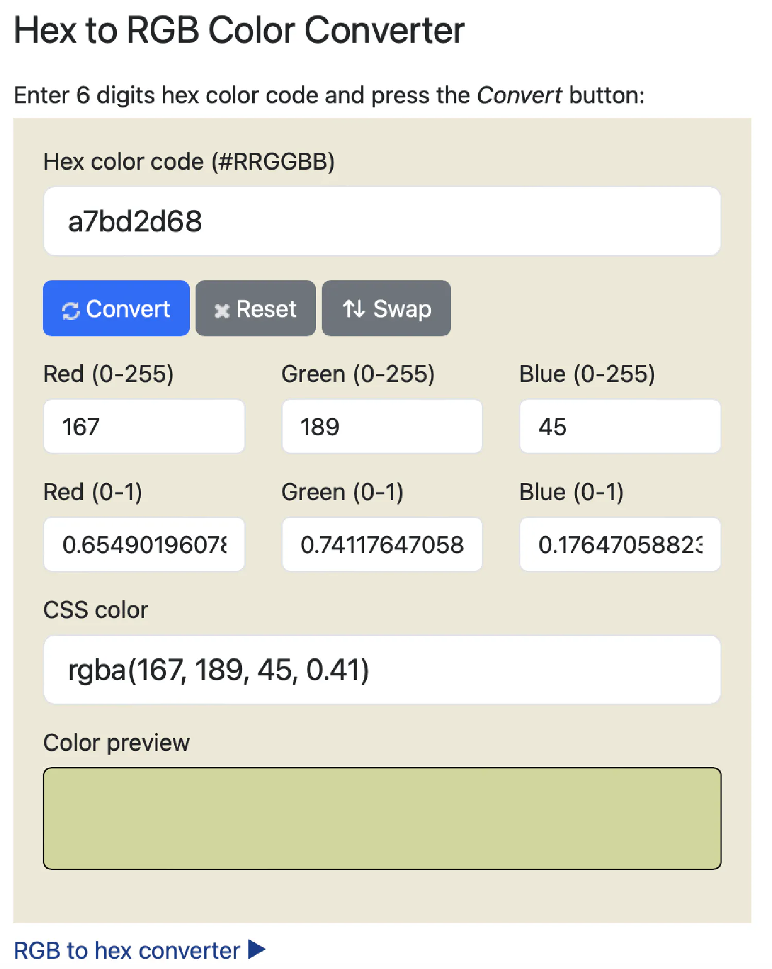
p {
color: #a7bd2d68;
}
This example is the same as rgba(167, 189, 45, 0.408). You can verify that with this tool .
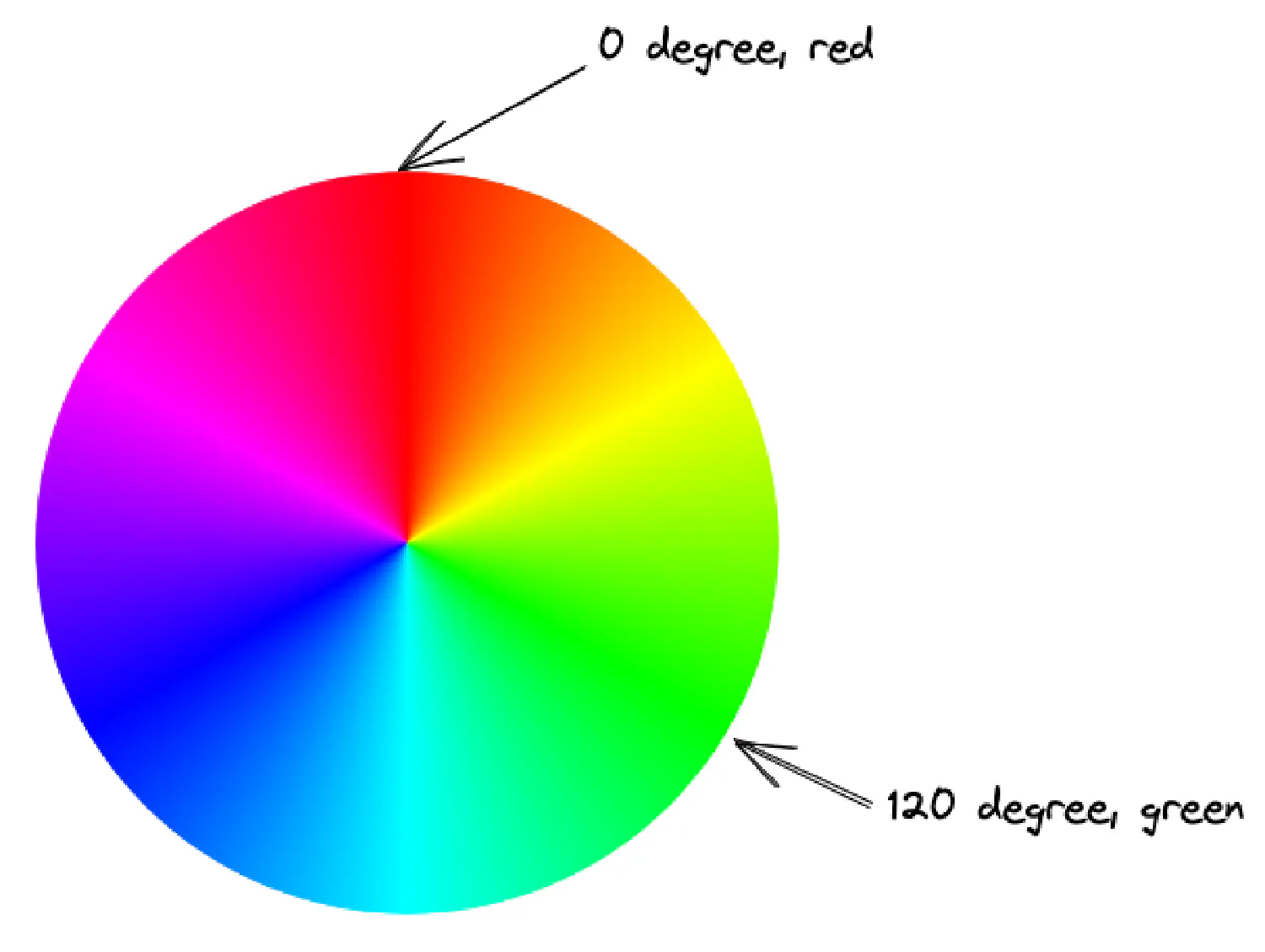
If you are into design or some other related fields, then you are already familiar with this method of defining a color. HSL takes three variables:
1
hsl(<hue>, <saturation>, <lightness>)
hue is the degree on a color wheel, from 0 to 360. A color wheel looks like this:
Notice that this wheel has no black, white, or gray. That is the job for the parameters saturation and lightness.
saturation is a percentage value, from 0 to 100, which determines how much gray should be added to the original color. 0 means the color is completely gray, and 100 means no gray is added.
lightness is also a percentage value, which determines how much black or white is added to the original color.
Lastly, hsla() is a similar formula that allows you to define an alpha value, which controls the transparency of the element.
1
hsla(hue, saturation, lightness, alpha)
1
2
3
p {
color: hsla(69, 62%, 46%, 0.408);
}
This example is the same as #a7bd2d68 and rgba(167, 189, 45, 0.408).
Typography refers to the styling and arrangement of texts in order to improve readability and user experience. Texts are almost everywhere on a webpage. They could be the headings (<h1>-<h6>), the paragraphs (<p>), lists (<li>), and so on.
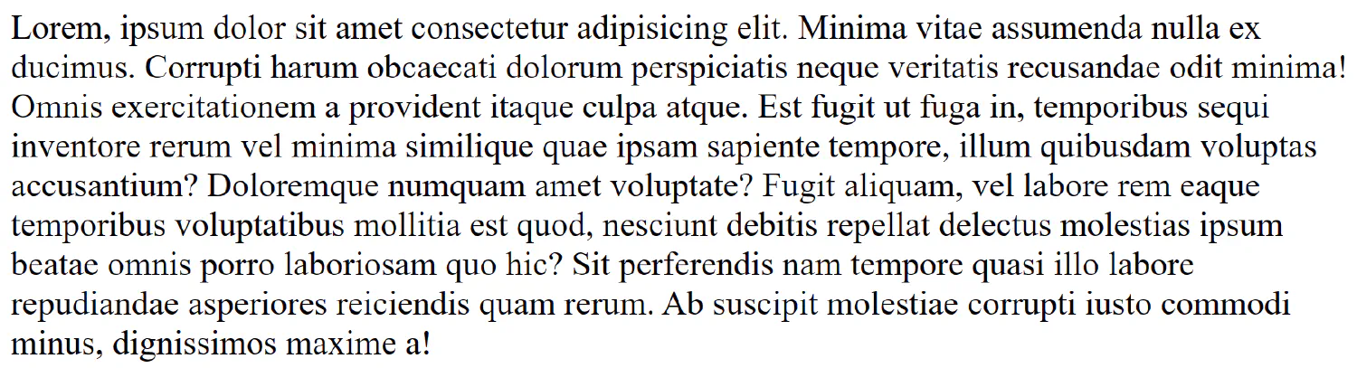
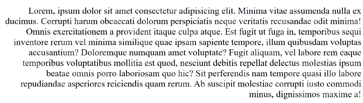
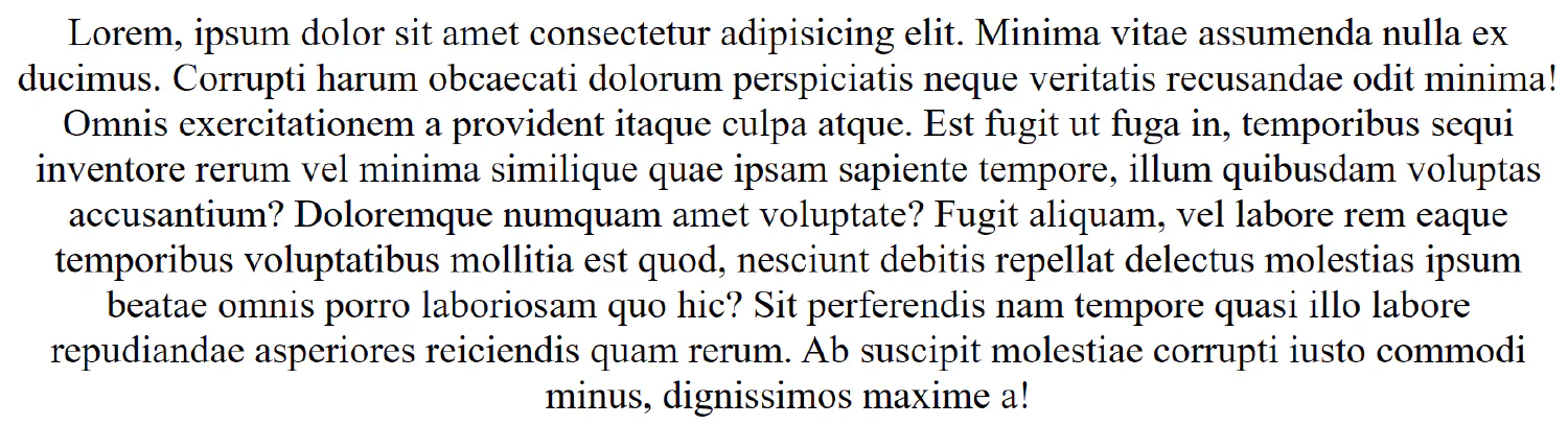
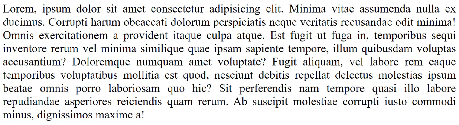
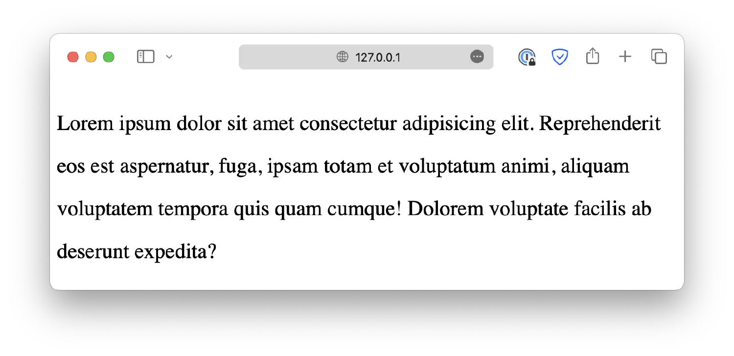
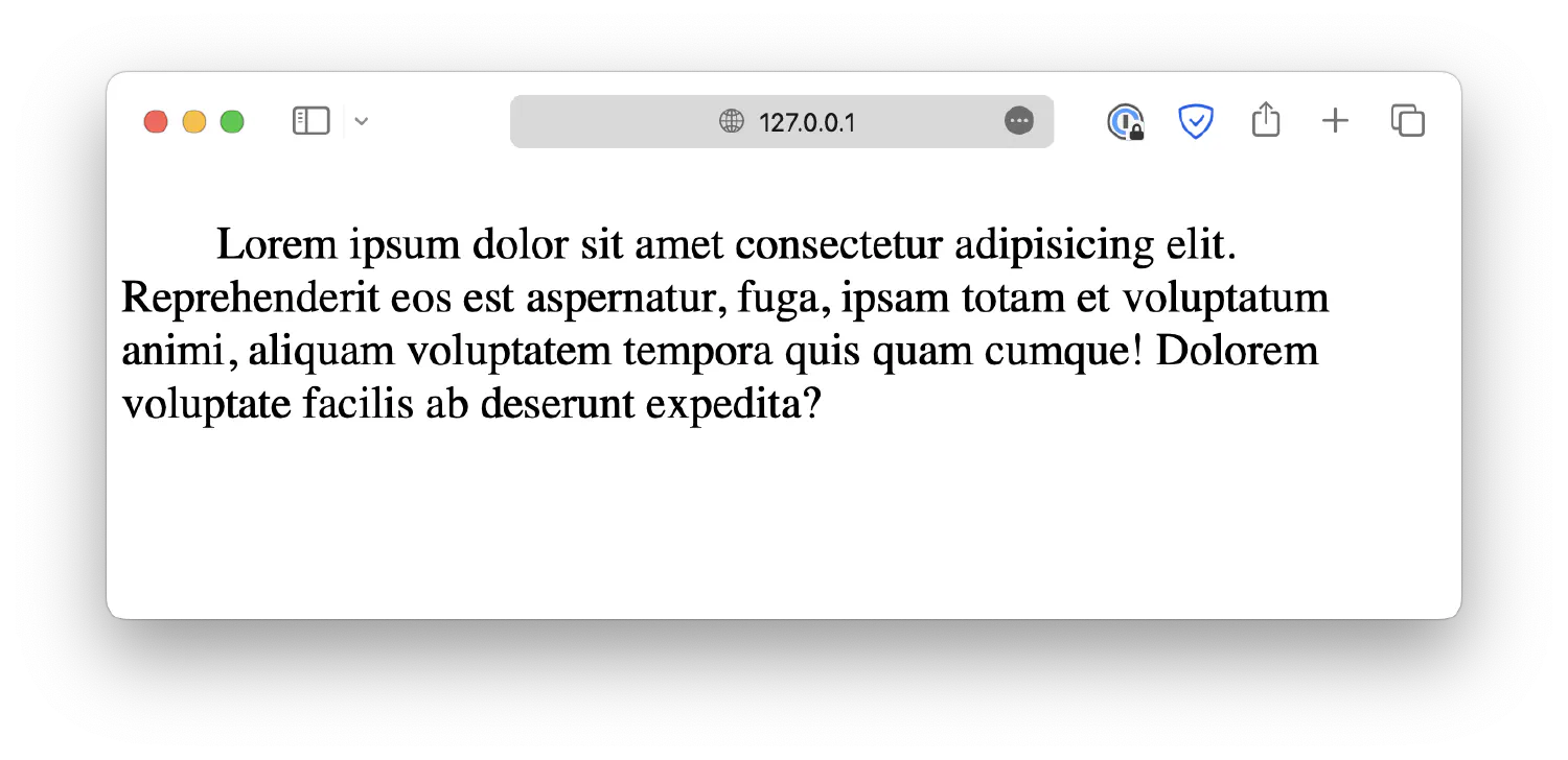
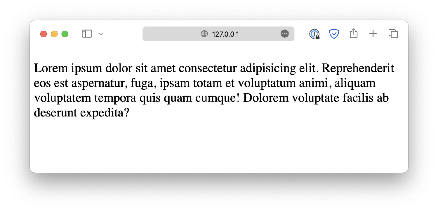
By default, the texts are left aligned, but you can change that by setting a text-align property. The property accepts four values, left, right, center, and justify.
1
2
3
p {
text-align: left;
}
1
2
3
p {
text-align: right;
}
1
2
3
p {
text-align: center;
}
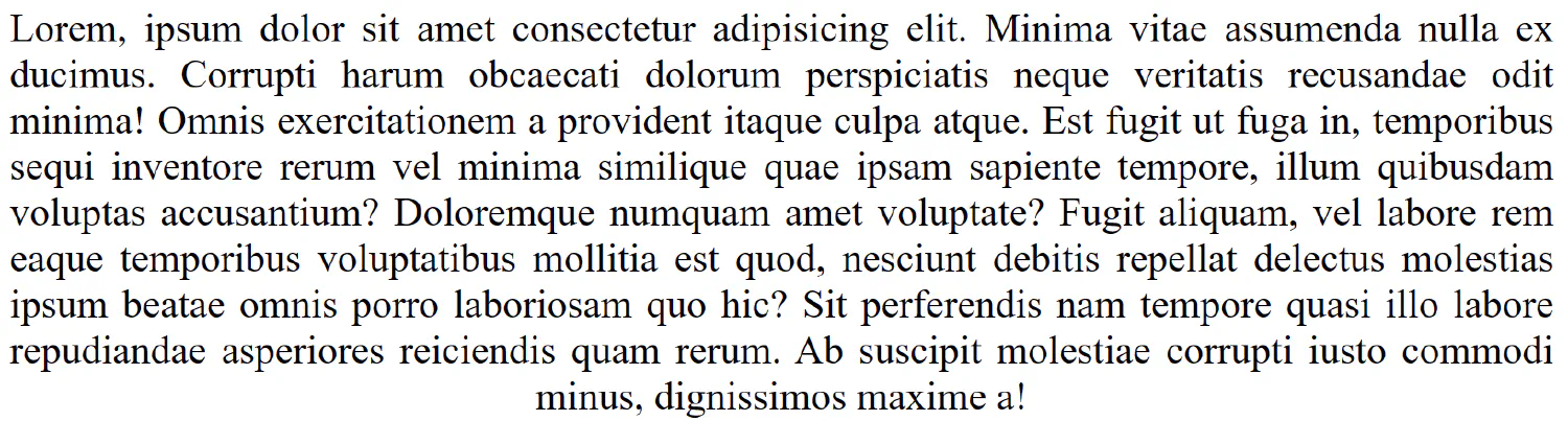
1
2
3
p {
text-align: justify;
}
Notice that the last line of the paragraph is not justified. It is processed differently so that the last line does not look strange when it cannot fill the horizontal space. However, you can force it to be justified using the text-align-last property. It takes the same set of values as text-align.
1
2
3
4
p {
text-align: justify;
text-align-last: center;
}
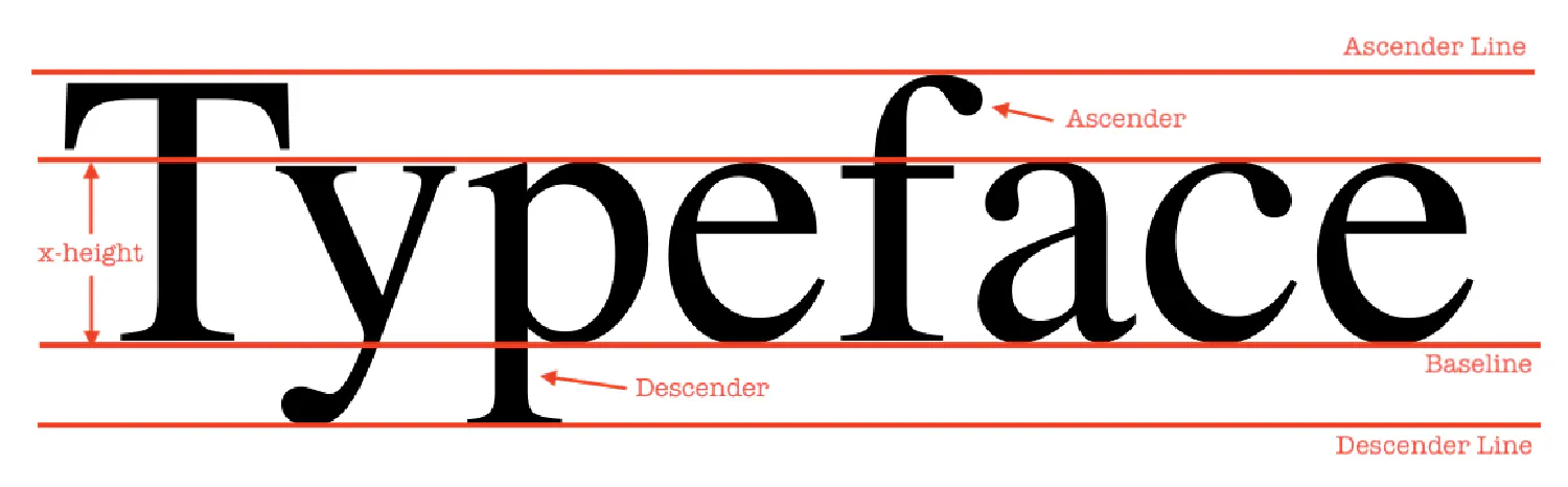
Besides horizontal alignment, you can also specify how you wish the text to be aligned vertically. By default, all the texts are aligned to the baseline, as shown in the diagram below:
Some letters will go below the baseline, such as y and p in this diagram, but they are still considered as being aligned to the baseline.
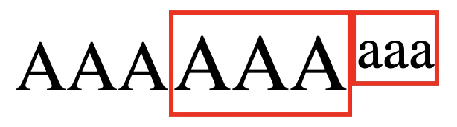
You can change the default behavior by setting a vertical-align property. For instance, top will align the texts to the highest element in the line.
To make the effect more noticeable, I have changed the font size and added borders to each element. We will discuss how to do this later. As you can see, the upper border of .small is aligned with the upper borders of .large.
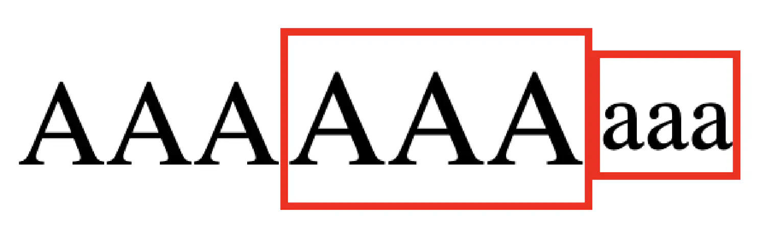
On the other hand, the text-top option will align the text with the highest letter in the parent element, which is <p> in this case.
Notice that the .large element is ignored even though it is slightly higher because it is a sibling of .small, not the parent.
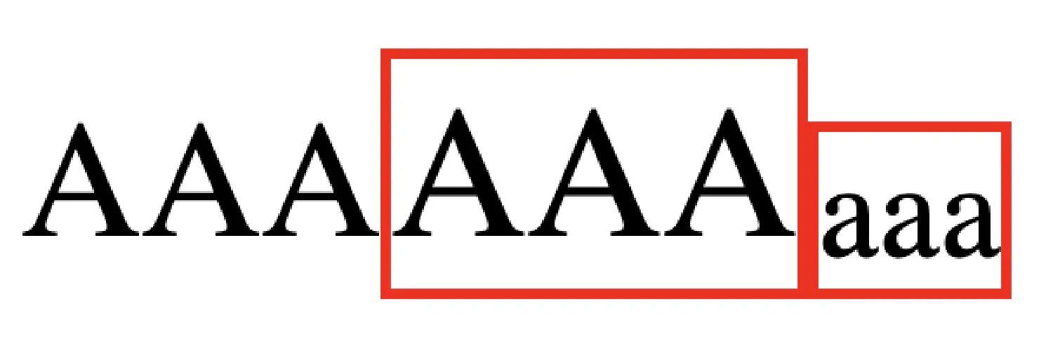
The bottom and text-bottom works similarly. bottom aligns the text to the lowest letter in the same line, and text-bottom aligns the text to the lowest letter in the parent element.
Lastly, the middle option aligns the text to the middle of the parent element, and the sub and super option each aligns the text to the subscript and superscript baseline of the parent text. You can test them in your own browser.
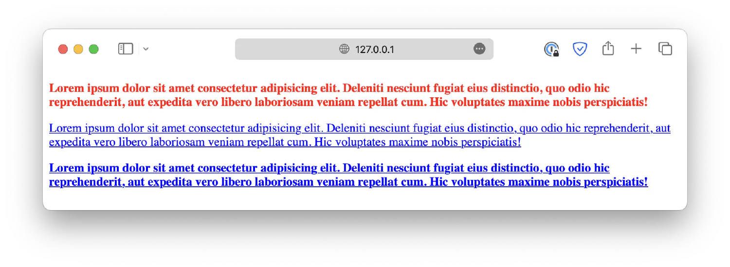
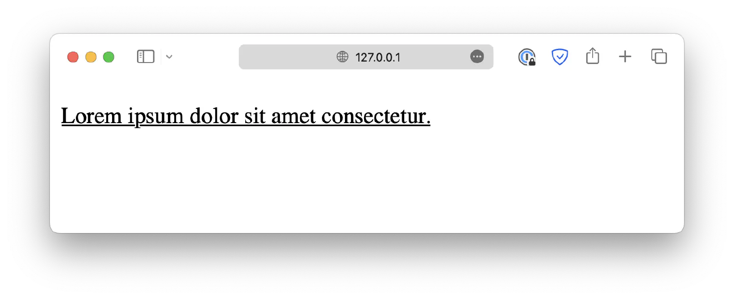
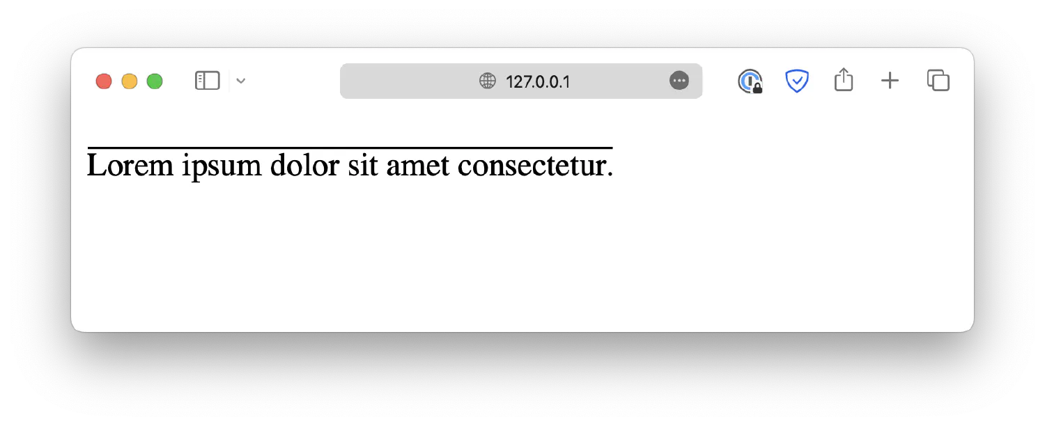
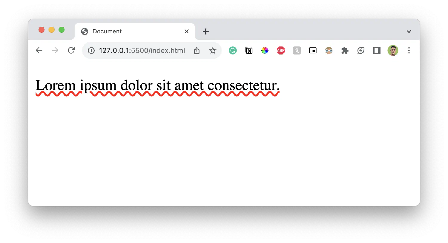
Text decorations are decorative lines you add to the plain text in order to make it stand out. For example, by setting the text-decoration-line property, you can underline the text like this:
1
<p>Lorem ipsum dolor sit amet consectetur.</p>
1
2
3
p {
text-decoration-line: underline;
}
Other possible values include overline, which is a line displayed over the text.
1
2
3
p {
text-decoration-line: overline;
}
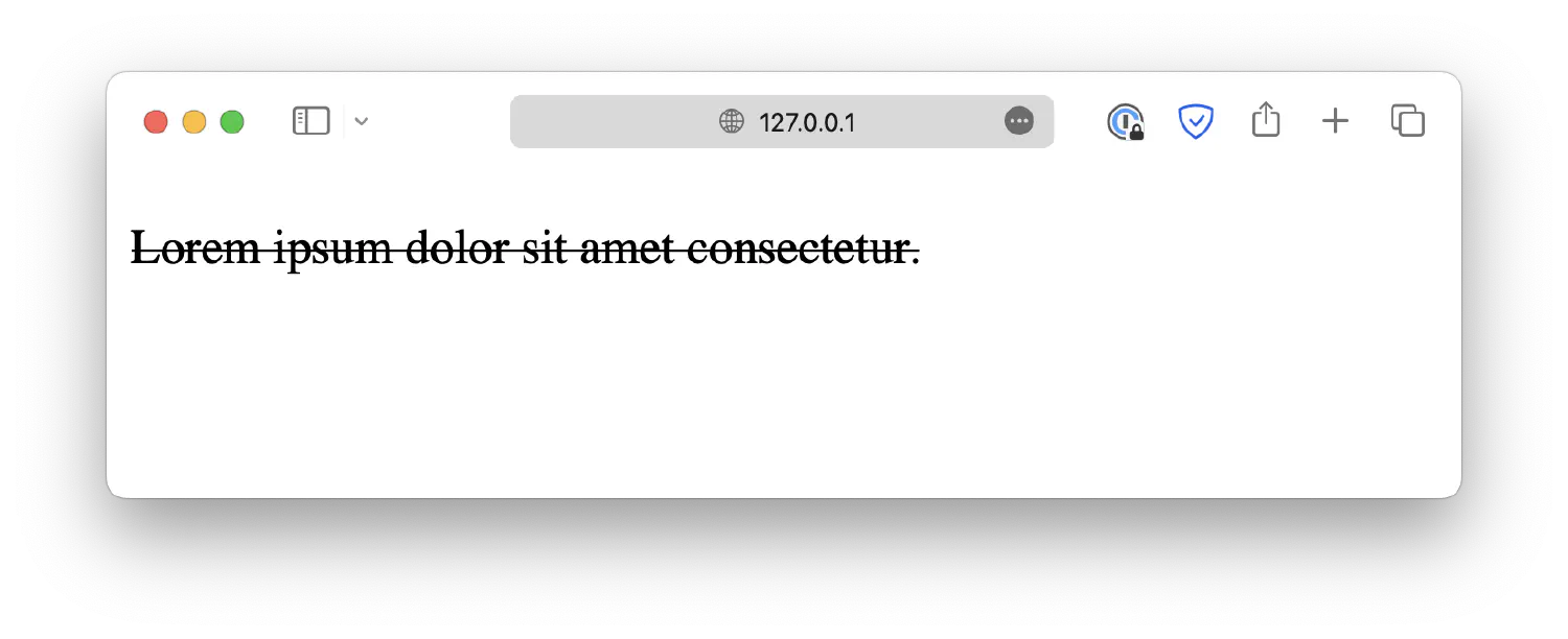
Or line-through, which is a line displayed through the text.
1
2
3
p {
text-decoration-line: line-through;
}
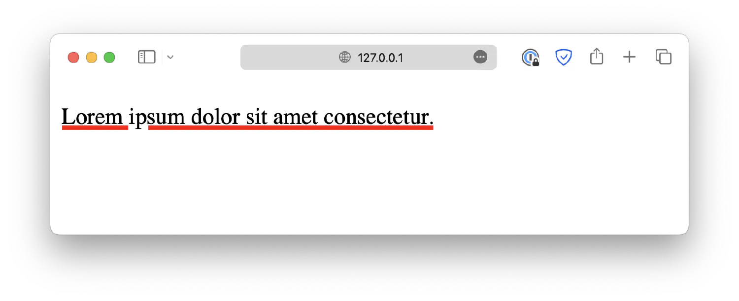
You can further customize the decorative line by setting a color using the text-decoration-color property.
1
2
3
4
p {
text-decoration-line: underline;
text-decoration-color: red;
}
Customize its thickness using the text-decoration-thickness property.
1
2
3
4
5
p {
text-decoration-line: underline;
text-decoration-color: red;
text-decoration-thickness: 5px;
}
Or define a style, such as dotted, wavy, and so on, using the text-decoration-style property.
1
2
3
4
5
p {
text-decoration-line: underline;
text-decoration-color: red;
text-decoration-style: wavy;
}
This seems like a lot of work for just a decorative line. Luckily, CSS offers a shortcut property, text-decoration, which allows you to define the type, style, thickness, and color simultaneously. It follows the syntax shown below:
However, please note that the text-decoration shorthand with multiple values is not yet supported with Safari. You must use the individual properties if your webpage needs to be compatible with the browser.
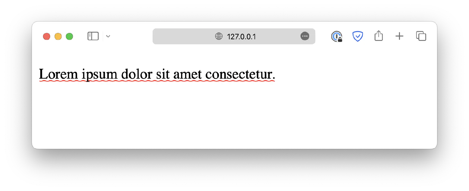
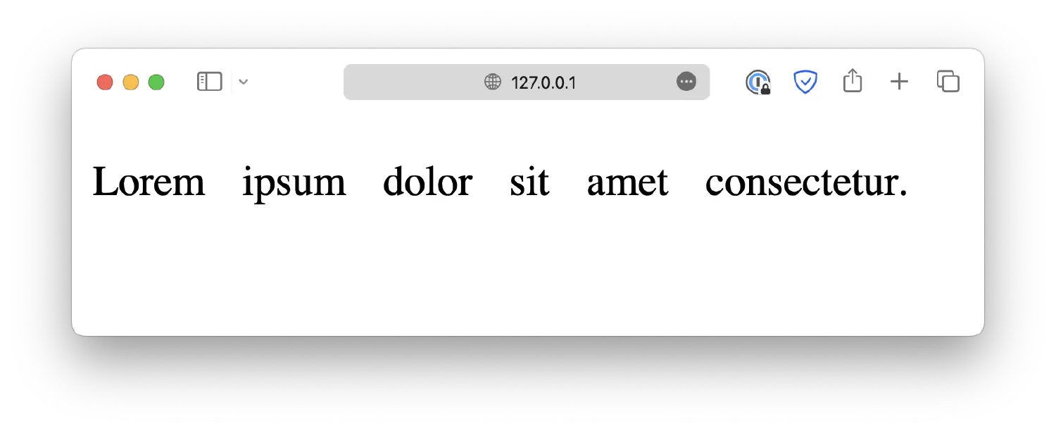
Similar to text alignment, we must discuss both horizontal and vertical directions when it comes to text spacing. Horizontal spacing refers to word spacing and letter spacing.
Word spacing can be customized using the property word-spacing.
1
<p>Lorem ipsum dolor sit amet consectetur.</p>
1
2
3
p {
word-spacing: 10px;
}
In this example, the length is defined by px, which stands for pixels.
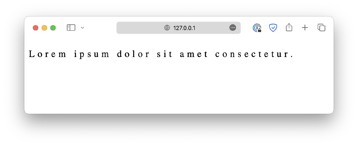
Letter spacing can be defined in a similar manner, using the letter-spacing property.
1
2
3
p {
letter-spacing: 5px;
}
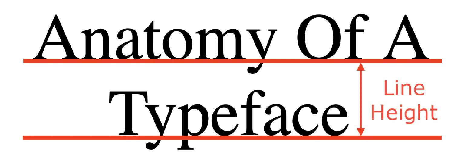
When it comes to vertical spacing, there is the line height (sometimes referred to as lead), which is the distance between two baselines.
Line height can be specified using the property line-height.
1
2
3
p {
line-height: 2em;
}
You can also control the indentation of the first line in a text block using the text-indent property.
1
2
3
p {
text-indent: 50px;
}
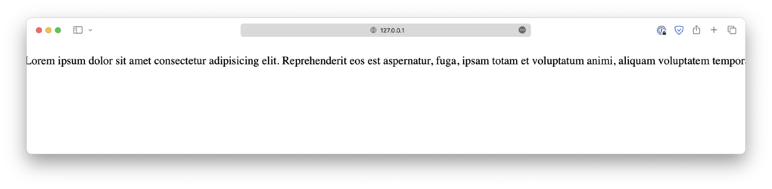
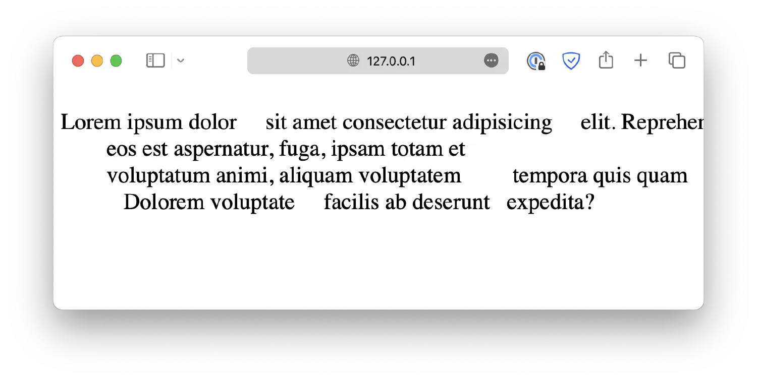
Lastly, as you know, your browser will automatically remove extra white spaces when rendering texts. It is possible to change that behavior by setting the white-space property.
When set to normal, the default condition, the browser will collapse all extra white spaces, and the text will wrap when necessary (automatically change to the next line when there is insufficient space). Line breaks are also considered white spaces.
1
2
3
4
5
<p>
Lorem ipsum dolor sit amet consectetur adipisicing elit. Reprehenderit eos est
aspernatur, fuga, ipsam totam et voluptatum animi, aliquam voluptatem tempora
quis quam cumque! Dolorem voluptate facilis ab deserunt expedita?
</p>
When set to nowrap, the browser will not automatically wrap the texts.
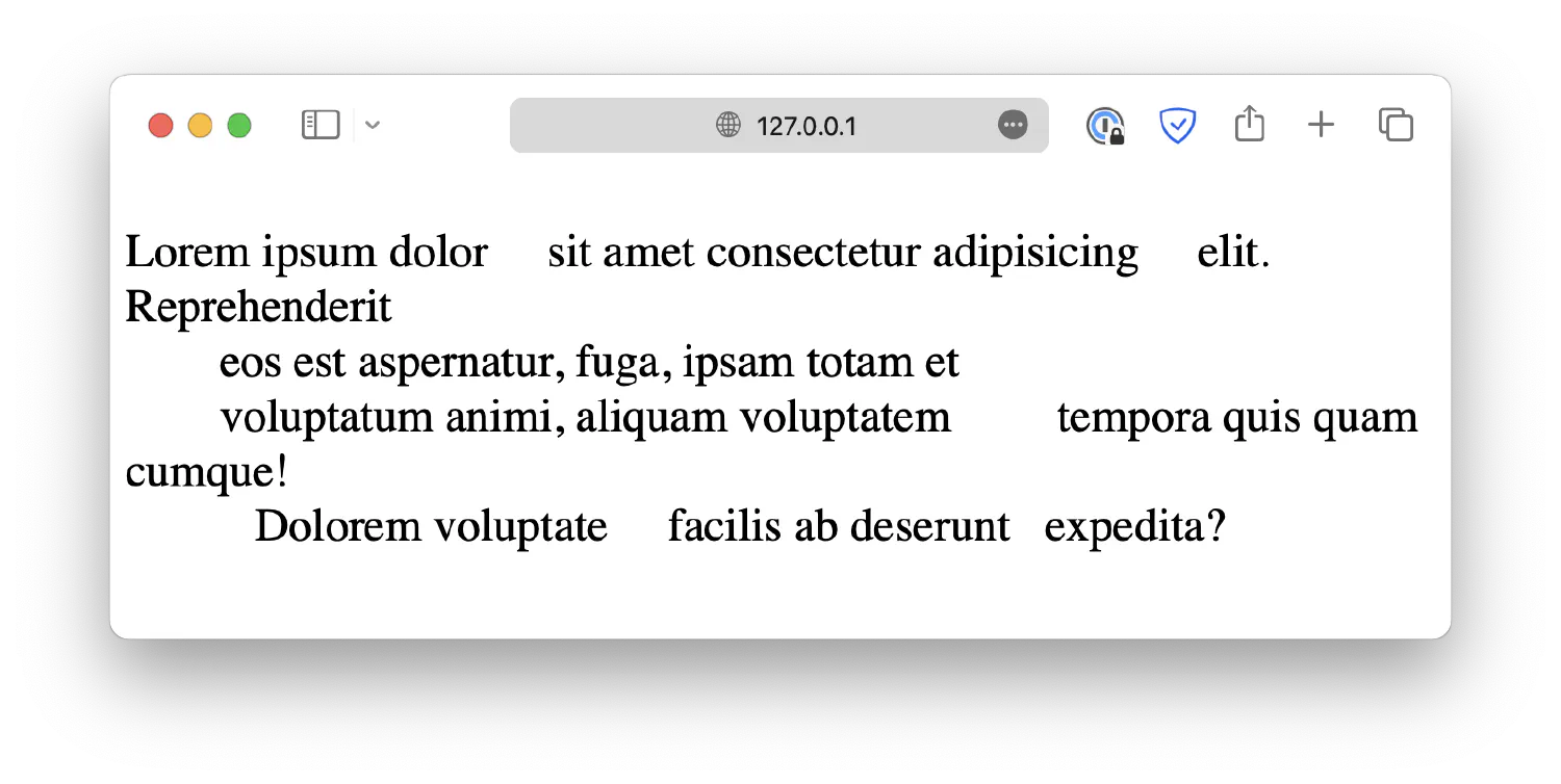
When set to pre, all white spaces will be preserved, and texts will not wrap automatically.
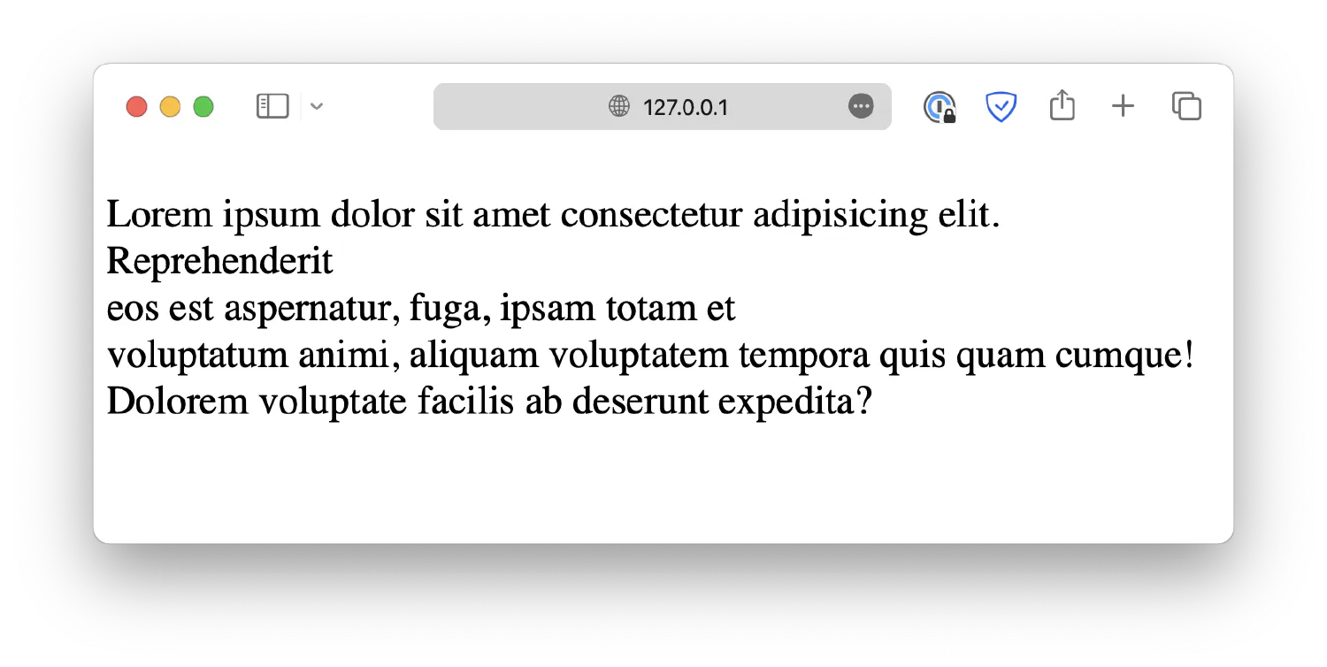
When set to pre-wrap, all white spaces will be preserved, and texts will wrap automatically.
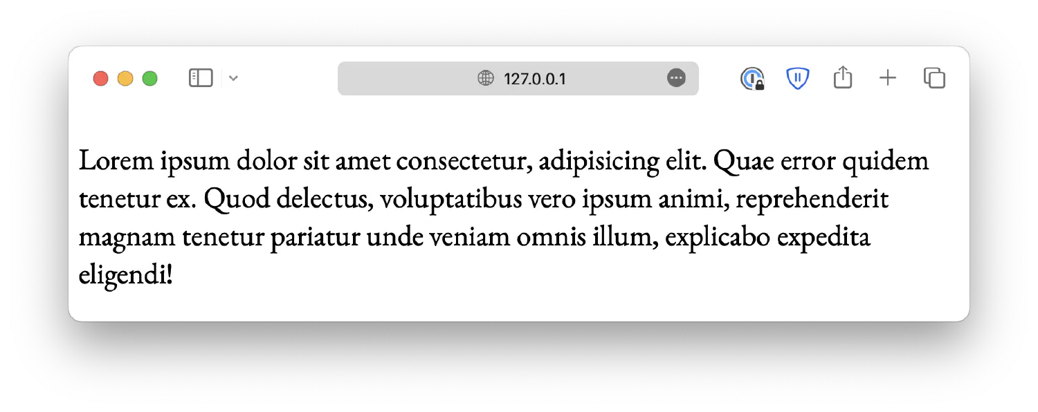
When set to pre-line, sequences of white spaces (multiple spaces, tabs) will collapse into one, but line breaks will be preserved, and texts will wrap automatically.
Using the right font when creating a webpage can have a huge impact on the user experience. Using different fonts can create visual hierarchy, establish your own unique branding, improve esthetics and design, highlight key information, and more.
In CSS, we generally classify fonts into different categories based on their styles. The most common ones are:
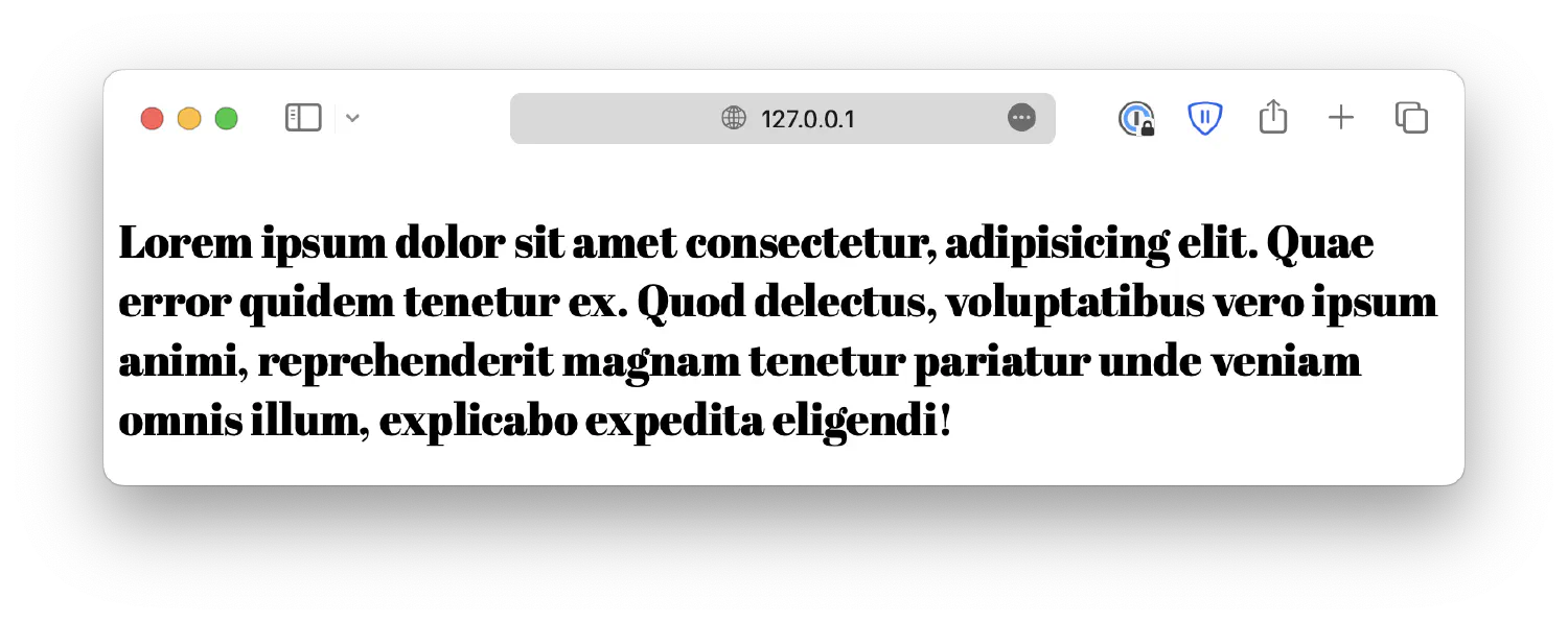
Serif fonts: These fonts have small decorative lines attached to the ends of the letters, also known as serifs. Some examples include Times New Roman, Georgia, and Garamond.
Sans-serif fonts: These fonts do not have serifs. Some examples are Arial, Helvetica, and Calibri.
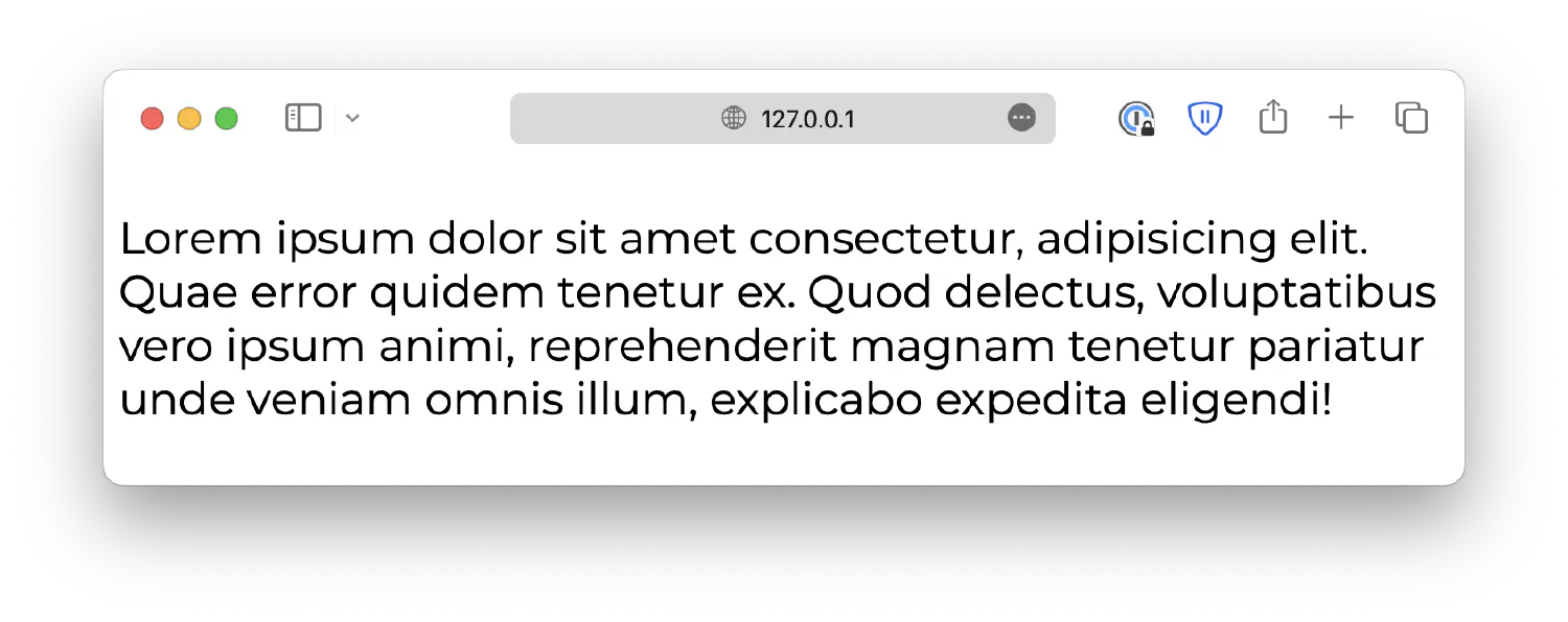
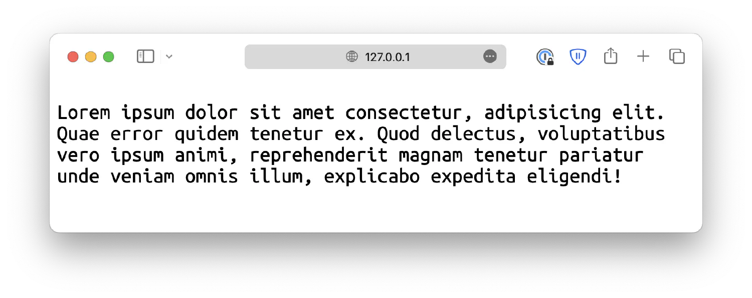
Monospace fonts: All characters have the same width. Most commonly used in coding environments. Some examples include Courier New, Lucida Console, and so on.
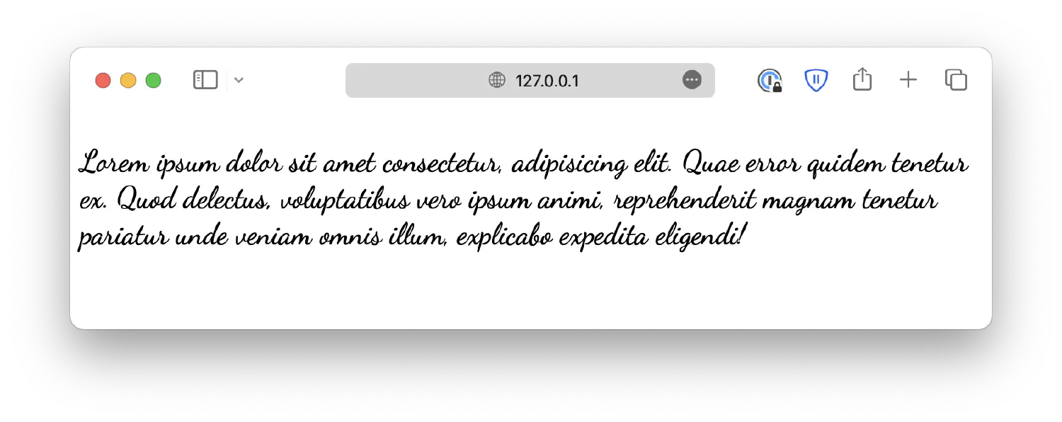
Handwritten fonts: Fonts that mimics handwritings. Such as Comic Sans MS. Also called cursive fonts.
Display fonts: These fonts are attention-grabbing and often used for headings, titles, or logos. Examples include Impact, Lobster, and Bebas Neue. They are also called fantasy fonts.
You can use the font-family property to specify the font. For example:
1
<p>Lorem ipsum dolor . . .</p>
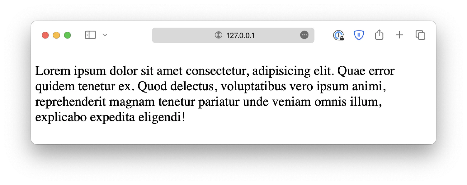
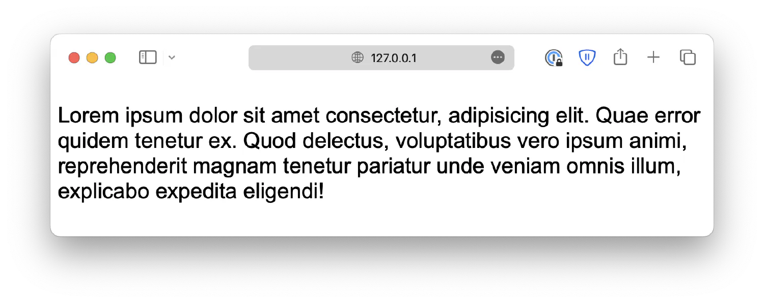
In most cases, your browser will use a serif font as the default. It may differ for your operating system, but that doesn’t matter. You can change the default font like this:
1
2
3
p {
font-family: Arial;
}
Here, we defined the font as Arial, a widely used sans-serif font available on almost all platforms.
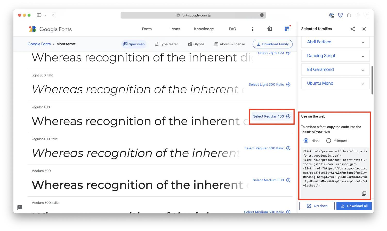
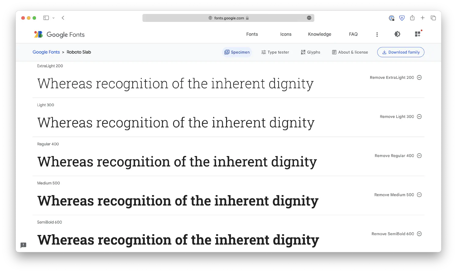
You can also download fonts from the internet using tools such as Google Fonts , and then use it in your webpage. For example, after you’ve found and selected your desired fonts, follow the instructions to embed them into your webpage.
Either copy the <link> elements into the <head> section of your HTML document.
Or copy the @import code to the beginning of your CSS file.
1
2
3
4
5
@importurl('https://fonts.googleapis.com/css2?family=Abril+Fatface&family=Dancing+Script&family=EB+Garamond&family=Montserrat&family=Ubuntu+Mono&display=swap');
p {
. . .
}
And then, you can use them like regular fonts. Notice that if the font name consists of multiple words, you must wrap it in quotes.
1
2
3
p {
font-family: "EB Garamond";
}
If, for some reason, the user’s browser cannot download the fonts, it will simply use the default option. That could be problematic because all the texts will have the same font. As a result, it is best to have a fallback system so that even if your first option is not available, the browser will fall back to its closest relative.
You can create a fallback system by specifying multiple fonts with the font-family property, separated using commas:
1
2
3
4
p {
font-family: "EB Garamond", Cambria, Cochin, Georgia, Times,
"Times New Roman", serif;
}
The system should start with the font you like and end with common fonts that are available on most platforms (such as Times New Roman), as well as a generic font family.
In most cases, the font you choose comes in various styles, weights, and sizes. There are a few properties available in CSS that allow you to customize the fonts. For instance, you can change the font size using the font-size property:
1
2
3
p {
font-size: 16px;
}
In this case, the font size is defined with px (pixels). In fact, there are many other more interesting units you can use, as shown in the list below:
cm: Centimeters.
mm: Millimeters.
in: Inches.
px: Pixels.
pt: Points, 1pt equals 1/72in.
pc: Picas, 1pc equals 12pt.
There are also relative units. Their values are based on some other elements.
em: This is a relative unit, relative to the font size of the parent element. If not set, the default font size will be 16px. 2em is two times the current font size, which is 32px.
ex: Relative to the x-height of the current font. This is rarely used.
ch: Relative to the width of the character 0. The value may be different for different fonts.
rem: Relative to the font size of the root element, <html>. This provides a consistent base size across the entire document, and as a result, this is the most commonly used unit for fonts.
vw: Relative to 1% of the width of the viewport. Viewport is the visible area of the webpage, such as the browser window.
vh: Relative to 1% of the height of the viewport.
vmin: Relative to 1% of the smaller dimension (width or height) of the viewport. This ensures the element is at least visible on the screen.
vmax: Relative to 1% of the larger dimension (width or height) of the viewport.
%: Relative to the parent element.
Of course, these units can be used to define the sizes for any elements, and not just texts. We will dig deeper into this topic later with real-world examples.
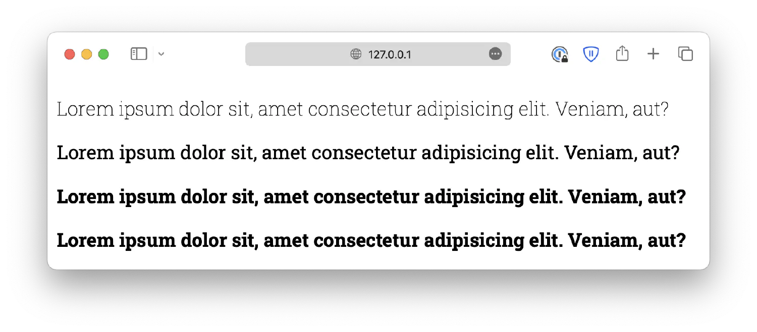
Next, you can also define the weight (the thickness of the strokes) of the font using the font-weight property. The accepted values include lighter, normal, bold, bolder:
Or you can use numeric values 100, 200, to 900. 100 being the lightest, and 900 being the boldest. However, you should know that most fonts do not have this many variants. You must ensure the fonts you are using have the variants you need.
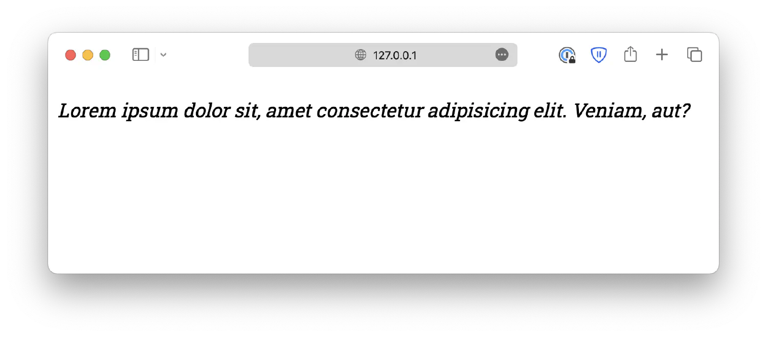
The font-style is used to define italic text. It can be either normal, italic, or oblique. Oblique is similar to italic but less supported, so it is rarely used.
1
2
3
p {
  font-style: italic;
}
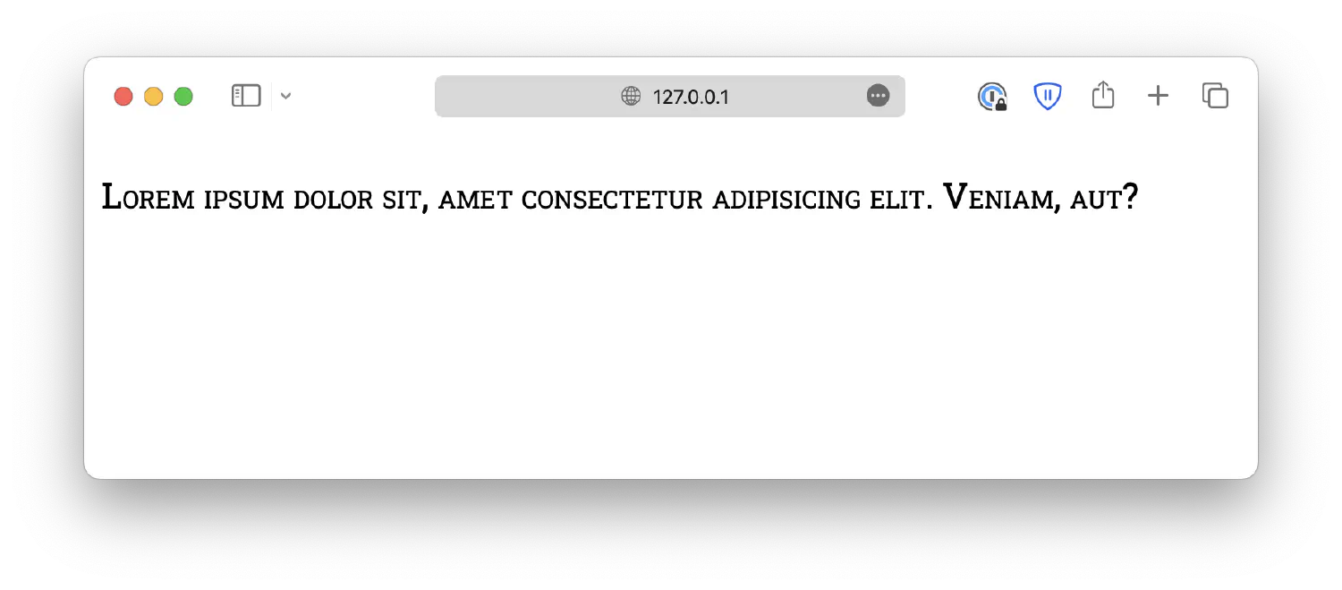
Lastly, the font-variant property defines whether or not the text should be displayed in a small-caps form, where all lowercase letters are converted to uppercase but in a smaller form.
In this chapter, we discussed the basics of CSS, the Cascading Style Sheet. We learned how to select HTML elements using different selectors, how to change the color of elements, as well as the fundamentals of typography, the styling and arrangement of texts in a webpage. In this next chapter, we are going to talk about more advanced topics in HTML and CSS, such as the box model, transitions, animations, and more.