Advanced HTML and CSS
This course has been migrated to www.thedevspace.io .
- HTML Basics
- CSS Basics
- Advanced HTML and CSS ⬅️ You are here
- How to Position and Arrange Content Using CSS
- Responsive Design
- Recreating YouTube Using HTML and CSS
- Some CSS Tools and Frameworks
- HTML & CSS Best Practices
In the previous chapters, we’ve established a solid foundation in HTML and CSS, equipping you with the knowledge to create HTML documents and apply CSS styles. You’re now well-versed in various selectors and proficient in modifying element styles such as color and font. As we move into a new chapter, we are going to delve further into the topic of HTML and CSS, exploring more advanced concepts and techniques.
Before we continue, please consider buying the e-book version of this course.
By purchasing this e-book, you will get access to all the accompanied source code. Thank you for your support! Happy coding! 🖥️✨
How are the elements displayed #
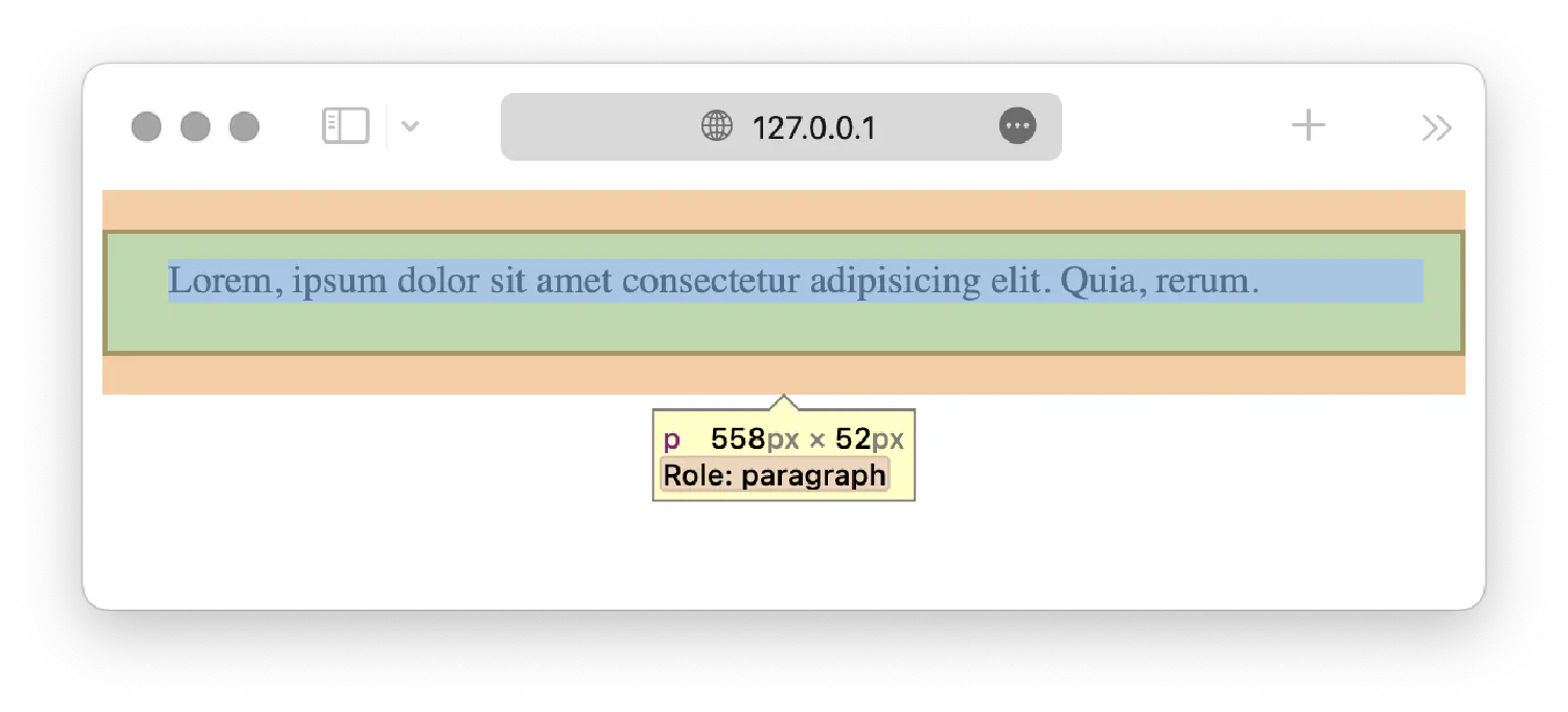
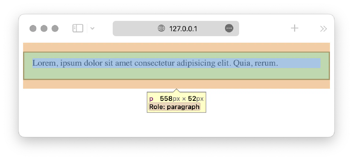
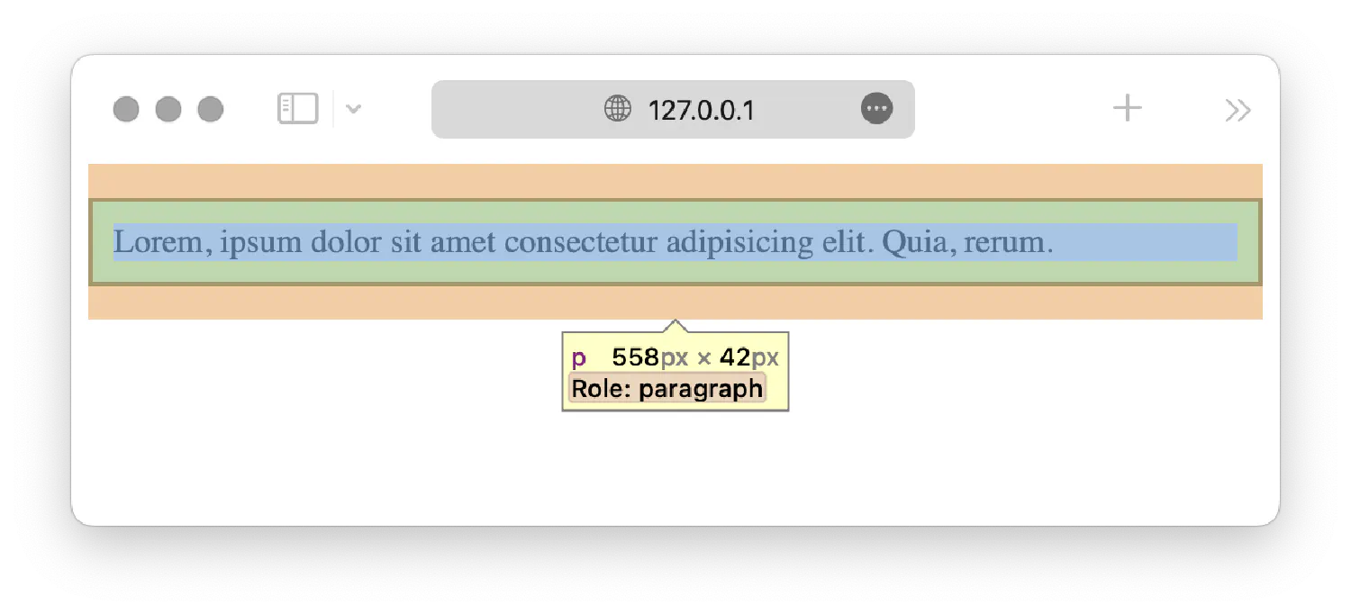
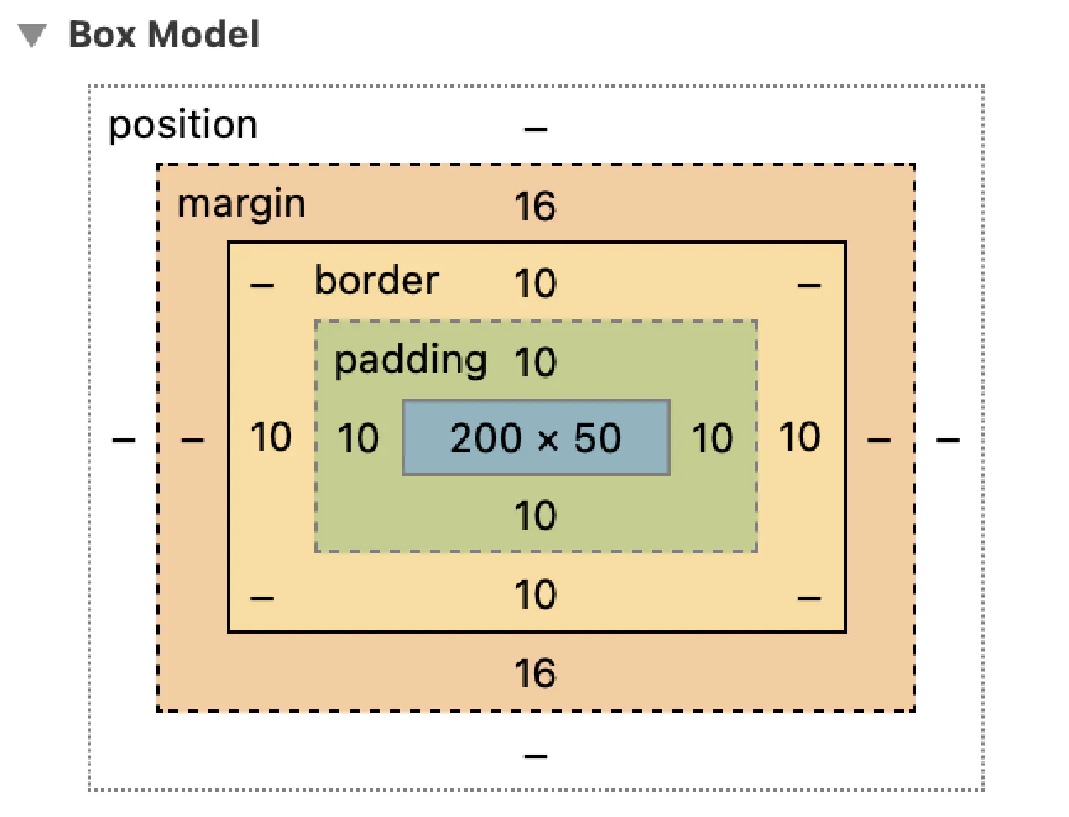
When the browser renders an element, it will be treated as a box. The box is defined by a border, with margin and padding. Margin is the space surrounding the border, and padding is the space between the border and content.
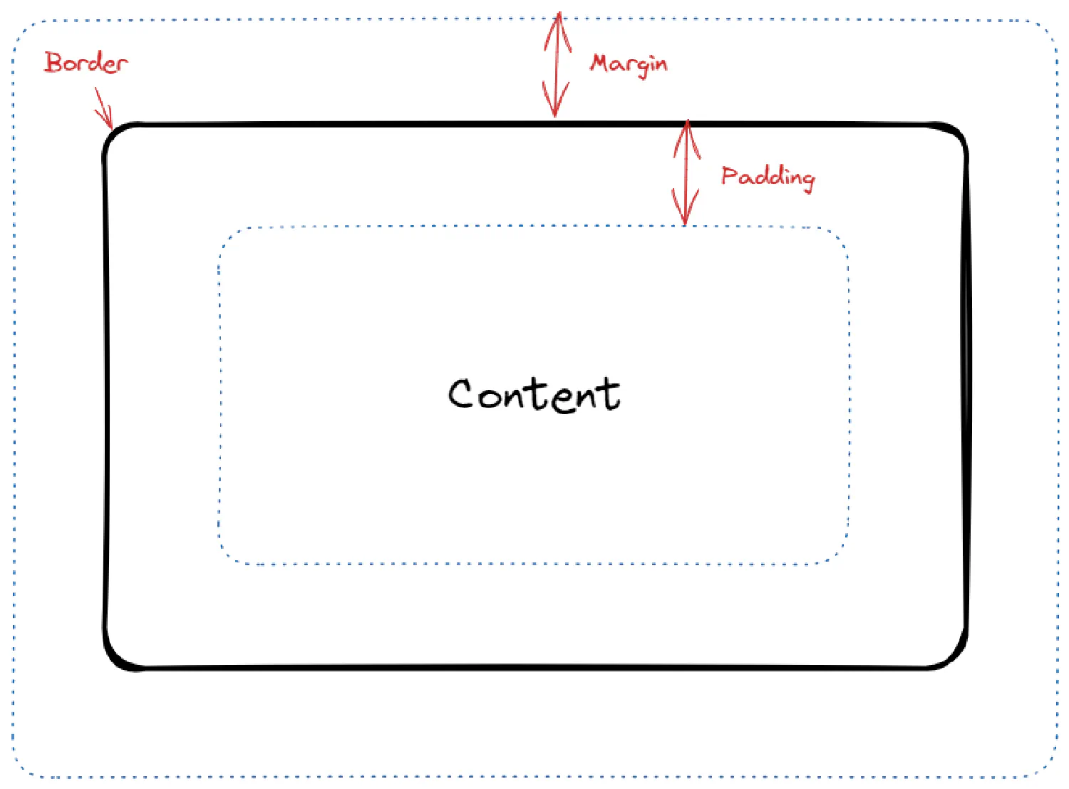
Border, margin, and padding #
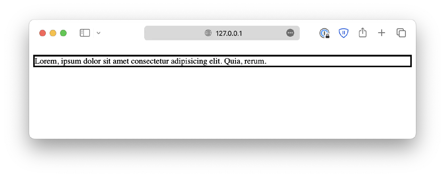
The border is not visible by default, but that can be changed by defining a border style.
| |
| |
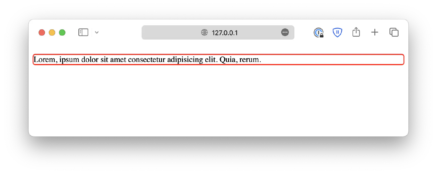
You can also customize its width, color, and radius:
| |
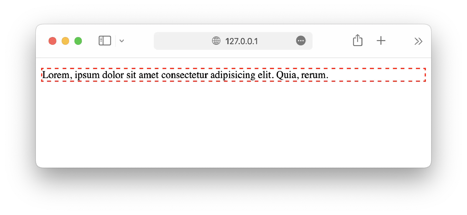
CSS also offers a shorthand property, border, which allows you to customize width, style, and color together.
| |
Lastly, using properties border-top, border-right, border-bottom, and border-left, you can create borders for each side of the box, and they work exactly the same as the border property.
Inside the box, you can add space between the border and the content. This space is called padding, defined by the padding property.
If the property is given four values, it will follow this format:
| |
| |
If the property has three values:
| |
| |
If the property has two values:
| |
| |
If the property has only one value, then the element will have equal padding in all four directions:
| |
If the ordering is too confusing, you can always set individual paddings using properties padding-top, padding-right, padding-bottom, and padding-left.
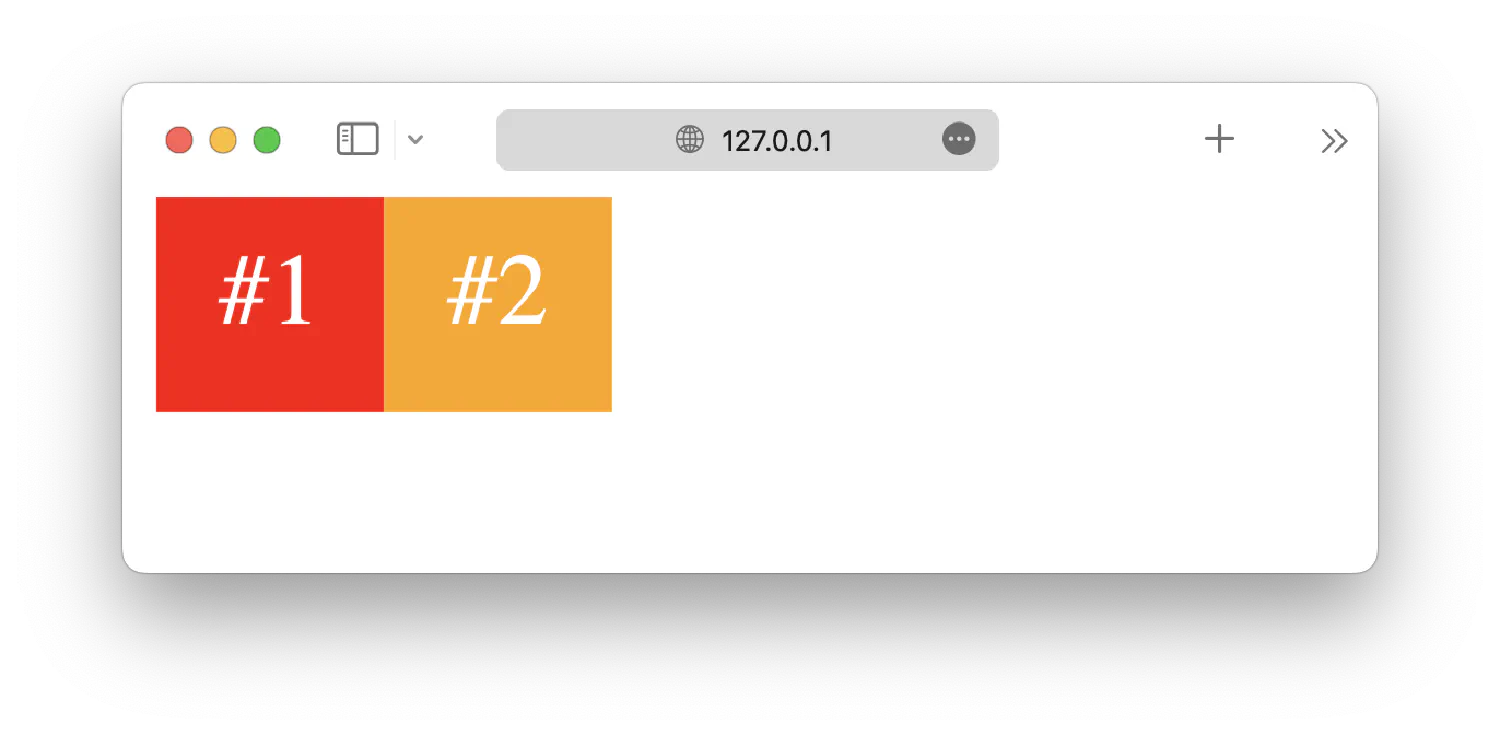
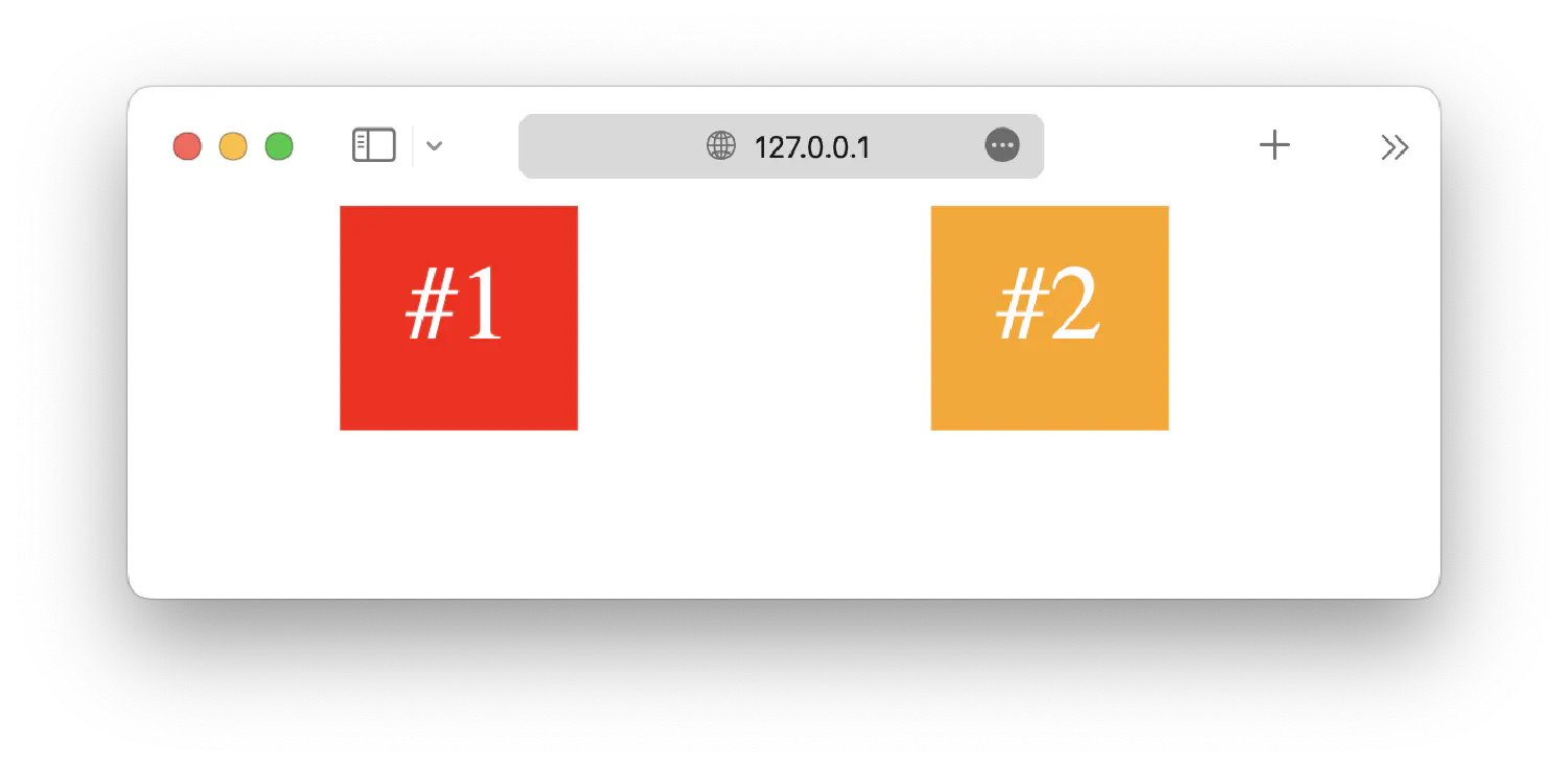
Similarly, you can add space outside the border so that two neighboring elements do not touch each other. This space is called margin, defined by the margin property. For instance, here we have two <span> elements:
The margin property works similarly to the padding property.
| |
| |
Resizing elements #
After understanding the box model, you can define the size of the box using width and height properties.
| |
| |
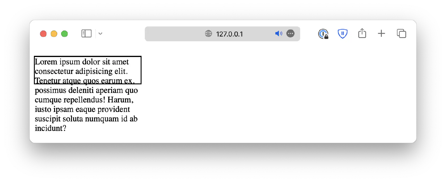
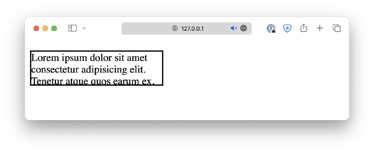
Deal with content overflow #
Notice that the content is too big to fit inside the 200 x 50px box. You can customize how the overflow is dealt with by setting an overflow property.
When set to hidden, the overflow will be cropped off.
When set to scroll, the overflow will be cropped off, but a scrollbar will be added, allowing you to scroll down to see the full content.
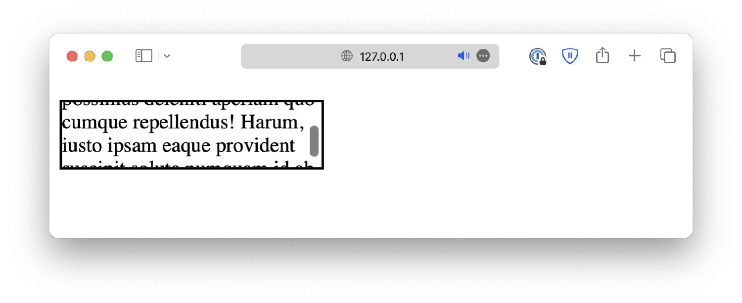
Or you can simply set it to auto, which adds a scrollbar only when necessary.
Box sizing #
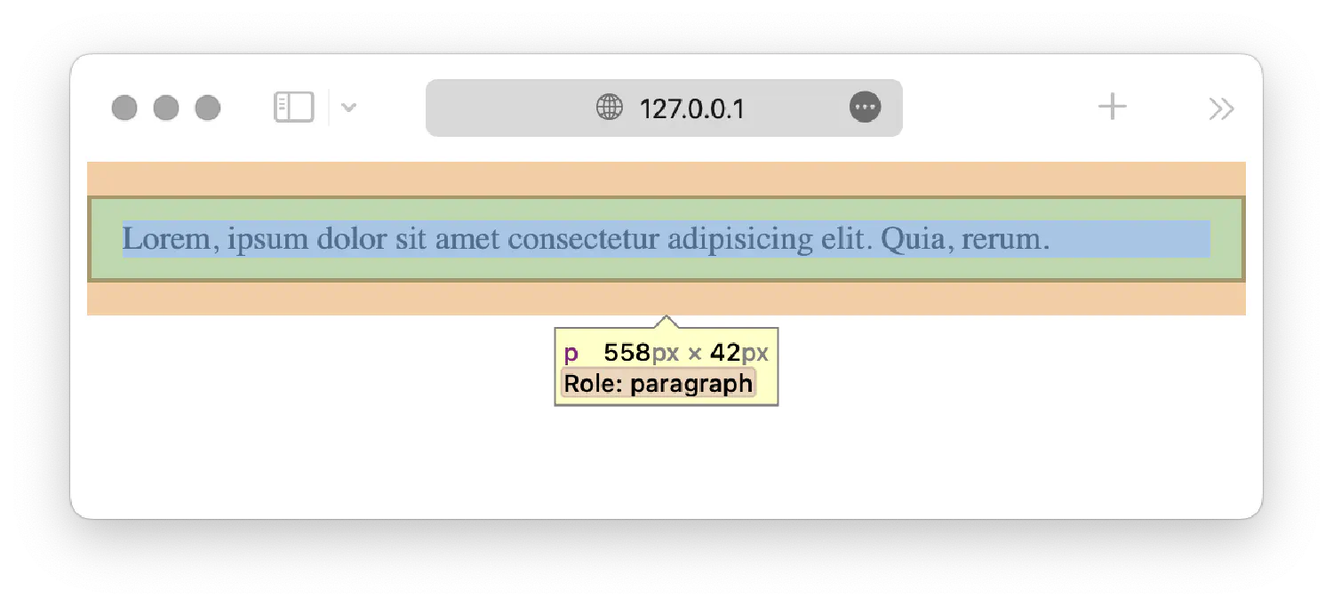
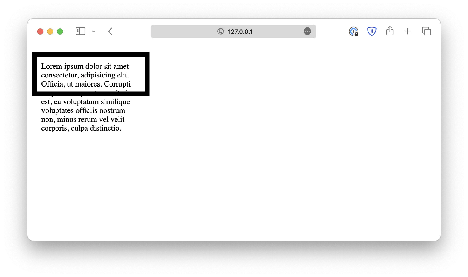
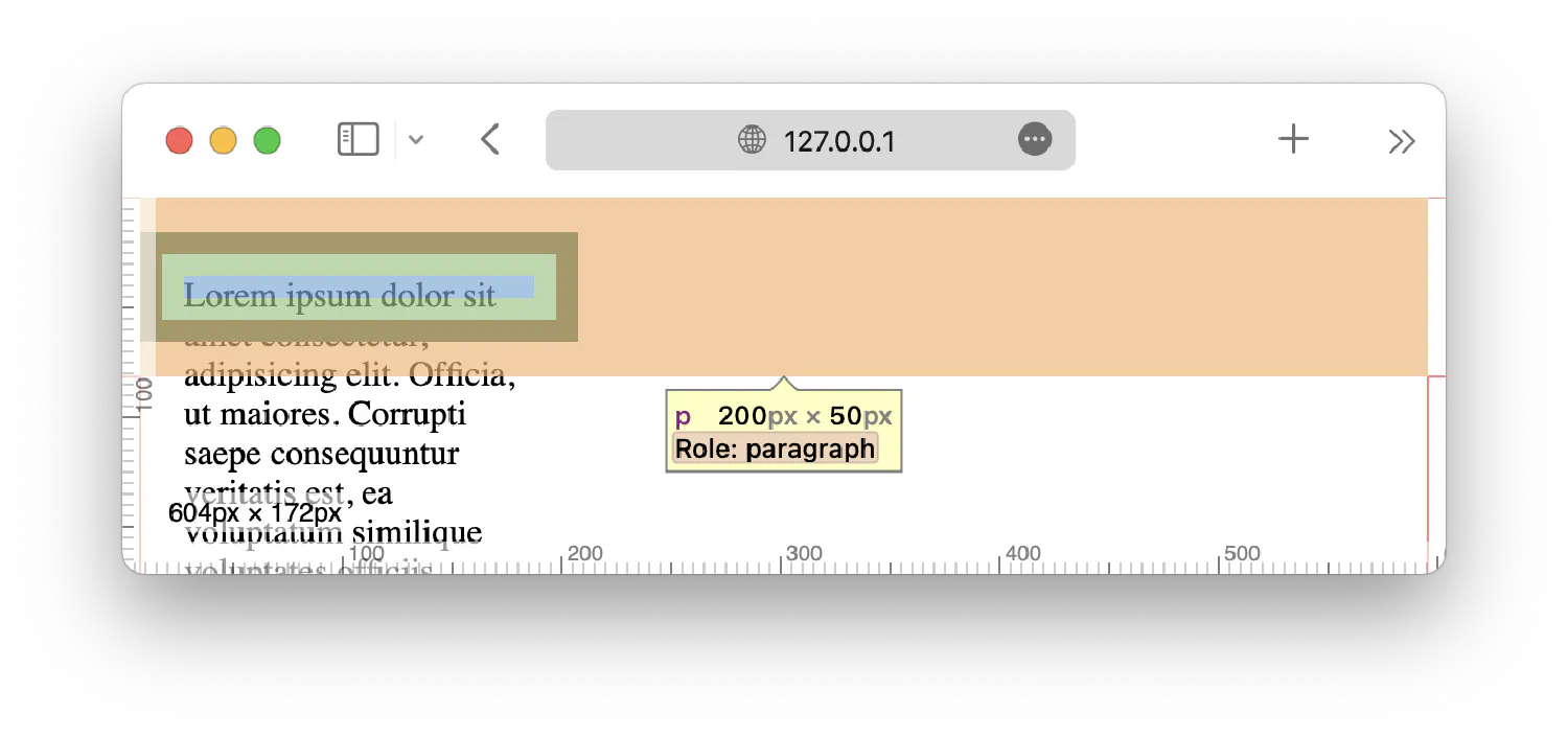
There is one more issue with this box. Remember that we defined this box to be 200px wide and 50px tall, but if you inspect this paragraph element using the Developer Tools, you will see that it is, in fact, 204 x 54px.
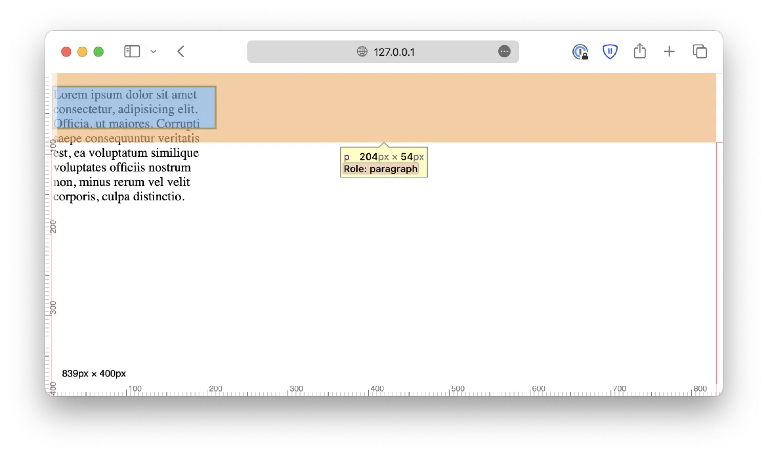
This is because when you define the box size, the browser assumes you refer to the size of the content, meaning it ignores the padding and the border itself. For example, let’s make the border thicker and add a padding. Notice that the content size remains the same.
| |
This can be counterintuitive sometimes because when we define the box size, we usually mean the size of the border, not just the content. To fix this issue, you can overwrite the browser’s default actions by setting the box-sizing property to border-box.
| |
By default, this property is set to content-box, so the browser will count the size of the content as the size of the box. When you set it to border-box, the browser will take padding and border into account when calculating the box size.
Functions and variables #
CSS functions are special statements in CSS that add programmatic characteristics to the language. A function accepts one or more input and returns an output. The output will then be assigned to the CSS property. For example, the rgb() function we discussed in the previous chapter accepts three values as the input and returns the corresponding color code as the output. The color code is then assigned to the color property.
| |
There are dozens of different functions available in CSS, and you can find a complete reference here . Discussing all of them in one chapter is impossible as that will make this course too long and tedious. Instead, we will talk more about them as we encounter specific examples in the future.
In this section, let’s talk about a very special and helpful function called var(). This function allows you to retrieve a user-defined variable.
| |
The variables are defined in the :root section. In this example, --primary-color is the variable name, and salmon is the variable value. The var() function accepts the variable name as the input and returns its value as the output.
This method of defining styles is very useful because you can reuse the same variables in different locations of the CSS file. When designing a webpage, you’ll want to keep your design language consistent. For instance, if you want skyblue to be your main accent color, you’ll need to use that value in many different places.
| |
But that means you will have to edit multiple lines when you need to change it to some other value. In a large-scale project, that is easy to cause errors. A better way to organize your code is to put this information in the :root section as variables and then access them later in the code using the var() function. When you need to change the accent color, all you need to do is to change the corresponding variable.
| |
Of course, this method is not limited to colors. You can define basically anything you want, such as the font family, font size, width and height, and so on.
| |
Applying filters #
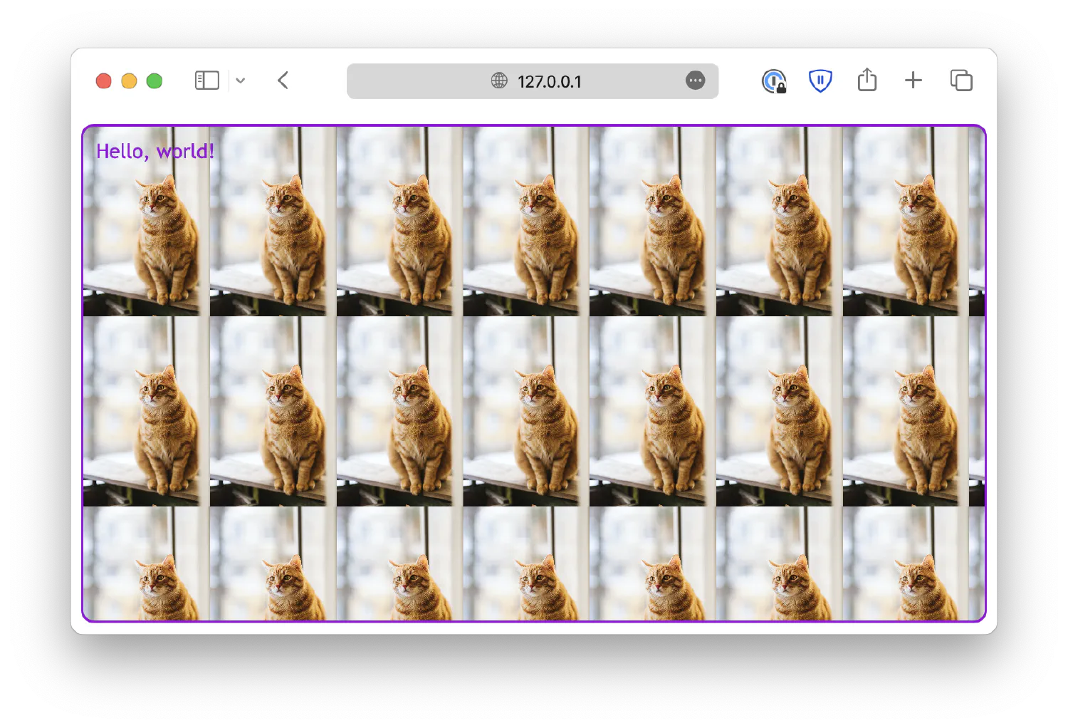
Now that you understand what a function is, it is time to discuss filter, the CSS property that uses the most functions. The filter allows you to define visual effects that can be applied to HTML elements to modify their appearances, such as adjusting the brightness, contrast, saturation, and more. The filters are most commonly used on images, but they also work on other elements. Each filter is defined by a CSS function, as shown in the list below:
blur()This filter applies a blur filter to the element. It accepts a blur radius as the input. A larger radius will create more blur.
1 2 3 4 5 6 7 8 9 10 11#cat1 { filter: blur(0px); } #cat2 { filter: blur(5px); } #cat3 { filter: blur(10px); }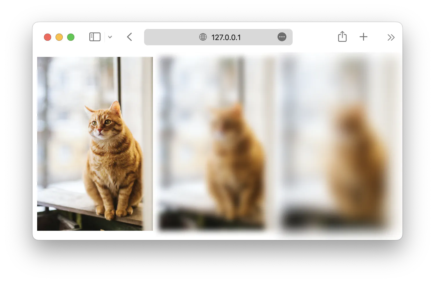
brightness()The
brightness()function controls the brightness of an element. The function accepts a percentage value argument,0%will make the element completely dark,100%will be the original, and values higher than that will make the element brighter.1 2 3 4 5 6 7 8 9 10 11#cat1 { filter: brightness(50%); } #cat2 { filter: brightness(100%); } #cat3 { filter: brightness(150%); }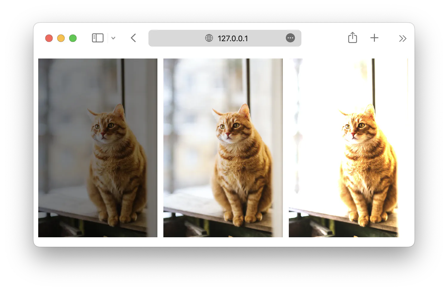
contrast()The function controls the contrast of the element, and it works similarly to the
brightness()function. It also accepts a percentage value argument,0%will make the element completely dark,100%will be the original, and higher values will give the element more contrast.1 2 3 4 5 6 7 8 9 10 11#cat1 { filter: contrast(50%); } #cat2 { filter: contrast(100%); } #cat3 { filter: contrast(150%); }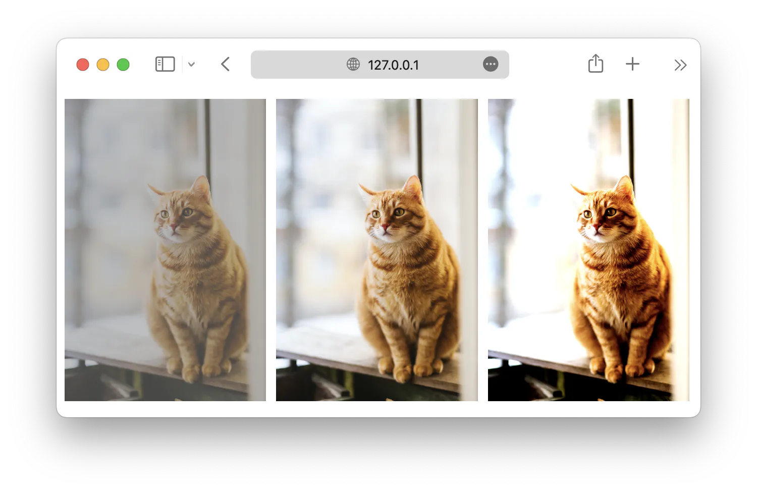
grayscale()Turns the element into a grayscale image. The function accepts percentage values from
0%to100%.0%will be the original, and100%will turn the element black and white.1 2 3 4 5 6 7 8 9 10 11#cat1 { filter: grayscale(25%); } #cat2 { filter: grayscale(50%); } #cat3 { filter: grayscale(100%); }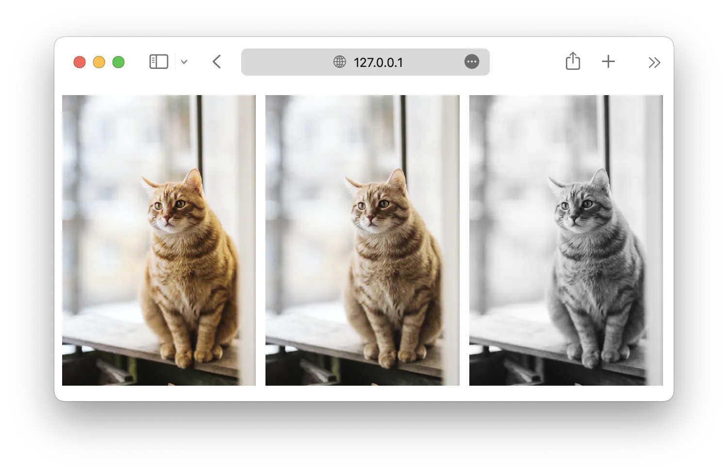
hue-rotate()This function will perform a hue rotation on the image based on the provided rotation degree, from
0degto360deg. We learned in the previous chapter that hue is the degree on a color wheel.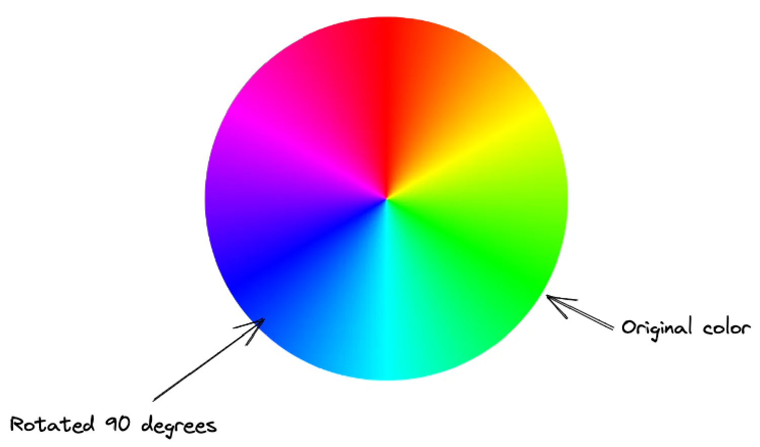
So, if we perform a
90deghue rotation, the green color in the original image will become blue.1 2 3 4 5 6 7 8 9 10 11#cat1 { filter: hue-rotate(90deg); } #cat2 { filter: hue-rotate(180deg); } #cat3 { filter: hue-rotate(270deg); }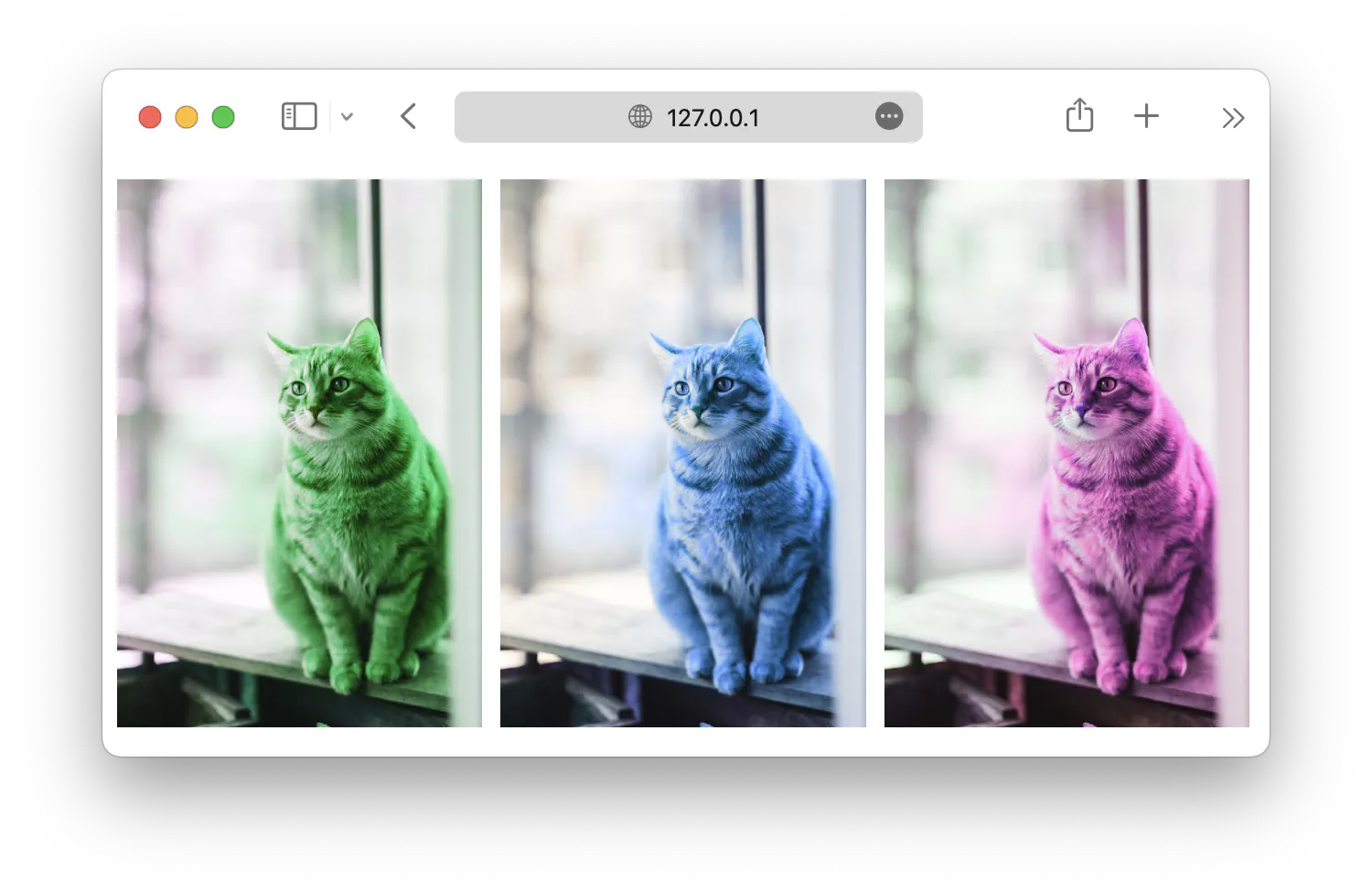
invert()Inverts the original image.
0%is the original, and100%inverts the image completely.1 2 3 4 5 6 7 8 9 10 11#cat1 { filter: invert(0%); } #cat2 { filter: invert(50%); } #cat3 { filter: invert(100%); }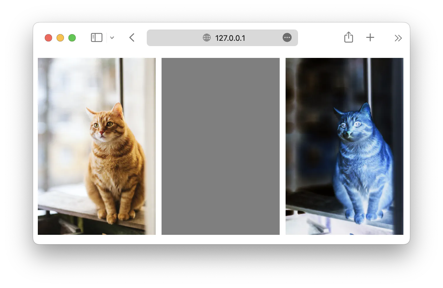
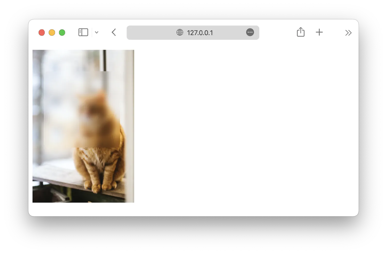
opacity()Controls the opacity of the image from
0%(completely invisible) to100%(completely visible).1 2 3 4 5 6 7 8 9 10 11#cat1 { filter: opacity(25%); } #cat2 { filter: opacity(50%); } #cat3 { filter: opacity(100%); }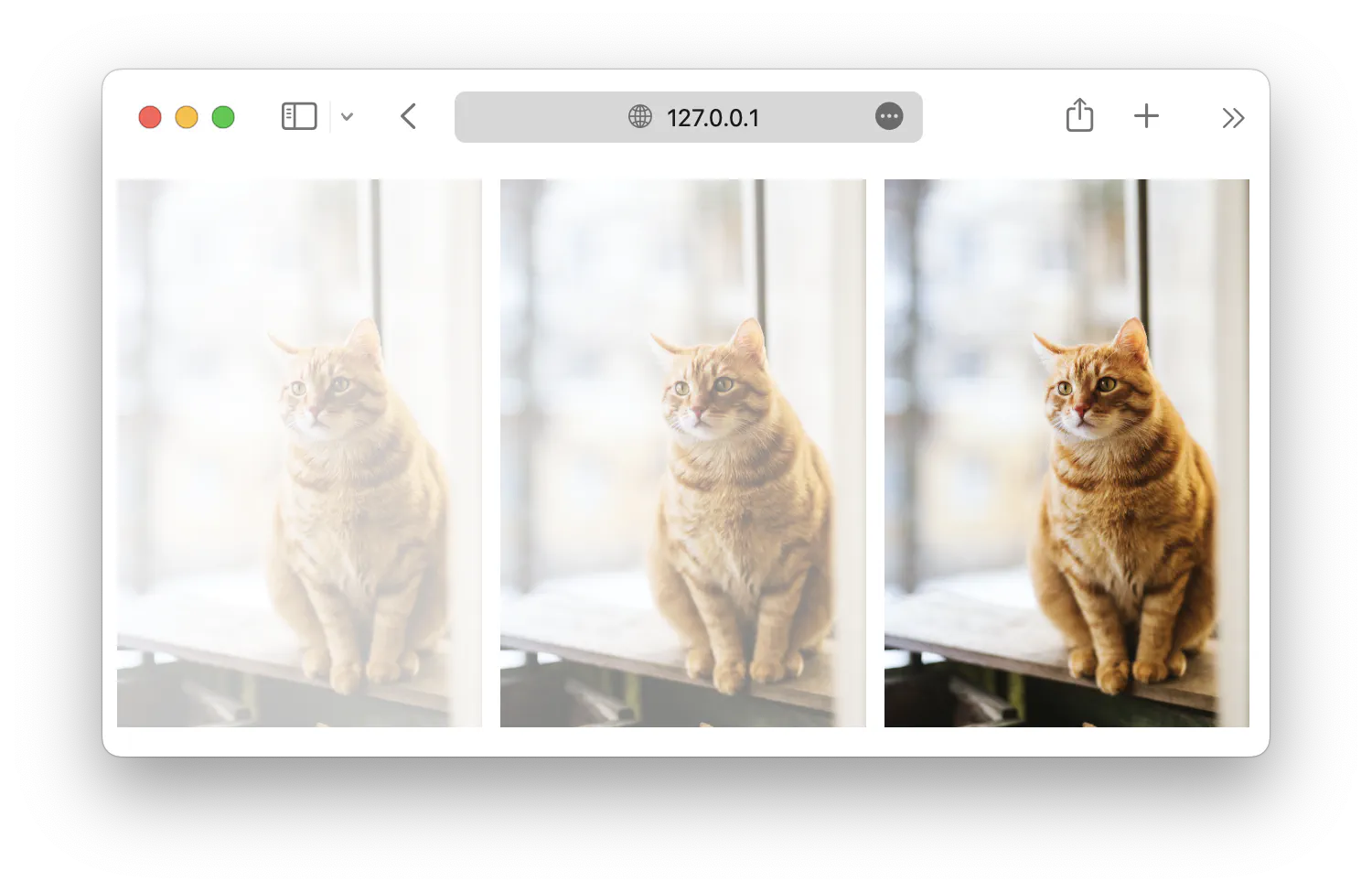
saturate()Controls the saturation of the image.
100%is the original, values lower than that make the image less saturated, and values higher than that make the image more saturated.1 2 3 4 5 6 7 8 9 10 11#cat1 { filter: saturate(50%); } #cat2 { filter: saturate(100%); } #cat3 { filter: saturate(150%); }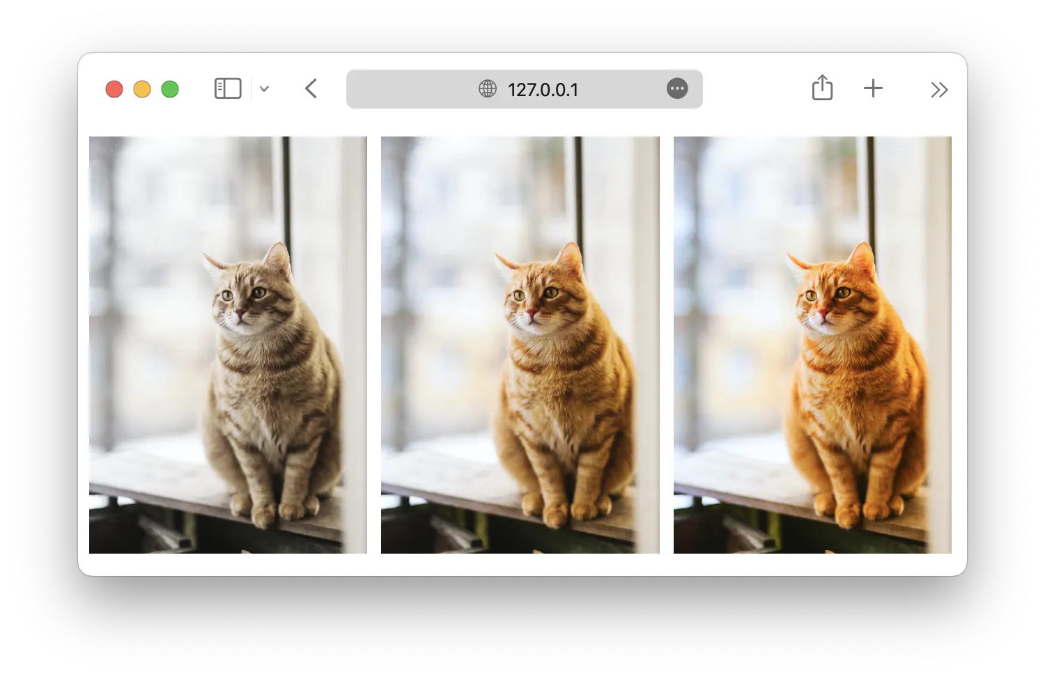
sepia()Sepia is a reddish-brown color, which makes the image appear old. The function accepts values from
0%to100%.1 2 3 4 5 6 7 8 9 10 11#cat1 { filter: sepia(0%); } #cat2 { filter: sepia(50%); } #cat3 { filter: sepia(100%); }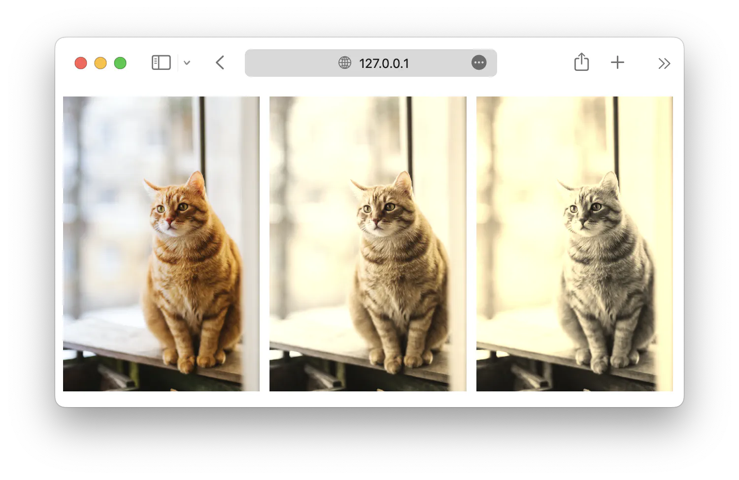
drop-shadow()This filter works similarly to the
box-shadowproperty, which adds a drop shadow to the element. The function accepts arguments that allow you to define the shadow position (horizontal and vertical offset), radius, and color.1 2 3 4 5 6 7 8 9 10 11#cat1 { filter: drop-shadow(5px 5px 10px rgba(0, 0, 0, 0.5)); } #cat2 { filter: drop-shadow(5px 10px 5px rgba(255, 0, 0, 0.5)); } #cat3 { filter: drop-shadow(10px 5px 15px rgba(0, 255, 0, 0.5)); }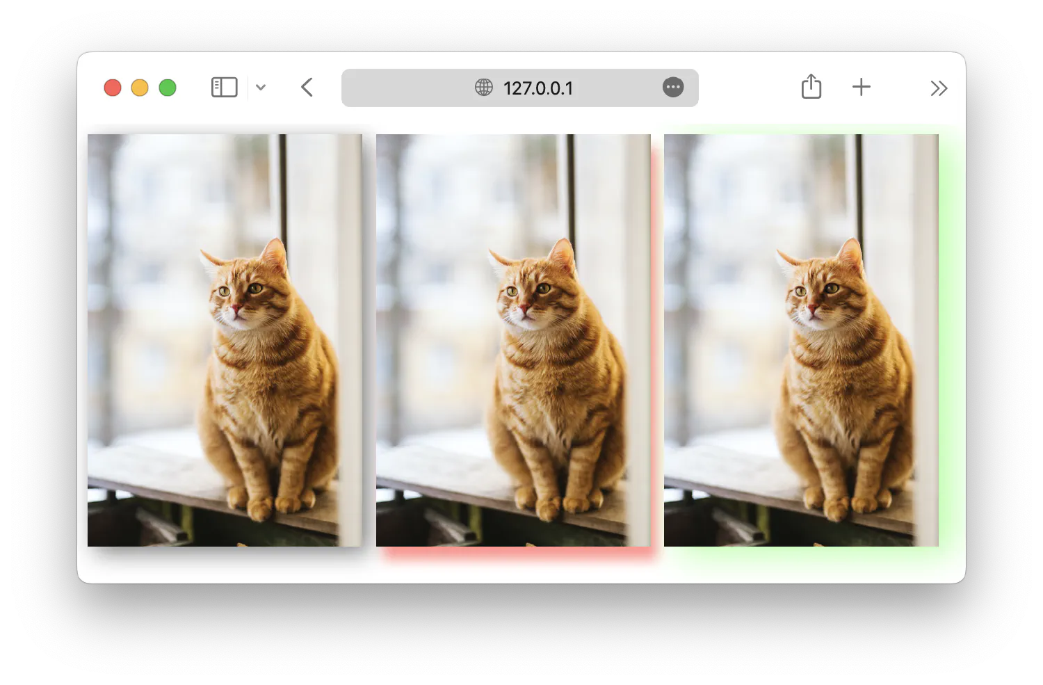
These filter functions can also be used together to create a more complex filter. For instance:
| |
Z-index and backdrop filters #
Besides the filter property, there is also a backdrop-filter, which allows you to apply filter effects to the area behind an element rather than the element itself. It is primarily used to create effects like blurring or adjusting the contrast of the content behind an element while keeping the element’s content unaffected.
For example, you can use the backdrop filter to create a glassmorphism effect like this:
| |
| |
In this example, the z-index property is used to order the elements when they are stacked on top of each other. We will discuss more about how to position and arrange elements in the next chapter.
CSS transitions #
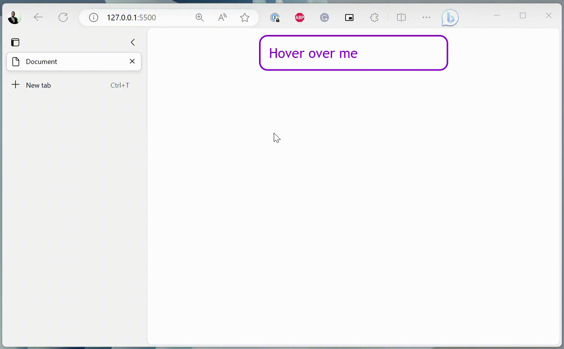
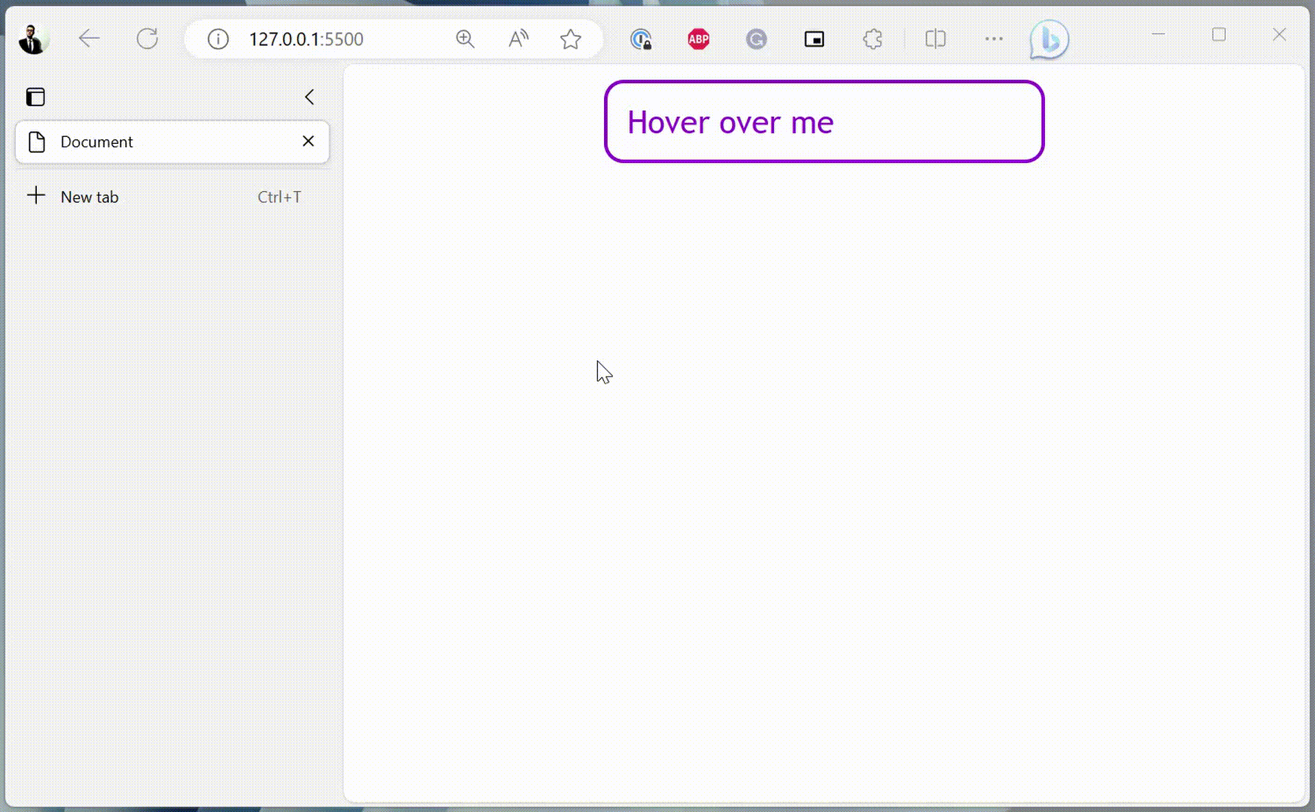
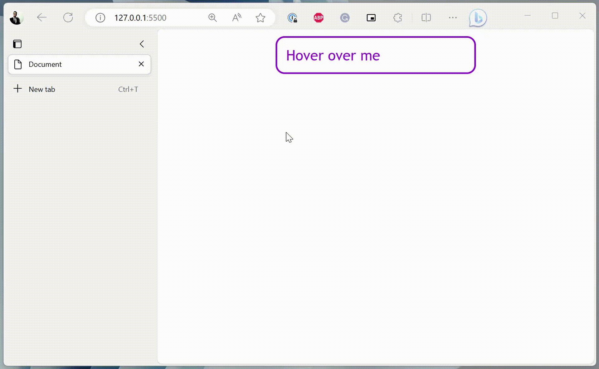
In the previous chapter, we introduced the pseudo-selectors, which allow you to define properties that only activate when the element is under a particular state. For example, with the following setup, the <div> will grow when the cursor is hovered on top of it.
| |
But notice that the change happens instantly, so what if you want to customize it to make the change smoother? This effect can be achieved by defining the transition properties.
| |
The transition-property specifies the name of the CSS property for which this transition configuration is created. And the transition-duration determines how long it takes for the transition effect to complete. In this case, the width of the <div> element will take 2 seconds to change from 200px to 400px.
You can also specify multiple transition properties like this:
| |
Currently, all the transitions are linear, meaning the speed of changes remains constant throughout the transition process. You can customize this behavior using the transition-timing-function property. Some common values include:
linear:This is the default behavior. The transition speed remains constant from start to end, as we’ve demonstrated before. This option is equivalent to using a
cubic-bezier()function with valuescubic-bezier(0,0,1,1).1 2 3 4 5 6 7 8div { . . . transition-property: width, color, background-color; transition-duration: 2s; transition-timing-function: linear; /* transition-timing-function: cubic-bezier(0,0,1,1); */ }The function defines a Cubic Bezier curve . I’ll spare you the complex mathematical definition, which looks like this:
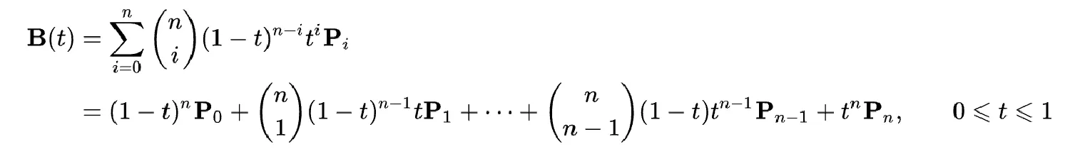
Instead, all you need to know is that this curve is defined by four control points:
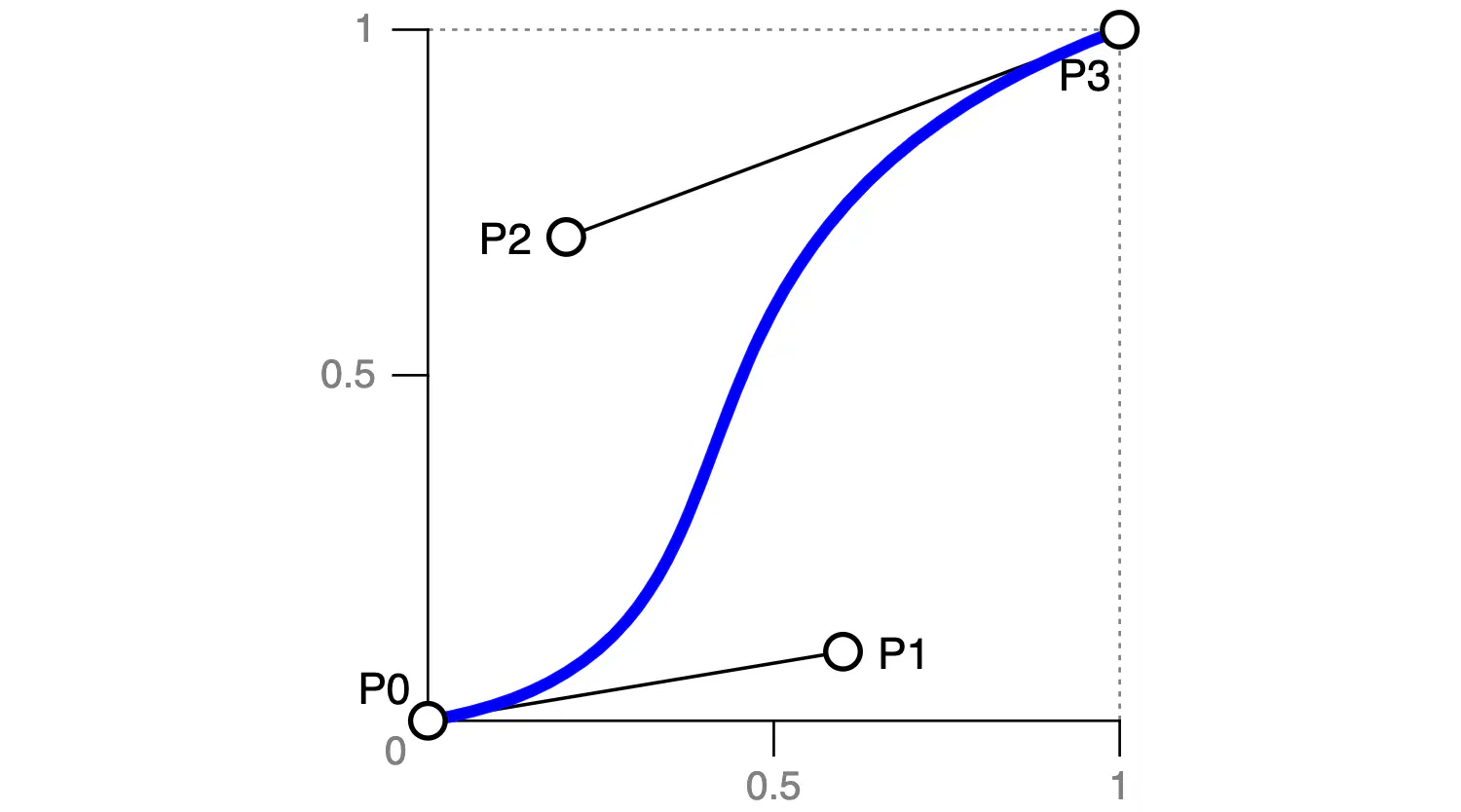
With these four control points in the above example, the transition will start slow, accelerate in the middle, and finish slowly. You don’t need to know precisely how to calculate these points. You can easily find the desired control points using this website .
ease:Corresponds to the Cubic Bezier function
cubic-bezier(0.25,0.1,0.25,1).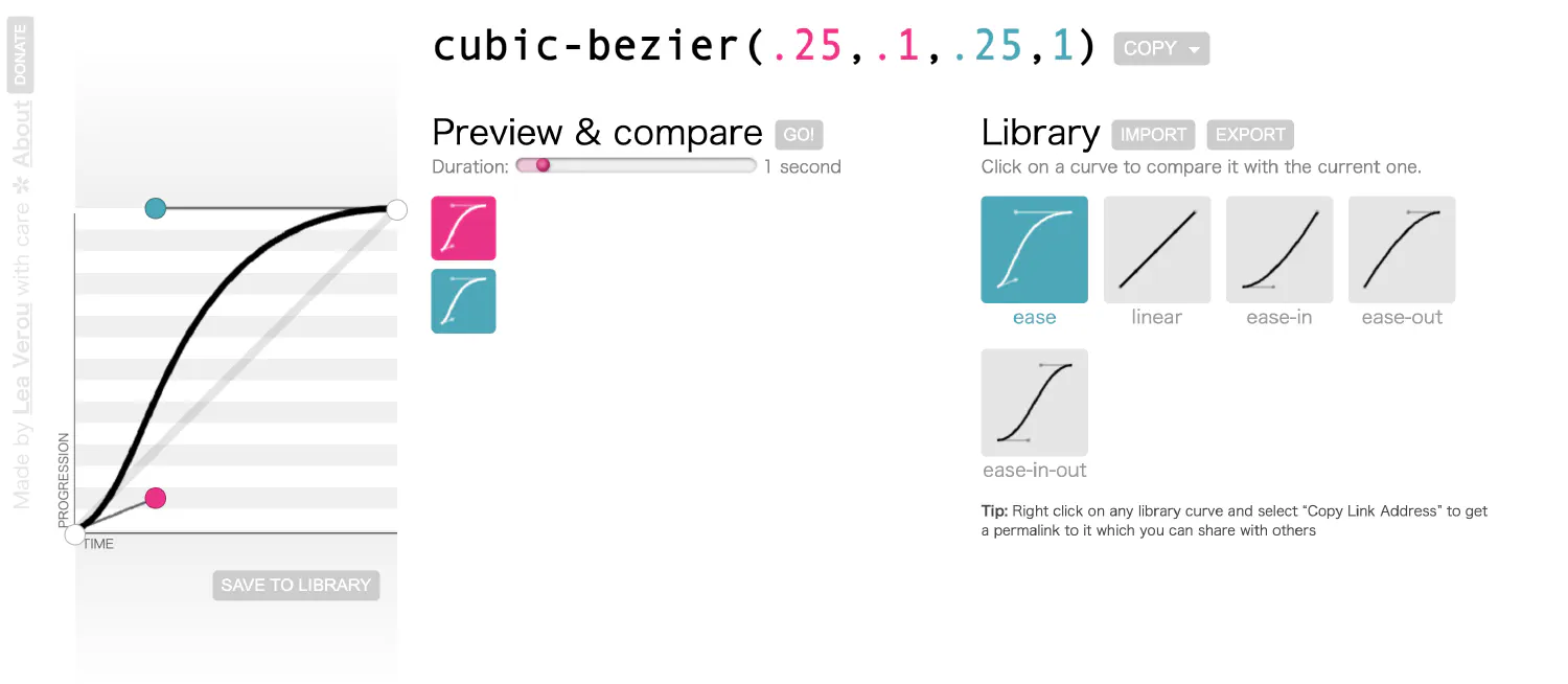
The transition will begin slowly, fast in the middle, and finish slowly.
ease-in:Corresponds to the Cubic Bezier function
cubic-bezier(0.42,0,1,1).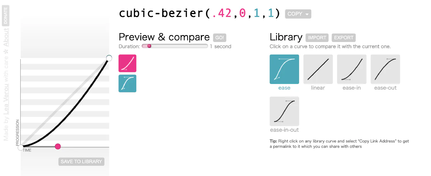
The transition will begin slowly and then accelerate.
ease-out:Corresponds to the Cubic Bezier function
cubic-bezier(0,0,0.58,1).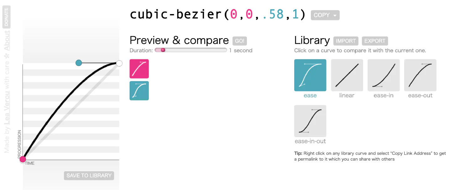
The transition will begin fast and then decelerate to end slowly.
ease-in-out:Corresponds to the Cubic Bezier function
cubic-bezier(0.42,0,0.58,1).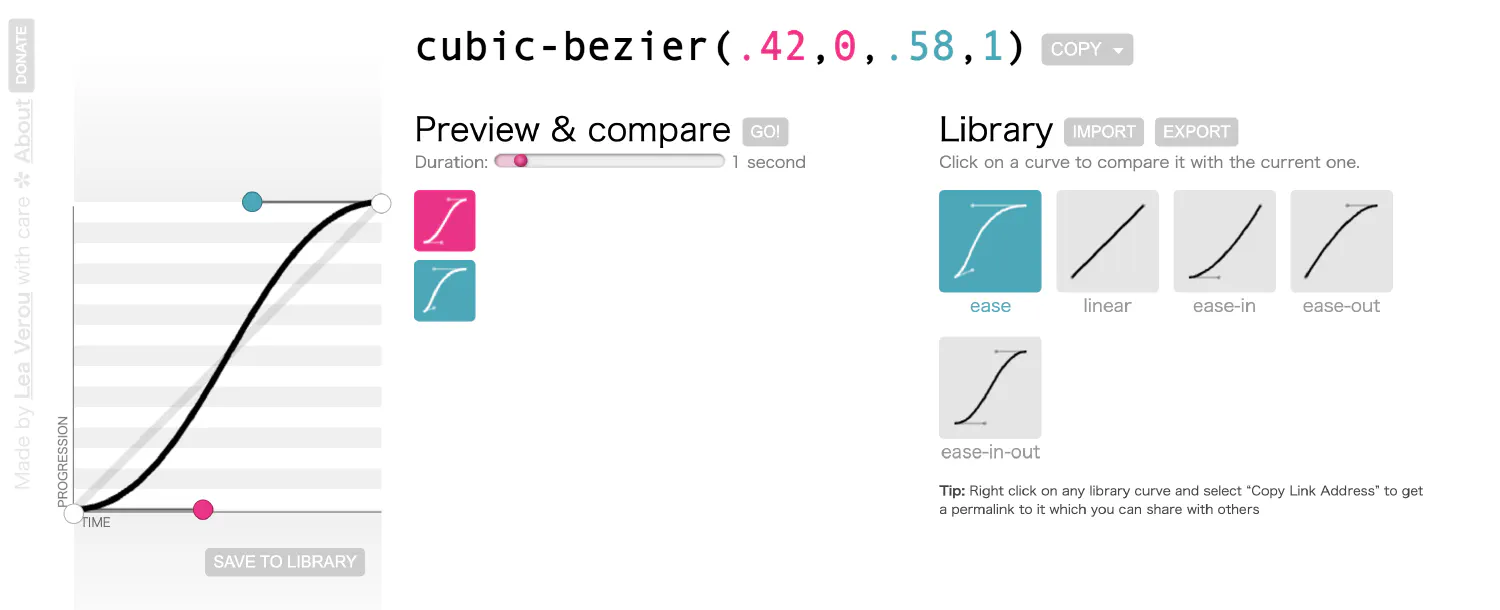
The transition will begin slowly, accelerate in the middle, and finish slowly. This is very similar to
ease, but as you can see from the curve, it is much smoother, which means there won’t be a noticeable acceleration or deceleration phase.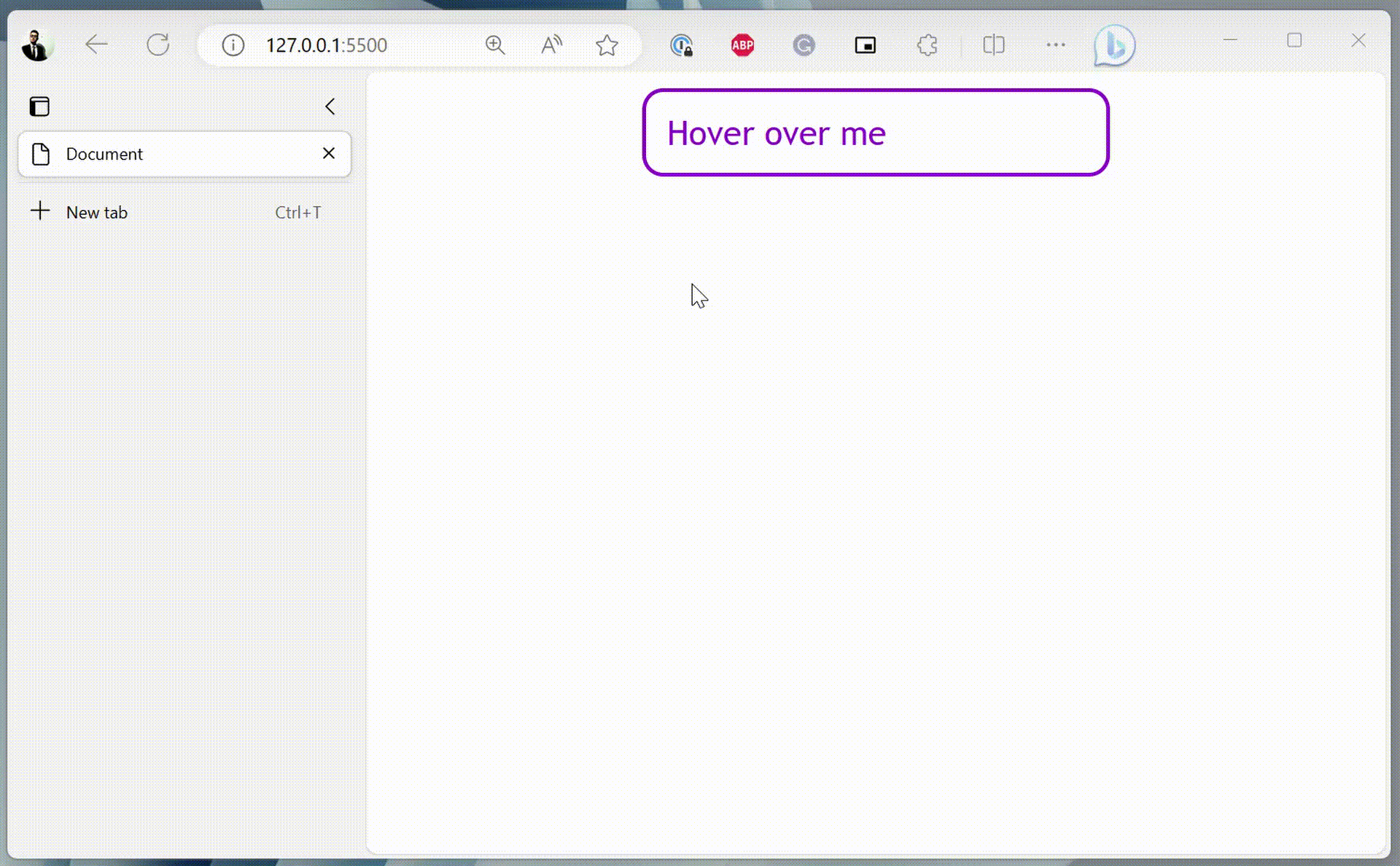
step-start:This transition is a bit different. It is defined by a stepping function,
steps(), which takes two values. The first one specifies the number of steps, and the second one sets the point at which the change occurs within the step, eitherstartorend. For example:1 2 3 4 5 6 7div { . . . transition-property: width, color, background-color; transition-duration: 2s; transition-timing-function: steps(5, start); }In this case, the transition will take five steps, and the change happens at the start of each step.
The
step-startoption corresponds to the functionsteps(1, start).
step-end:The
step-endoption corresponds to the functionsteps(1, end).
You can also set a delay for the transition using the transition-delay property.
| |
Notice that the transition only starts one second after the cursor is hovered over the <div> element.
Lastly, CSS also provides a shorthand property that enables you to define all transition properties together. The shorthand has the following syntax:
| |
| |
You can also define multiple transitions using the transition shorthand by dividing different cases with commas:
| |
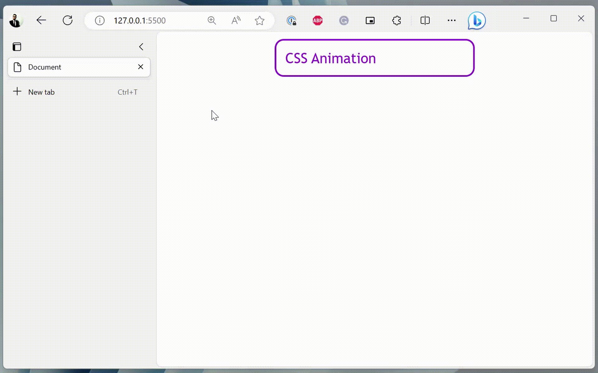
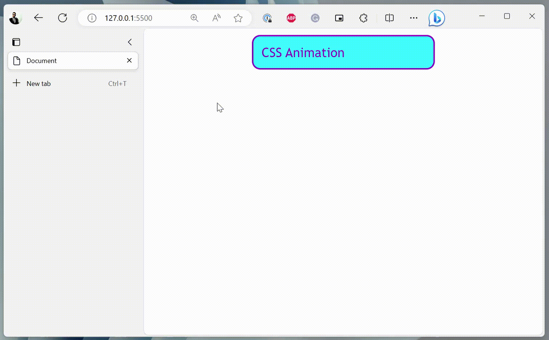
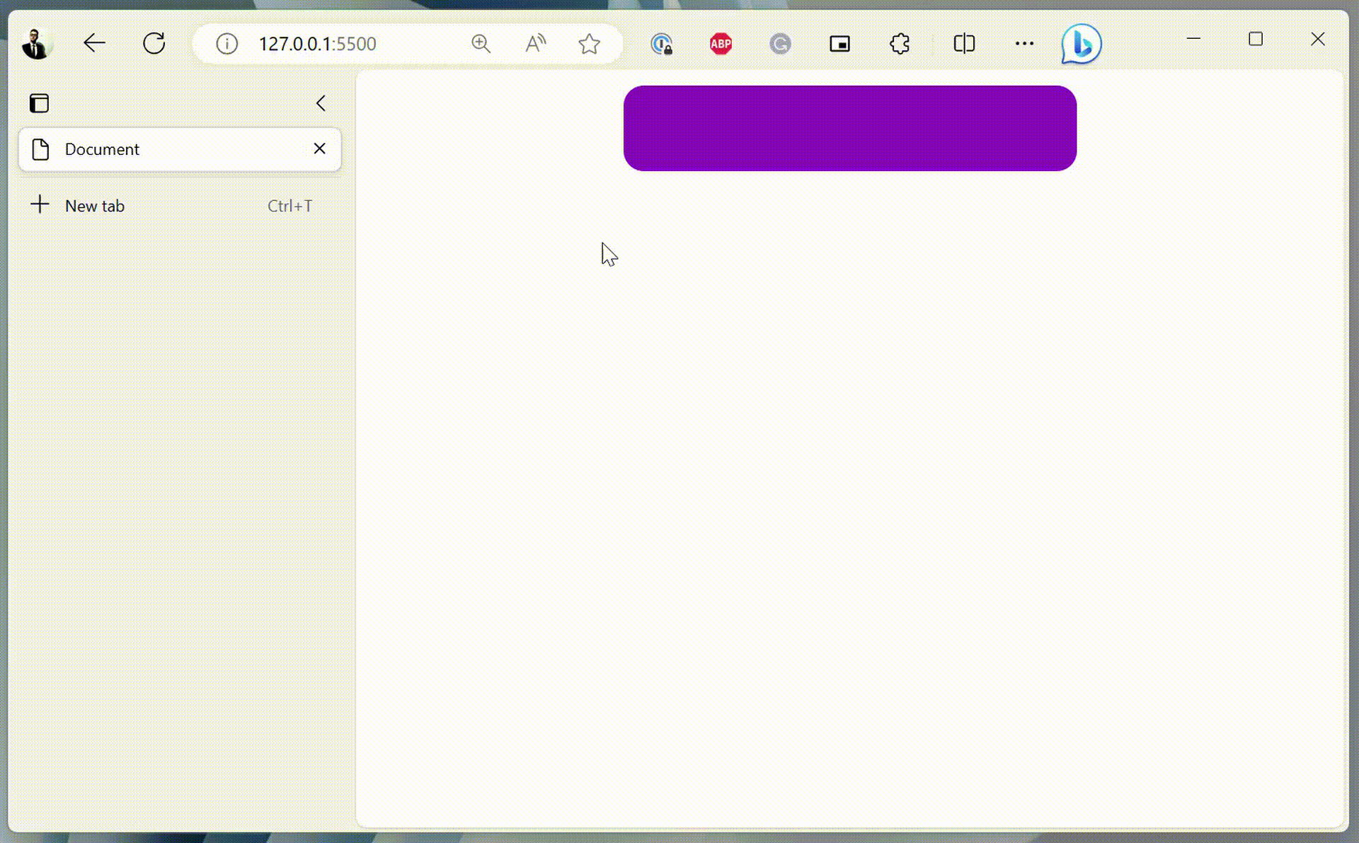
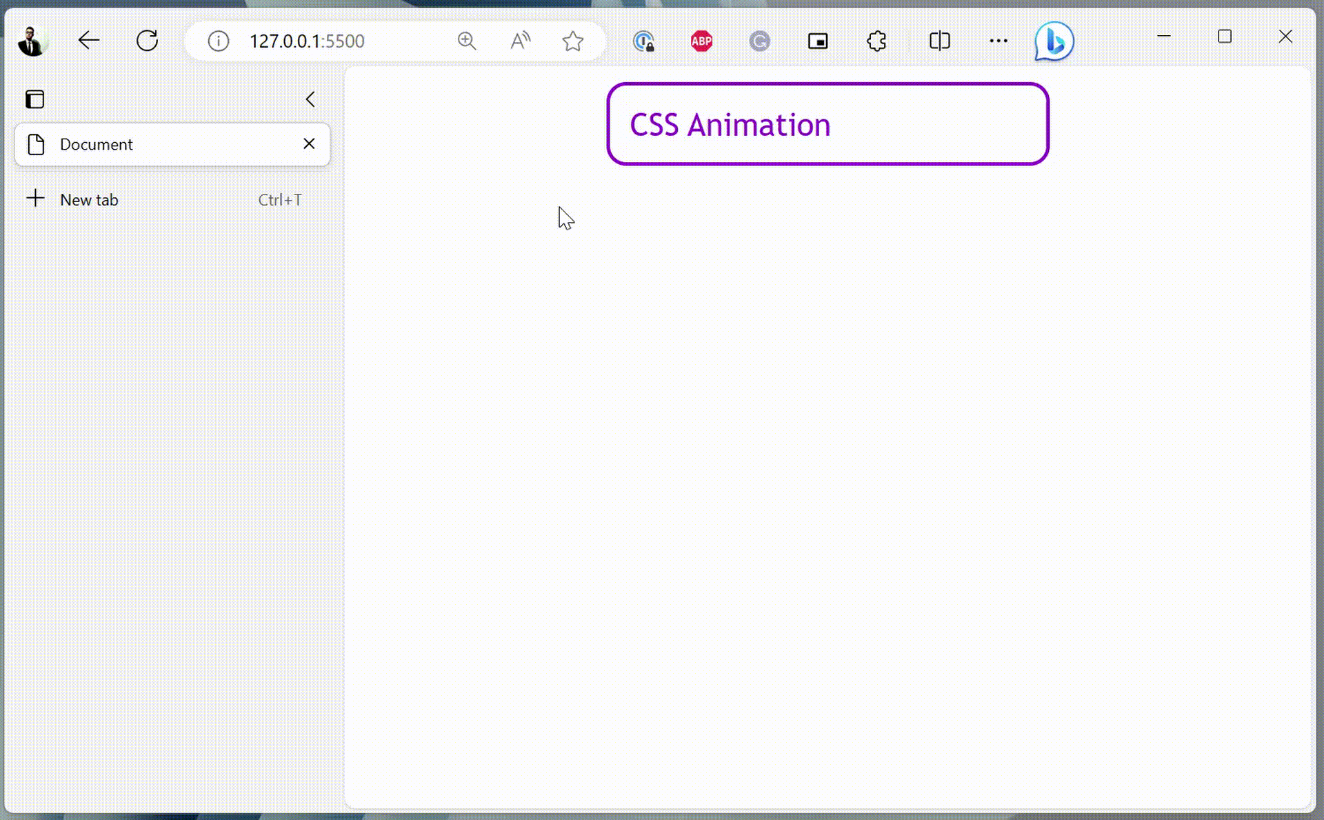
CSS animations #
Besides the transitions, there is also a similar concept called animation, except that you don’t need to use the pseudo-selectors to define a trigger. The animation starts automatically once it is loaded. Instead, you will need to define keyframes using the @keyframes rule.
| |
This animation is named change-bg-color, and it changes the background-color property from white to darkviolet. To employ this animation, you must specify the animation-name and animation-duration properties.
| |
Instead of the keywords from and to, it is possible to use percentage values, which allows you to define more than two keyframes.
| |
Just like transitions, animation also has properties animation-timing-function and animation-delay. And they work the same as their transition counterparts.
| |
You can also define how many times you wish the animation to be repeated using the animation-iteration-count property.
| |
The animation-direction property defines how the animation will be played, which accepts four different options:
normal: The animation is played forward.reverse: The animation is played backward.alternate: The animation is played forward first, then backward. Only works whenanimation-iteration-countis more than 1.alternate-reverse: The animation is played backward first, then forward.
| |
Lastly, the animation-fill-mode property determines how the element will be displayed before and after the animation is played. By default, the element will not retain any styles from the animation.
| |
When set to forwards, the element will retain the styles from the last keyframe of the animation after the animation is played.
When set to backwards, the element will take on the styles from the first keyframe of the animation as soon as the animation is played.
When set to both, the element will retain the styles from the first keyframe before the animation starts (behaves like backwards), and it will also retain the styles from the last keyframe after the animation is finished (like forwards).
Lastly, just like with the transitions, CSS also offers a shorthand property called animation, which has the following syntax:
| |
| |
Styling backgrounds #
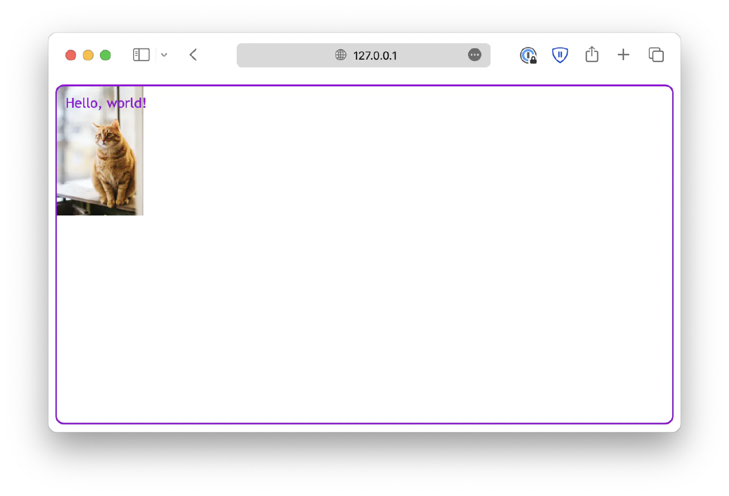
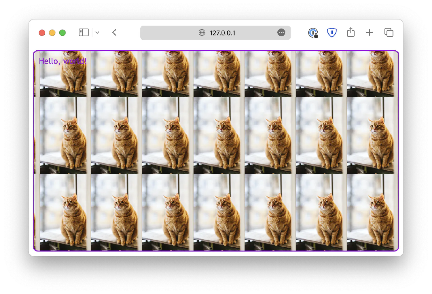
Previously, we used the background-color property to demonstrate how to create pure color backgrounds for different HTML elements. But in fact, you can also create more interesting backgrounds using CSS. For example, the background-image property allows you to define an image as the background.
| |
| |
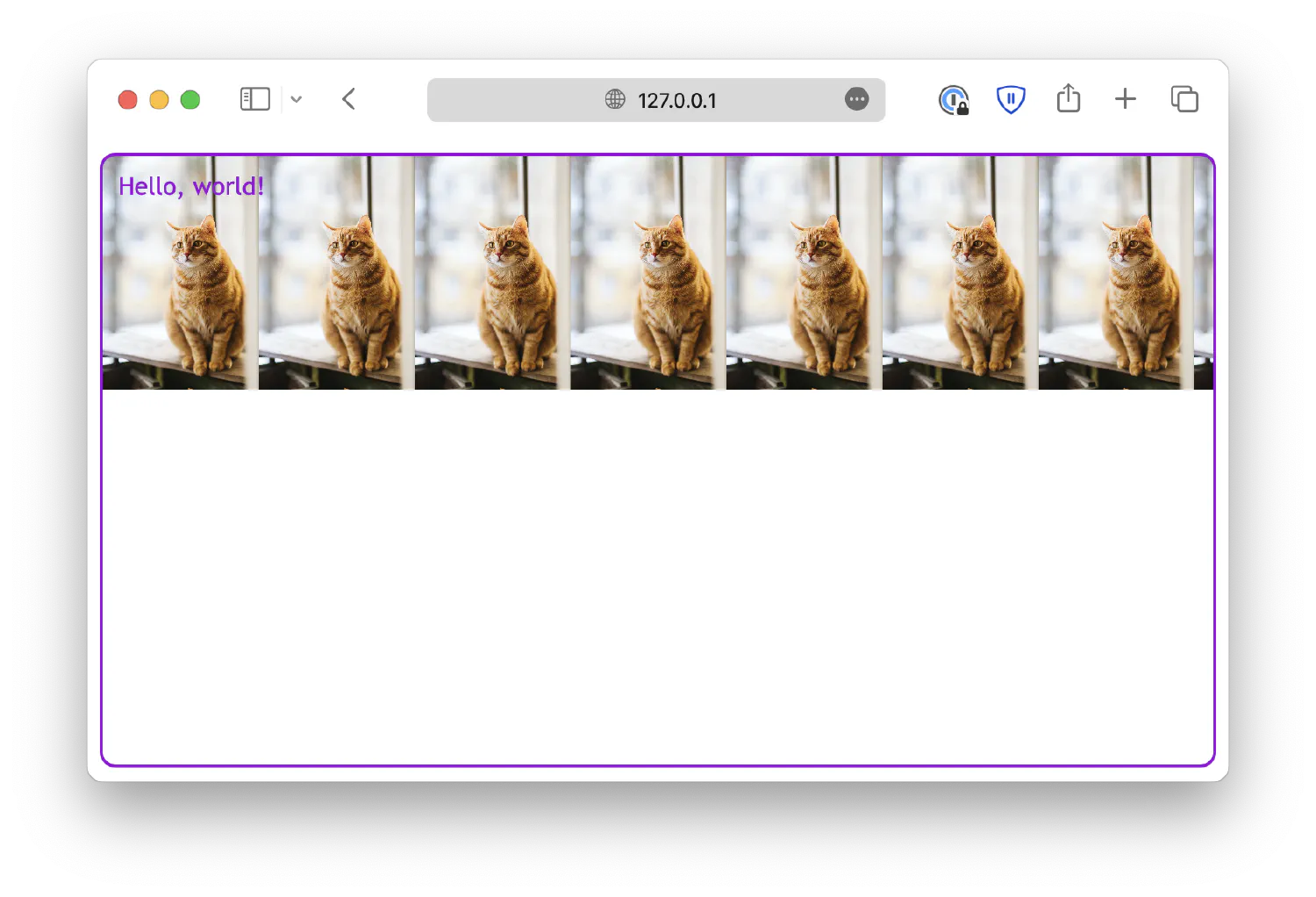
As you can see, the image is too big for the <div> element. You can define a size for the image using background-size.
| |
By default, the image will be repeated both horizontally and vertically if it is not enough to fill the entire <div> element background. You can disable that behavior by setting background-repeat to no-repeat.
| |
Or, in some cases, you might need to enable only horizontal or vertical repeat:
| |
Lastly, notice that the image always starts from the top left corner. You can change that by setting the background-position property.
| |
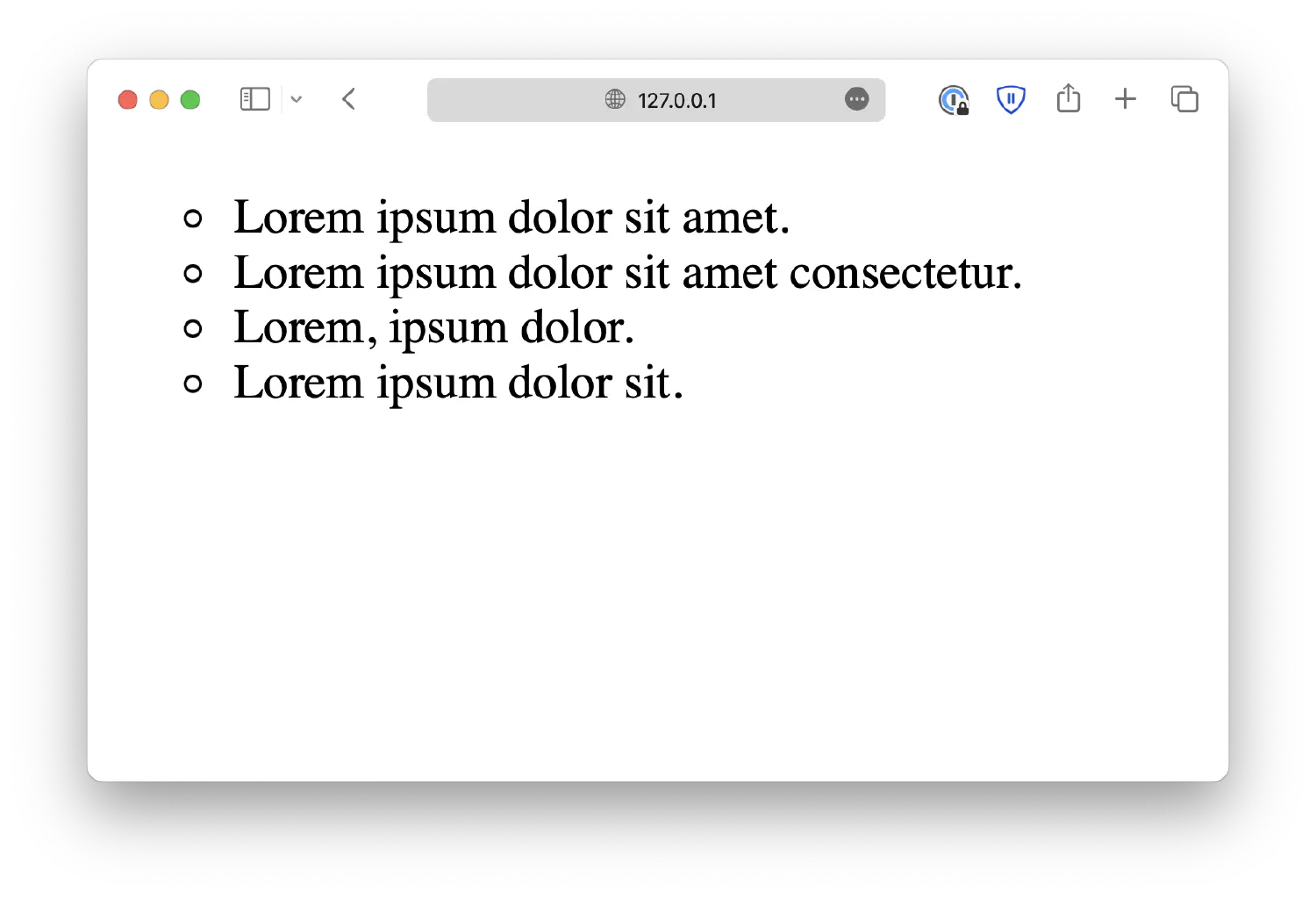
Styling lists #
In the first chapter, where we discussed the basics of HTML, we learned that there are two types of lists: ordered and unordered lists. For unordered lists, each list item is marked by a filled circle.
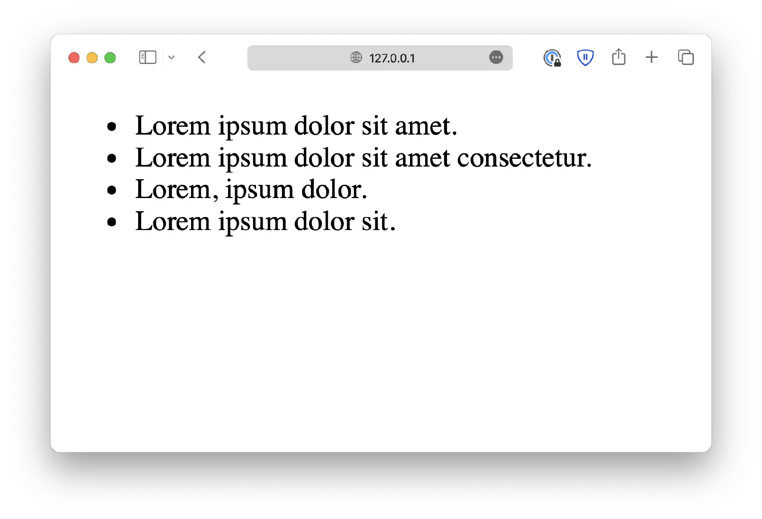
You can, in fact, customize the list marker using the list-style-type property.
| |
As for ordered lists, there are many more options available. You can find a full list of available options here . For demonstration purposes, here is an ordered list marked with Roman numbers.
| |

You can even replace the marker with an image using list-style-image property.
| |
url() is a CSS function used to load an external file, and in this case, we are using it to load the image marker.jpg, assuming you have the following file structure.
| |
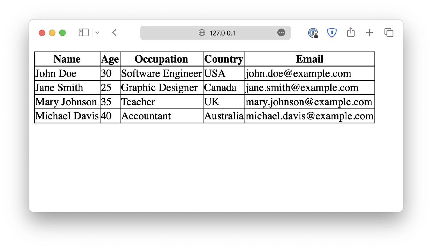
Styling tables #
| |
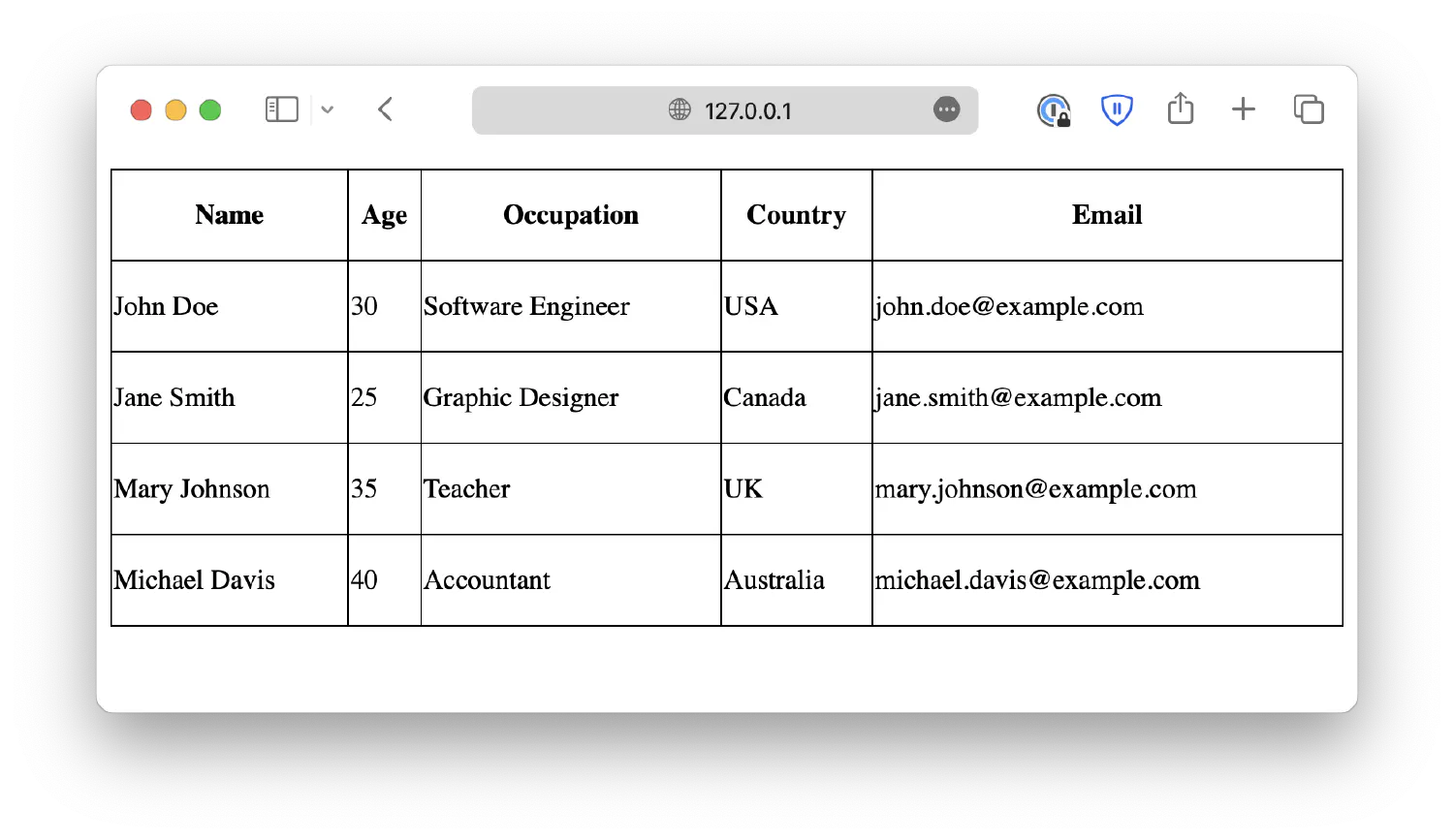
We have talked about this table in the HTML basics chapter, and we were able to add a border to this table by specifying the attribute border="1". However, in practice, it is best to use CSS to control the appearance of the table like this:
| |
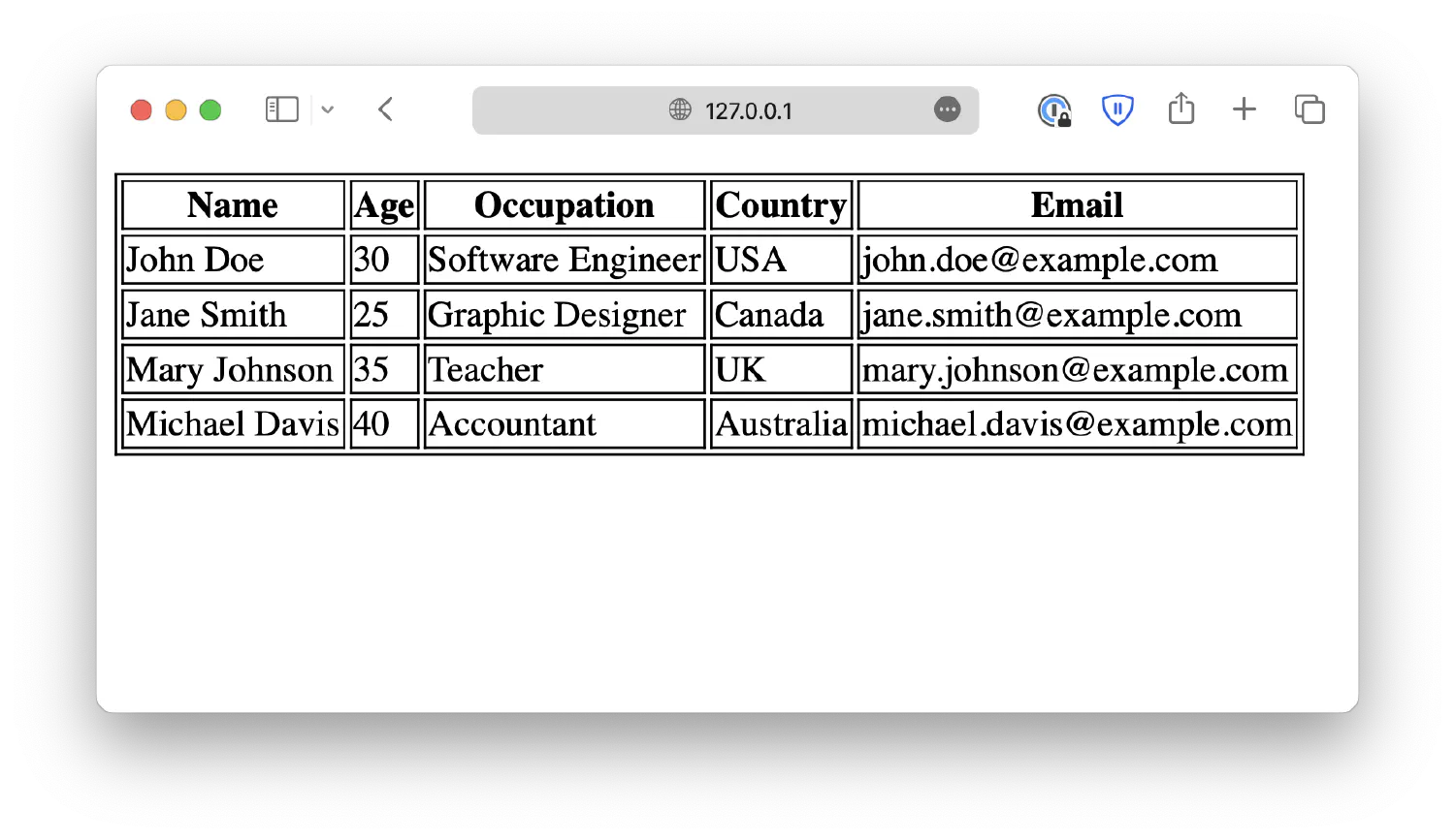
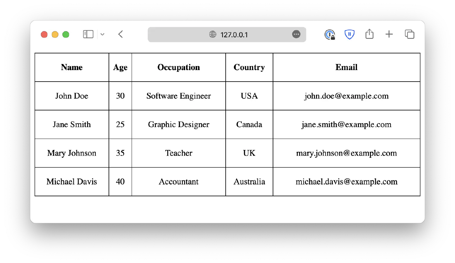
By default, the table has a double border. This is because both the table (<table>) and each individual table cell (<td>) have their own borders. Using CSS, you may collapse them into one by setting a table-collapse property.
| |
Just like any other block-level element, you can define the width and height of the table and table cells.
| |
As you can see, when there are extra spaces, the <td> will be vertically centered and horizontally left-aligned. The <th> will be centered both vertically and horizontally. You can customize the alignment using text-align and vertical-align properties. text-align changes the horizontal alignment, and vertical-align changes the vertical alignment.
| |
We will discuss more about how to align elements in the next chapter.
Conclusion #
In this chapter, we discussed some advanced topics in HTML and CSS, including the box model, CSS functions, filters, transitions and animations, etc. Of course, there are many more CSS properties to talk about, and when you combine different properties, you will be able to create many more interesting effects. Unfortunately, we cannot explore all of them in one chapter, so instead, I will give more demonstrations in the form of individual articles. Please subscribe to my newsletter for future updates.
In the next step of our HTML and CSS journey, we will discuss how to position HTML elements and create webpage layouts.
If you think my articles are helpful, please consider making a donation to me. Your support is greatly appreciated.