How to Position and Arrange Content Using CSS
This course has been migrated to www.thedevspace.io .
- HTML Basics
- CSS Basics
- Advanced HTML and CSS
- How to Position and Arrange Content Using CSS ⬅️ You are here
- Responsive Design
- Recreating YouTube Using HTML and CSS
- Some CSS Tools and Frameworks
- HTML & CSS Best Practices
When designing a webpage, you must understand that the elements are not independent, and you have to consider the relations between them. These elements should be arranged in a way such that it is easy for the users to make the connection visually. For example, when comparing different products, it is easier for people to see the differences when they are placed next to each other horizontally.
By default, the block-level elements will be arranged vertically, as they take all the horizontal space available. So, how can we arrange them differently to create a layout like the above example? This will be the primary problem we will tackle in this chapter.
Before we continue, please consider buying the e-book version of this course.
By purchasing this e-book, you will get access to all the accompanied source code. Thank you for your support! Happy coding! 🖥️✨
Display types #
Recall that at the beginning of this course, where we explored the basics of HTML, we introduced the block and inline elements. Block elements are those that automatically takes all the horizontal space available, but you can define custom width and height. Inline elements, on the other hand, only take as much space as necessary, and defining width and height has no effect on these elements.
Inline #
However, when working on real-life projects, you sometimes need to be more flexible. For example, you are trying to build a navigation bar that sits on top of the page, and you have a list of links here:
| |
By default, <li> is a block element which occupies the entire horizontal line.
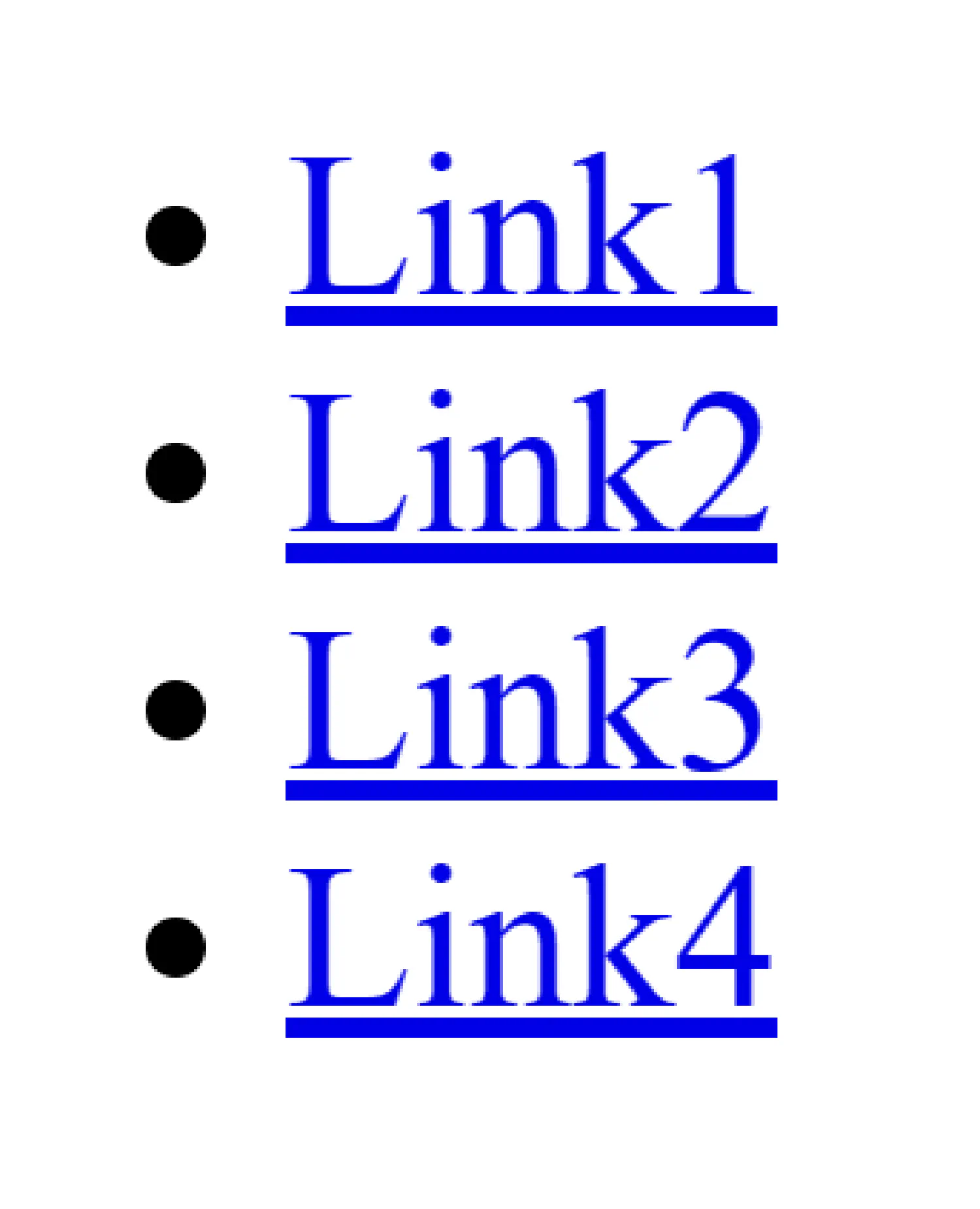
This would waste a lot of vertical space. To fix this issue, you can change how the <li> element is displayed using the display property.
| |

And now, the <li> will be displayed as an inline element.
Block #
You can also make an inline element behave like a block element in a similar way.
| |
| |

Inline block #
If you need an inline element but you want to be able to specify its width and height, you can use inline-block instead.
| |
display vs. visibility #
display can also control whether or not an element is rendered in the webpage. If you set display to none, the element will not be displayed. This can create useful features when combined with JavaScript, allowing you to toggle the element on and off.
This is very similar to another CSS property called visibility. Their difference is that when visibility is set to hidden, the element is still in the webpage, just not displayed by the browser. It will take up the same space as before. When display is set to none, the element will be completely removed from the webpage.
The display property is probably the most important property we are going to cover in this chapter. It also accepts values such as grid, flex, etc. These values require a deeper understanding of CSS, so we will come back to this topic later. Let’s start easy and first discuss how to place individual elements in a webpage.
How to position elements #
The position property controls how you wish to position an element. There are five different position methods available, including static, relative, fixed, absolute, and sticky. static is the default positioning method, meaning the element is not positioned in any special way. But things start to get more interesting, starting from the relative position.
Relative position #
With the relative positioning, the element will be placed relative to its default position. Its position can be adjusted by setting the left, right, top, or bottom properties.
| |
| |
Fixed position #
fixed position means that the element is positioned relative to the viewport. This method can be useful when you need to create a component, such as a navigation bar, that always stays at the top of the webpage, no matter the user’s scrolling position. Or when you need to pop up window that stays at the bottom right corner.
| |
| |
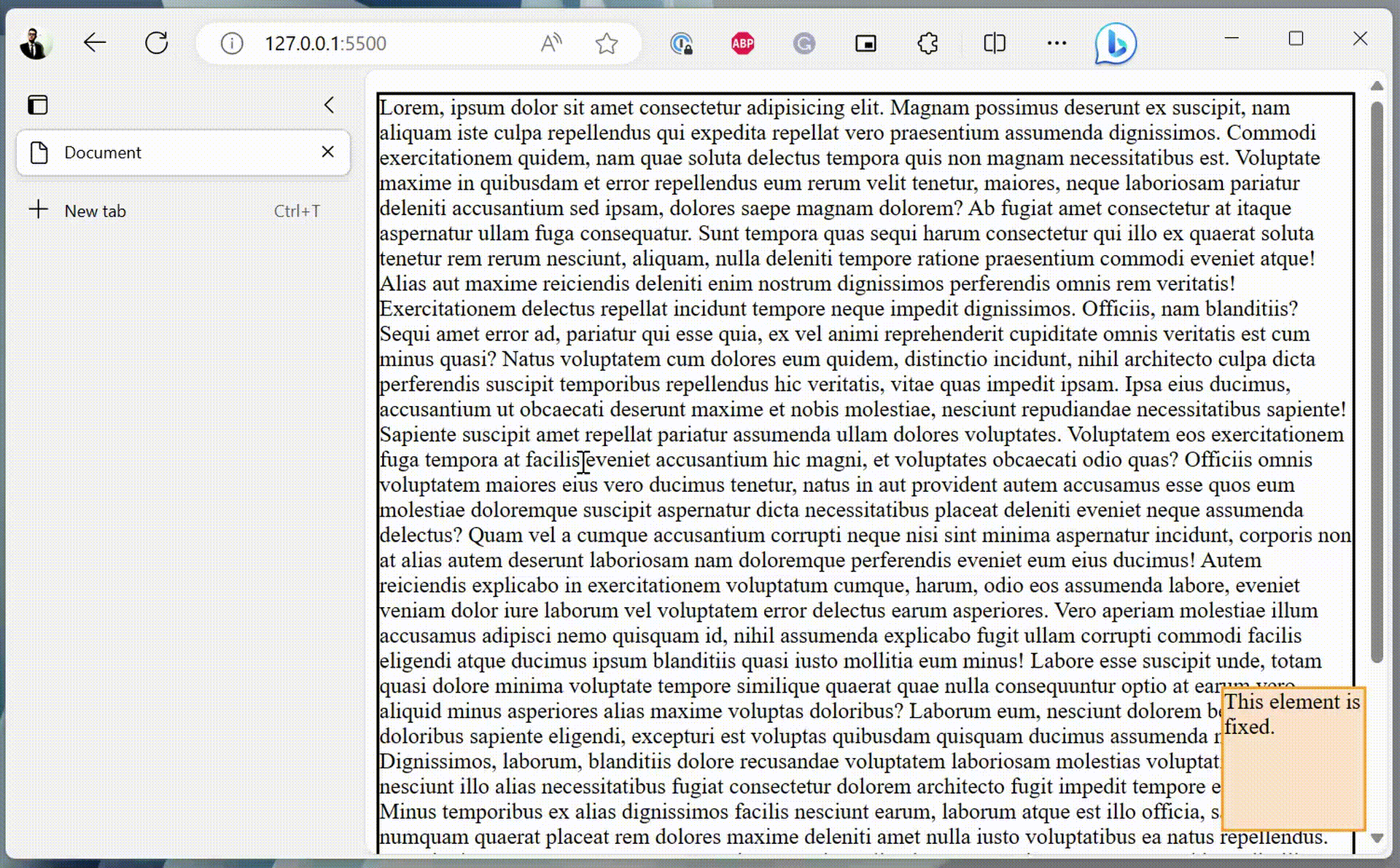
The right and bottom properties together anchor the <div> element to the bottom right corner of the webpage.
Absolute position #
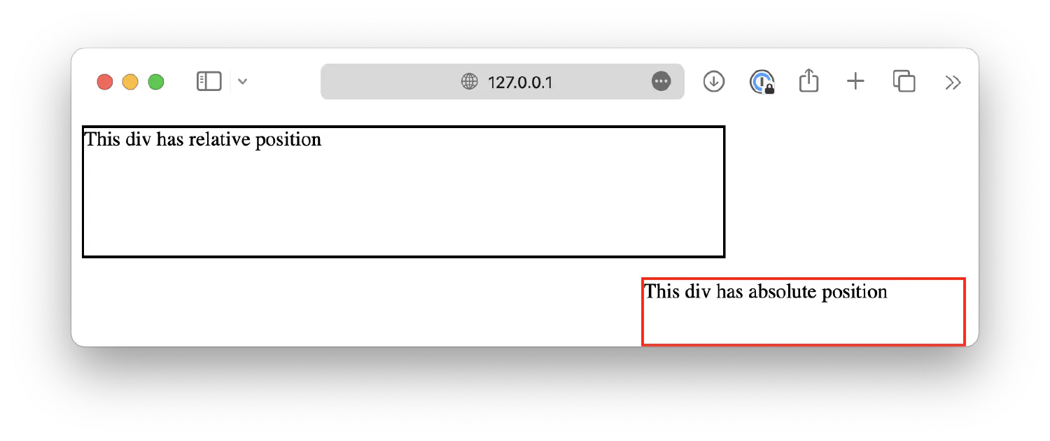
If an element has the absolute position, it will be placed according to its closest positioned ancestor (has position method other than static).
| |
| |
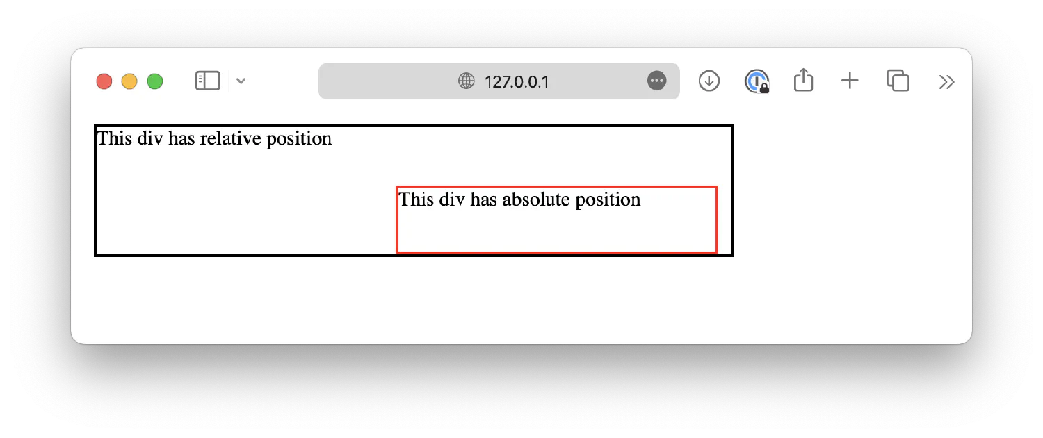
In this example, .relative is a 500x100px box with relative position, and .absolute is a smaller box placed inside .relative. As you can see, the .absolute box is positioned relative to the .relative box, instead of the viewport.
If the absolute element does not have a positioned ancestor, it will be positioned relative to the viewport, making it behave like a fixed element.
| |
Sticky position #
The sticky option is similar to fixed, except that the element will only be fixed when a specific scroll threshold is reached. Like the left sidebar in this page.
| |
| |
Transforming elements #
After you’ve placed the element to the desired position, sometimes you also need to transform that element, like rotating or scaling it, to make the webpage look more appealing. This is the job for the transform property, which accepts the following functions/methods:
translate(),translateX(), andtranslateY()scale(),scaleX(), andscaleY()rotate()skew(),skewX(), andskewY()matrix()
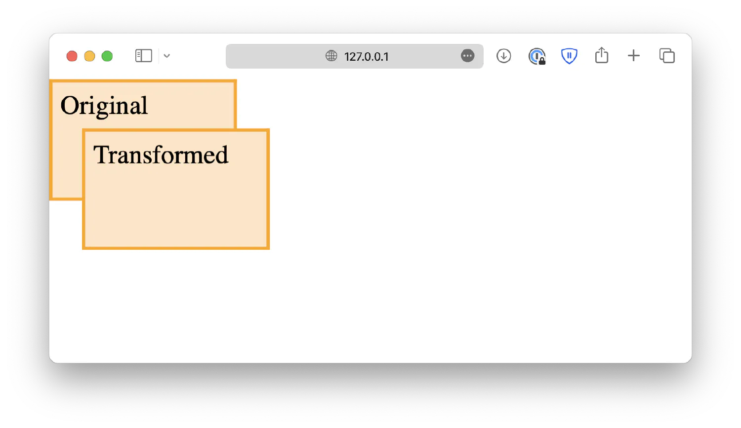
The translate(x,y) method moves the element along the X-axis and Y-axis. For instance, translate(20px, 30px) will move the element 20px to the right and 30px down.
| |
| |
Having a fixed position ensures that both blocks start at the same location.
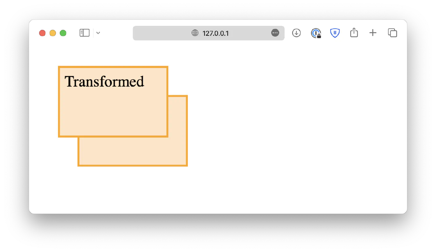
Negative values are also accepted here, which moves the element to the left or up.
| |
translateX(n) and translateY(n) are two of its variants. translateX(n) moves the element along the X-axis, and translateY(n) moves the element along the Y-axis.
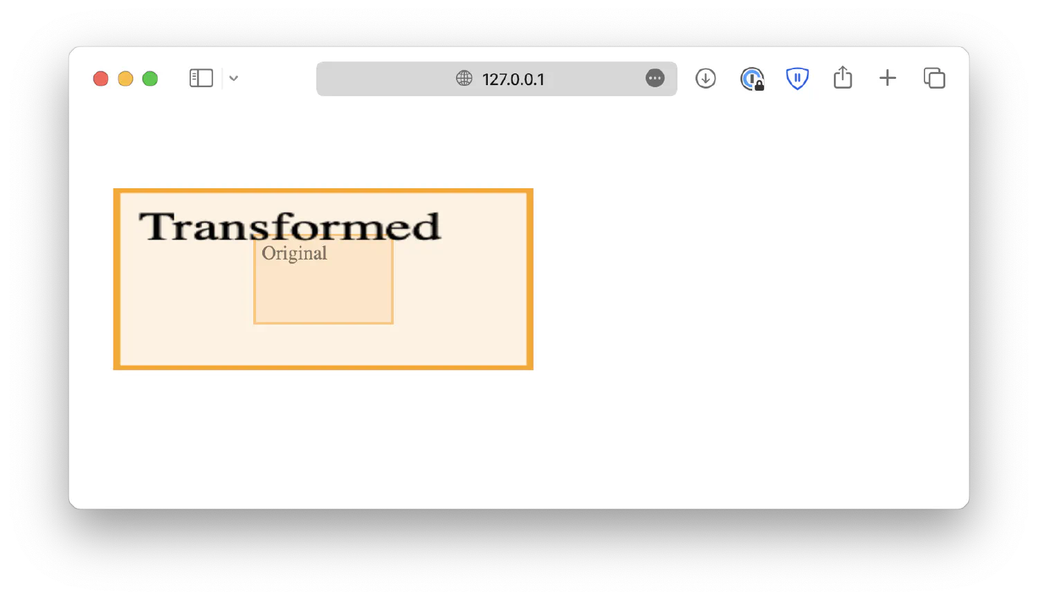
The scale(width, height) alters the size of the element based on its original size. For instance, scale(3,2) will increase the element’s size to three times its original width and two times its original height.
| |
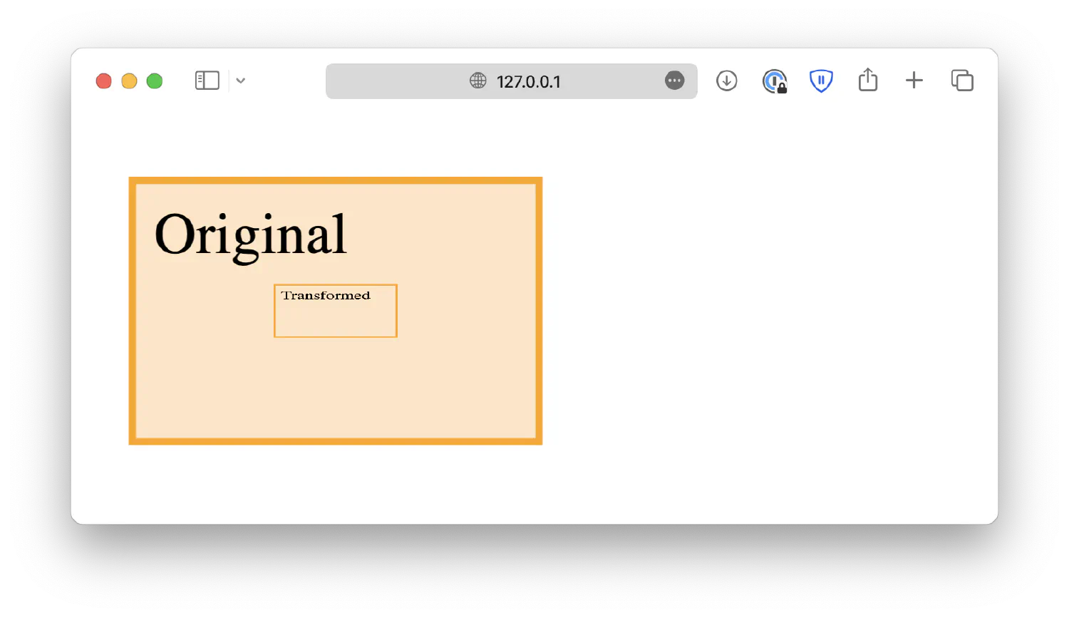
To shrink the original element, use decimal numbers.
| |
Similarly, scaleX(width), and scaleY(height) are two of its variants.
The rotate(degree) method, as the name suggests, rotates the original element along its center point, either clockwise (positive values) or counter-clockwise (negative values).
| |
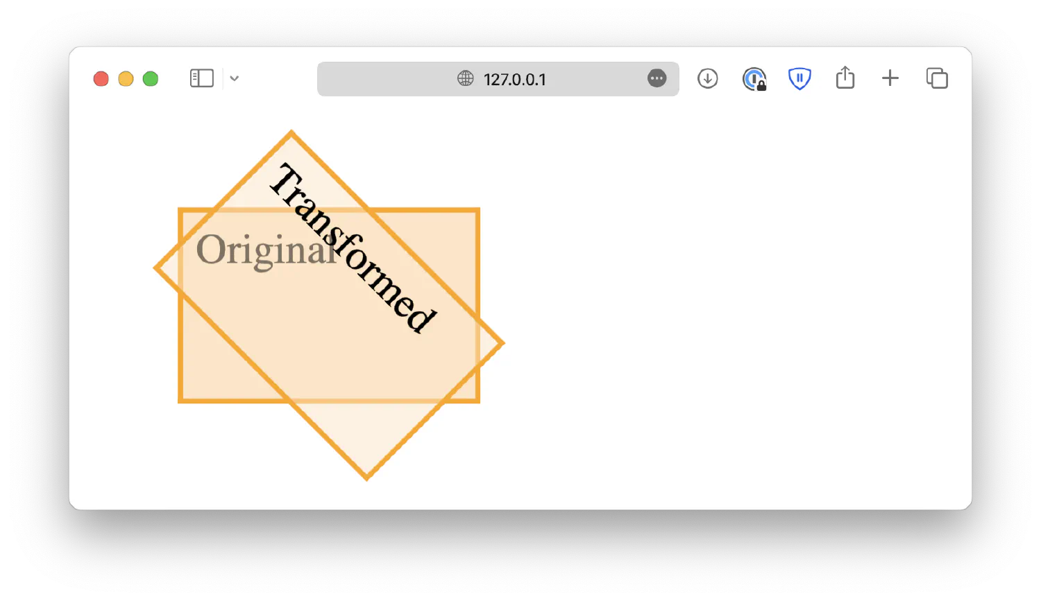
| |
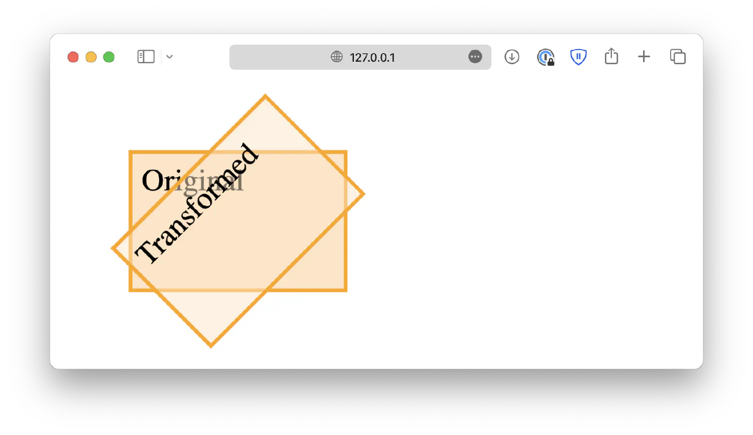
The skew(x,y) method skews the element along X-axis and Y-axis.
| |
And just like the other variants, skewX(n) skews the element along the X-axis, and skewY(n) skews the element along the Y-axis.
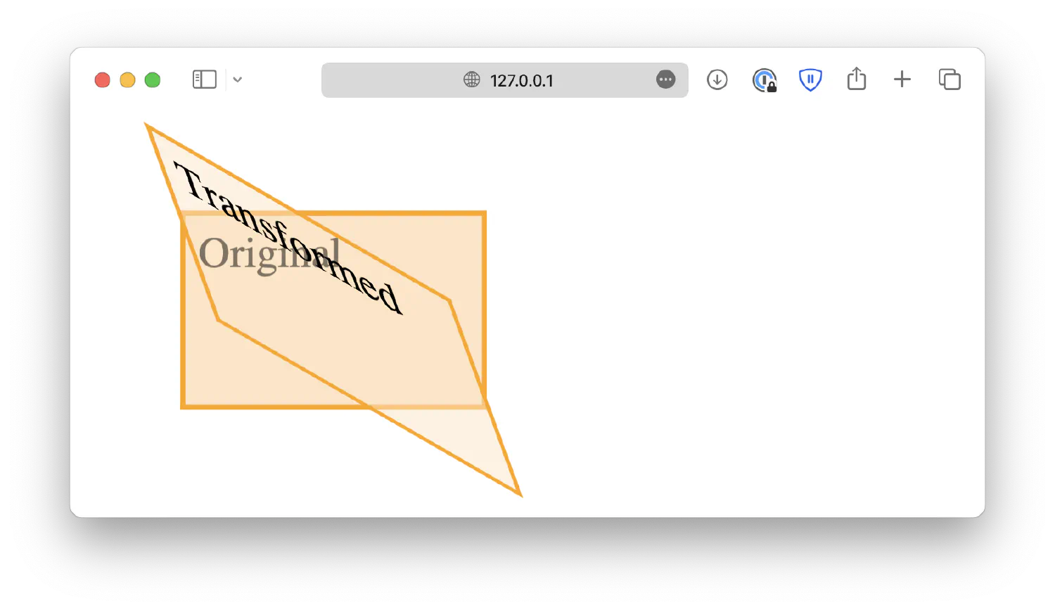
Lastly, the matrix() method combines all the methods discussed above, allowing you to define multiple transforms at once. The syntax is as follows:
| |
Notice how rotate() is missing from this syntax? That is because the rotation degree (θ) can be derived from the following equation:
| |
Where atan2(b, a) is an arctangent function that takes two values and returns the angle whose tangent is the quotient of b and a. (180 / π) then converts radiant to degrees.
I know that is a lot of math for a web development course, so I suggest you avoid using the matrix() function if possible. You might have to write more code and use more functions to achieve the same result, but it will make the code much easier to understand, and sometimes, that is much more crucial than writing fewer code.
How to align elements #
Aligning elements is another important topic in web design. Making sure the elements are properly aligned allows you to create well-structured and visually pleasing webpages. Let’s start by discussing how to center an element.
Horizontally center an element #
Recall that we discussed the box model in the previous chapter and learned about margin, which is space added outside the border. To horizontally center an element, you can simply set the left and right margin to auto.
| |
| |
In this example, we have two boxes with different sizes. By setting the horizontal margin of the smaller box to auto, your browser will automatically add equal space on both the left and right side of the paragraph element, hence centering the box horizontally.
Vertically center an element with padding #
When it comes to vertically centering elements, things get more complicated. The first solution is to add vertical padding to the bigger box <div>. Unfortunately, there isn’t a simple auto option you can use here, and you’ll have to do some calculations.
The bigger box is 300px high, and the smaller box is 150px high. The center of the smaller box is at 75px. So if we push the box down 75px, it should align with the center of the bigger box, which is at 150px.
However, when you implement this solution, you will get a different result.
| |
The top space is smaller than the bottom space. That is because we haven’t set the box-sizing property yet. By default, when the browser is calculating the height/width of an element, it only counts the content and does not include padding or the border width. For example:
| |
This box has a 10px thick border and 20px vertical padding. And we define its height to be 100px. But the actual height, as you can see, is 160px.
The actual height, if you are counting border to border, equals two borders (20px), plus two paddings (40px), and plus the height of the content (100px), which is 160px.
This can be very annoying as when we define the size of an element, we mean the box, from border to border, not just the content. Luckily, this can be changed using the box-sizing property we discussed in the previous chapter. It is set to content-box by default, and you need to change it to border-box.
| |
Now, go back to our original problem. When trying to center an element using paddings, you must set box-sizing: border-box;, so that the browser counts the border width and paddings as part of the total height.
| |
Using the wildcard selector (*) makes sure that all boxes in the webpage have the same behavior.
But wait, now we have another problem. The bottom space is now smaller than the top. This is because the <p> element comes with a default 16px vertical margin. So you are actually pushing the element down 75px + 16px = 91px. To fix that, you need to set the paragraph box’s margin to 0.
| |
Personally, I like to remove all default margins and paddings for all elements, so I would put this at the top of my CSS file:
| |
Vertically center an element using position and transform #
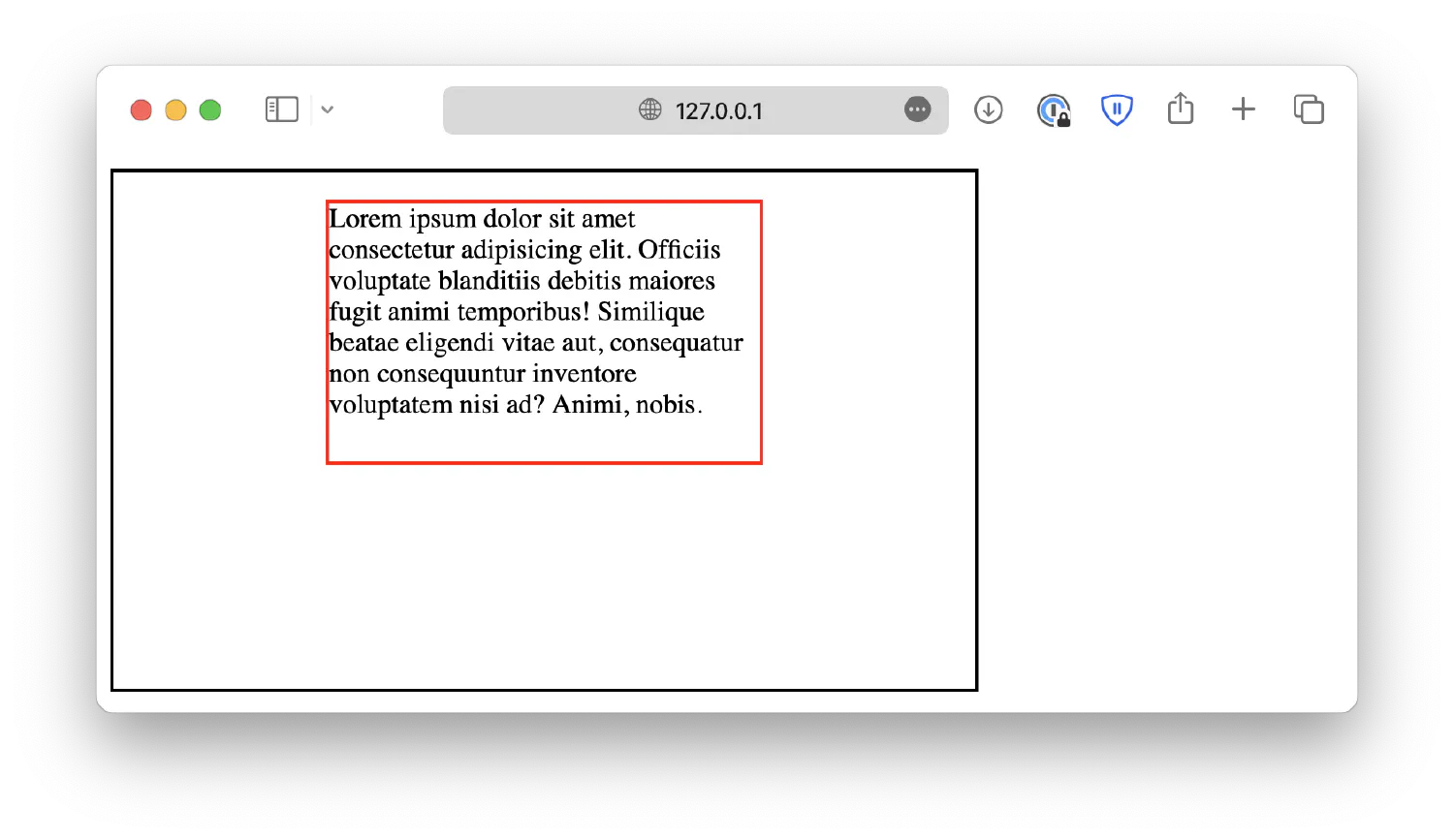
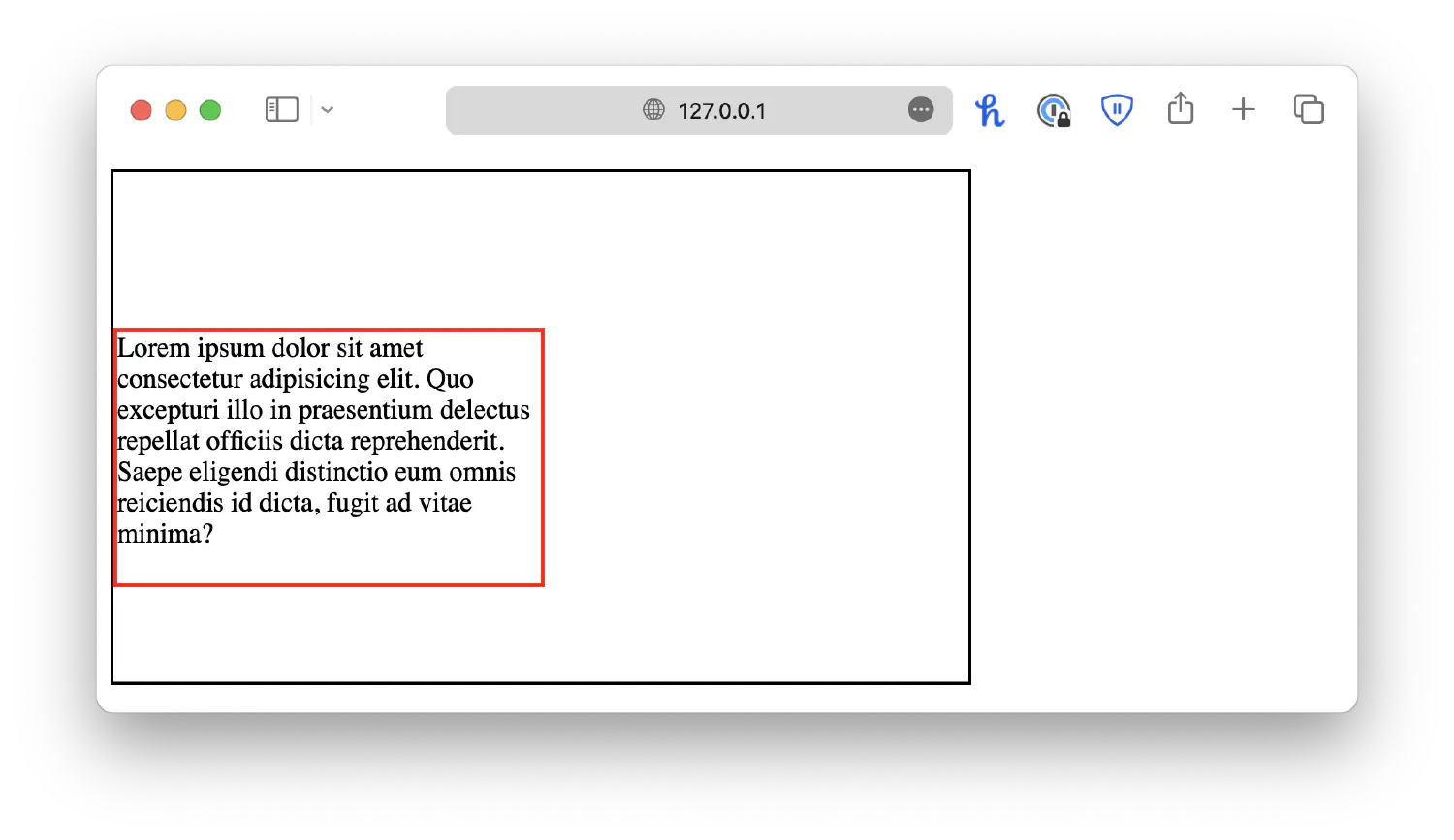
However, using paddings requires you to know the exact height of the boxes, but what if you don’t have that information? For example, you are trying to display texts submitted by the user, and you don’t know the length of that text. How can you vertically center it in this scenario?
| |
In this example, the paragraph only has the width set. Its height depends on the length of the text, which we do not know. In this case, we could utilize the combination of position and transform we just discussed.
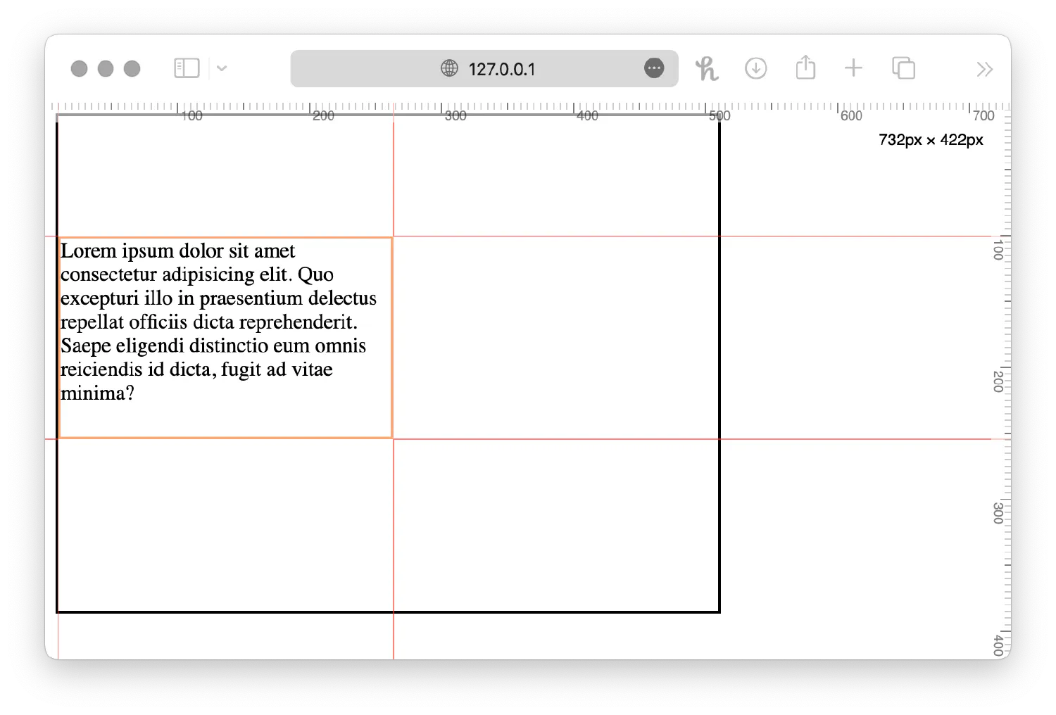
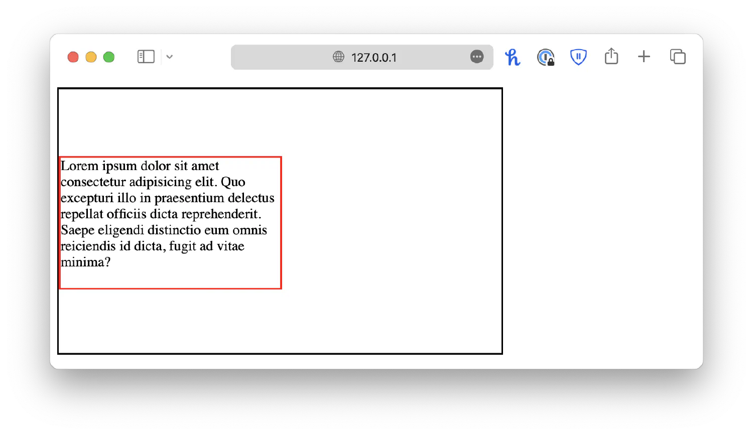
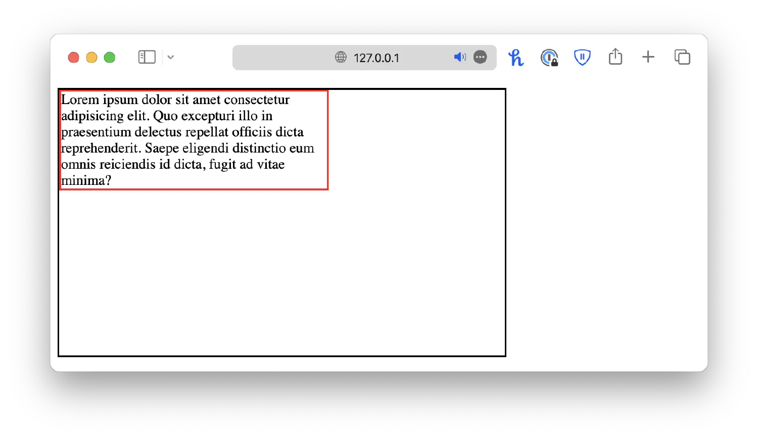
| |
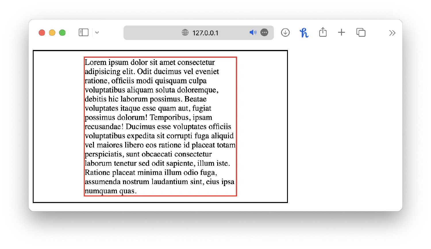
First of all, the absolute position, along with top: 50%; and left: 50%; will place the top left corner of the red box to the center point of the black box.
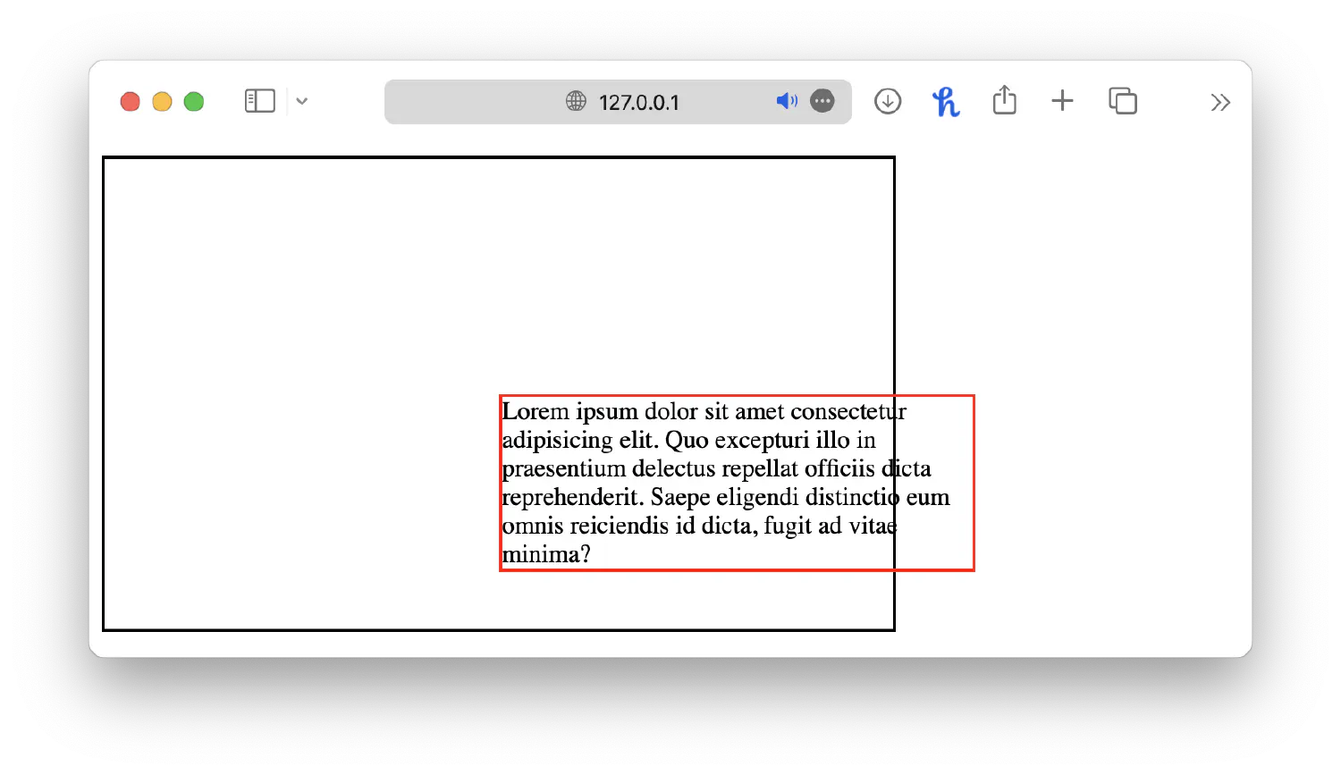
And then translate(-50%, -50%) shifts the paragraph element’s position back by 50% of its own width and height, aligning its center point with the black box’s center point.
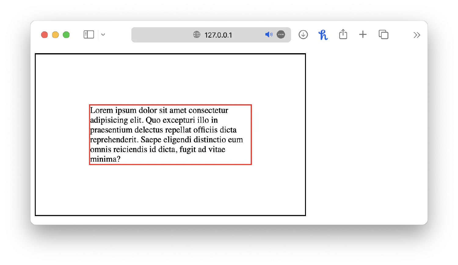
This technique ensures that the smaller box will always be centered inside the bigger box, even if the text is longer or shorter.
Centering an element inside another element sounds like an easy task, but as you can see, it actually requires you to have a deep understanding of CSS.
Left and right align elements #
When it comes to aligning elements to the left or right, the most straightforward solution is, of course, the absolute position.
| |
| |
However, what if you have multiple <div> elements and want to put them in the same horizontal line but aligned to the left/right? You could micromanage each of them, but you would have to know the exact width of each element. A better solution is to use another property called float.
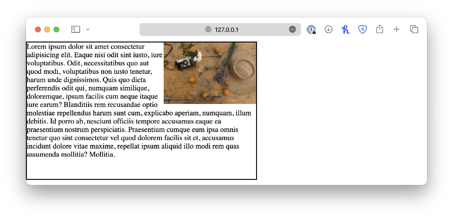
The following chart shows a common webpage layout with images and texts. The text flows around the image instead of letting the image take up the entire line, which wastes a lot of space.
This effect is achieved with the float property. When an element is floated, it is taken out of the normal flow of the document, and other elements wrap around it based on the available space. For instance, you can make the image float to the left.
| |
| |
Or you can also make the image float to the right.
| |
Multiple elements can also float together.
| |
| |
Creating grids #
Creating layouts using CSS is one of the most fundamental skills a web developer must possess. A well-designed layout is the backbone of any successful website, as it improves user experience, visual appeal, and overall usability. There are two ways you can create a webpage layout using CSS, either with grids or the flexbox. Let’s start with the traditional method and discuss how to create a grid layout.
A grid layout consists of a grid container and several grid items. The grid container must have its display property set to grid or inline-grid. grid creates a block-level grid container, and inline-grid creates an inline-level grid container.
| |
| |
All direct children of this container will automatically become grid items.
Grid columns and rows #
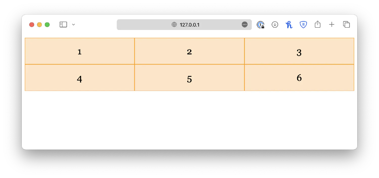
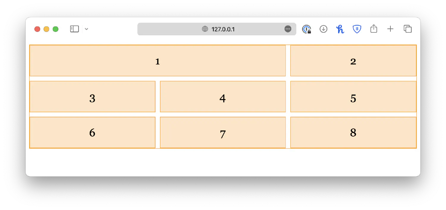
You can then specify how many columns you wish to create using the grid-template-columns property. The property accepts any number of values. The number of values determines the number of columns, and the value itself determines the size of that column. For example:
| |
I also added some styles for the grid items to make the grid look more pleasing, but it is not necessary here, so I will omit them in future examples.
| |
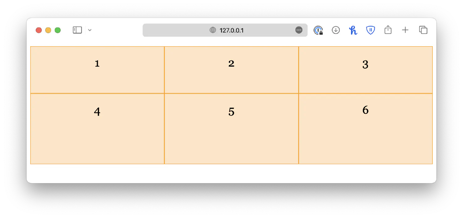
If you want all columns to have equal size, simply set the values to auto.
Similarly, you can specify row sizes using the grid-template-rows property.
| |

However, this property does not determine the number of rows in the grid. If you specify extra values, they will be ignored.
Lastly, grid-template is a shorthand property for grid-template-columns and grid-template-rows with the following syntax:
| |
| |
Grid gaps #
When designing a webpage, it is good to leave some space between elements so that they are not too close to each other. By using the grid layout, you can easily add equal spacing between all grid items instead of micromanaging each margin. For example:
| |
Alternatively, you may use the shorthand property, gap:
| |
If you want equal spacing for column gaps and row gaps, specify a single value:
| |
Grid items #
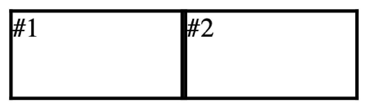
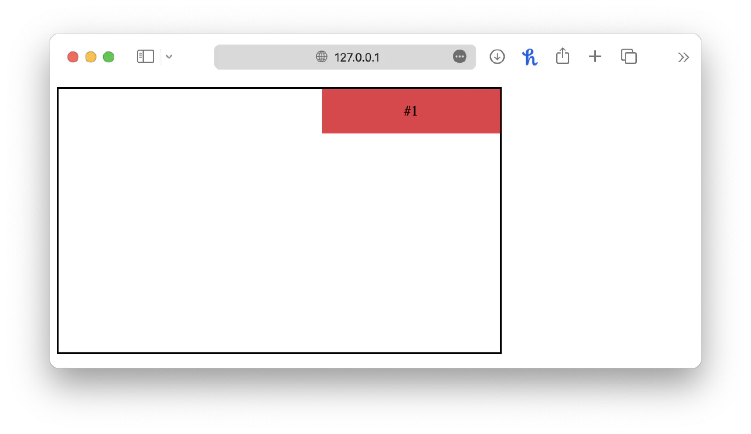
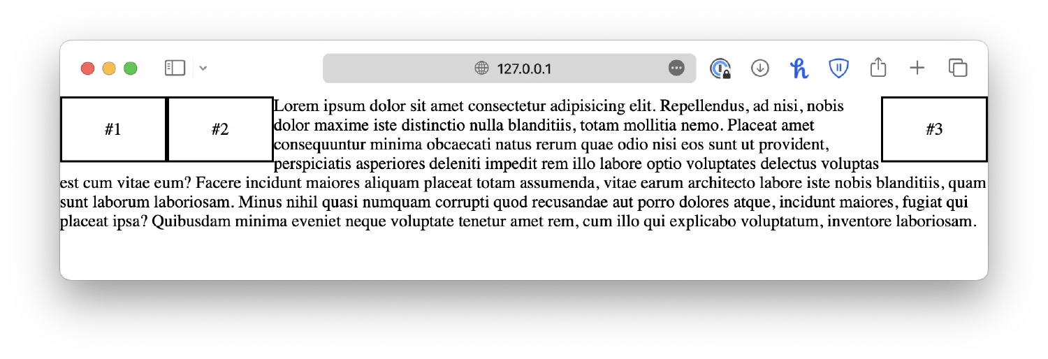
It is also possible for you to customize individual grid items using CSS. In a real-life scenario, it is common for one grid item to take up multiple columns or rows. For example, you can define an item to span across multiple columns by specifying a start point (grid-column-start) and an end point (grid-column-end).
| |
| |
Keep in mind that the numbers refer to the column lines, not columns, as shown in the chart below.
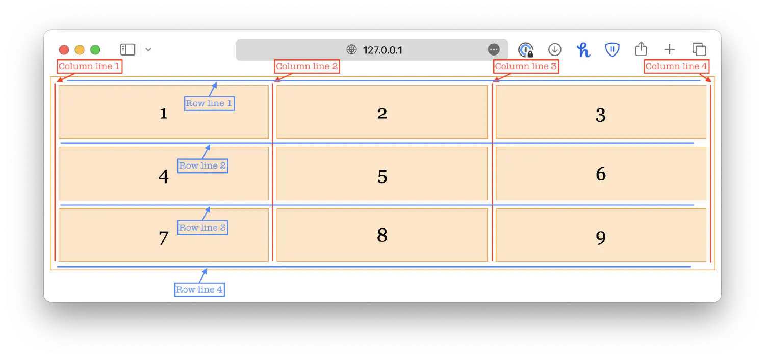
So, for an item to span across two columns, it should start from 1 and end with 3.
You can also use the shorthand property grid-column to achieve the same result:
| |
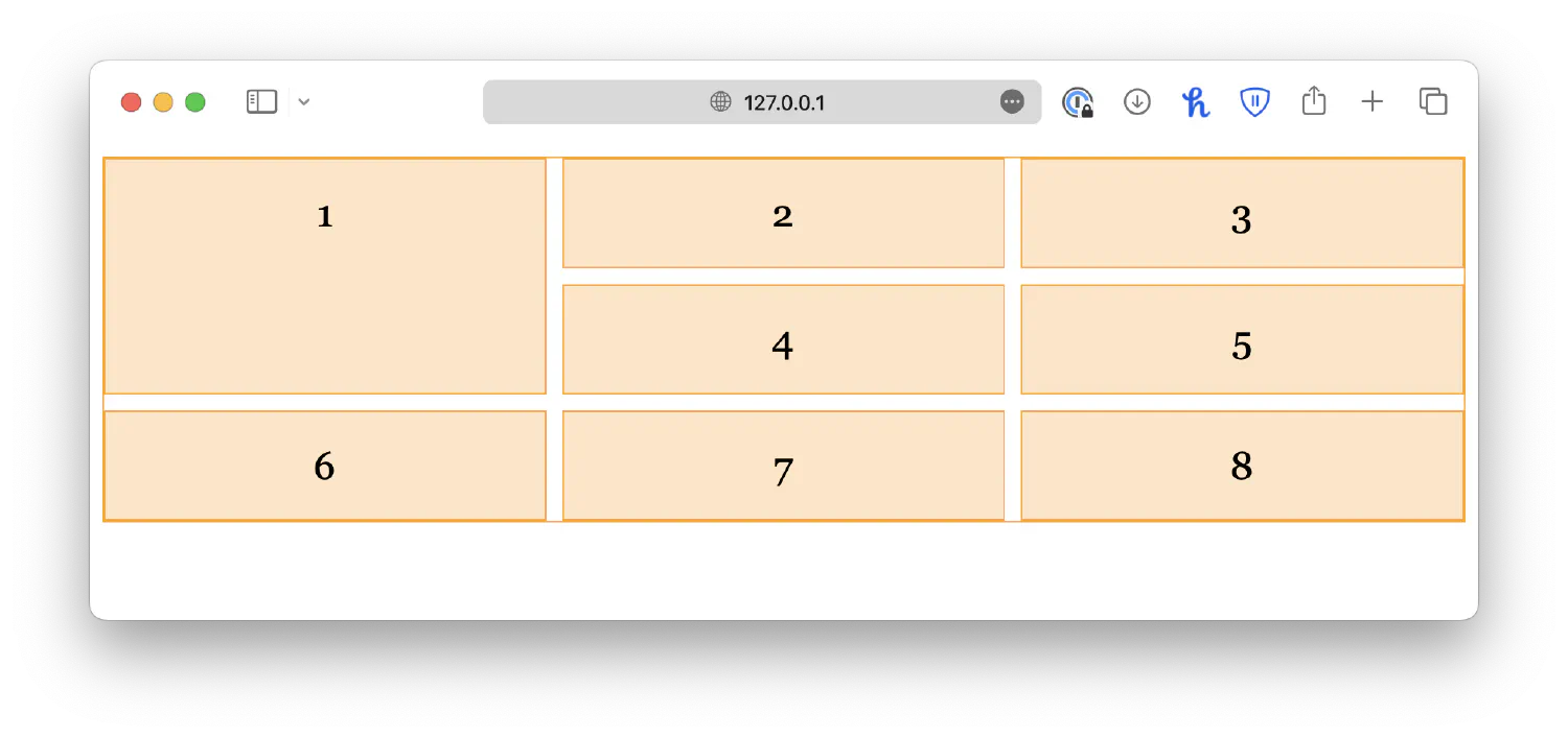
Similarly, you can define a grid item to span across multiple rows using the grid-row-start and grid-row-end properties, or the grid-row shorthand.
| |
| |
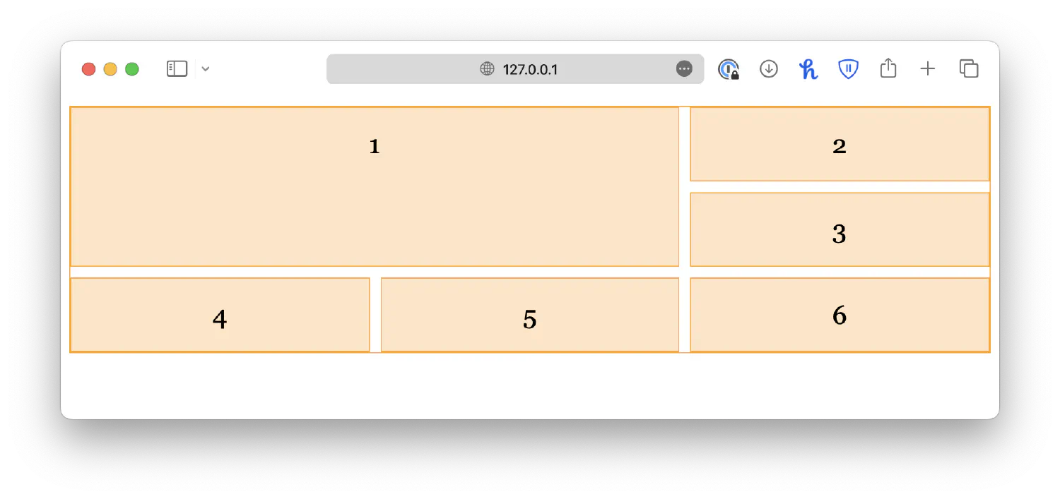
If an item needs to span across multiple rows and columns, you can use the grid-area property instead, which is a shorthand for grid-row and grid-column. It has the following syntax:
| |
| |
Grid alignment #
Just like aligning individual elements in a webpage, when aligning items in a grid, we also have to talk about horizontal and vertical directions. However, things are a bit more complex than that. There are six different alignment properties, as shown in the list below:
align-contentalign-itemsalign-selfjustify-contentjustify-itemsjustify-self
Vertical alignment #
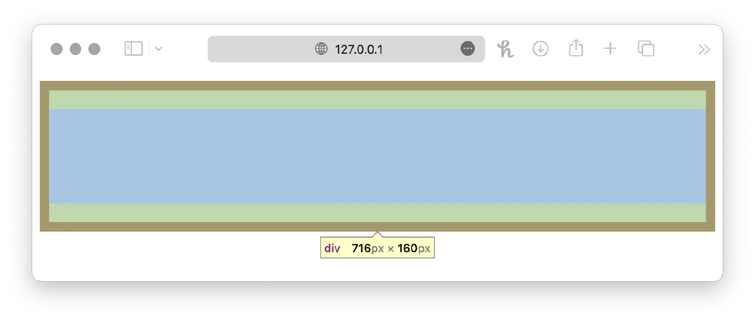
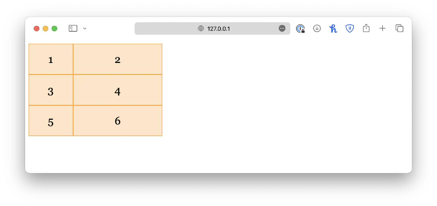
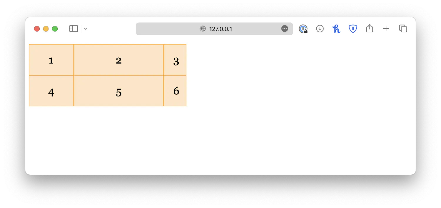
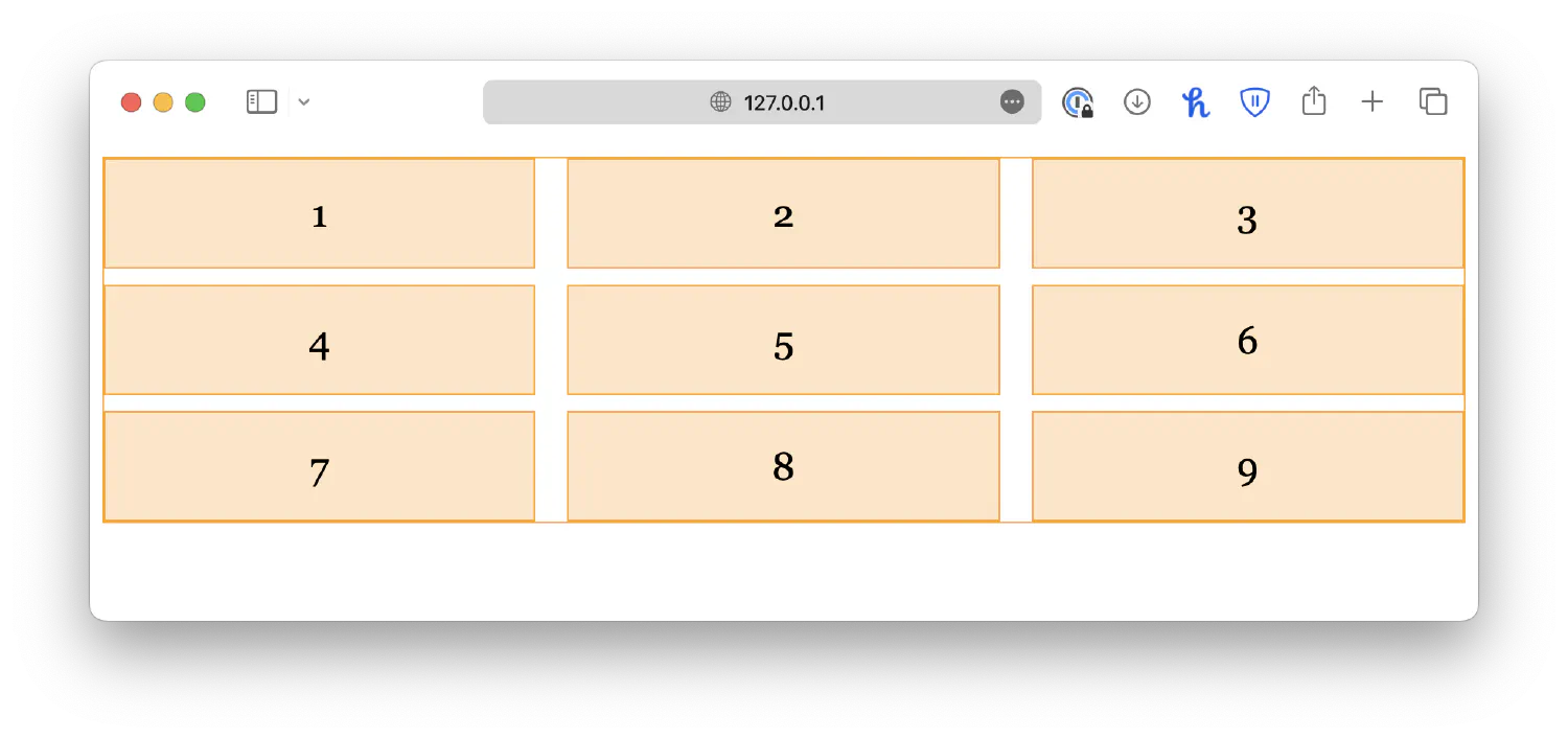
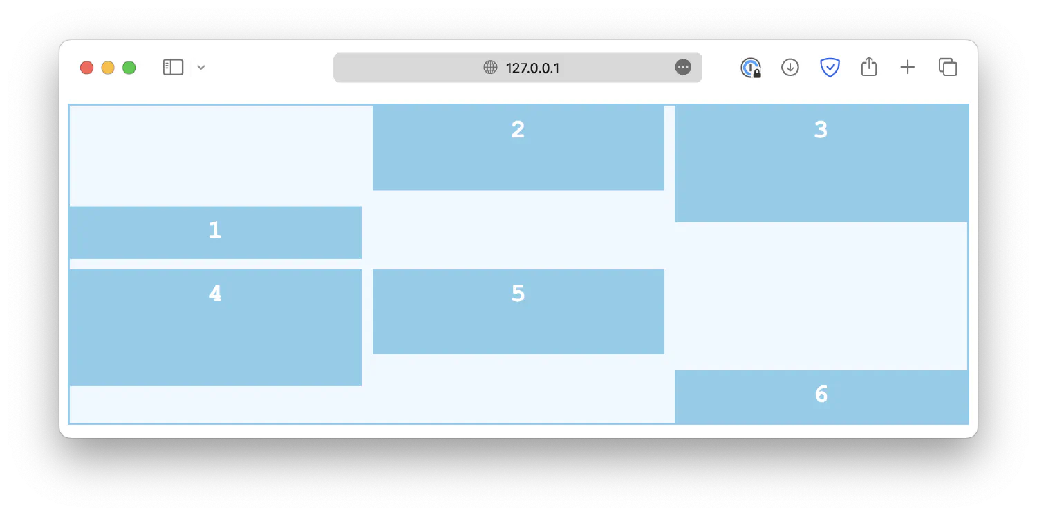
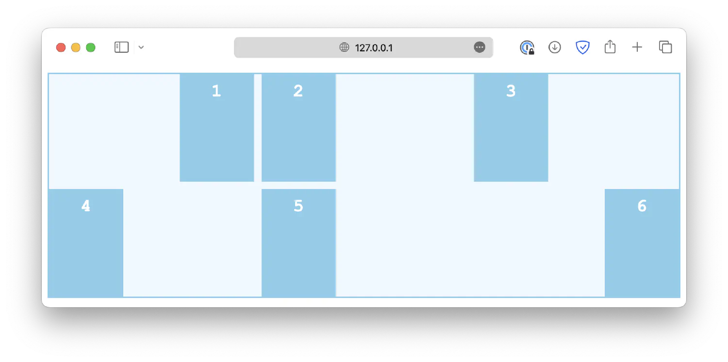
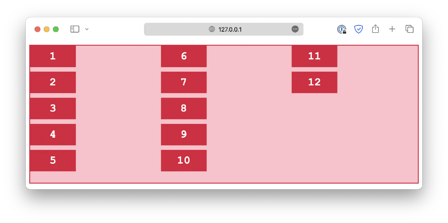
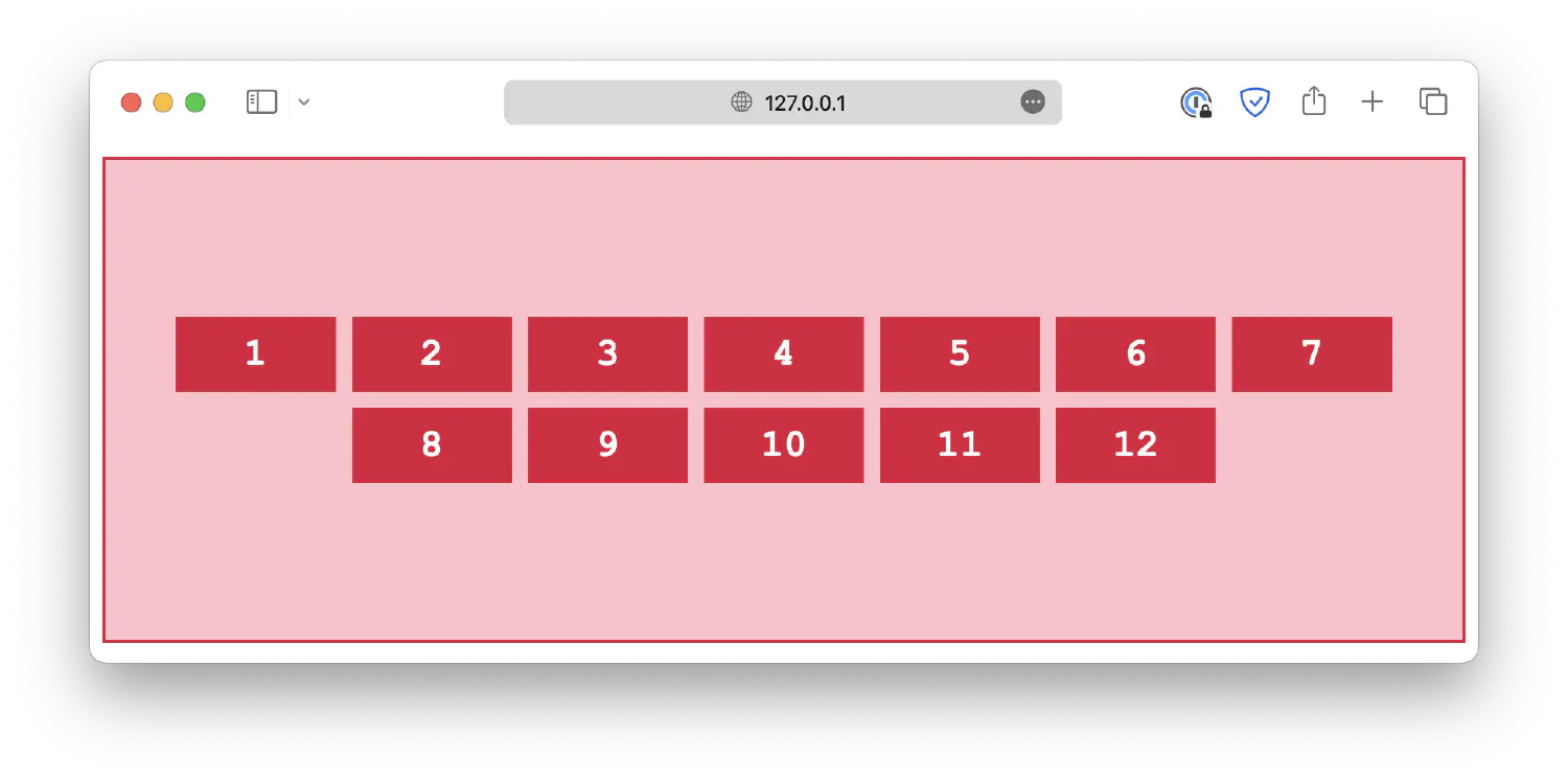
Let’s discuss each of them one by one. First of all, the align properties control vertical alignment. As an example, this is a grid with six items, and the grid container is 300px high:
| |
| |
The align-content property is used to specify the alignment of rows when there is available space in the container. Common values include:
start1 2 3.container { align-content: start; }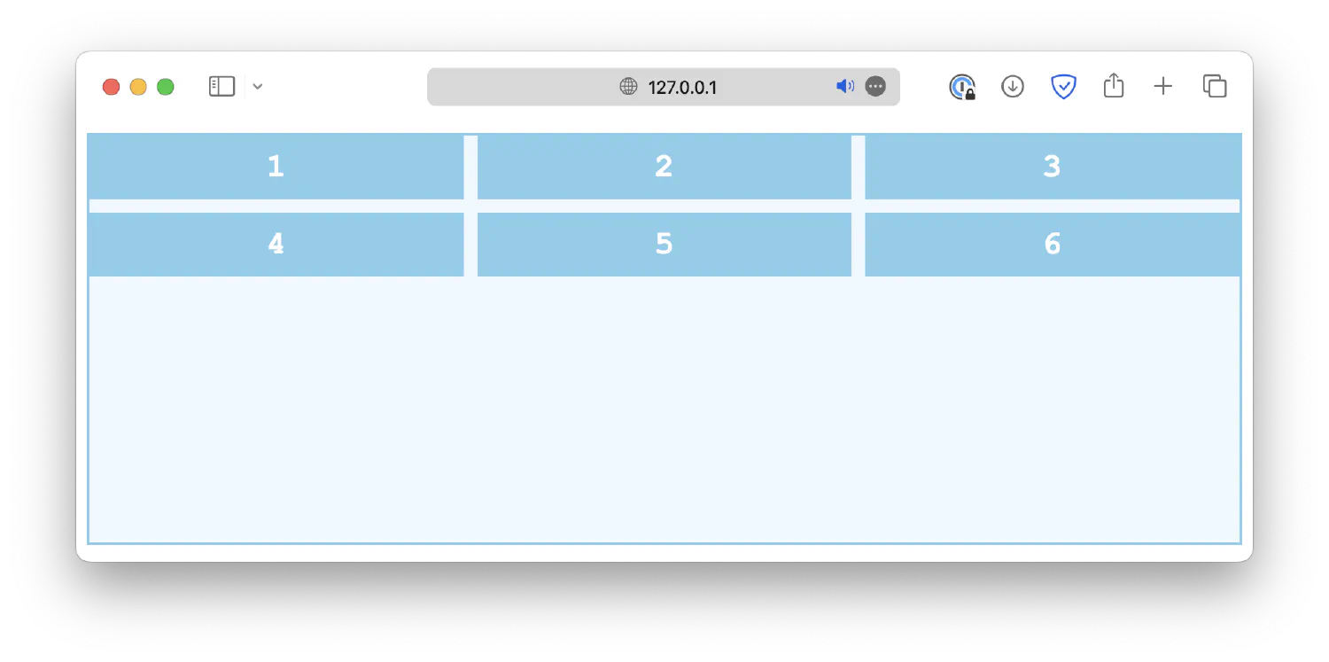
end1 2 3.container { align-content: end; }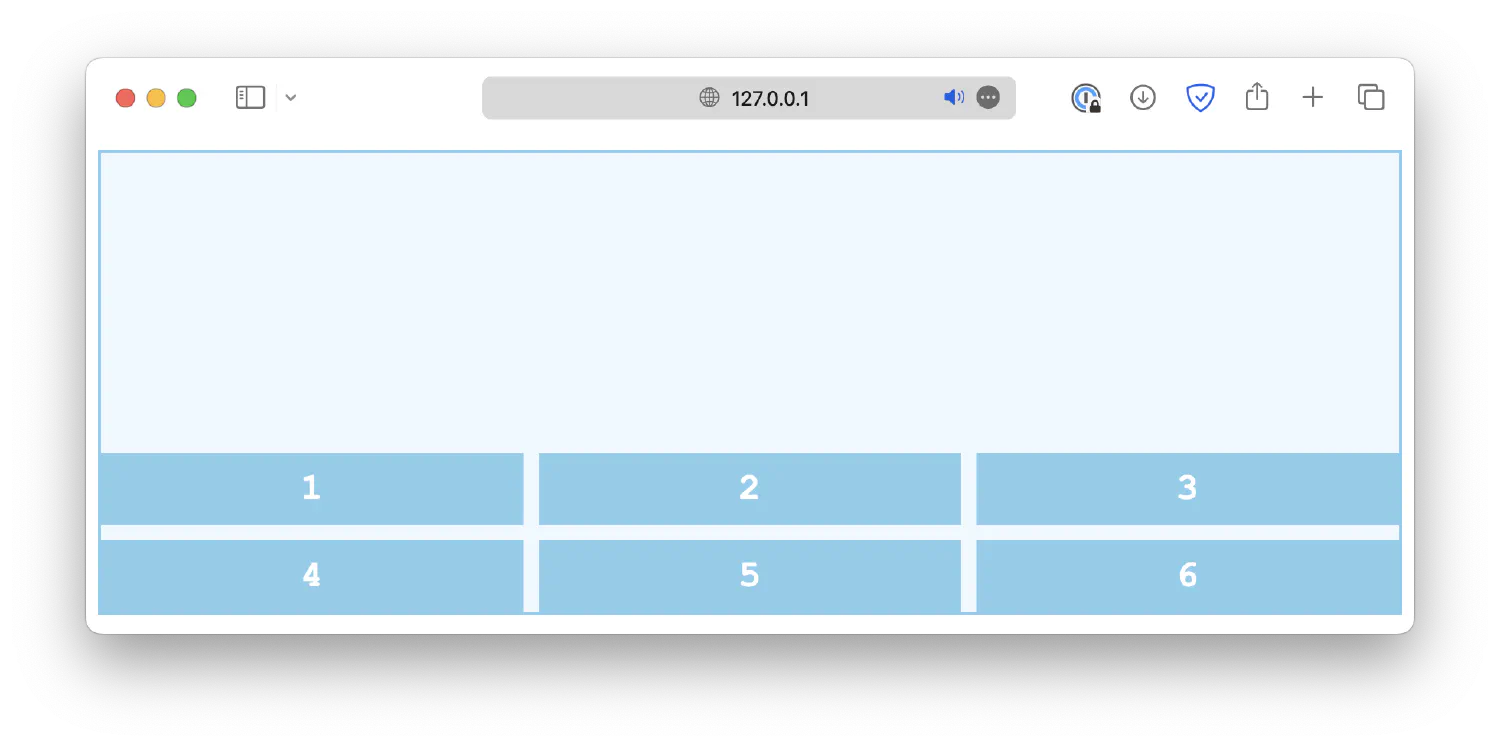
center1 2 3.container { align-content: center; }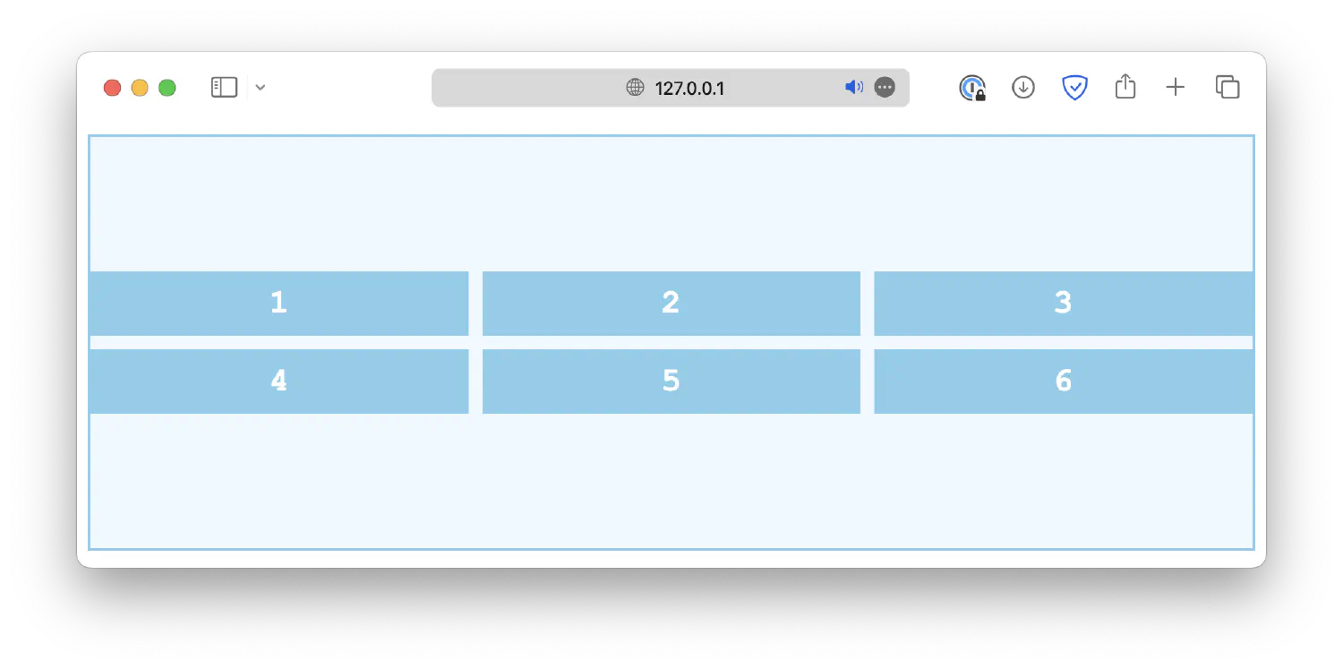
space-between1 2 3.container { align-content: space-between; }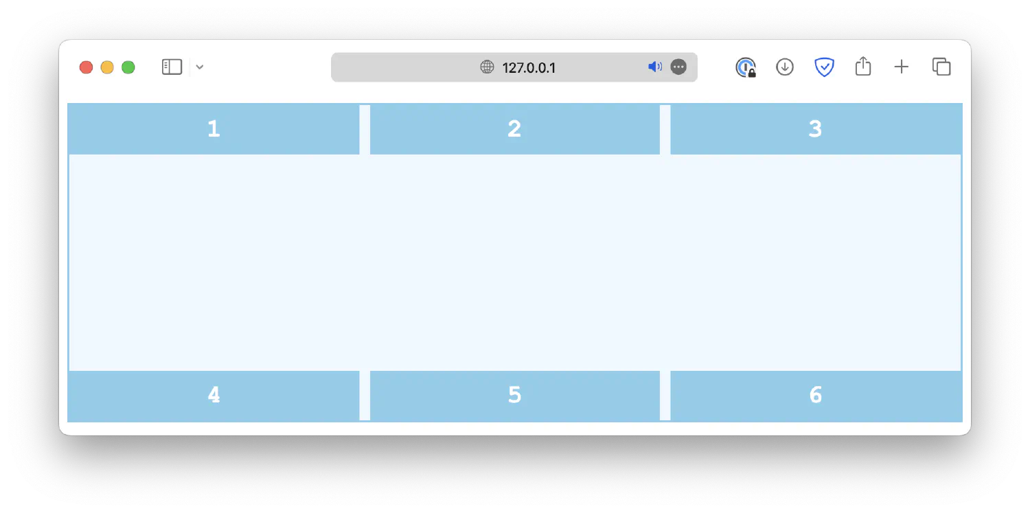
space-around1 2 3.container { align-content: space-around; }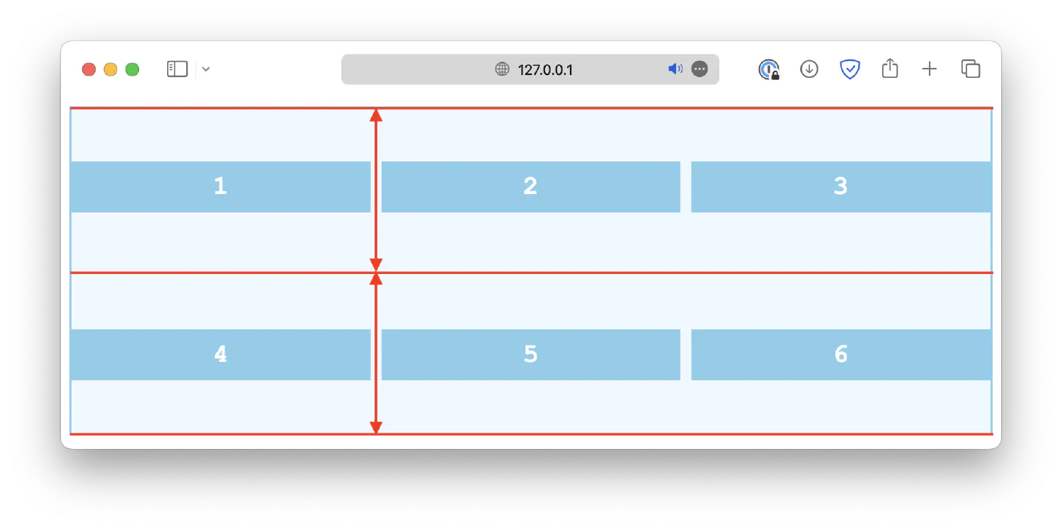
space-evenly1 2 3.container { align-content: space-evenly; }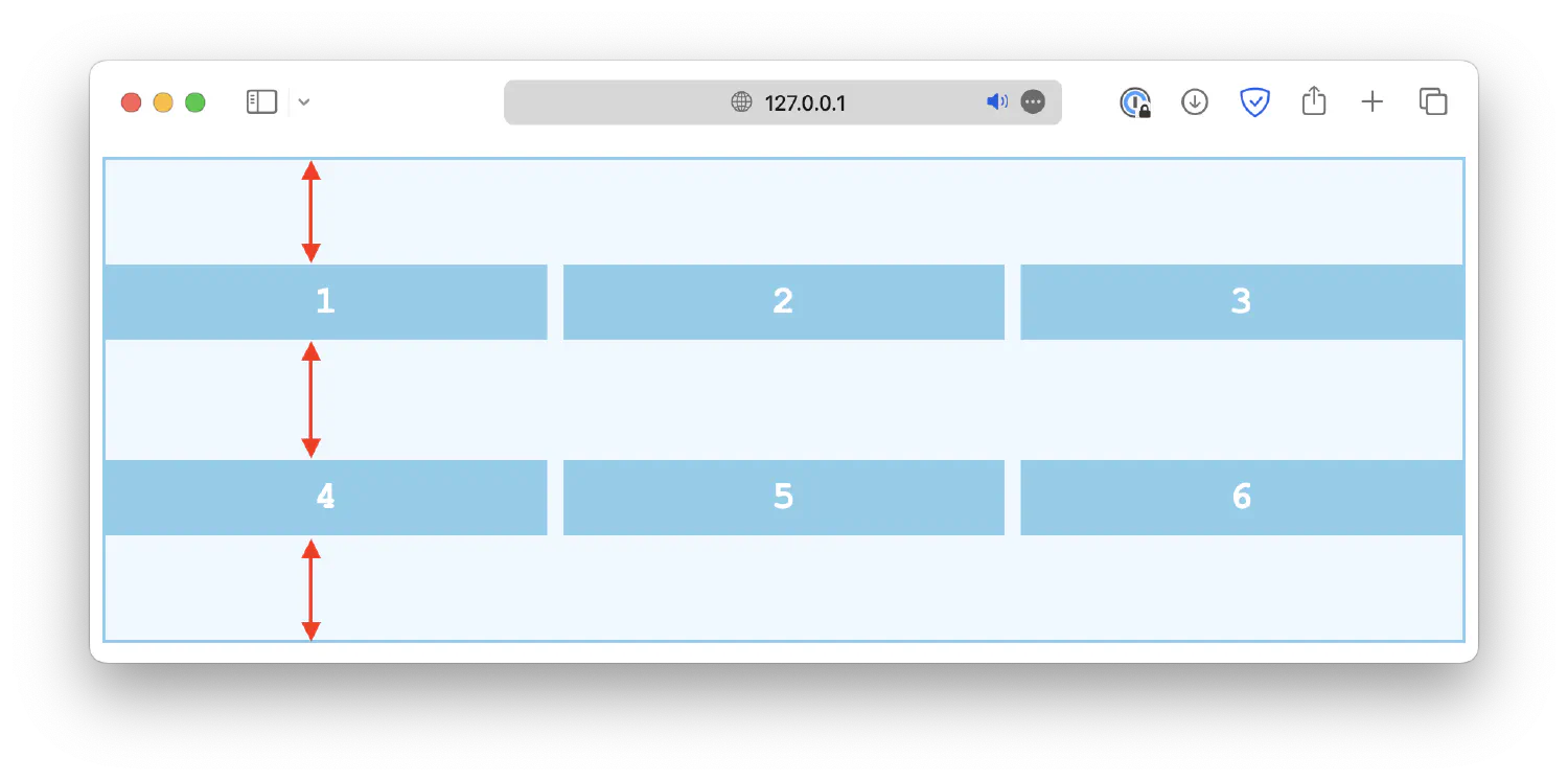
stretch1 2 3.container { align-content: stretch; }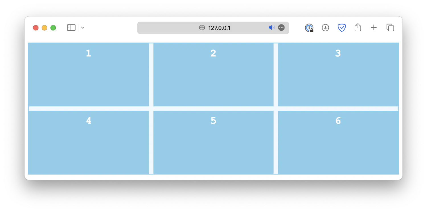
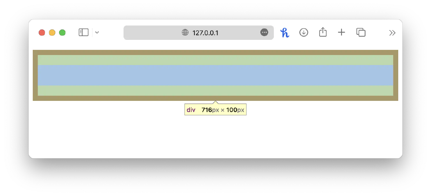
align-items, on the other hand, is used to align individual grid items within their respective grid cells along the block axis. This is especially useful when grid items have different heights. Common values include:
start1 2 3.container { align-items: start; }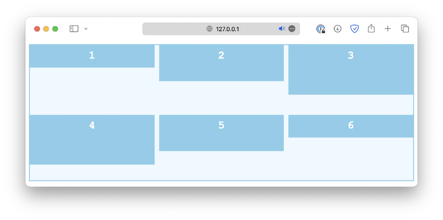
end1 2 3.container { align-items: end; }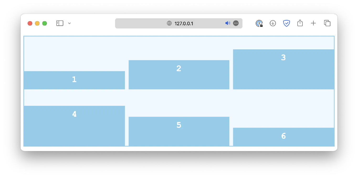
center1 2 3.container { align-items: center; }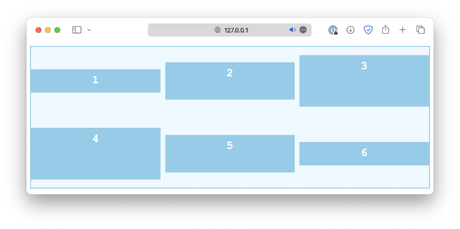
stretch1 2 3.container { align-items: stretch; }
baseline1 2 3.container { align-items: baseline; }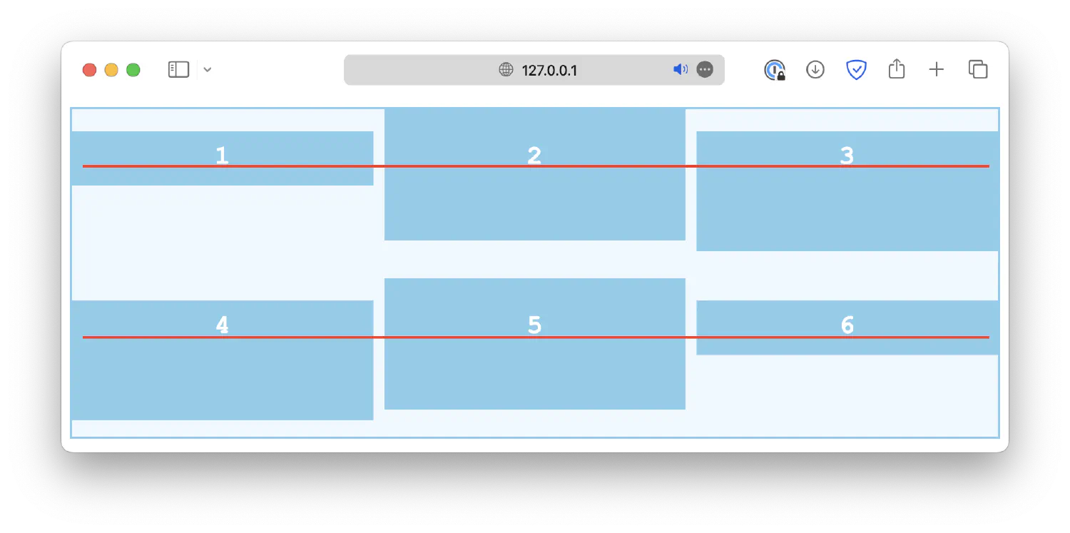
Lastly, the align-self property works just like align-items, except it is used on individual grid cells, not the container. It will overwrite the alignment rule set by align-items.
| |
Horizontal alignment #
The horizontal alignment, controlled by the justify properties, works in a similar way. First, the justify-content property defines how grid items are distributed horizontally along the main axis. Some common values are:
start1 2 3.container { justify-content: start; }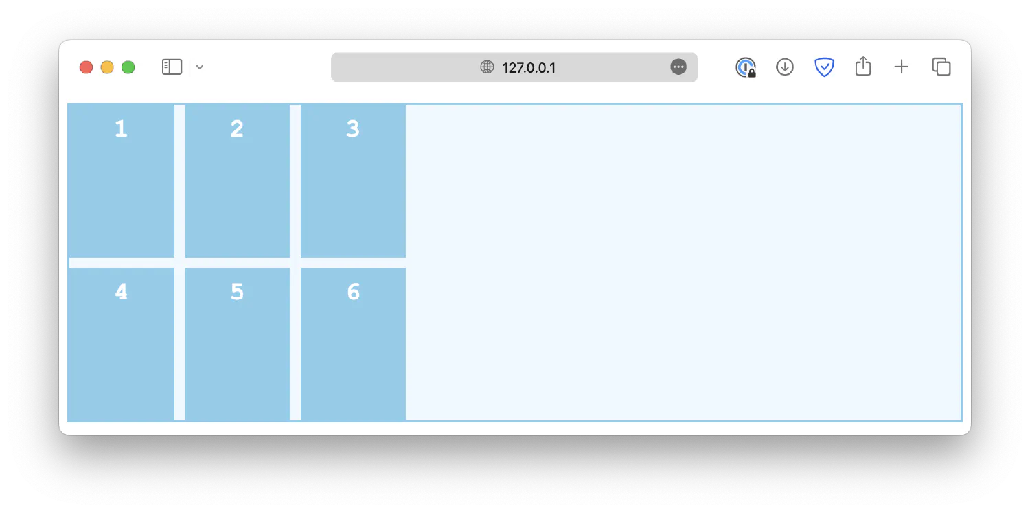
end1 2 3.container { justify-content: end; }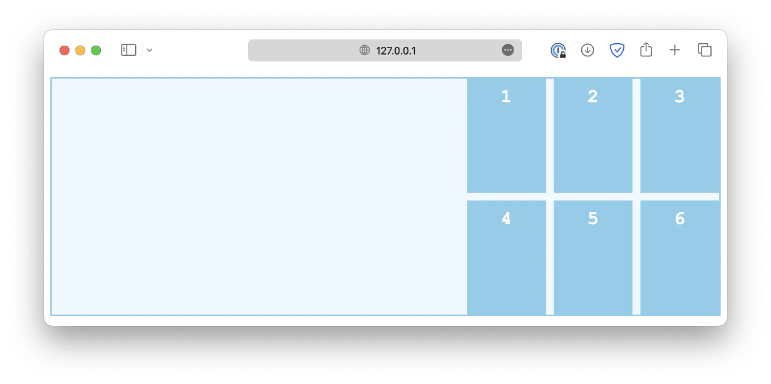
center1 2 3.container { justify-content: center; }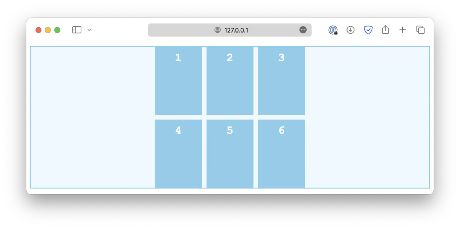
space-between1 2 3.container { justify-content: space-between; }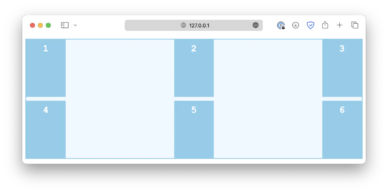
space-around1 2 3.container { justify-content: space-around; }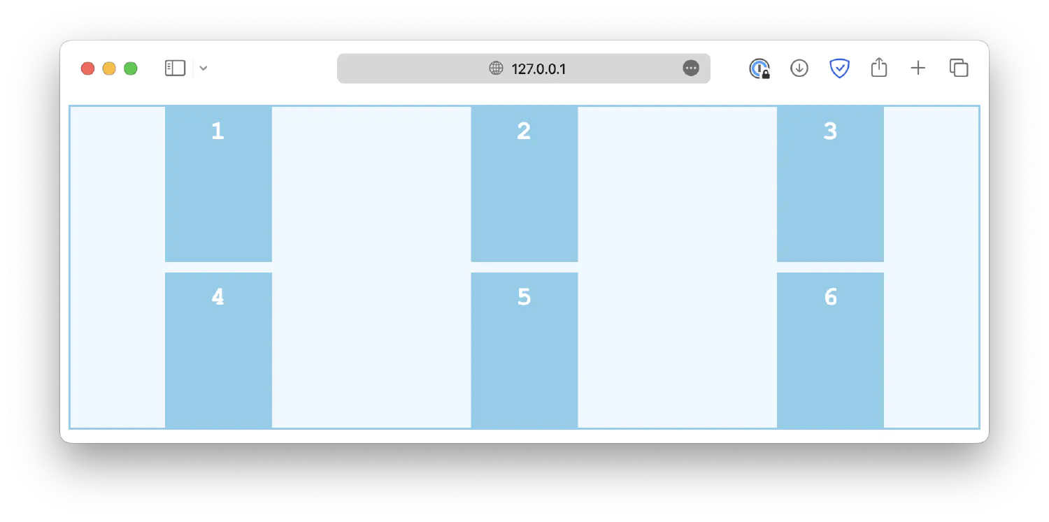
space-evenly1 2 3.container { justify-content: space-evenly; }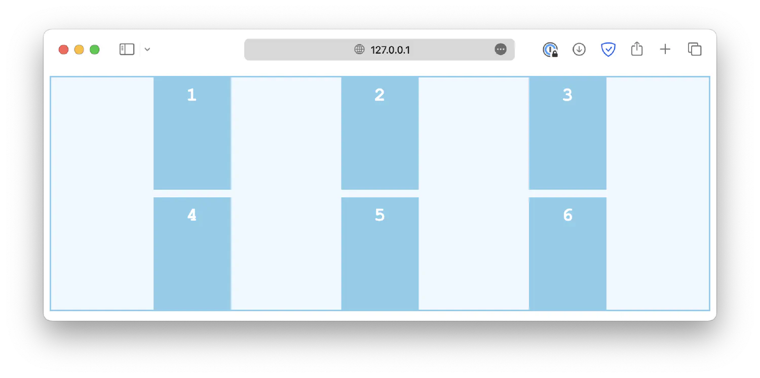
The justify-items controls how grid items are aligned horizontally within their cells. Some common values are:
start1 2 3.container { justify-items: start; }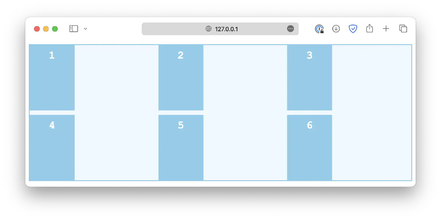
end1 2 3.container { justify-items: end; }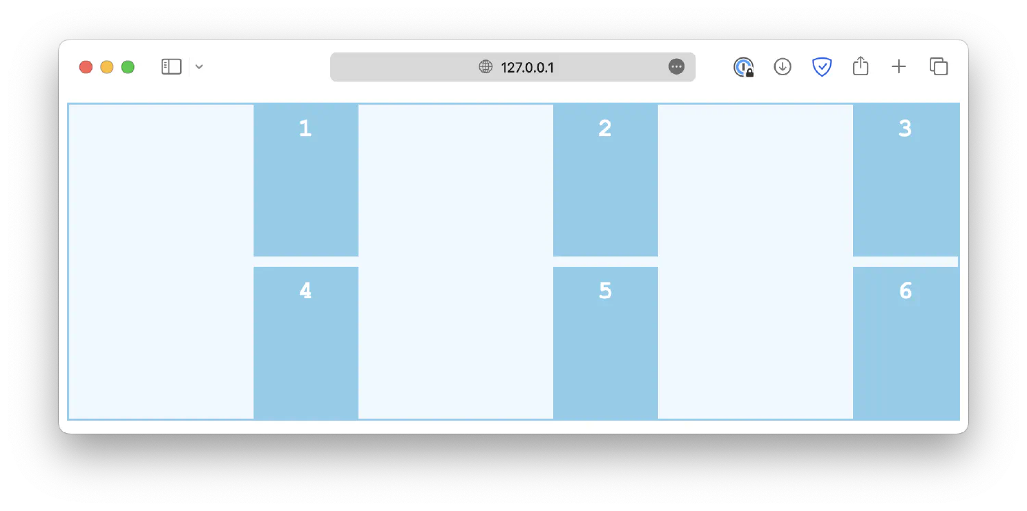
center1 2 3.container { justify-items: center; }
stretch1 2 3.container { justify-items: stretch; }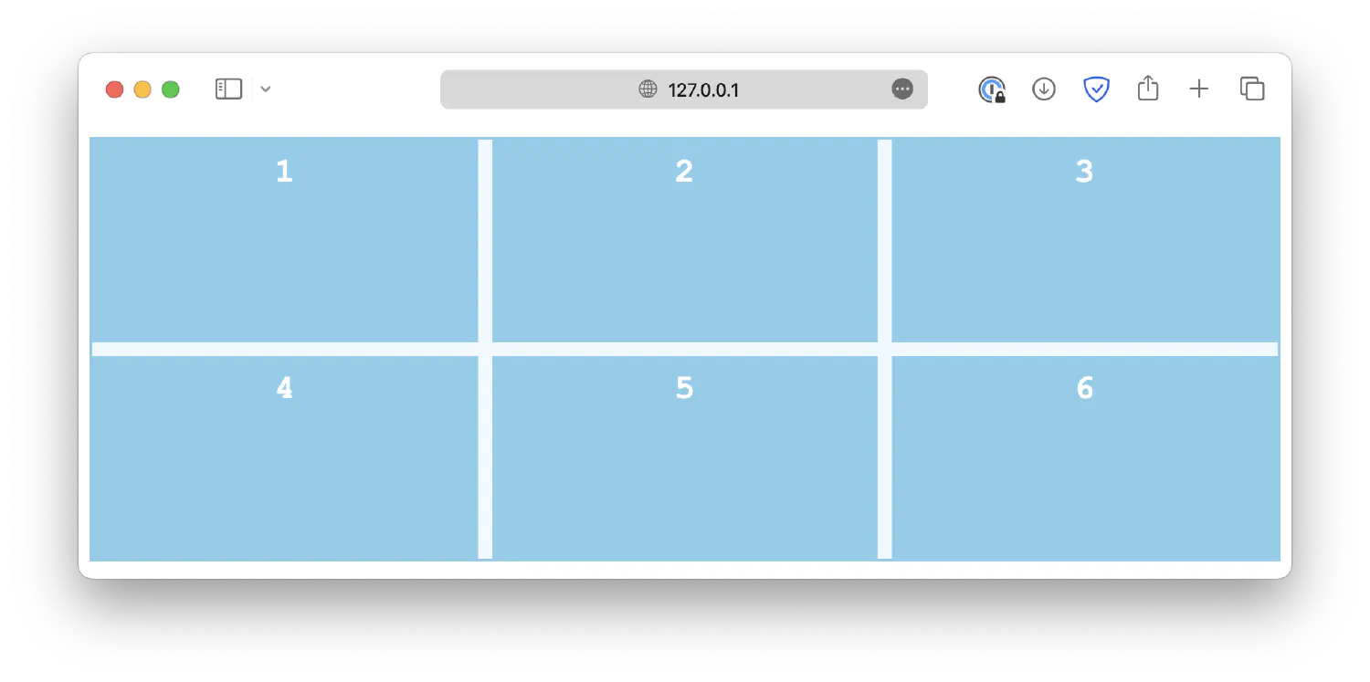
Similarly, the justify-self property is used on individual grid items to overwrite the default alignment rule set by justify-items.
| |
Flexbox layout #
The flexbox is another layout model in CSS that provides an efficient way to design and structure complex layouts, but with a more flexible approach. It is particularly suited for creating one-dimensional layouts, either in a row or a column, as we will see later.
Just like a grid layout, a flexbox layout also consists of a flex container and several flex items. The container should have its display property set to flex, and all its direct children automatically become flex items.
| |
| |
With a flex layout, instead of rows and columns, you must define a flex-direction and a flex-wrap. The flex-direction specifies in which direction the container should stack its flex items. The accepted values are:
column1 2 3.container { flex-direction: column; }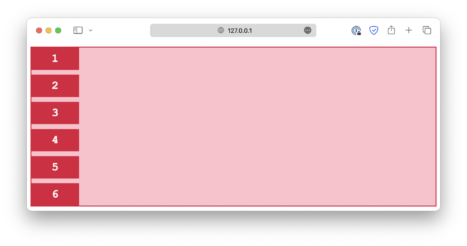
column-reverse1 2 3.container { flex-direction: column-reverse; }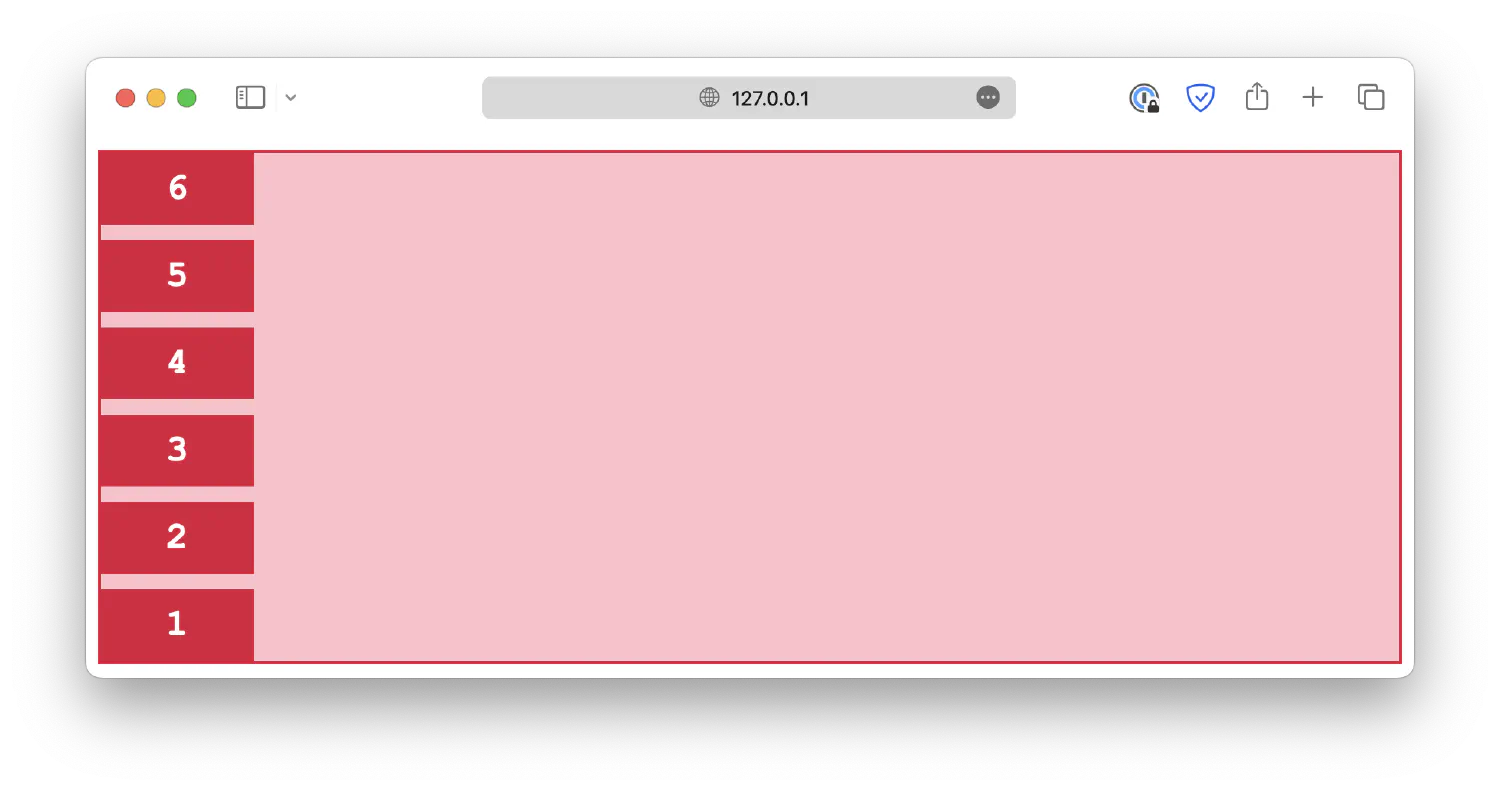
row1 2 3.container { flex-direction: row; }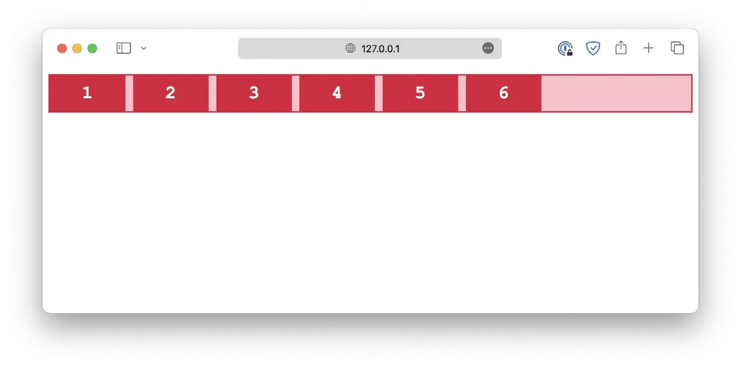
row-reverse1 2 3.container { flex-direction: row-reverse; }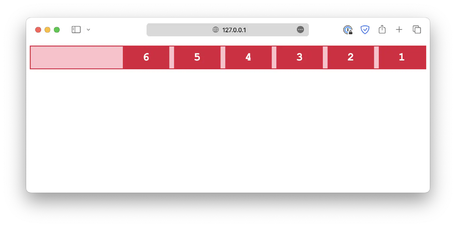
The flex-wrap property determines whether the flex items should wrap (automatically change to the following line when there is insufficient space).
wrap1 2 3.container { flex-wrap: wrap; }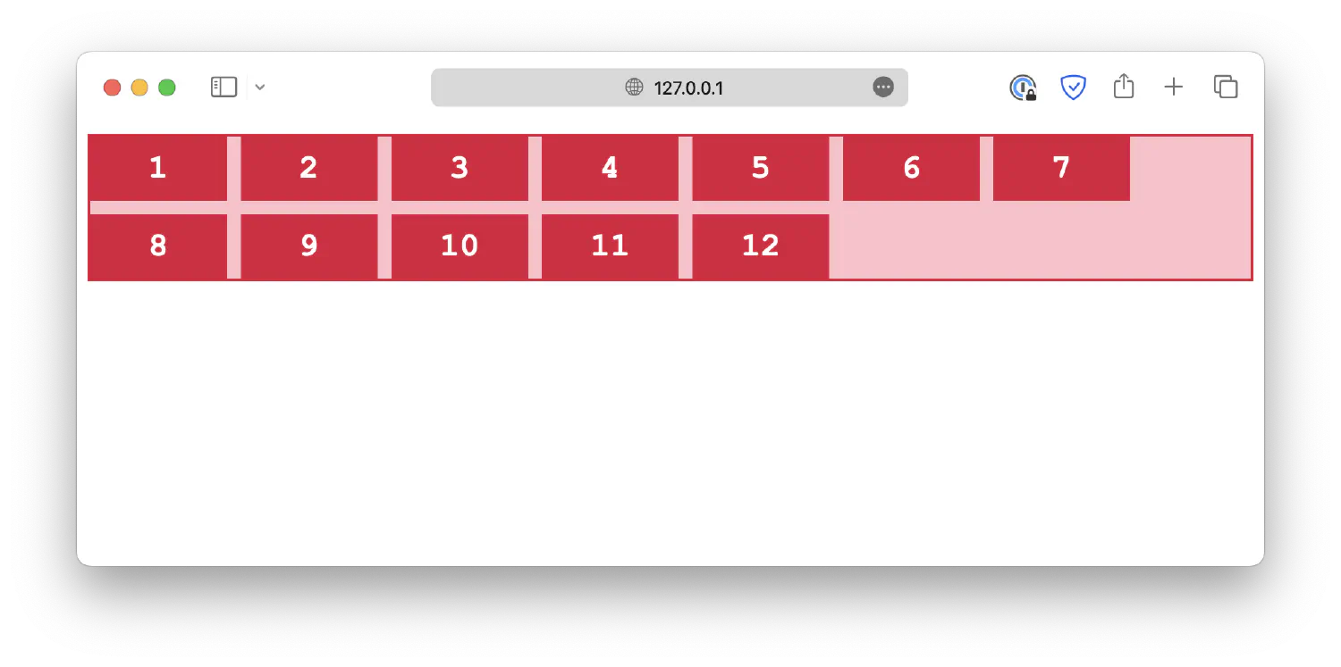
nowrap1 2 3.container { flex-wrap: nowrap; }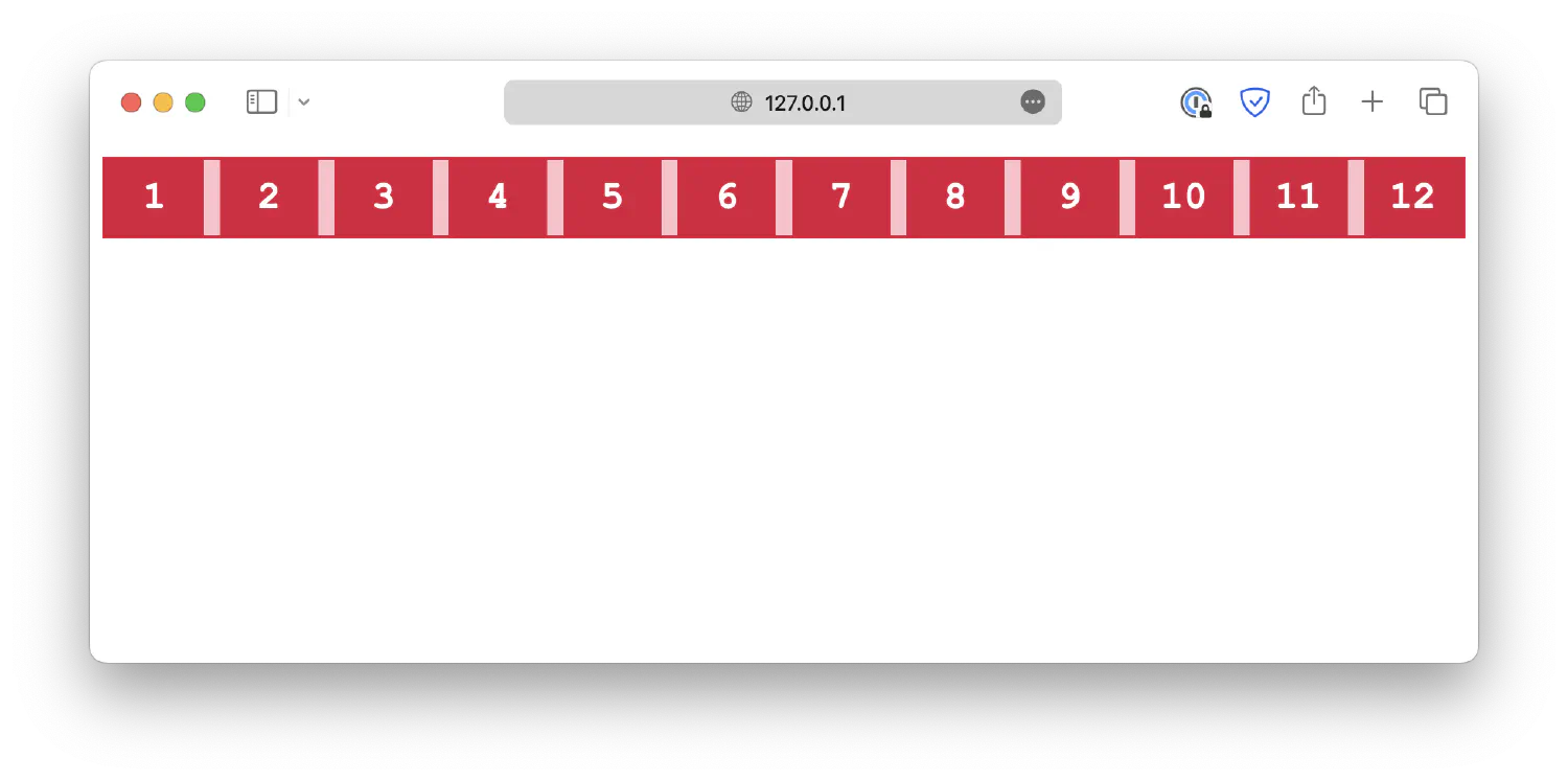
wrap-reverse1 2 3.container { flex-wrap: wrap-reverse; }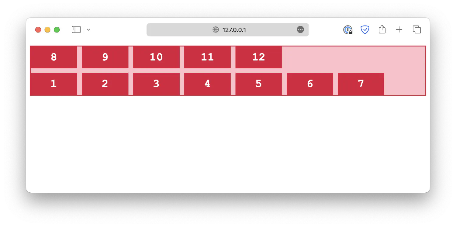
The flex-flow is a shorthand for flex-direction and flex-wrap properties.
| |
Lastly, the alignment properties for the grid layout we discussed before also work for flexbox layouts. For example:
| |
A practical example #
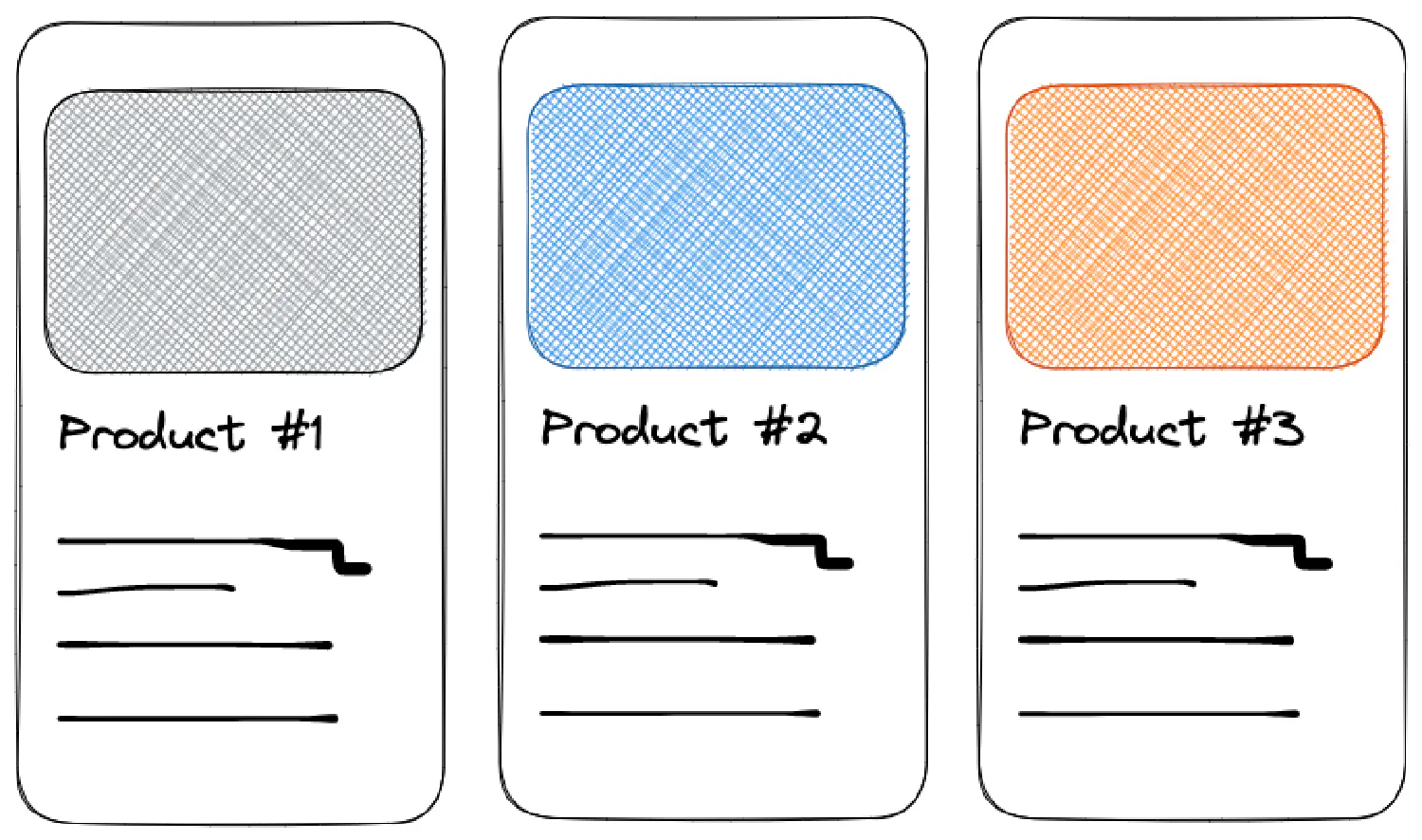
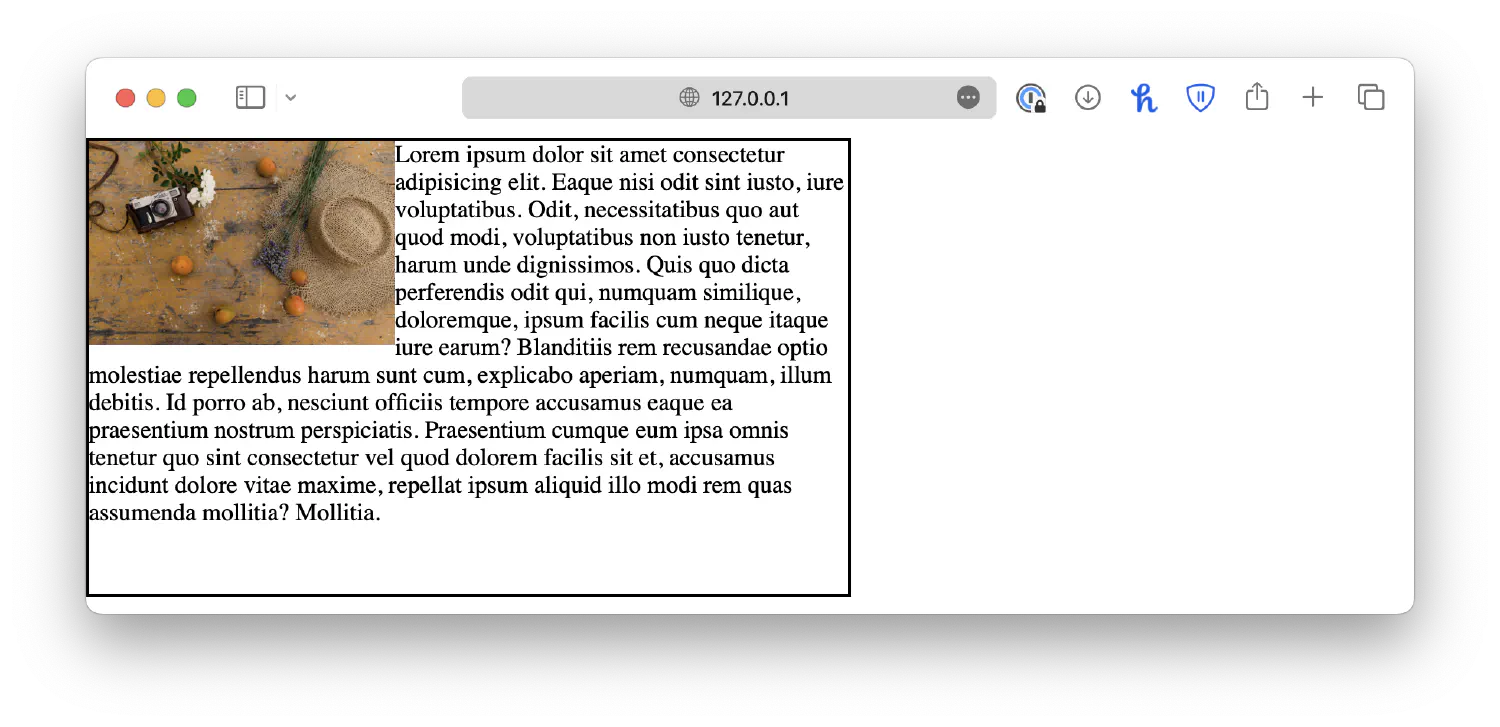
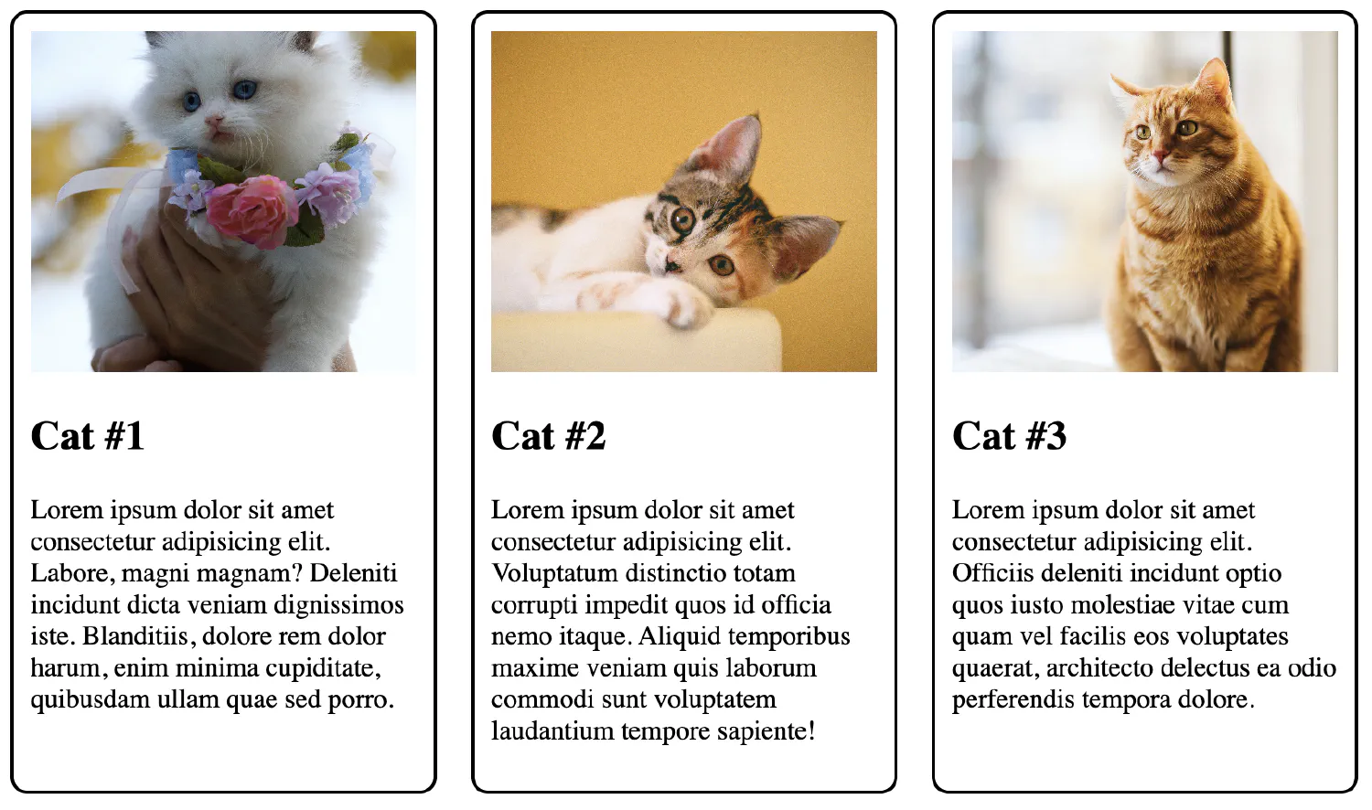
Before we wrap up this chapter, let’s go back to the original question: how do we create a product compare section with different products placed side by side like this:
Let’s start with the HTML code:
| |
Here, we have a container with three different product-card. The container should be either a grid or a flexbox. I’ll use the grid as an example:
| |
The container is a grid layout with three columns. Each column is 250px wide and with a 20px gap between each column.
Next, each product-card should have a border, and there should be padding between the border and the content.
| |
Lastly, you need to ensure the image fits inside the defined space by setting a with and height.
| |
However, the images come in many different sizes, so they might not fit inside the defined space. The object-fit: cover; property makes sure the image will not be stretched or squished. We will discuss more about this property in the next chapter.
This will be the final result:
Conclusion #
In this chapter, we covered some essential aspects of webpage layout and design, including display types, element positioning, transformation, and alignment techniques. We also explored the power of grids and flexbox layouts, providing the necessary skills for creating adaptable and visually appealing designs. As we move forward, the upcoming chapter will delve into responsive design techniques, allowing you to create webpages that seamlessly cater to various devices and screen sizes.
If you think my articles are helpful, please consider making a donation to me. Your support is greatly appreciated.