🏷️ #frontend #html #css

Recreating YouTube Using HTML and CSS

So far, we have covered the basics of HTML and CSS, discussed different techniques that allow you to position elements in a webpage, and explored the concept of responsive design, which enables you to create webpages that automatically adapt to different screen sizes. In this chapter, we will put everything we have learned so far together to recreate YouTube using only HTML and CSS.

YouTube Demo

Before we continue, please consider buying the e-book version of this course.

By purchasing this e-book, you will get access to all the accompanied source code. Thank you for your support! Happy coding! 🖥️✨

Purchase e-book || Download a sample

Creating the page layout #

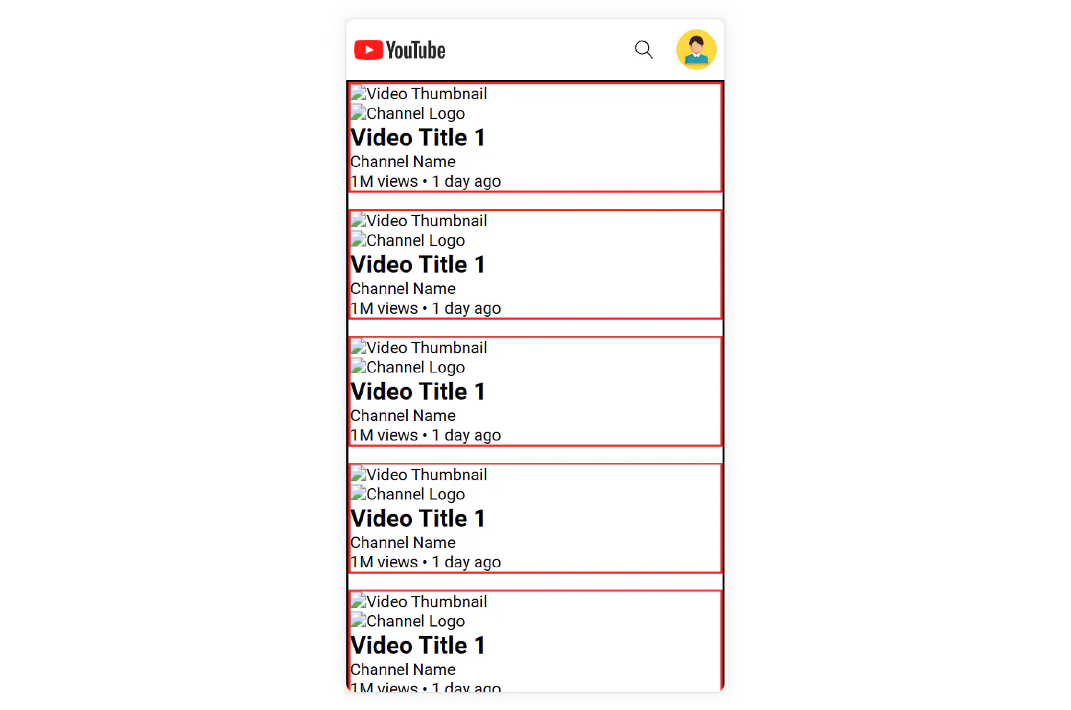
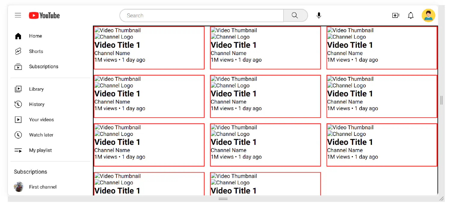
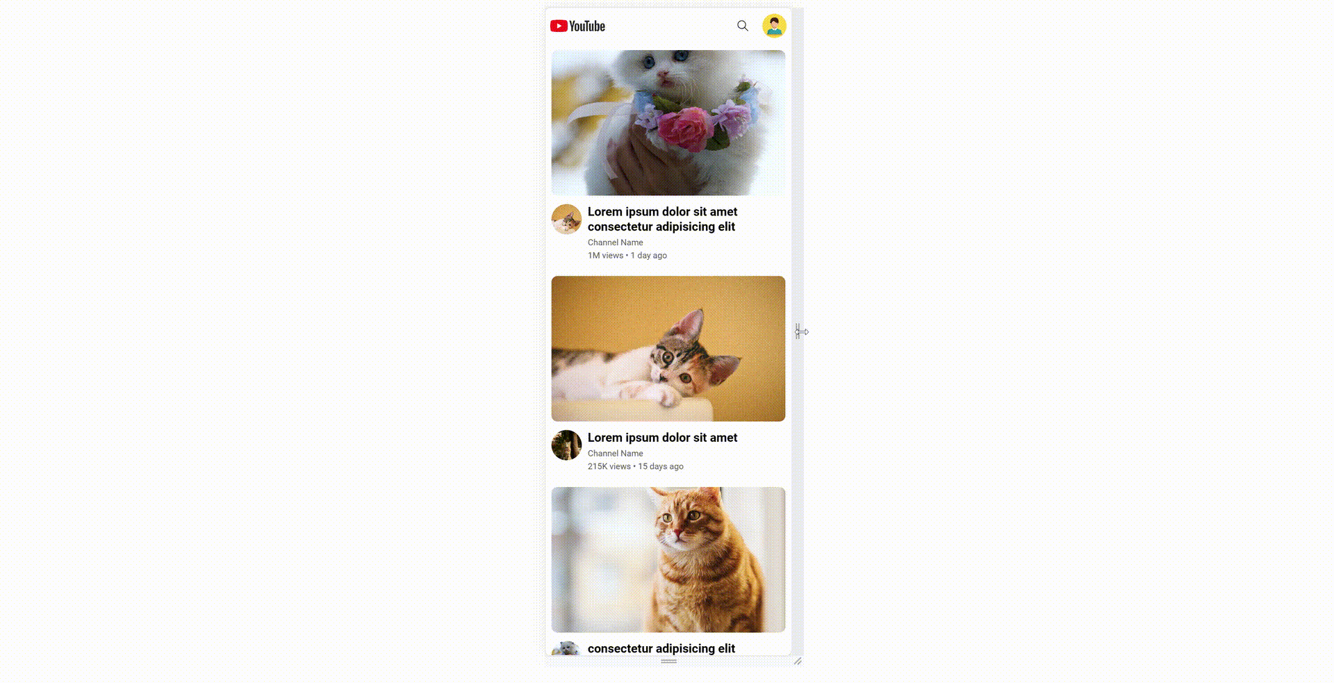
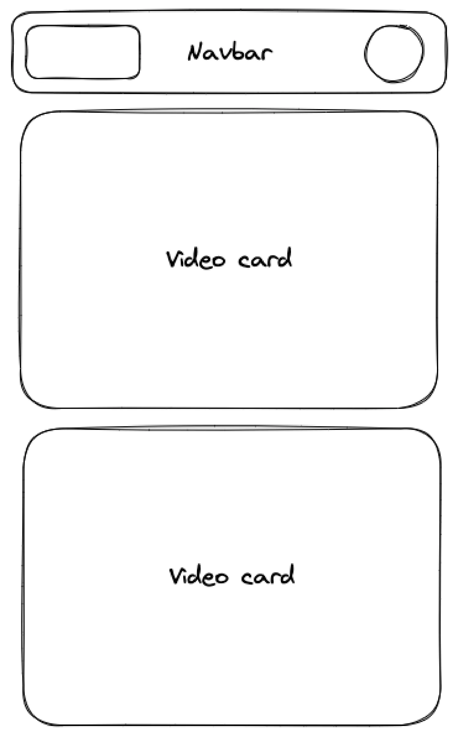
Let’s start by discussing the basic page layout. We will follow the mobile-first rule and start from the small screen. On a small screen, there should be a top navigation bar and a content section. The navigation bar has the logo on the left and some buttons on the right. The content section should include several card components showing individual videos.

page layout on small screen

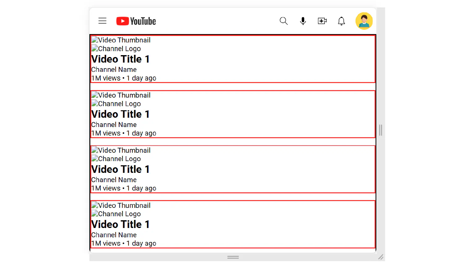
On a medium screen (>= 640px), more icons should be displayed in the navigation bar. We will skip this step for now and revisit this topic when we start building the navigation menu.

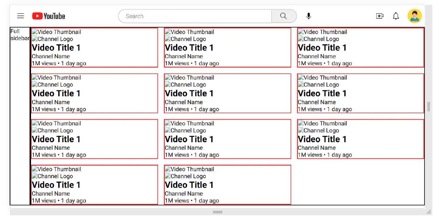
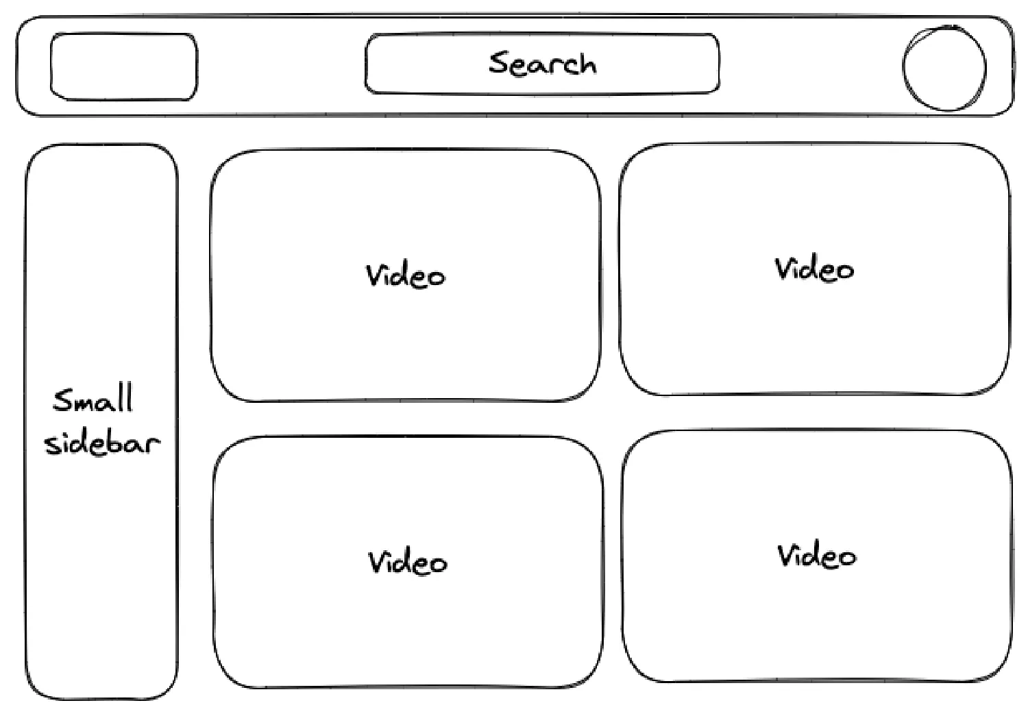
On a large screen (>= 768px), the page should have a small sidebar. The navigation bar should display a search box at the center instead of just an icon. The content section should also be multi-column.

page layout on large screen

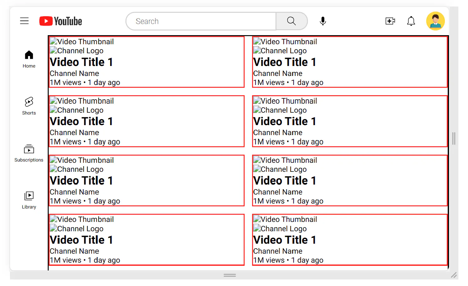
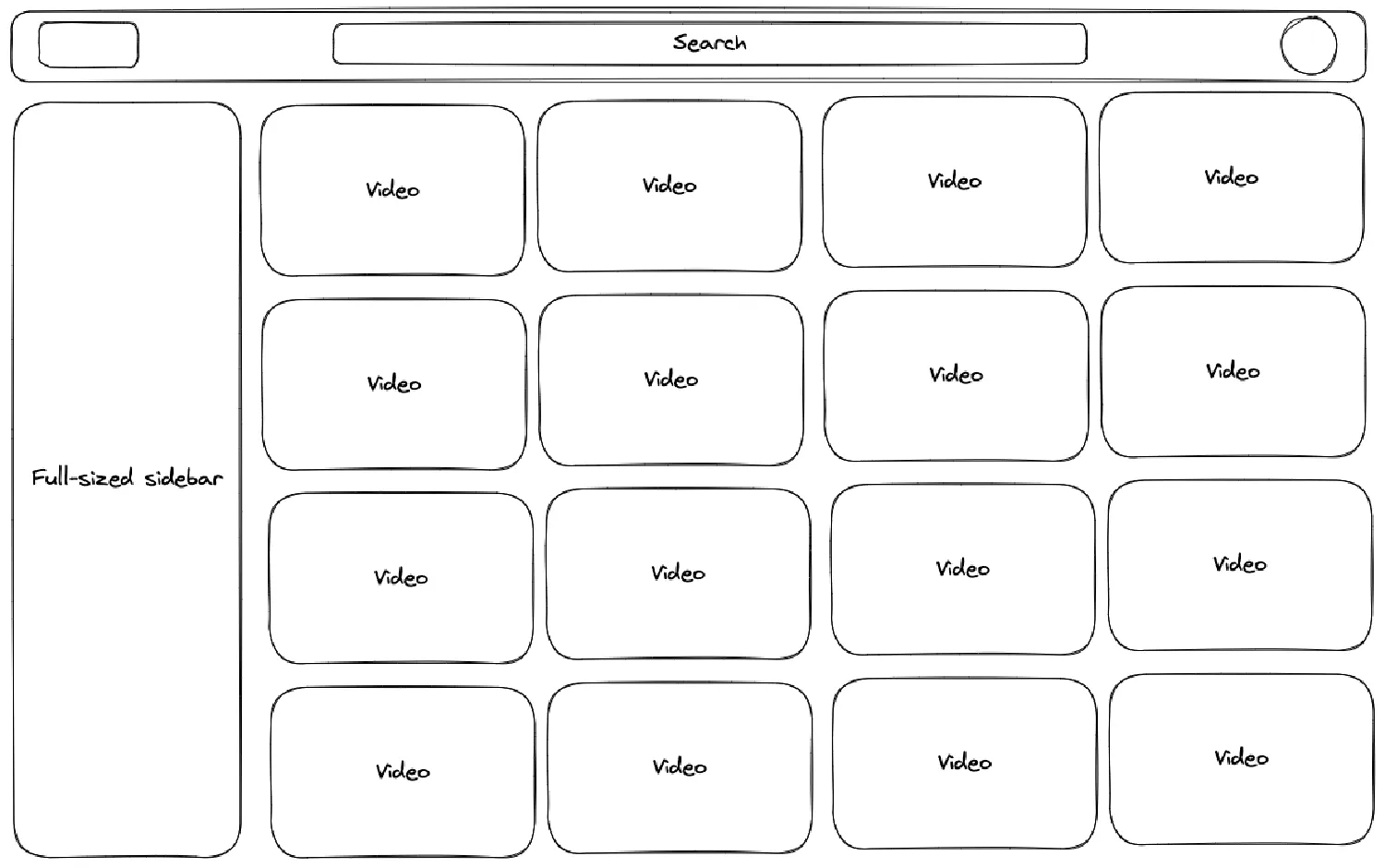
And lastly, on an x-large screen (>= 1024px), the webpage should have a full-sized sidebar, a fully expanded navigation bar with all the icons and search boxes, and the content section should have more columns.

page layout on x-large screen

The HTML document #

Now, let’s see if you can construct this layout. We’ll start with the HTML document. We will start with the navigation bar:

 1
 2
 3
 4
 5
 6
 7
 8
 9
10
11
12
13
14
15
16
17
<header>
  <nav>
    <div class="start">
      <div>Button</div>
      <div>Logo</div>
    </div>
    <div class="center">
      <div>Search</div>
      <div>Microphone</div>
    </div>
    <div class="end">
      <div>Button</div>
      <div>Button</div>
      <div>Button</div>
    </div>
  </nav>
</header>

And then the sidebars:

1
2
3
4
5
<main>
  <aside class="sidebar-sm">Small sidebar</aside>
  <aside class="sidebar-full">Full sidebar</aside>
  . . .
</main>

There should also be a content section inside the <main> element:

 1
 2
 3
 4
 5
 6
 7
 8
 9
10
11
12
13
14
15
16
<section class="content">
  <section class="video">
    <div class="video-thumbnail">
      <img src="video_thumbnail1.jpg" alt="Video Thumbnail" />
    </div>
    <div class="video-info">
      <img src="channel1.jpg" alt="Channel Logo" />
      <div>
        <h2>Video Title 1</h2>
        <p>Channel Name</p>
        <p>1M views • 1 day ago</p>
      </div>
    </div>
  </section>
  . . .
</section>

Remember your HTML should have all the components required for all screen sizes. If an element is not required for a certain screen, you can remove it by setting display to none.

This example contains a navigation bar, defined by the <nav> element. The navigation bar has three sections, start, center, and end. The class names correspond to their respective positions in the navigation bar. This layout can be created with a flexbox, and the justify-content property should be set to space-between. The center section should be removed until the screen is big enough.

The <main> section has two sidebars, a small sidebar (sidebar-sm) and a full-sized sidebar (sidebar-full). The small sidebar should be displayed on large screens, and the full-sized sidebar should be displayed only on x-large screens.

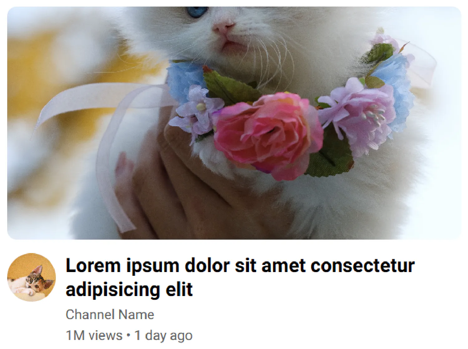
Lastly, for the content section, you can use a CSS grid with the responsive-layout-without-breakpoint technique we discussed in the previous chapter. For now, we are not going to worry about how the card components are created.

Now we can move on to the CSS file. Let’s remove the default margins and paddings and set the box-sizing property to border-box. You can also add a border to each section to make their respective positions more clear.

 1
 2
 3
 4
 5
 6
 7
 8
 9
10
11
12
* {
  box-sizing: border-box;
  padding: 0px;
  margin: 0px;
}

nav,
.sidebar-sm,
.sidebar-full,
.content {
  border: black solid 2px;
}

Next, the navigation bar should be a flexbox with its direction set to row, and justify-content set to space-between, so that each subsection has equal spaces between each other. The subsections should also be row flexboxes so that the logo and icons are also placed horizontally. However, since we are starting from the small screen, the center section should be removed (display: none;) for now.

 1
 2
 3
 4
 5
 6
 7
 8
 9
10
11
12
13
14
15
16
17
18
19
nav {
  display: flex;
  flex-direction: row;
  justify-content: space-between;
}

.start {
  display: flex;
  flex-direction: row;
}

.center {
  display: none; /* Not displayed on small screens */
}

.end {
  display: flex;
  flex-direction: row;
}

For large screens, the center section should be designed just like its siblings.

1
2
3
4
5
6
7
/* Large screen */
@media screen and (min-width: 768px) {
  .center {
    display: flex;
    flex-direction: row;
  }
}

Next, the <main> section should be a row flexbox, or a grid with two columns, so that the sidebar and the content are on the same row.

1
2
3
4
main {
  display: flex;
  flex-direction: row;
}

The sidebars are removed on small screens.

1
2
3
4
5
6
7
.sidebar-sm {
  display: none;
}

.sidebar-full {
  display: none;
}

The small sidebar is displayed on large screens. By setting flex to 0, you make sure the sidebar has a fixed size and only the content section changes as the viewport changes.

 1
 2
 3
 4
 5
 6
 7
 8
 9
10
11
12
13
14
15
/* Large screen */

@media screen and (min-width: 768px) {
  .center {
    display: flex;
    flex-direction: row;
  }

  .sidebar-sm {
    display: flex;
    flex-direction: column;

    flex: 0;
  }
}

The full-sized sidebar is displayed on x-large screens, and the small sidebar will be removed.

 1
 2
 3
 4
 5
 6
 7
 8
 9
10
11
12
13
14
/* X-Large screen */

@media screen and (min-width: 1024px) {
  .sidebar-sm {
    display: none;
  }

  .sidebar-full {
    display: flex;
    flex-direction: column;

    flex: 0;
  }
}

The content section #

Lastly, for the content section:

 1
 2
 3
 4
 5
 6
 7
 8
 9
10
11
12
.content {
  display: grid;
  grid-template-columns: repeat(auto-fill, minmax(20em, 1fr));
  grid-gap: 1em;

  flex: 1;
}

.video {
  border: red solid 2px;
  width: 100%;
}

For now, we’ll set the maximum width of a video card to be 20em. This is how this layout looks like as the viewport changes:

YouTube layout

Building the navigation bar #

Next, let’s focus on the navigation bar. The start section has a menu icon and a logo. The center section includes a search form and a search icon. Lastly, the end section contains several icons and a profile photo. In order to make this example shorter, I left out the actual icon elements, defined by <svg>, but you can copy these resources from YouTube directly.

You can also purchase my E-book: “HTML & CSS: A Practical Guide ”, which includes the complete source code for this chapter.

 1
 2
 3
 4
 5
 6
 7
 8
 9
10
11
12
13
14
15
16
17
18
19
20
21
22
<nav>
  <div class="start">
    <div class="menu-icon">. . .</div>
    <img src="images/logo.png" alt="YouTube Logo" />
  </div>
  <div class="center">
    <form action="/">
      <input type="text" placeholder="Search" />
      <button>
        <div class="search-form-icon">. . .</div>
      </button>
    </form>
    <div class="mic-icon-center">. . .</div>
  </div>
  <div class="end">
    <div class="search-icon">. . .</div>
    <div class="mic-icon">. . .</div>
    <div class="camera-icon">. . .</div>
    <div class="notification-icon">. . .</div>
    <img src="images/profile.jpg" alt="Profile Image" />
  </div>
</nav>

First of all, all the icons should have a unified style. They should be rounded and have equal paddings. The icons should also have a background when the cursor is hovered on top.

 1
 2
 3
 4
 5
 6
 7
 8
 9
10
11
12
13
14
15
16
17
18
19
20
21
22
23
24
.menu-icon,
.search-icon,
.mic-icon,
.mic-icon-center,
.camera-icon,
.notification-icon {
  border-radius: 100%;
  padding: 10px;
}

svg {
  display: block;
  width: 100%;
  height: 100%;
}

.menu-icon:hover,
.search-icon:hover,
.mic-icon:hover,
.mic-icon-center:hover,
.camera-icon:hover,
.notification-icon:hover {
  background-color: #e5e5e5;
}

icon style

On a small screen, most of these icons should be removed, as the horizontal space on a mobile device is very valuable. In this case, we’ll only keep the logo, the search icon, and the profile picture. All the other elements will be removed.

navbar small screen

1
2
3
4
5
6
7
.menu-icon,
.mic-icon,
.mic-icon-center,
.camera-icon,
.notification-icon {
  display: none;
}

And then, style the start, center and end sections of the navbar.

 1
 2
 3
 4
 5
 6
 7
 8
 9
10
11
12
13
14
15
16
17
18
19
20
21
22
23
24
25
26
27
28
29
30
31
32
33
34
35
36
37
38
39
40
41
/* Navbar start section */

.start {
  display: flex;
  flex-direction: row;
  flex: 1;

  gap: 10px;
  padding: 8px;
  align-items: center;
}

.start > img {
  width: 90px;
}

/* Navbar center section */

.center {
  display: none;
  flex: 2;
}

/* Navbar end section */

.end {
  display: flex;
  flex-direction: row;

  padding: 8px;
  align-items: center;
  justify-content: end;
  flex: 1;
}

.end > img {
  width: 40px;
  border-radius: 100%;
  object-fit: cover;
  margin-left: 10px;
}

start and end will have equal size, and center will grow faster than its siblings as the viewport grows. center will be removed on a small screen, so for now, there are only start and end.

On a medium screen, more icons will appear, but the center section is still removed.

navbar medium screen

1
2
3
4
5
6
7
8
9
@media screen and (min-width: 640px) {
  /* Display the menu, mic, camera, and notification icons for medium screen */
  .menu-icon,
  .mic-icon,
  .camera-icon,
  .notification-icon {
    display: block;
  }
}

On a large screen, the center section will be displayed, the mic icon will be moved to the center, and the right search icon will be removed. I left out the styles for the search form.

navbar large screen

 1
 2
 3
 4
 5
 6
 7
 8
 9
10
11
12
13
14
15
16
17
18
19
20
21
22
23
24
25
26
27
28
29
30
31
32
33
@media screen and (min-width: 768px) {
  .sidebar-sm {
    display: flex;
    flex-direction: column;

    flex: 0;
  }

  /* Display the center section for large screens */
  .center {
    display: flex;
    flex-direction: row;

    gap: 10px;
    padding: 8px;
    align-items: center;
    justify-content: center;
  }

  . . .

  /* Hide the search and right mic icons */
  .search-icon,
  .mic-icon {
    display: none;
  }

  /* Display the center mic icon */

  .mic-icon-center {
    display: block;
  }
}

Building the sidebar #

Now, let’s move on to the sidebar. The small sidebar will be displayed on large screens, and the full-sized sidebar will be displayed on x-large screens.

1
2
3
4
5
6
7
<aside class="sidebar-sm">
  <div class="side-icon">
    <div class="icon">. . .</div>
    <div class="text">Home</div>
  </div>
  . . .
</aside>
 1
 2
 3
 4
 5
 6
 7
 8
 9
10
11
12
13
14
15
16
17
18
19
20
21
22
23
24
25
26
27
28
29
30
31
32
33
34
35
36
37
38
39
40
41
42
<aside class="sidebar-full">
  <section class="guide">
    <div class="item">
      <div class="icon">. . .</div>
      <div class="text">Home</div>
    </div>
    . . .
    <div class="divider"></div>
    <div class="item">
      <div class="icon">. . .</div>
      <div class="text">Library</div>
    </div>
    . . .
  </section>
  <div class="divider"></div>
  <section class="subscriptions">
    <p>Subscriptions</p>
    <div class="item">
      <img src="images/1.jpg" alt="Channel1" />
      <div class="text">First channel</div>
    </div>
    . . .
  </section>
  <div class="divider"></div>
  <section class="explore">
    <p>Explore</p>
    <div class="item">
      <div class="icon">. . .</div>
      <div class="text">Trending</div>
    </div>
    . . .
  </section>
  <div class="divider"></div>
  <section class="mf-ytb">
    <p>More from YouTube</p>
    <div class="item">
      <div class="icon">. . .</div>
      <div class="text">YouTube Premium</div>
    </div>
    . . .
  </section>
</aside>

The small sidebar contains four buttons arranged vertically. Each individual button should also be a flexbox, aligned vertically.

small sidebar

 1
 2
 3
 4
 5
 6
 7
 8
 9
10
11
12
13
14
15
16
17
18
19
20
21
22
23
24
25
26
27
28
29
30
31
32
33
34
@media screen and (min-width: 768px) {
  .sidebar-sm {
    display: flex;
    flex-direction: column;

    flex: 0;
  }

  .side-icon {
    width: 80px;
    height: 100px;
    border-radius: 10px;

    display: flex;
    flex-direction: column;
    justify-content: center;
    align-items: center;
  }

  .side-icon:hover {
    background-color: #f2f2f2;
  }

  .side-icon svg {
    width: 25px;
  }

  .side-icon > .text {
    font-size: 10px;
    margin-top: 5px;
  }

  . . .
}

As for the full-sized sidebar, it should only be displayed on x-large screens. The sidebar should have a fixed width (flex: 0 250px;) so that it does not change as the viewport size changes. The height is defined as 100 percent of the viewport height (100vh), and the overflow is set to auto. This configuration ensures that the sidebar is treated as an individual section in the webpage. When you scroll the sidebar up and down, it will not affect other parts of the page.

full sized sidebar

 1
 2
 3
 4
 5
 6
 7
 8
 9
10
11
12
13
14
15
16
17
18
@media screen and (min-width: 1024px) {
  .sidebar-sm {
    display: none;
  }

  .sidebar-full {
    display: flex;
    flex-direction: column;
    flex: 0 250px;

    height: 100vh;
    overflow-y: auto;

    padding: 8px;
  }

  . . .
}

For individual items in the sidebar, the setup should be easy to understand.

 1
 2
 3
 4
 5
 6
 7
 8
 9
10
11
12
13
14
15
16
17
18
19
20
21
22
23
24
25
26
27
28
29
30
31
32
33
34
35
36
37
38
39
40
41
42
43
44
45
46
47
48
49
50
51
52
53
54
55
56
57
58
59
60
61
62
63
64
@media screen and (min-width: 1024px) {
  .sidebar-sm {
    display: none;
  }

  .sidebar-full {
    display: flex;
    flex-direction: column;
    flex: 0 250px;

    height: 100vh;
    overflow-y: auto;

    padding: 8px;
  }

  /* Section titles */

  .subscriptions > p,
  .explore > p,
  .mf-ytb > p {
    font-size: 16px;
    padding: 10px;
  }

  /* Individual items */

  .item {
    display: grid;
    grid-template-columns: 25px auto;
    gap: 20px;

    align-items: center;
    justify-items: stretch;

    padding: 10px;

    border-radius: 10px;
  }

  .item:hover {
    background-color: #f2f2f2;
  }

  .item > .text {
    font-size: 14px;
  }

  /* Channel images */

  .item > img {
    width: 30px;
    aspect-ratio: 1/1;
    border-radius: 100%;
    object-fit: cover;
  }

  /* Divider */

  .divider {
    border: #e5e5e5 solid 1px;
    margin: 10px 0px;
  }
}

Building the video card component #

As for the content section, we already have the general layout ready. All you need to do here is build the video card component.

video card

 1
 2
 3
 4
 5
 6
 7
 8
 9
10
11
12
13
14
15
16
<section class="content">
  <section class="video">
    <div class="video-thumbnail">
      <img src="images/1.jpg" alt="Video Thumbnail" />
    </div>
    <div class="video-info">
      <img src="images/2.jpg" alt="Channel Logo" />
      <div>
        <h2>Lorem ipsum dolor sit amet consectetur adipisicing elit</h2>
        <p>Channel Name</p>
        <p>1M views • 1 day ago</p>
      </div>
    </div>
  </section>
  . . .
</section>
 1
 2
 3
 4
 5
 6
 7
 8
 9
10
11
12
13
14
15
16
17
18
19
20
21
22
23
24
25
26
27
28
29
30
31
32
33
34
35
36
37
38
39
40
41
42
43
44
/* Video card */

.video {
  width: 100%;
  height: min-content;
}

.video-thumbnail > img {
  width: 100%;
  height: 15em;
  object-fit: cover;
  border-radius: 10px;
}

.video-info {
  display: grid;
  grid-template-columns: 50px auto;
  gap: 10px;

  padding: 10px 0px;
}

.video-info > img {
  width: 50px;
  height: 50px;
  border-radius: 100%;
  object-fit: cover;
}

.video-info > div {
  display: flex;
  flex-direction: column;
  gap: 5px;
}

.video-info h2 {
  font-weight: 700;
  font-size: 20px;
}

.video-info p {
  color: #606060;
  font-size: 14px;
}

The content element itself should also be independent, like the sidebar.

 1
 2
 3
 4
 5
 6
 7
 8
 9
10
11
12
13
14
.content {
  display: grid;
  grid-template-columns: repeat(auto-fill, minmax(22em, 1fr));
  grid-gap: 1em;

  align-content: start;

  flex: 1;

  padding: 10px;

  height: 100vh;
  overflow-y: auto;
}

Conclusion #

In this chapter, we took everything we have learned so far about HTML and CSS and recreated the homepage of YouTube. With this example, we pretty much covered everything you should know about HTML and CSS. In the following chapter, we will discuss some commonly used CSS tools and frameworks that might come in handy when creating your webpage.


If you think my articles are helpful, please consider making a donation to me. Your support is greatly appreciated.

Subscribe to my newsletter ➡️

✅ News and tutorials every other Monday

✅ Unsubscribe anytime

✅ No spam. Always free.