Some CSS Tools and Frameworks
This course has been migrated to www.thedevspace.io .
- HTML Basics
- CSS Basics
- Advanced HTML and CSS
- How to Position and Arrange Content Using CSS
- Responsive Design
- Recreating YouTube Using HTML and CSS
- Some CSS Tools and Frameworks ⬅️ You are here
- HTML & CSS Best Practices
In the previous chapter, we saw the challenges of building a webpage using raw CSS, evident from the 340 lines of code required for a basic YouTube homepage. The complexity of modern web design necessitates more efficient solutions, and this is why various CSS tools and frameworks are created. These resources are designed to enhance code quality and accelerate the development process. In this chapter, we will delve into some popular tools and frameworks and briefly discuss how to use them to optimize your development workflow.
Before we continue, please consider buying the e-book version of this course.
By purchasing this e-book, you will get access to all the accompanied source code. Thank you for your support! Happy coding! 🖥️✨
CSS preprocessor #
A CSS preprocessor is a program that can generate CSS code from unique scripting languages. The scripting language possesses programming features such as variables, nesting, functions, and so on, hence extending the capabilities of raw CSS.
The most popular CSS preprocessors include Sass and Less . Sass stands for Syntactically Awesome Stylesheets, which is written in Ruby, a popular programming language known for its simplicity and productivity. On the other hand, Less is short for Leaner Style Sheets, a preprocessor written in JavaScript, one of the most popular programming languages, making it compatible with various web development environments.
Both tools offer similar features to improve your development process, and for demonstration purposes, I will use Less as an example because it is the more popular option. At the time this course is finished, Less has 17k stars on GitHub, compared to Sass , which has 14.7k stars.
Less can be installed into your project using npm , a package manager for JavaScript. We will talk more about this in the JavaScript course in the feature. For now, you only need to know that Less can be installed with the following command:
| |
And to compile a .less file into .css, use this command:
| |
In this case, input.less file will be compiled into style.css.
Less adds programming features to your CSS code, such as user-defined variables, custom functions, mixins, imports, inheritance, and more. Let’s take a look at some examples:
Creation of variables
Less allows you to define variables that can be accessed anywhere in the
.lessfile.1 2 3 4 5 6 7 8 9@primary-color: #3498db; .button { background-color: @primary-color; } .heading { color: @primary-color; }The compiled CSS file looks like this:
1 2 3 4 5 6.button { background-color: #3498db; } .heading { color: #3498db; }Recall that it is possible to create variables using raw CSS as well.
1 2 3 4 5 6 7:root { --primary-color: salmon; } p { color: var(--primary-color); }However, as you can see, you need to retrieve the variable using the
var()function. Using a preprocessor makes this process much simpler.Nesting of selectors
Less also allows for the nesting of selectors, providing a more structured and readable way to write styles.
1 2 3 4 5 6 7 8 9 10 11 12 13 14 15 16 17 18 19nav { ul { margin: 0; padding: 0; list-style: none; } li { display: inline; } a { text-decoration: none; &:hover { text-decoration: underline; } } }The generated CSS:
1 2 3 4 5 6 7 8 9 10 11 12 13 14nav ul { margin: 0; padding: 0; list-style: none; } nav li { display: inline; } nav a { text-decoration: none; } nav a:hover { text-decoration: underline; }Import other Sass/Less files
You can also create partial Less files that can be imported into other Less files. This feature promotes modularization and reusability, making it easier for you to manage the project structure.
_variables.less1 2 3@base-font-size: 16px; @heading-font-size: 24px; @spacing-unit: 10px;styles.less1@import "variables.less";Mixins
A mixin is a group of CSS declarations that can be reused in different parts of the file.
1 2 3 4 5 6 7 8 9 10 11 12.border-radius(@radius) { border-radius: @radius; -webkit-border-radius: @radius; -moz-border-radius: @radius; } .button { width: 100px; height: 40px; background-color: blue; .border-radius(5px); }Inheritance
Inheritance is a feature that allows styles from one selector to be inherited by another selector. For example, you are creating different alert messages, which have the same size, font, and border. The only thing different is the text color. You can create a
.messageselector and let all other.*-messageselectors inherit from.messagelike this:1 2 3 4 5 6 7 8 9 10 11 12 13 14 15 16.message { padding: 10px; border: 1px solid #ccc; } .success-message { &:extend(.message); background-color: #4caf50; color: #fff; } .error-message { &:extend(.message); background-color: #f44336; color: #fff; }The output looks like this:
1 2 3 4 5 6 7 8 9 10 11 12 13 14.message, .success-message, .error-message { padding: 10px; border: 1px solid #ccc; } .success-message { background-color: #4caf50; color: #fff; } .error-message { background-color: #f44336; color: #fff; }As you can see, it helps you avoid a lot of unnecessary repetition.
Custom functions
This is different from the CSS functions we discussed before, as these functions are defined by you. Let’s look at this example:
1 2 3 4 5 6 7 8 9double(@value) { @result: @value * 2; return @result; } .example { width: @width; height: double(10px); }The
double()function is not a built-in function. It is created within the context of the specific project. The custom functions provide a powerful mechanism for creating dynamic styles.
Comparing Sass and Less, they are similar in many ways, as they both offer powerful features to improve CSS development. The choice between them often comes down to personal preference, project requirements, and the existing toolset and environment of a development team.
PostCSS #
Contrary to the preprocessors, PostCSS is a CSS postprocessor that will parse existing CSS code to enhance its functionality, efficiency, and compatibility.
With the right plugin, you can use PostCSS to automatically add the correct vendor prefix, ensuring compatibility with different browsers. For example, some CSS properties require you to have the -webkit- prefix to work on Safari, and -ms- prefix to work on older versions of Microsoft Edge, before Chromium.
Let’s say you have this CSS code:
| |
To ensure compatibility on all platforms, PostCSS will transform it into:
| |
PostCSS can also minimize your CSS file by removing unnecessary white spaces. The result will be difficult for humans to understand, but it won’t be a problem for machines.
| |
Output:
| |
Besides autoprefixing and minification, PostCSS can also run linters to analyze the code for potential errors, help manage the media queries, inline small images into CSS as data URLs to improve page load times, and so much more. PostCSS can perform a wide range of transformations to enhance the performance, maintainability, and cross-browser compatibility of your CSS files.
Popular CSS frameworks #
When we recreated the YouTube homepage together, remember that we started by designing the page layout to see what content needed to be present in the webpage. Then, we moved to the HTML code to ensure all the elements were included, and finally, we wrote the CSS code to make sure the elements were displayed as designed.
The CSS frameworks simplifies this process by removing the final step. A framework is a collection of prebuilt CSS styles with intuitive class names. All you need to do is put the right class name to the right element. Just like when we discussed the legacy layout method. We created the CSS file first:
| |
And then, in order to create a <div> that takes the full width on small screens, six columns on medium screens, and two columns on large screens, you only need to put the right class names to the <div> element.
| |
CSS frameworks are essentially the same, except they cover much more than creating columns.
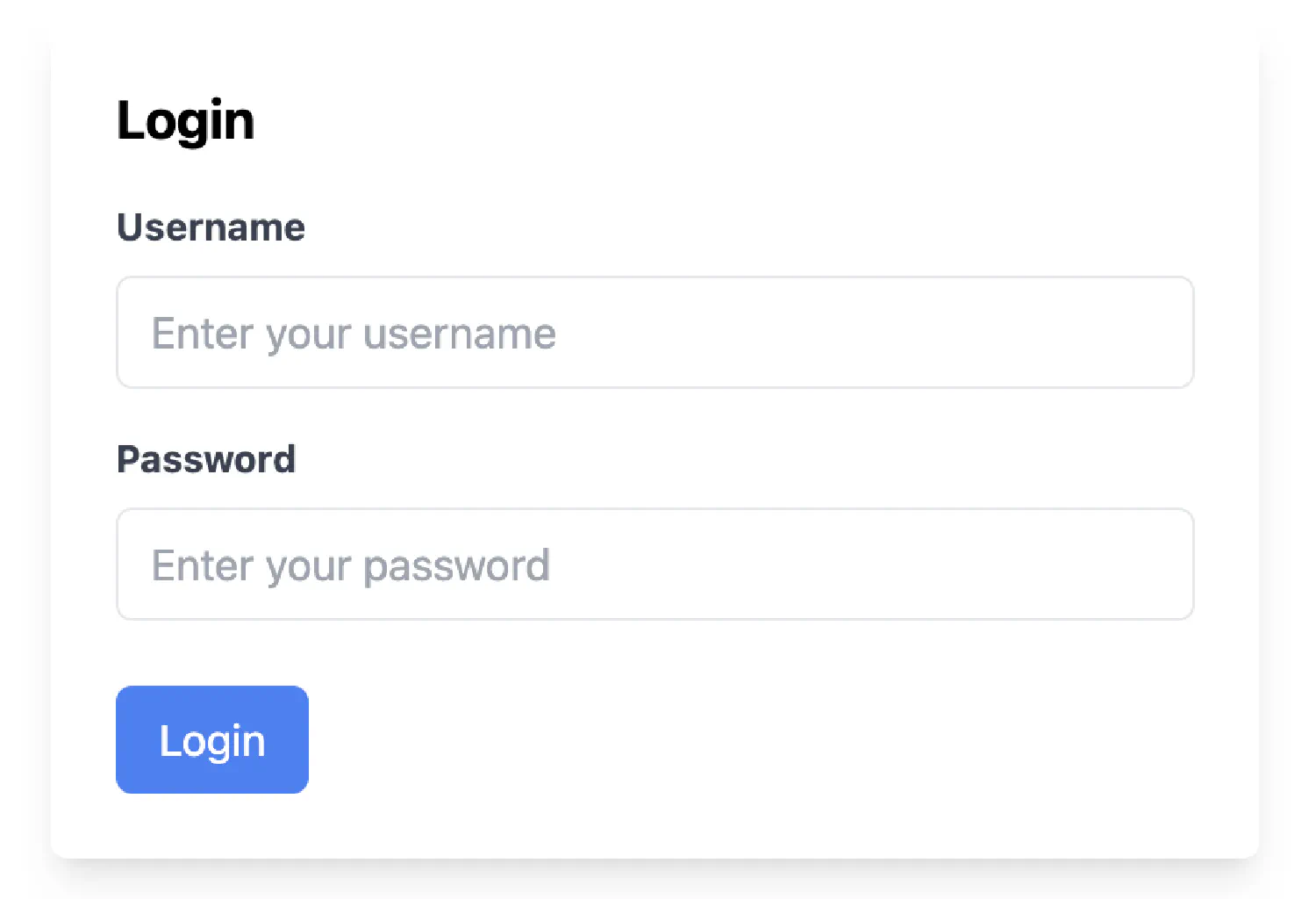
Some commonly used frameworks include Bootstrap , TailwindCSS , Bulma , Foundation , and so on. TailwindCSS is my personal favorite, as it is a utility-first CSS framework that provides low-level utility classes for any custom designs. It is highly customizable and configurable. You can customize it to suit your own unique design preferences.
For example, here is a basic login form I created using TailwindCSS without having to write a single line of CSS.
| |
If you think my articles are helpful, please consider making a donation to me. Your support is greatly appreciated.