This article is outdated. If you are interested in learning HTML and CSS, check out my new course ➡️ HTML & CSS: A Practical Guide.
In this article, we are going to use what we’ve learned about HTML, CSS, JavaScript, and Vue.js so far, to create a portfolio website, which you can use to tell the world about you and your projects. Without further ado, let’s get started.
First of all, let’s create a working directory, and you can call it portfolio. Everything related to the portfolio project should be stored inside the portfolio directory. You can do this differently, but remember to be organized because we are going to add quite a few things later.
Next, go to portfolio and create an HTML file, portfolio.html. Open it with a text editor, you can use the notepad that comes with your operating system if you want, but I recommend using a proper code editor such as Visual Studio Code .
Like we talked about before, an HTML file has the following structure:
This part is pretty straightforward. We first defined the character set that this file is going to use, this information is used by the browser to make sure the characters and symbols are displayed correctly. Next, we defined the description, the keywords, and the author of this web page. This information is not displayed, but they are important for SEO (Search Engine Optimization) purposes. And finally, the title of this web page is declared as well.
We can see that from line 7 to 11, we defined five different types of links. The first three are relative URLs, the fourth one is an absolute URL that you should already be familiar with, and the last one is an anchor link, which we’ll talk about later.
For the first link, Root (/), it will take you to the root of the server, if you are not using a web server, this link will take you to the root of the disk where this HTML file is stored.
For the second link Home1 (portfolio.html), the browser will look for a file named portfolio.html in the current directory. This will lead to problems because as your website gets bigger, it is possible that you don’t know which directory you are currently in.
As for the third link Home2 (/portfolio.html), it is basically the combination of the first two. The browser will always go back to the root directory and then look for the portfolio.html file. This eliminates the possibility of any unexpected errors.
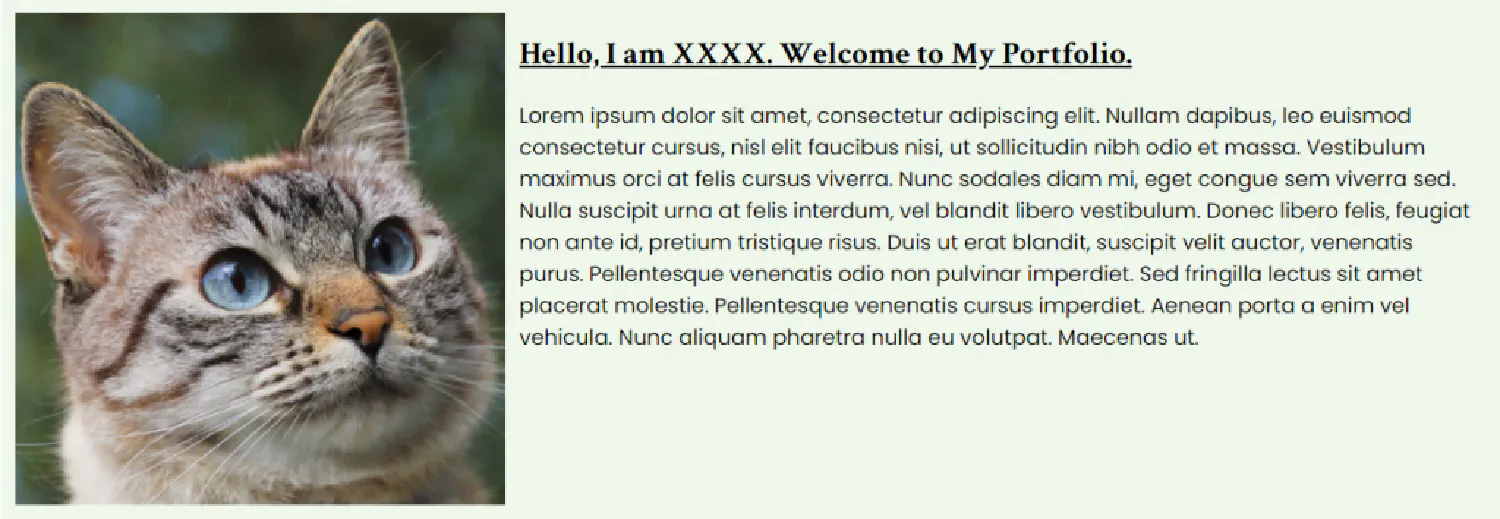
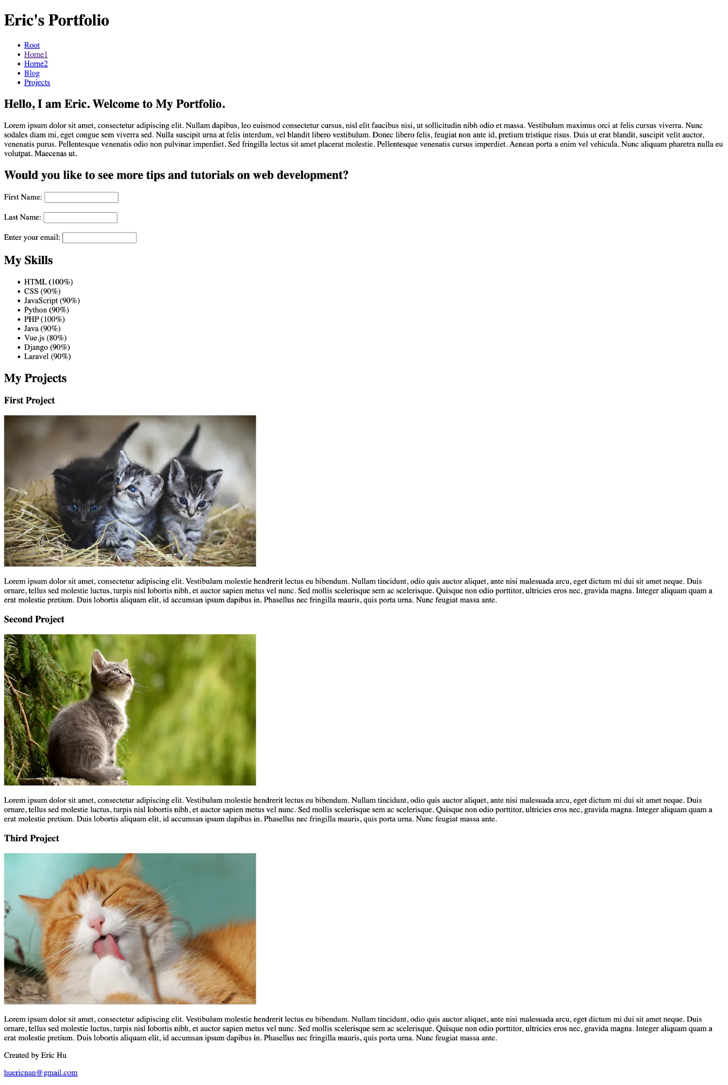
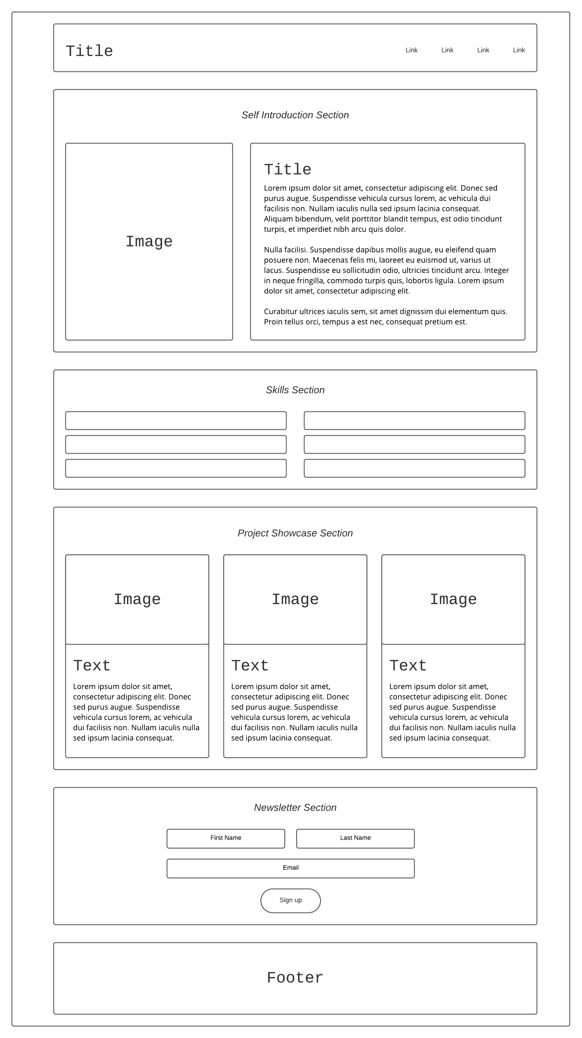
Self introduction section
1
2
3
4
5
<!--Self Introduction Section--><section>
<h2>Hello, I am Eric. Welcome to My Portfolio.</h2>
<p>. . .</p>
</section>
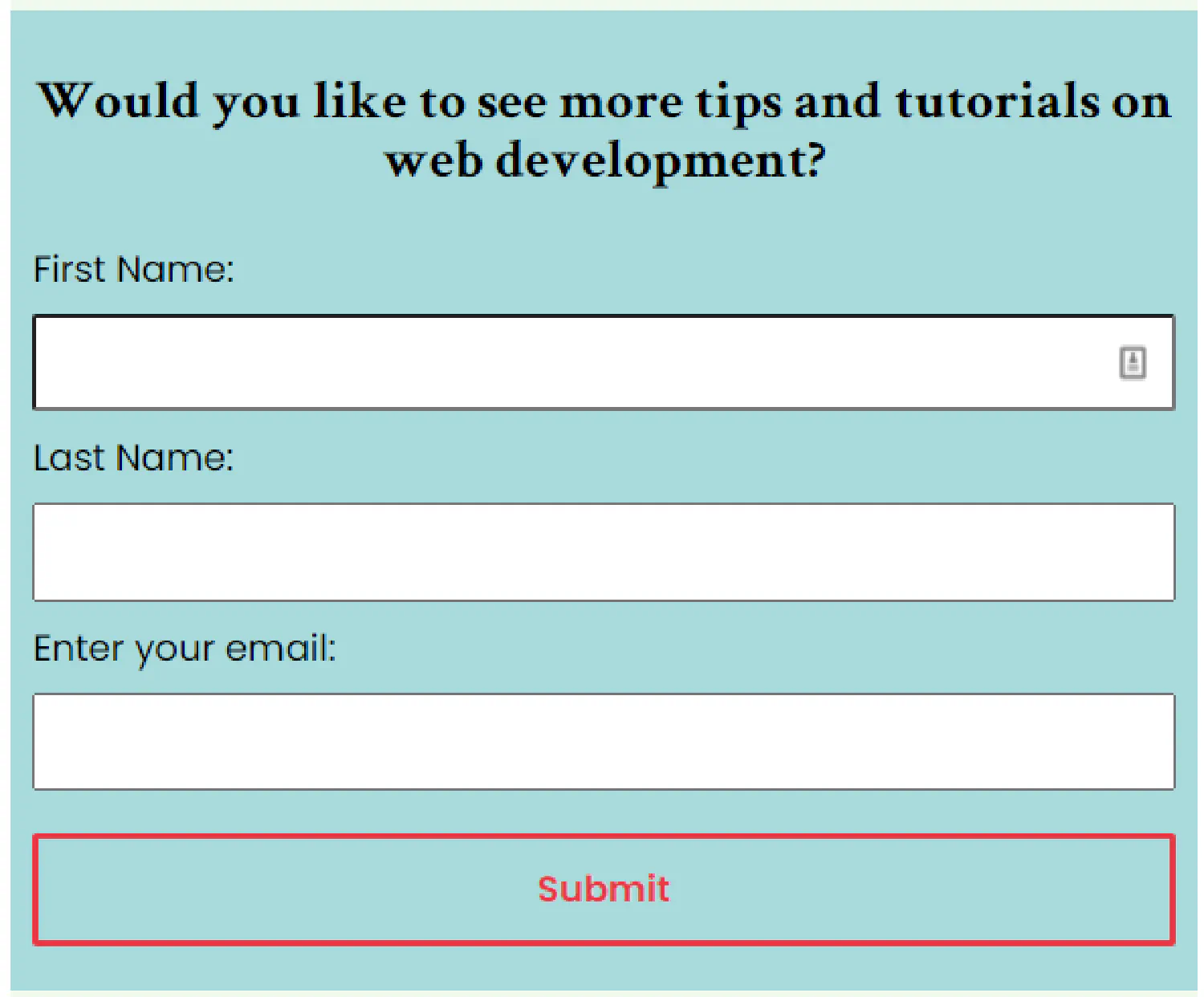
Newsletter sign up section
 1
 2
 3
 4
 5
 6
 7
 8
 9
10
11
12
13
14
<!--Newsletter Sign Up Section--><section>
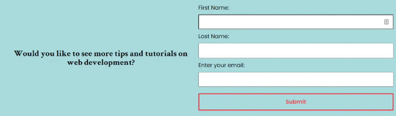
<h2>Would you like to see more tips and tutorials on web development?</h2>
<form>
<labelfor="firstname">First Name:</label>
<inputtype="text"id="firstname" />
<br /><br />
<labelfor="lastname">Last Name:</label>
<inputtype="text"id="lastname" />
<br /><br />
<labelfor="email">Enter your email:</label>
<inputtype="email"id="email"name="email" />
</form>
</section>
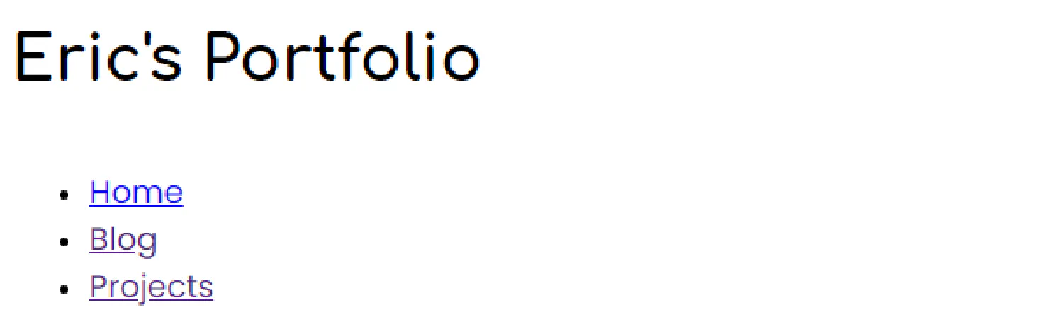
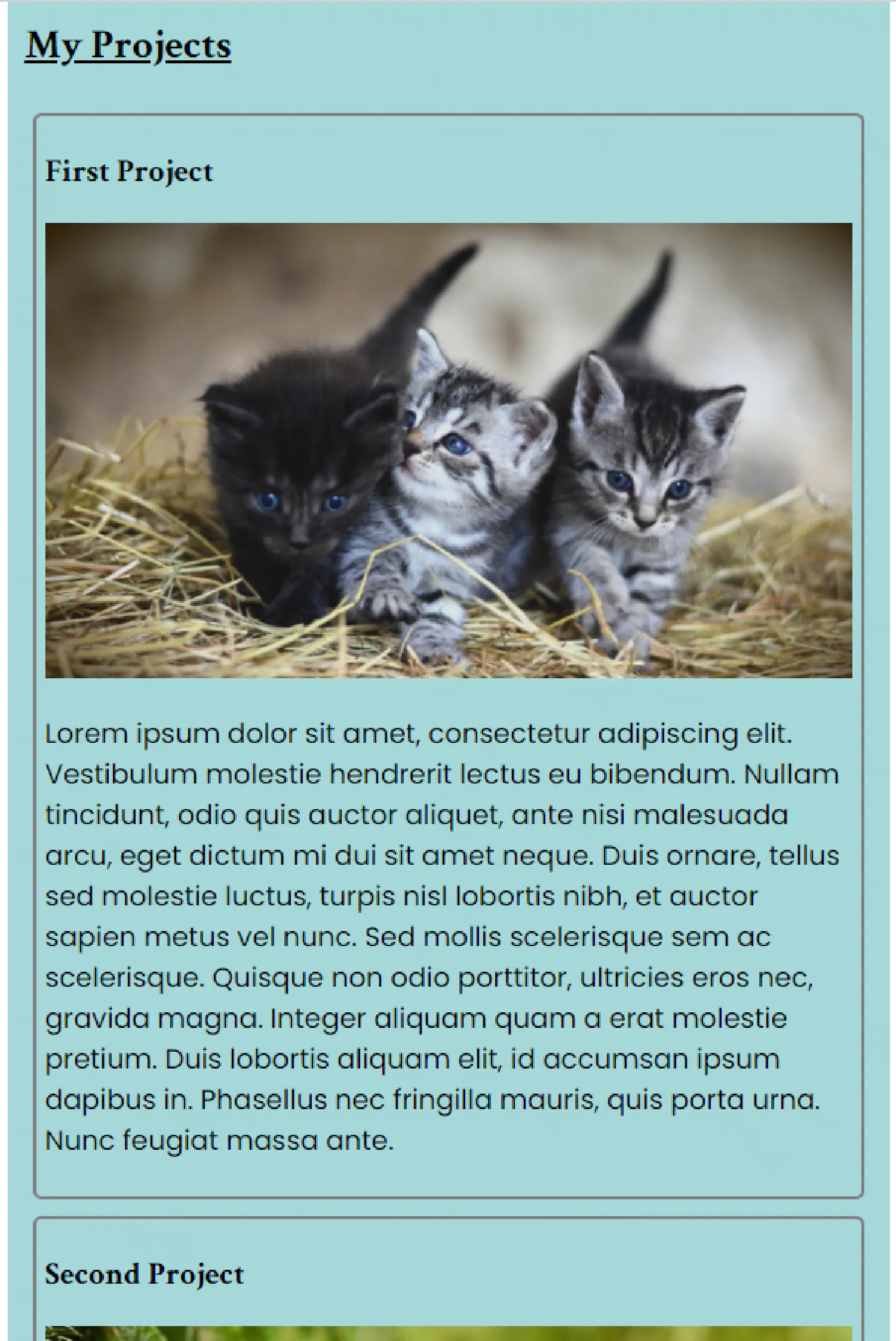
Notice that I give this <section> element an id attribute named project. This is to work with the anchor link that we mentioned before.
1
<ahref="#project">Projects</a>
This link will send you to the element whose ID is project. Also note that you should always use the ID to specify which element you wish to anchor so that it is unique in the entire web page.
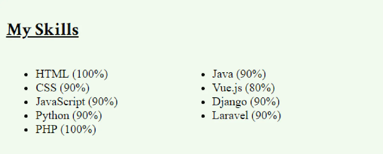
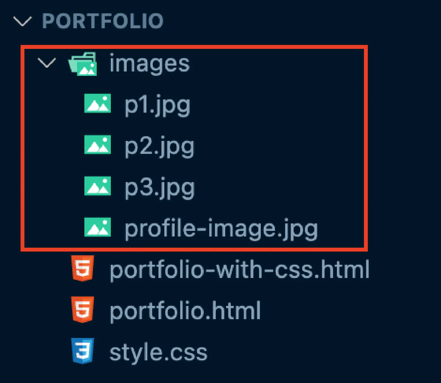
As for the images in this section, they are all stored in a folder called images under the folder portfolio.
Footer section
1
2
3
4
5
<!--Footer--><footer>
<p>Created by Eric Hu</p>
<p><ahref="mailto:huericnan@gmail.com">huericnan@gmail.com</a></p>
</footer>
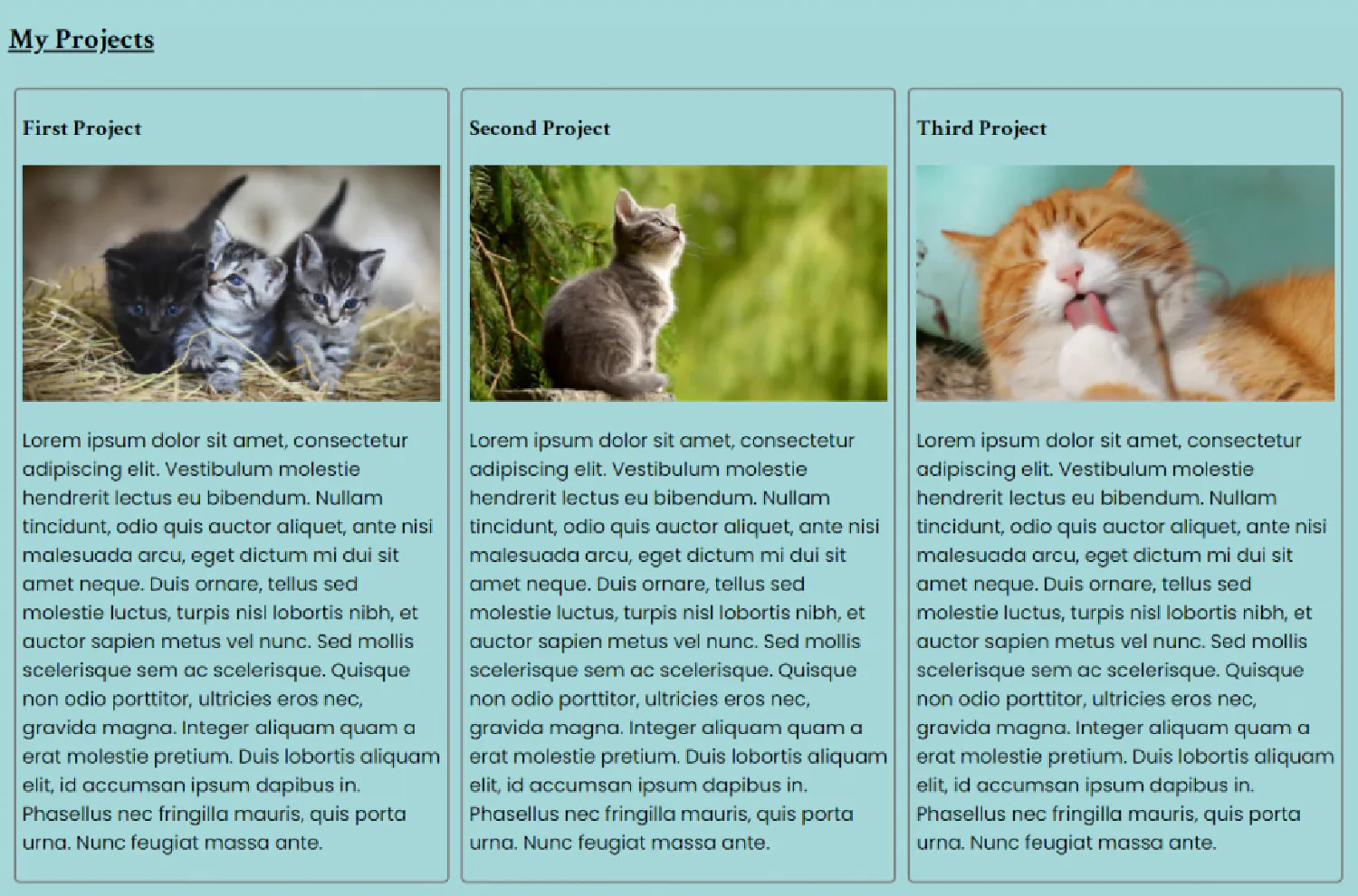
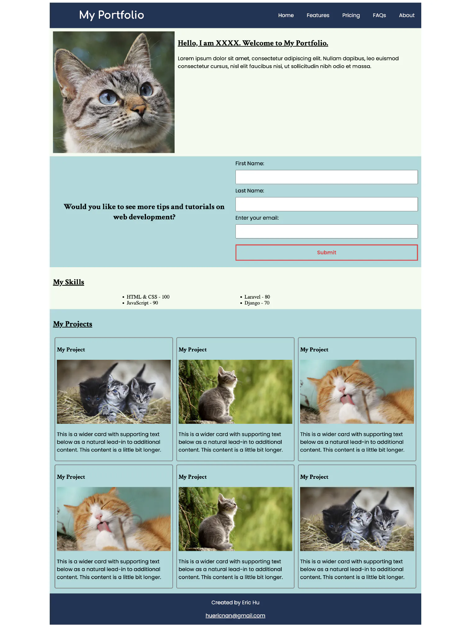
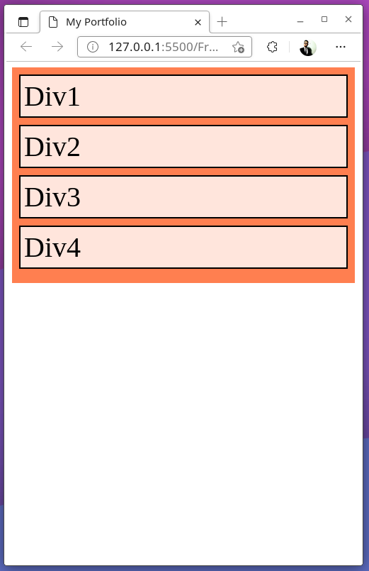
This is what the final result looks like. However, we have a new problem, yes, it looks terrible, and it’s not going to land you any job looking like this. But don’t worry, in the next part of this tutorial, we’ll find a way to make this web page more appealing using CSS.
Now it is time for us to make our portfolio website look better with CSS. Please understand that I’m not a professional designer, so forgive me if my design is terrible. But I will try to explain the basic concepts as clear as possible.
Let’s first create a style.css file, and then import it into our HTML document.
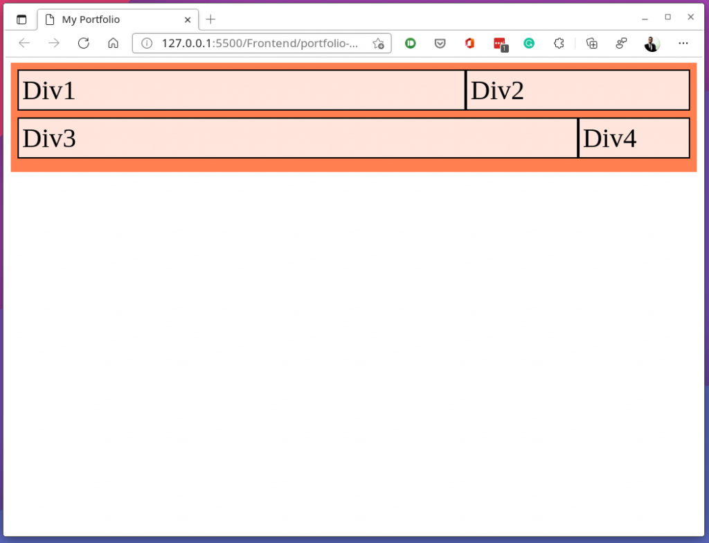
Let’s first start by designing a responsive layout for our portfolio. Remember that a responsive layout should have two key components, a container and a grid system.
First, we should have a fluid container that changes width as you resize your browser window. We usually set a maximum width on large screens so that the container does not stretch to the edge. However, on smaller screens, we usually set its width to 100% to utilize as much space as possible.
To keep things simple, here we only have one breakpoint. If the screen width is less than 1200px, the container stretches to its edge. If the screen is larger than 1200px, the maximum width of the container will be set to 1140px. Notice that in the second scenario, we defined margin: auto;, this is to make sure that the container is always entered.
Screen Size
Result
Small Screen
Medium Screen
Large Screen
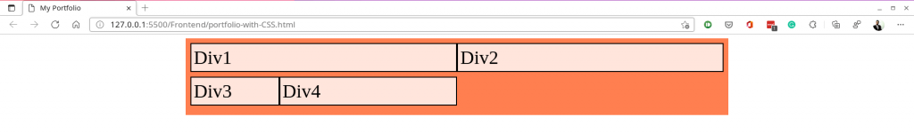
Second, we need to have different grid systems for the small screen (mobile phone), medium screen (tablet), and large screen (desktop). Each grid system contains 12 columns, and different elements could take up different columns on different screens. This could be realized by either the regular grid system or the flexbox. In this tutorial, we are going to use the flexbox.
This is the exact same code we talked about before in this article: CSS Basics #2. Let’s see how it works.
Screen Size
Result
Small Screen
Medium Screen
Large Screen
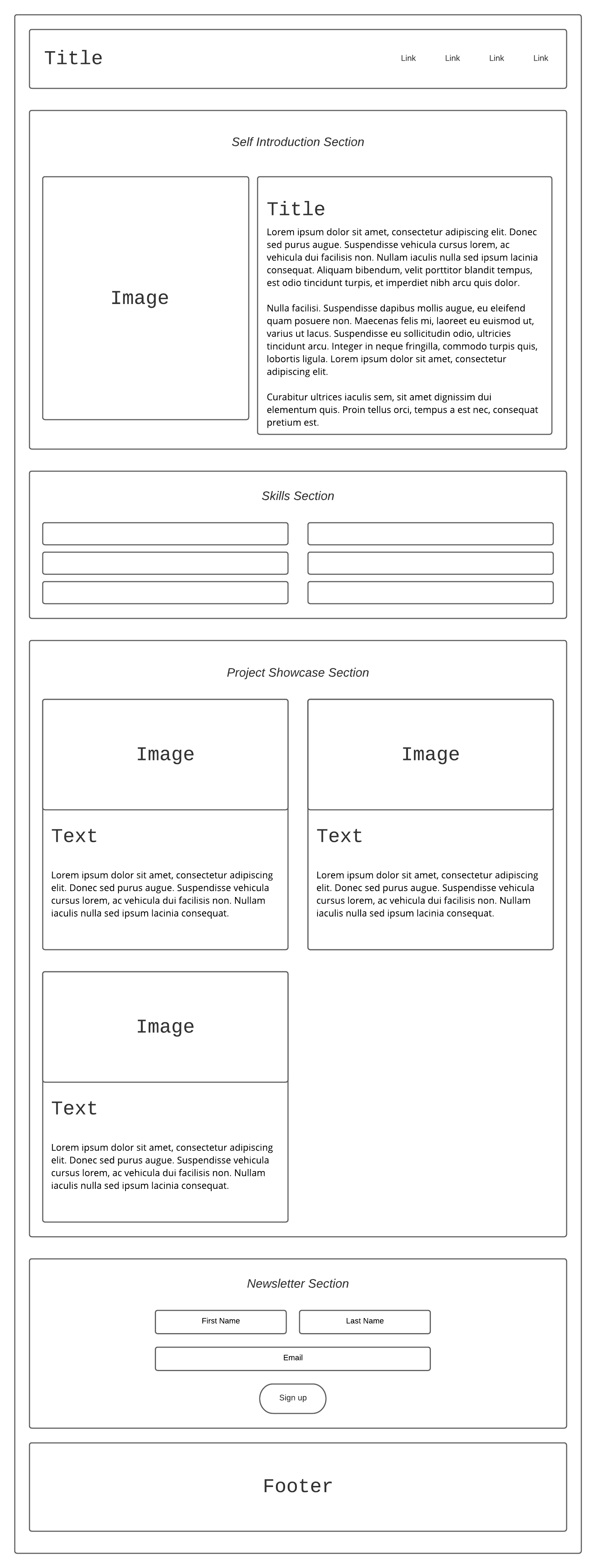
Now that we are done with designing the general responsive layout, it is time for us to go into the details. As a guide, the portfolio page we design should look like this:
The images are too big to be displayed here, but you can download them yourself.
Next, before we start designing the webpage, let’s first choose the color scheme and the font we are going to use. This might be difficult if you are not a professional designer, but don’t worry, there are several tools that can help us.
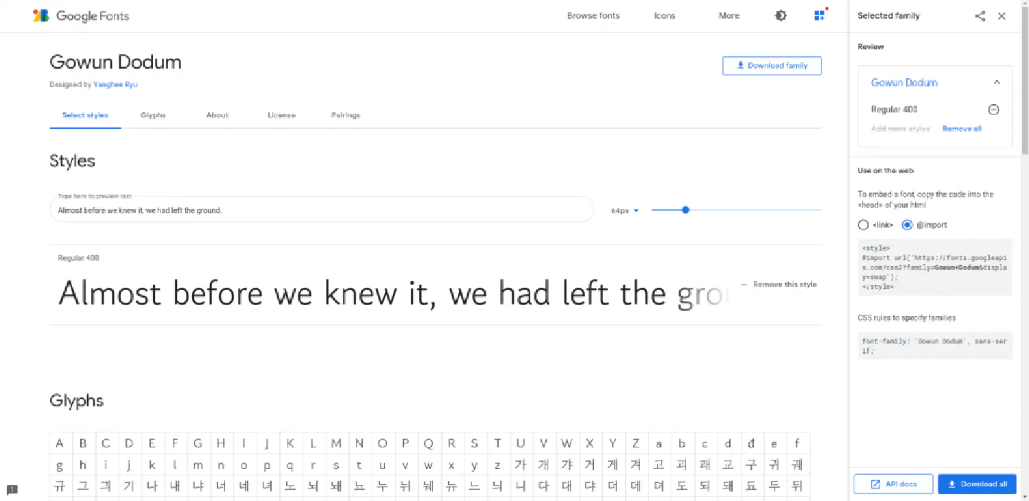
To find a nice-looking color scheme, we can use this website: Coolors , which offers hundreds of different color palettes with color codes. As for the fonts, the common practice is to use Google Fonts . We can select any font and use it in our CSS file.
Next, on small devices, we want <header> to stay on top of <nav>, and on larger screens, we want to put <header> on the left side and <nav> on the right side.
To achieve this, we need to make sure that the <div> element is also a flexbox container. So, this is what we can do:
This is the navbar we have. Next, since we only care about small devices right now, we need to center the header and the nav list. This is what we can do:
Finally, we need to change how the navbar looks on desktops, and apparently, we don’t want everything to be centred. Instead, we want the links to align to the right side.
<!--Newsletter Sign up Section--><sectionclass="col-12 col-s-12 newsletter-signup">
<h2class="col-6 col-s-6">
Would you like to see more tips and tutorials on web development?
</h2>
<formclass="col-6 col-s-6 newsletter-signup-form">
<labelfor="firstname">First Name:</label><br />
<inputtype="text"id="firstname" />
<br />
<labelfor="lastname">Last Name:</label><br />
<inputtype="text"id="lastname" />
<br />
<labelfor="email">Enter your email:</label><br />
<inputtype="email"id="email"name="email" />
<buttontype="submit">Submit</button>
</form>
</section>
<!--Footer--><footerclass="col-12 col-s-12 footer">
<p>Created by Eric Hu</p>
<p><ahref="mailto:huericnan@gmail.com">huericnan@gmail.com</a></p>
</footer>
Lastly, in this section, we are going to upgrade our portfolio website using Vue.js. Let’s start by creating a new working folder and set up a new Vue.js project by running the following commands:
1
2
3
4
npm init vue@latest
cd <your-project-name>
npm install
npm run dev
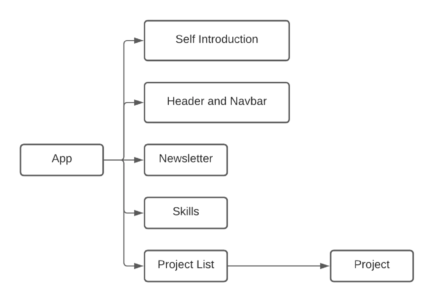
For this project, I’ve decided to use the following structure:
App.vue is the root component, which has five child components. One of those child components, ProjectListComponent.vue, has another child, ProjectComponent.vue, forming a very simple nested structure.
Of course, you can use whatever structure you want. For example, you could have a MainComponent that contains self-introduction, skills, newsletter and project list as child components, which makes a slightly more complicated structure. Or, if you don’t want so many components, you can combine the self-intro, skills and newsletter section as one single component. Vue.js gives you the freedom to structure your project however you want, as long as it makes sense to you.
First, we need to edit the index.html file, which is the entry point of our project. We need to edit some meta information.
Remember that we need to import the CSS code inside the root component, so that it applies to all other components as well. In this tutorial, I put the CSS file under the directory /src/assets/. Go to the browser, and you should see the navbar appearing.
Everything seems to be working, but now we have a new problem, since everything is hardcoded, if you want to change something, you have to change the code itself. Our goal here, however, is to make the webpage dynamic and reactive, meaning if you wish to change something, all you need to do is to change the corresponding data stored in the database.
To achieve this, we need to bind some information with variables. In the case of our navbar, we can bind the website name as well as the navigation links.
As you can see, here we put both the websiteName and the navLinks in the HeaderComponent, but is that the best solution? We already know that the websiteName will appear again in the FooterComponent, and since different components are rendered separately, that means the websiteName has to be retrieved from the database twice, which would be a waste of valuable resources.
An alternate solution would be putting the websiteName inside the root component (App.vue), and from there, we can pass the data down to the child components that need to use it.
To save us some time, I’m not going to include the other components in this article, but you can still download the source code here . However, I do recommend you to try it yourself before looking at the source code.
If you think my articles are helpful, please consider making a donation to me. Your
support is greatly appreciated.