How to Create Custom CSS Animations
This article is originally published at FreeCodeCamp .
Animations are a crucial component of modern web design. They enable you to create dynamic and engaging web elements that attract more customers and drive more sales.
In this article, we will discuss how to create cool custom animations using CSS.
Prerequisites #
Before going forward with this article, make sure you possess basic knowledge regarding HTML and CSS. This assumes you are familiar with CSS selectors, defining element size and color, positioning elements, adjusting opacity , and transforming elements.
How to create your first CSS animation #
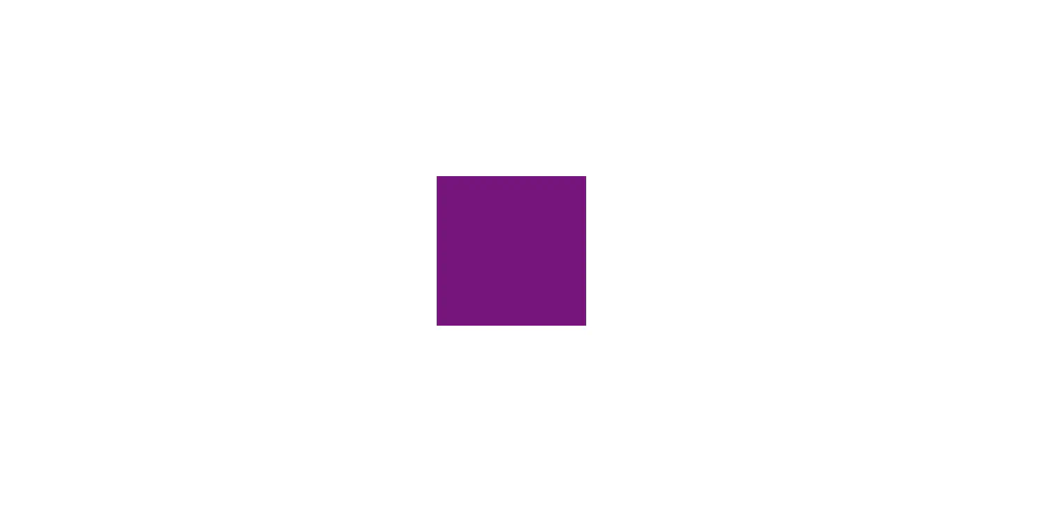
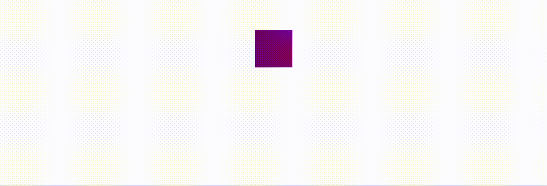
Let’s start by preparing an HTML element.
| |
| |
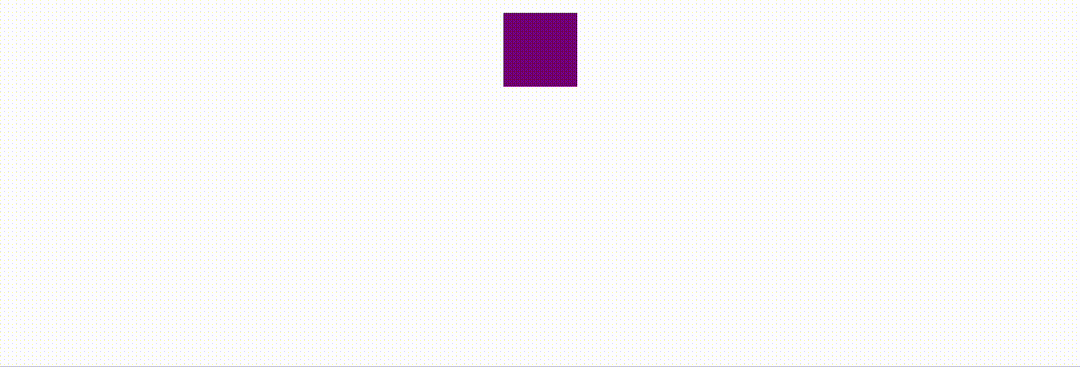
Line 7 to 10 is a commonly used method to center an element using CSS. Here’s the result of the above code:
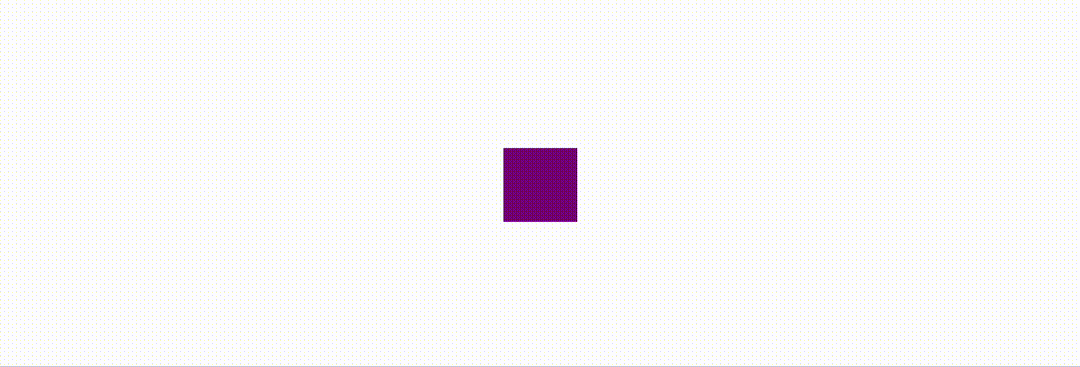
Before we start crafting the animation, you must first think about what kind of effect you wish to achieve.
For example, for this tutorial, I want to create a bouncing effect for the square. This means I need to create an animation based on the top property so that the square can move up and down.
| |
To define an animation, you must utilize the @keyframes rule, which allows you to define keyframes in the animation process.
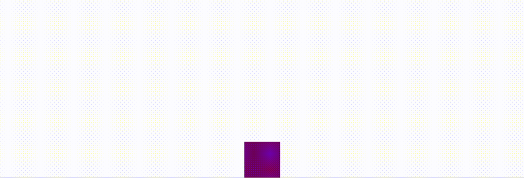
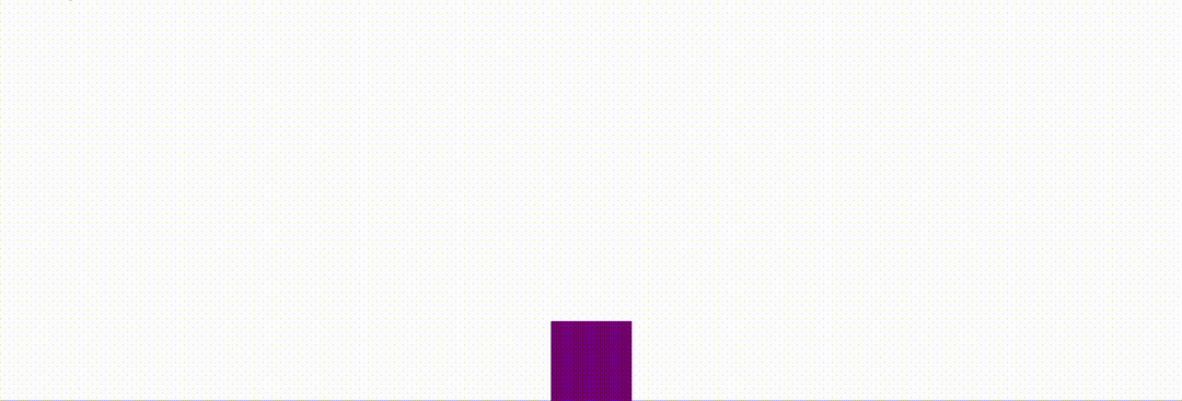
The keyframes are set with percentage values, starting from 0% and finishing with 100%. For instance, in our example, the animation will start from top: 90%;, and end with top: 10%;, and after that, it will reset back to 50%.
And, of course, you need to tie the bounce animation with the square (animation-name) and also tell the browser how long you want this animation to last (animation-duration). Here’s how you do that:
| |
How to add multiple keyframes #
However, as you can see, the square starts from the bottom, moves to the top, and then resets back to the center. That is not exactly a bouncing effect. So, how can we make the square move back down?
To do that, you can set up a third keyframe like this:
| |
This way, the square will start from the bottom (top: 90%;), move to the top (top: 10%;), and then move back down (top: 90%;).
How to create a repeat animation #
There is one problem that still needs to be solved. The animation only plays once. In practice, you might want your animation to repeat several times to create the effect that the square is actually bouncing.
Instead of creating more keyframes, which is not easy, you can define an animation-iteration-count property and specify the number of times you want the animation to repeat.
| |
And if you want the animation to last indefinitely, simply specify infinite.
| |
How to use a timing function for smoother animation #
Finally, the bouncing effect started working, but there is still room for improvement. The movement of the square seems a bit unnatural. The bouncing effect would look better if you could smooth out the movement.
This can be achieved with a timing function. By default, the browser will assume a linear timing function, which means the animation will have constant speed from start to end. But that can be changed using the animation-timing-function property.
| |
By specifying ease-in-out, you are telling the browser to start the animation slowly and also end it gradually. As a result, the entire animation would look a lot smoother.
The Cubic Bezier curve #
The value ease-in-out actually represents a mathematical equation called Cubic Bezier . I will spare you the complex mathematical definitions, and you only need to know that the function defines a curve with four control points.
cubic-bezier.com is an online tool that allows you to customize the curve by simply dragging the control points.
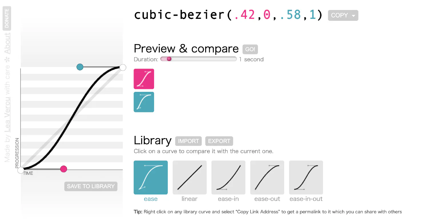
The points control the shape of the curve, and the slope of the curve then controls the speed of the animation. For example, the above graph indicates the animation will start slowly, accelerate, and then end smoothly.
| |
In most cases, you don’t have to define a customized Cubic Bezier curve. There are several predefined curves that should be enough for most use cases.
easerepresents the curvecubic-bezier(0.25, 0.1, 0.25, 1). The animation will start by slowly accelerating and then decelerate to stop.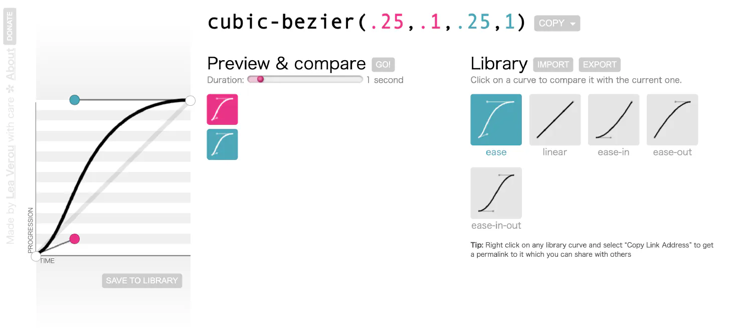
ease-inrepresents the curvecubic-bezier(0.42, 0, 1, 1). The animation will start smoothly and then stop rather abruptly.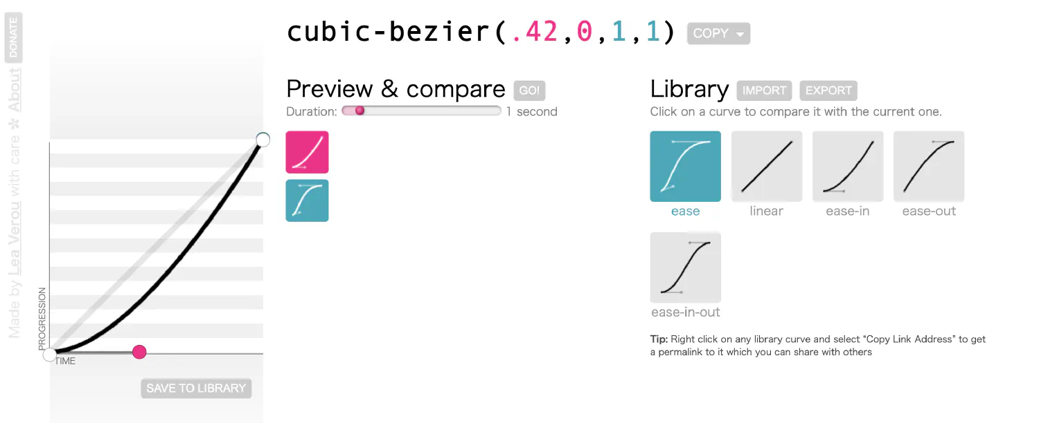
ease-outrepresents the curvecubic-bezier(0, 0, 0.58, 1). The animation will start abruptly and then slow down to stop smoothly.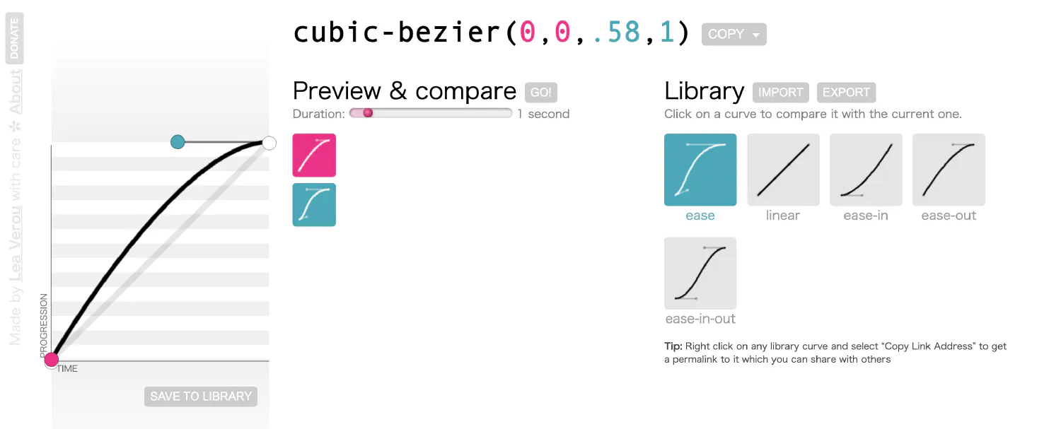
ease-in-outrepresents the curvecubic-bezier(0.42, 0, 0.58, 1). The animation will be smooth on both ends.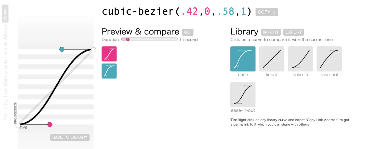
The steps function #
Besides the smooth curve, you can also specify a stepping function. The function steps() takes two arguments. The first one specifies the number of steps, and the second one sets the point at which the change occurs within the step, either start or end.
| |
In this case, the animation will be divided into five steps, and for each step, the change will happen at the beginning of the step.
There are also two shortcuts available for the steps() function. step-start corresponds to steps(1, start). And step-end corresponds to steps(1, end).
How to combine multiple animations #
So far, we’ve covered all the fundamentals you should understand to create CSS animations. And now, it is time to get more creative.
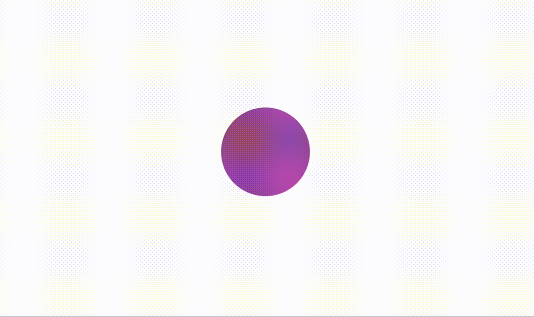
Our previous examples all focused on changing the top property in order to create the bounce effect. You can, in fact, combine multiple properties in one animation. For example, you can create a pulse effect by changing the element’s shape and opacity together.
| |
| |
Also note that the animation properties can be combined into a shortcut, animation.
Other animation-related properties #
Besides the animation properties we have discussed so far, there are some miscellaneous properties we should talk about. They could also be useful sometimes. First of all, there is the animation-direction property, which defines how the animation will be played. The property accepts four different values:
normal: The animation is played forward.reverse: The animation is played backward.alternate: The animation is played forward first, then backward. It only works whenanimation-iteration-countis more than 1.alternate-reverse: The animation is played backward first, then forward.
By default, the animation will start playing immediately after the page is loaded. But you can change that with the animation-delay property, which specifies how long you wish to wait before the animation starts.
Lastly, the animation-fill-mode property determines how the element will be displayed before and after the animation is played. By default, the element will not retain any styles from the animation. After the animation stops, the element will reset to normal.
When animation-fill-mode is set to forwards, the element will retain the styles from the last keyframe of the animation after the animation is played.
When set to backwards, the element will take on the styles from the first keyframe of the animation as soon as the animation is played.
When set to both, the element will retain the styles from the first keyframe before the animation starts (behaves like backwards), and it will also retain the styles from the last keyframe after the animation is finished (like forwards).
Conclusion #
This tutorial covered everything you need to know to start creating CSS animations using the @keyframes rule.
| |
We also went over several animation-related CSS properties:
animation-duration: Defines how long the animation will last.animation-iteration-count: Defines how many times the animation will repeat.animation-timing-function: Specifies the timing function, which controls the speed at which the animation is played.animation-direction: The direction in which the animation is played.animation-delay: The delay before the animation begins.animation-fill-mode: Whether or not to retain styles from the animation after it is finished.
For further readings on HTML and CSS, check out this course series -> HTML & CSS: A Practical Guide.
If you think my articles are helpful, please consider making a donation to me. Your support is greatly appreciated.