CSS Basics #1: Getting Started
This article is outdated. If you are interested in learning HTML and CSS, check out my new course ➡️ HTML & CSS: A Practical Guide.
The Cascading Style Sheet (CSS) is used to control the presentation and layout of HTML documents. It provides a way to separate the content of a web page from its presentation and design. With CSS, developers can define styles such as font, color, size, spacing, and positioning, and apply them to multiple elements on a web page. This makes it easier to manage and maintain the look and feel of a website, as well as provide a more consistent experience for users. CSS can be written in separate files or embedded within an HTML document, and it works in conjunction with HTML to create visually appealing and well-designed websites.
In CSS, you can define a set of rules that can be applied to a particular element or a group of elements on your web page.
For instance, the following example defines that all the <h2> elements in the HTML document should be red, and the size of the texts should be 5em, where em is a relative unit for font, 5em means five times the size of the original font.
| |
The h2 here is called a selector, it selects the HTML elements that we are going to style. And we have a set of different declarations wrapped inside the curly braces {}, which are in the form of “property: value” pairs.
Applying CSS to HTML pages #
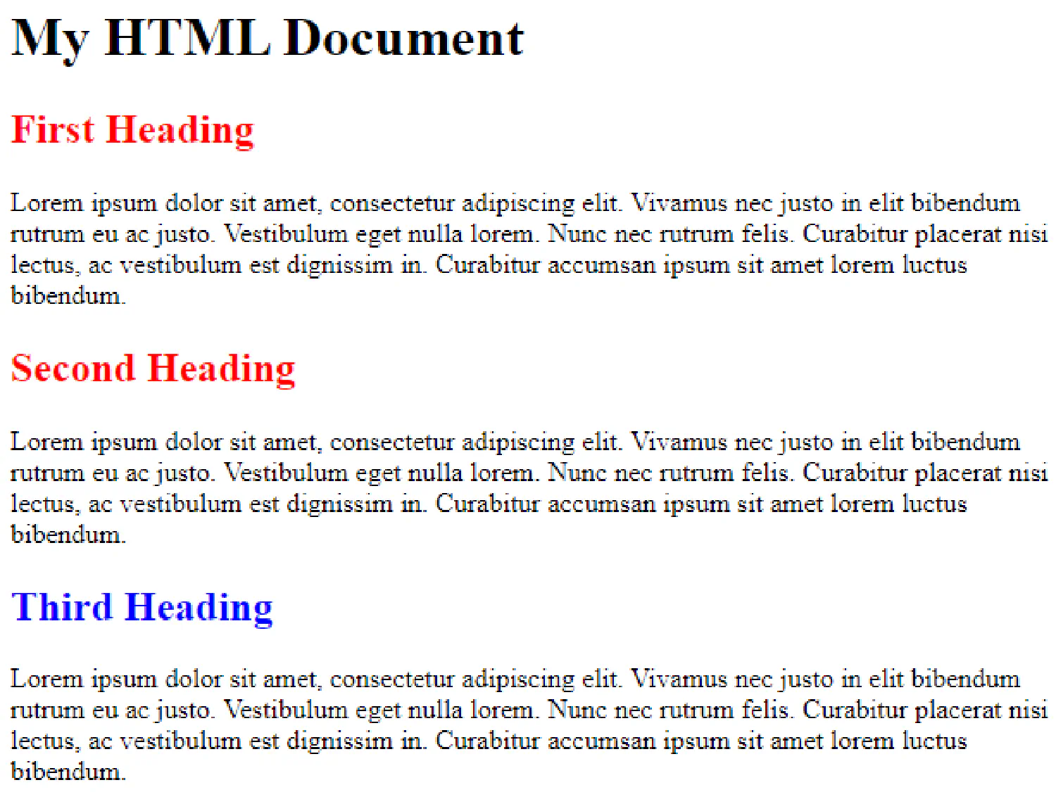
There are three different ways to apply CSS rules to an HTML document. Let’s consider this example:
| |
Now, our objective is to make both second-level headings (<h2>) red and underlined using CSS.
Inline CSS #
First, we can add the CSS declarations as attributes for the HTML elements like this:
| |
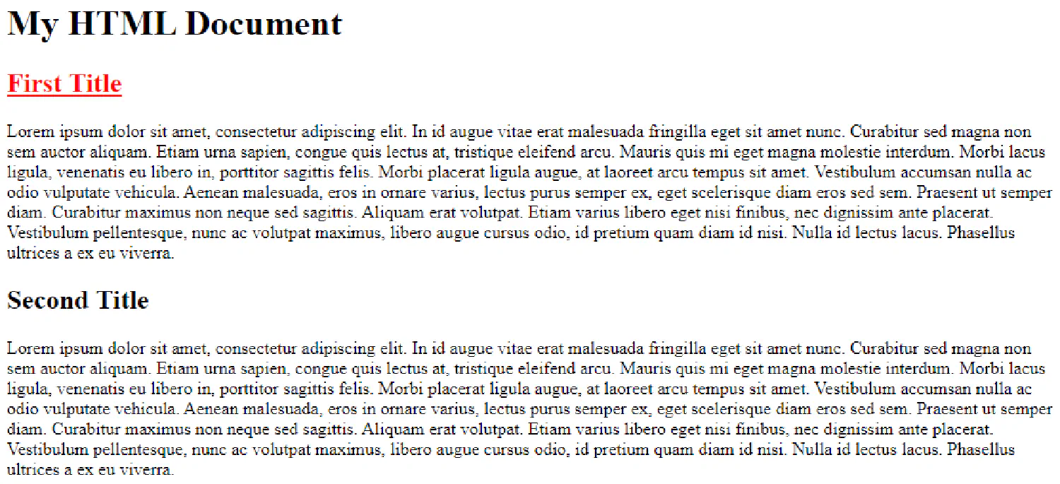
And as you can see, only the first heading is changed. So in order to change both of them, we have to add the style attribute to both headings. That is a very time-consuming task for a large HTML document, so it is not the recommended method to insert CSS.
Internal CSS #
We can also put the CSS code in the <head> section of the HTML document like this:
| |
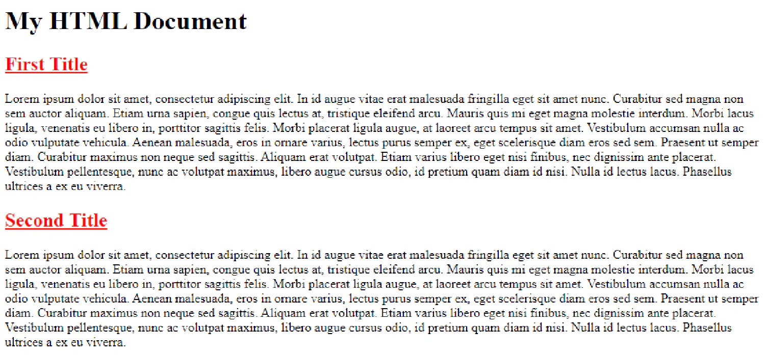
And as you can see, this time, both headings are changed. However, the downside of putting HTML and CSS together is that the document could easily get too large as the web page grows, which is not good for future maintenance.
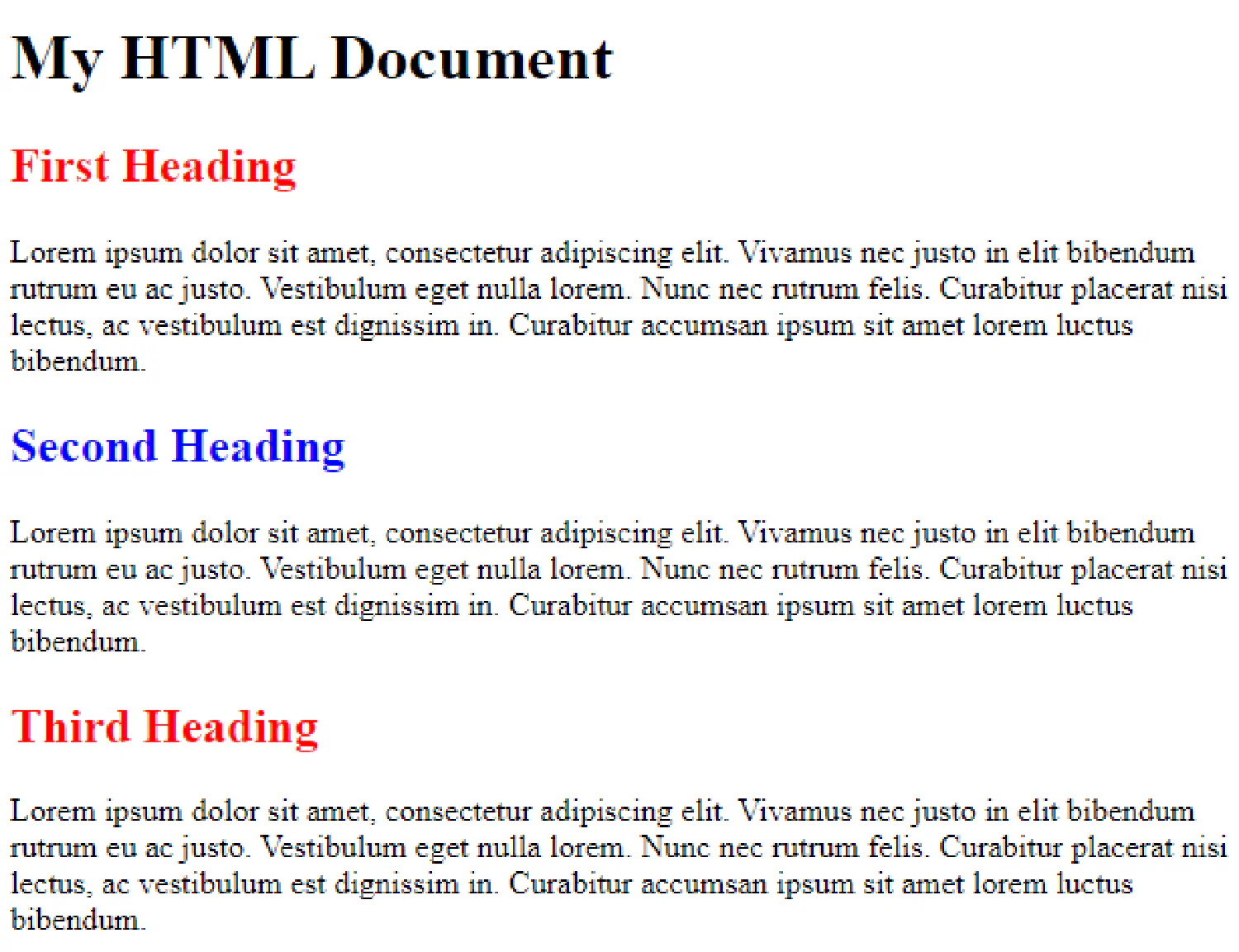
External CSS #
The best way to deal with CSS and HTML is to put them in separate files, and then in the HTML document, we will reference the external CSS in the <head> section. For example, here we have two documents, document.html and style.css:
document.html
| |
style.css
| |
The document object model #
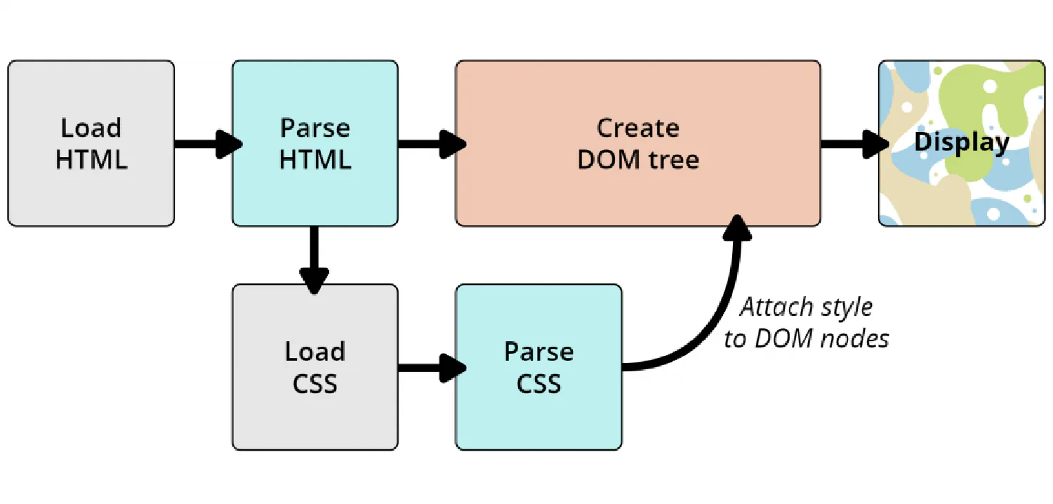
We already introduced the concept of the Document Object Model (DOM) in the HTML Basics article of this tutorial series. The DOM has a tree-like structure. Every HTML element is a node in this tree structure.
When the browser displays a document, it first reads the document’s content (HTML) and converts it into a DOM tree, and then it will parse the style information (CSS) and assign it to the corresponding node of the DOM tree. The following graph from MDN Web Docs illustrates this process.
Let’s take a look at another example,
| |
Here is the corresponding DOM tree. We can see that we have three block-level elements (two <div> elements and one <section> element) who are siblings to each other, and each of them has a heading and a paragraph.
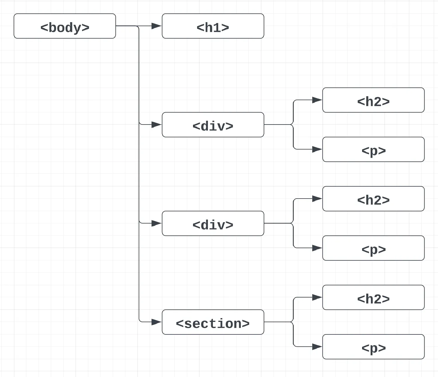
Our objective is to locate the headings in the <div> blocks and make it red, and then find the heading under the <section> block, and make it blue.
| |
That looks easy, right? We first locate both <div> elements and find the <h2> headings under the <div> blocks, and then in the declaration section, we set the color to red. After that, we do the same thing for the <section> block.
How to select HTML nodes #
However, as your HTML document gets bigger, this method may cause problems, because you are likely to use the same block-level element for different purposes, and you don’t want all of them to have the same style. So, the common practice is to use the class and id attributes as selectors instead.
class and id selectors #
This is the most common type of selector that we use in CSS. You select either a group of elements or a specific element based on its class or id.
| |
Here is an example:
| |
| |
As you can see, it is possible for us to put different types of elements in the same class.
Attribute selectors #
You can also select elements based on the presence of a certain attribute.
| |
| |
This selector will find all the second-level headings that have an id attribute and set its color to red.
Pseudo classes #
Finally, there is something called a pseudo-class in CSS, which only selects an element when it is under a certain state. The :hover pseudo-class, for example, selects an element only when the cursor hovers over it. Try the following example in your own browser. The headings will turn red when the cursor hovers over them.
| |
| |
Some commonly used CSS properties #
Colors #
In the remaining part of this article, we are going to take a look at some of the most commonly used CSS rules. Let’s start with colors.
There are four different ways we can define a color in CSS. The easiest method is to use a predefined color name like this:
| |
| |
The colors can also be specified using RGB values, HEX values or HSL values like this:
| |
| |
Texts and fonts #
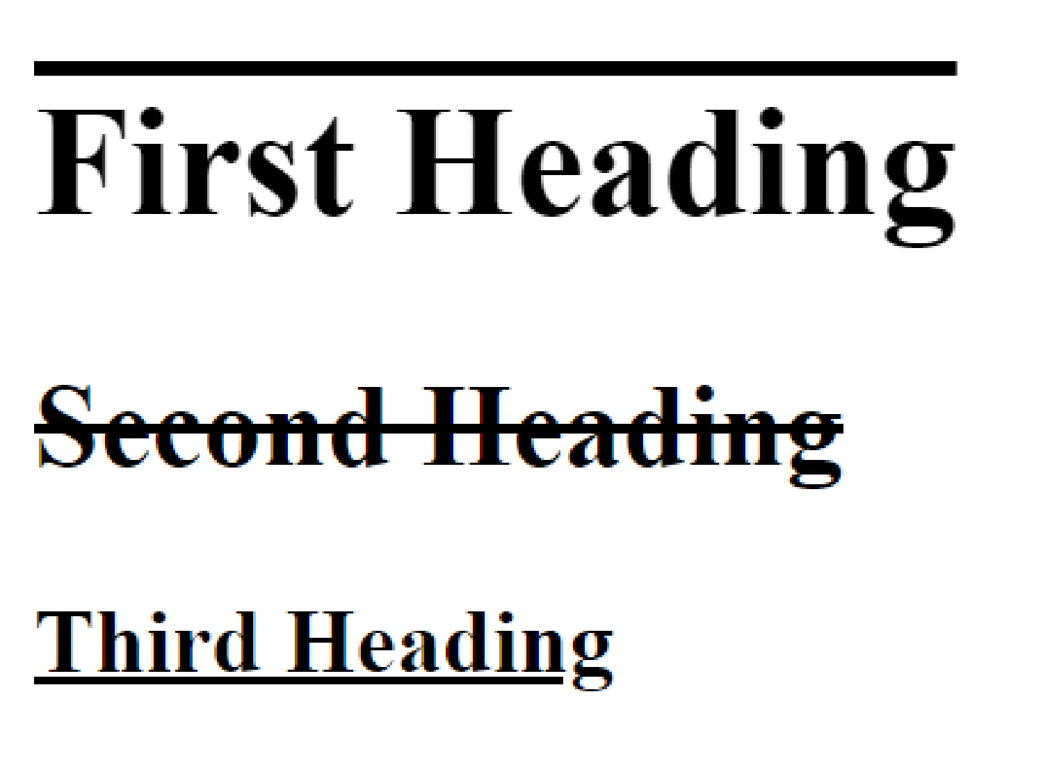
We can also customize texts using CSS. Besides setting text color, we can add or remove decorations using the text-decoration property:
| |
| |
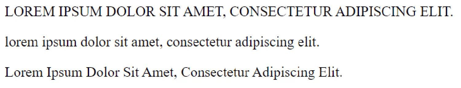
Or we can transform the text into uppercase, lowercase or the capitalized form:
| |
| |
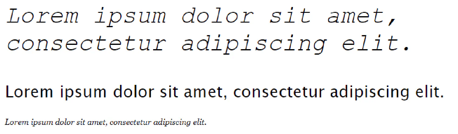
In order to make the texts more appealing, we can assign different fonts to our texts like this:
| |
| |
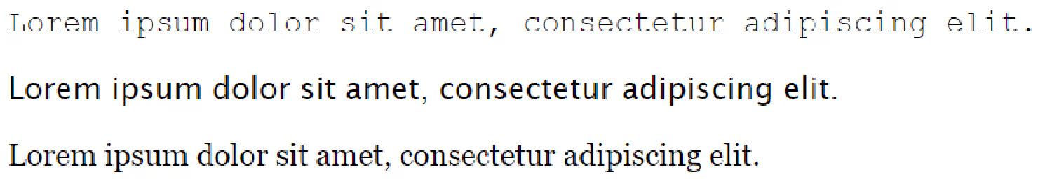
As you can see, here we assigned several fonts for each paragraph. That is to ensure there is a fallback system in place, if the first font is not available, the browser will go to its generic “siblings” instead.
Finally, we can also define the style, weight and size for the font:
| |
Links #
Previously, we talked about pseudo-classes, which describe the state of the elements. Links are where we use pseudo-classes the most often. A single link could have four different states:
a:link- a normal, unvisited linka:visited- a link the user has visiteda:hover- a link when the user mouses over ita:active- a link the moment it is clicked
Using these four states, we can style a link like this:
| |
| |
| Link | Style |
|---|---|
| Unvisited Link | 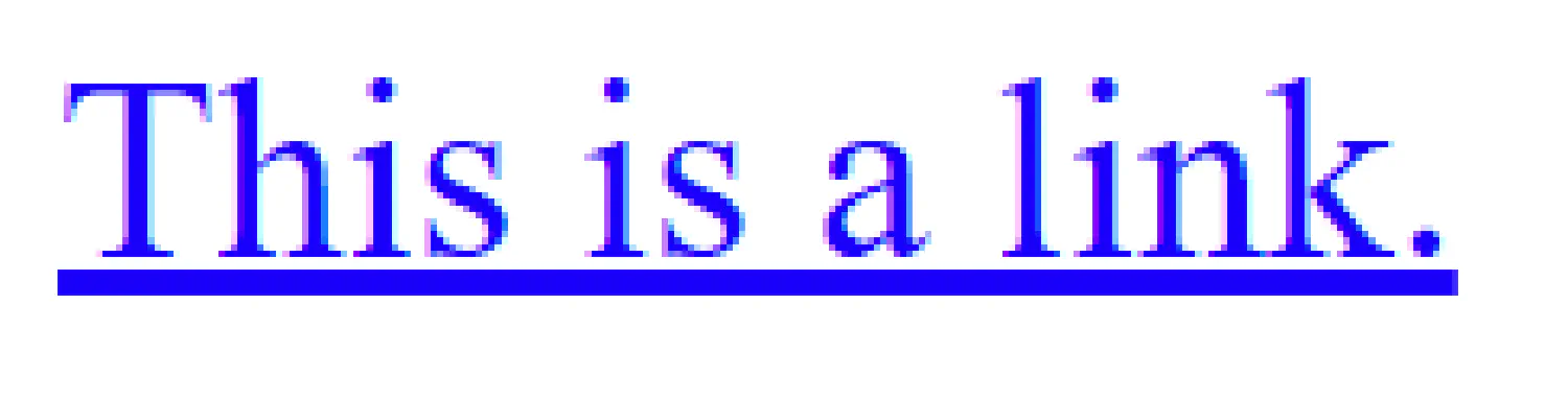 |
| Hovered Link | 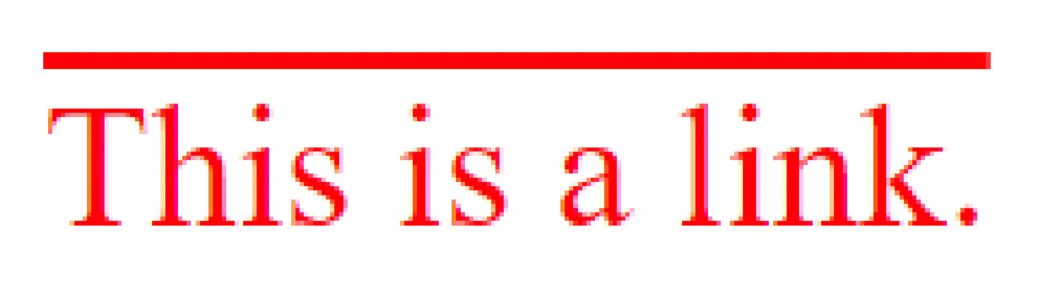 |
| Active Link |  |
| Visited Link | 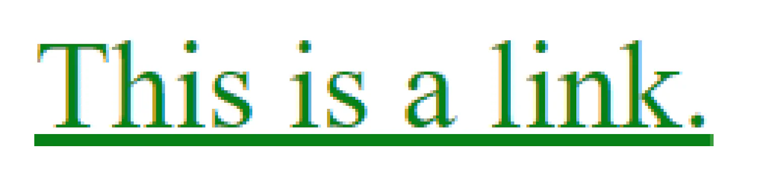 |
Tables #
The look of an HTML table can also be greatly improved with CSS. A typical HTML table looks like this:
| |
| |
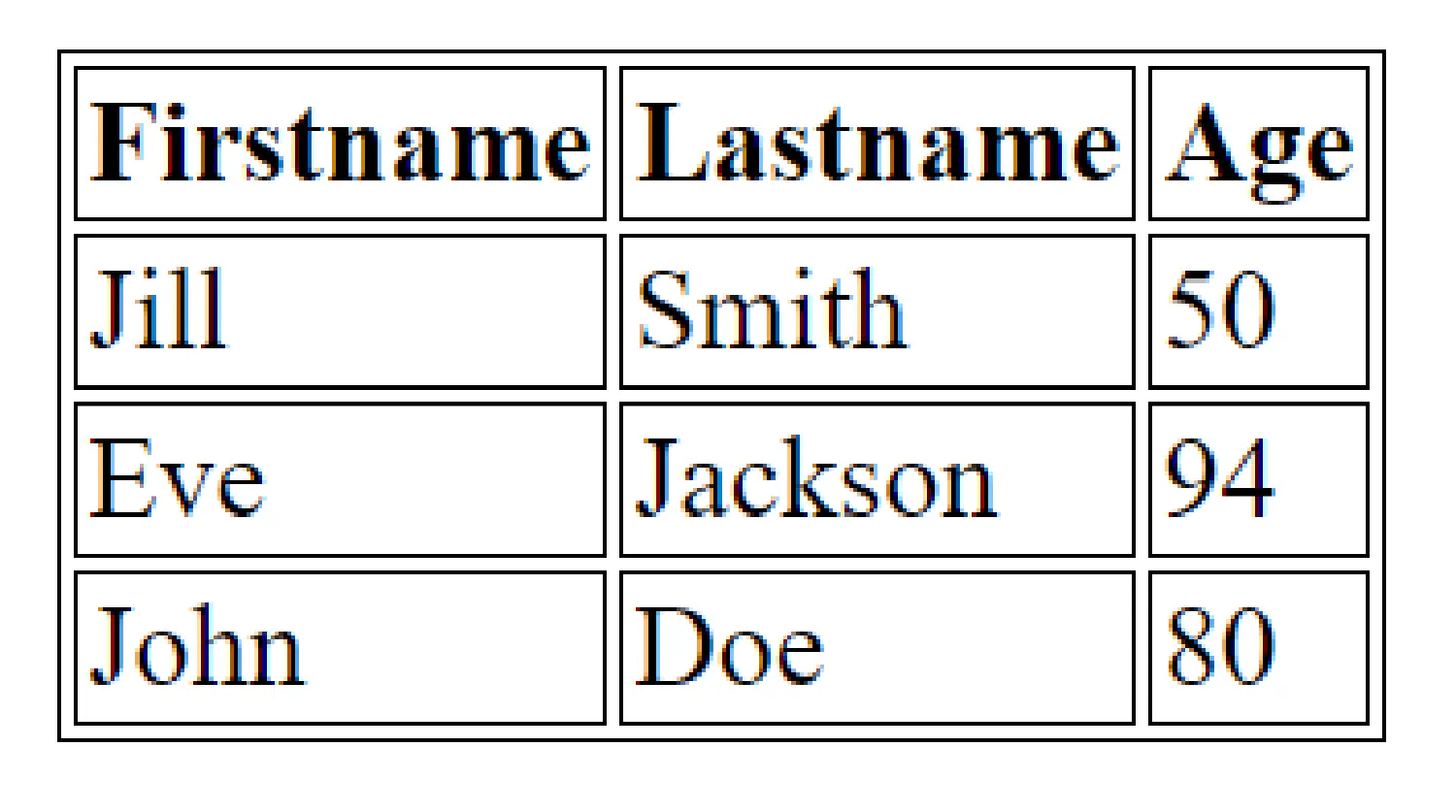
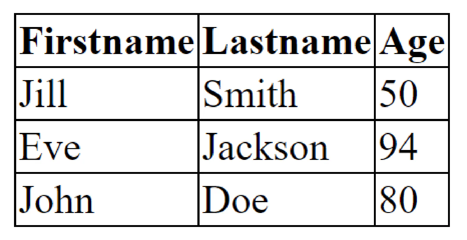
The first thing we notice is that the table has double borders. That is because both the table itself (<table>) and the <th> and <td> elements have separate borders. We can use the border-collapse property to make them collapse into one single border:
| |
We can use the width and height properties to set the size for the columns/rows or the entire table:
| |
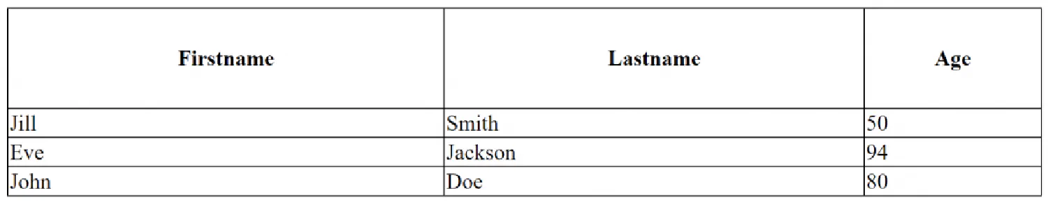
We can define the alignment inside the table like this:
| |
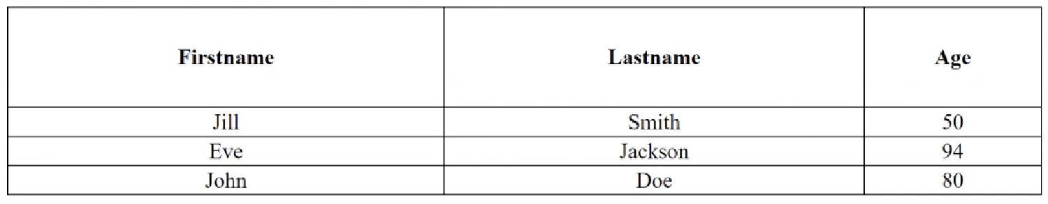
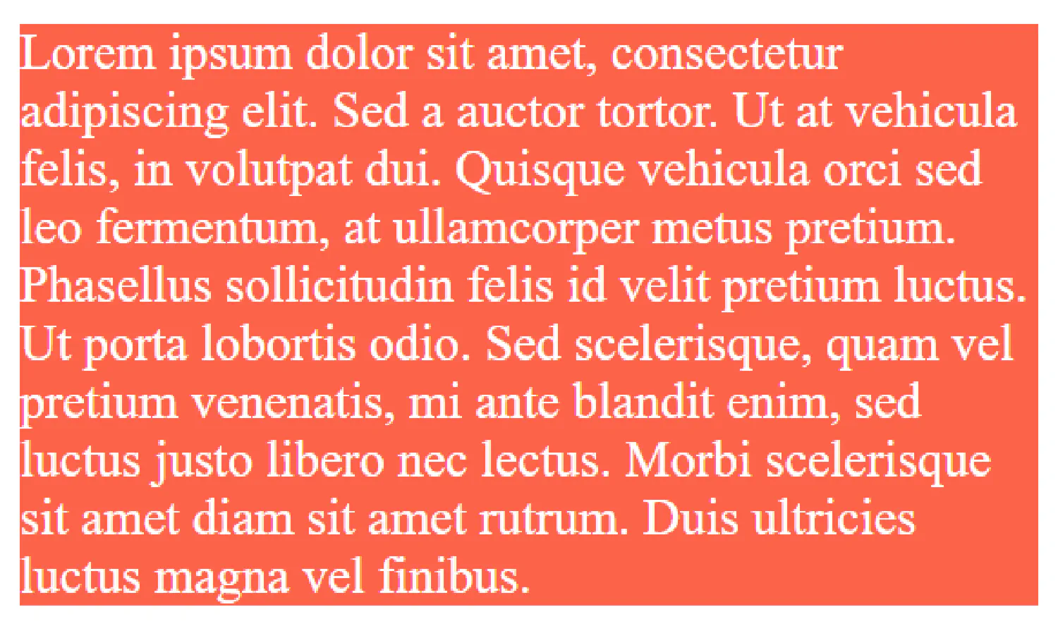
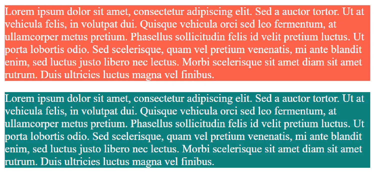
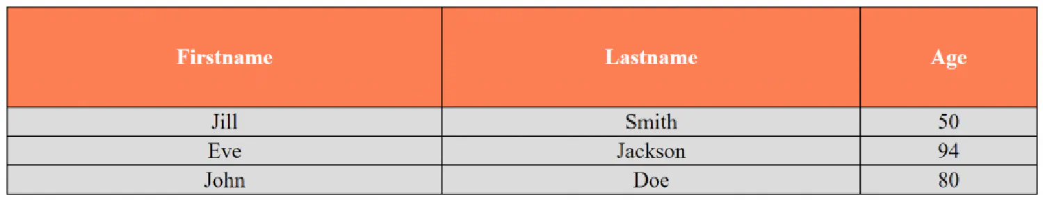
And lastly, we can set a background color for the table:
| |
Forms and Buttons #
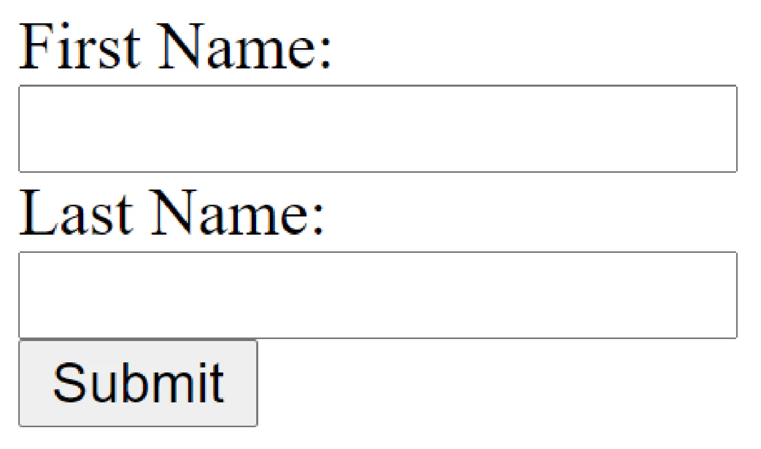
In the final section of this article, let’s talk about how to customize HTML forms. Here is an example:
| |
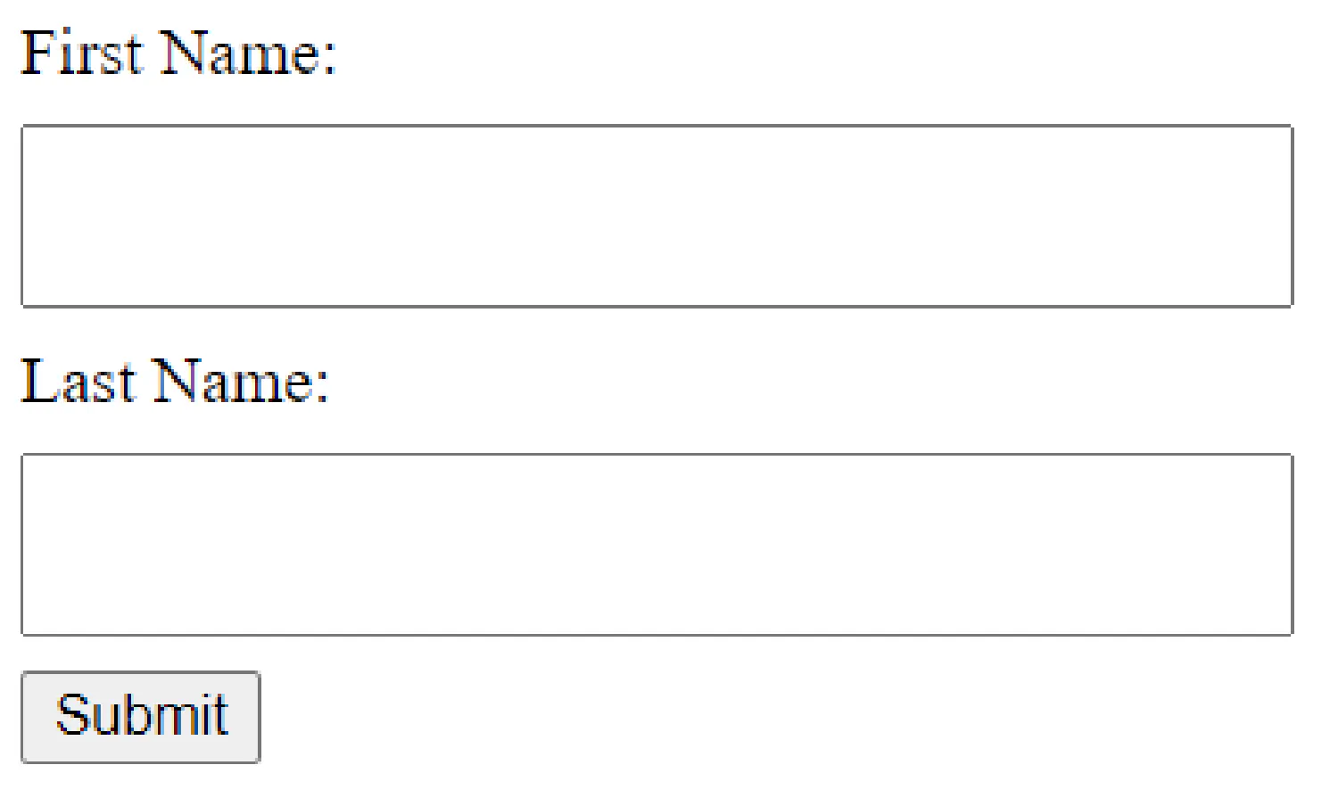
Now we can add some CSS code:
| |
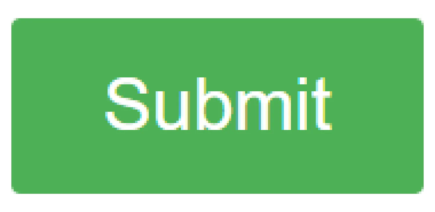
The button still doesn’t look very good, here is what we can do:
| |
Finally, let’s take one step further, let’s also add a border to the button, and make it hoverable using pseudo-class:
| |
| Button | Style |
|---|---|
| Original Button | 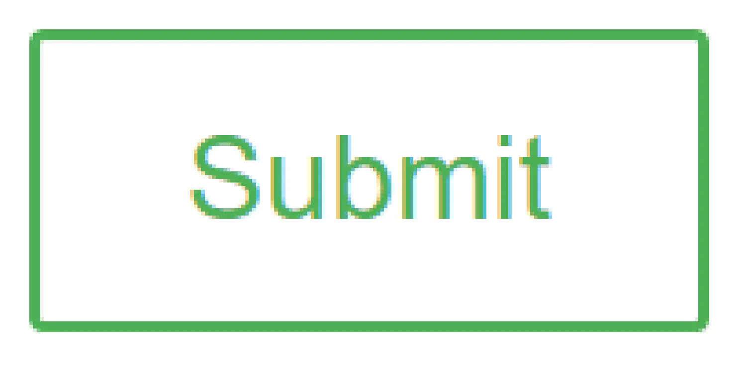 |
| Hovered Button |  |
If you think my articles are helpful, please consider making a donation to me. Your support is greatly appreciated.