CSS Basics #2
This article is outdated. If you are interested in learning HTML and CSS, check out my new course ➡️ HTML & CSS: A Practical Guide.
In this article, we are going to focus on how to position different HTML elements using CSS, as well as how to create a responsive layout for our web page.
Understanding boxes in CSS #
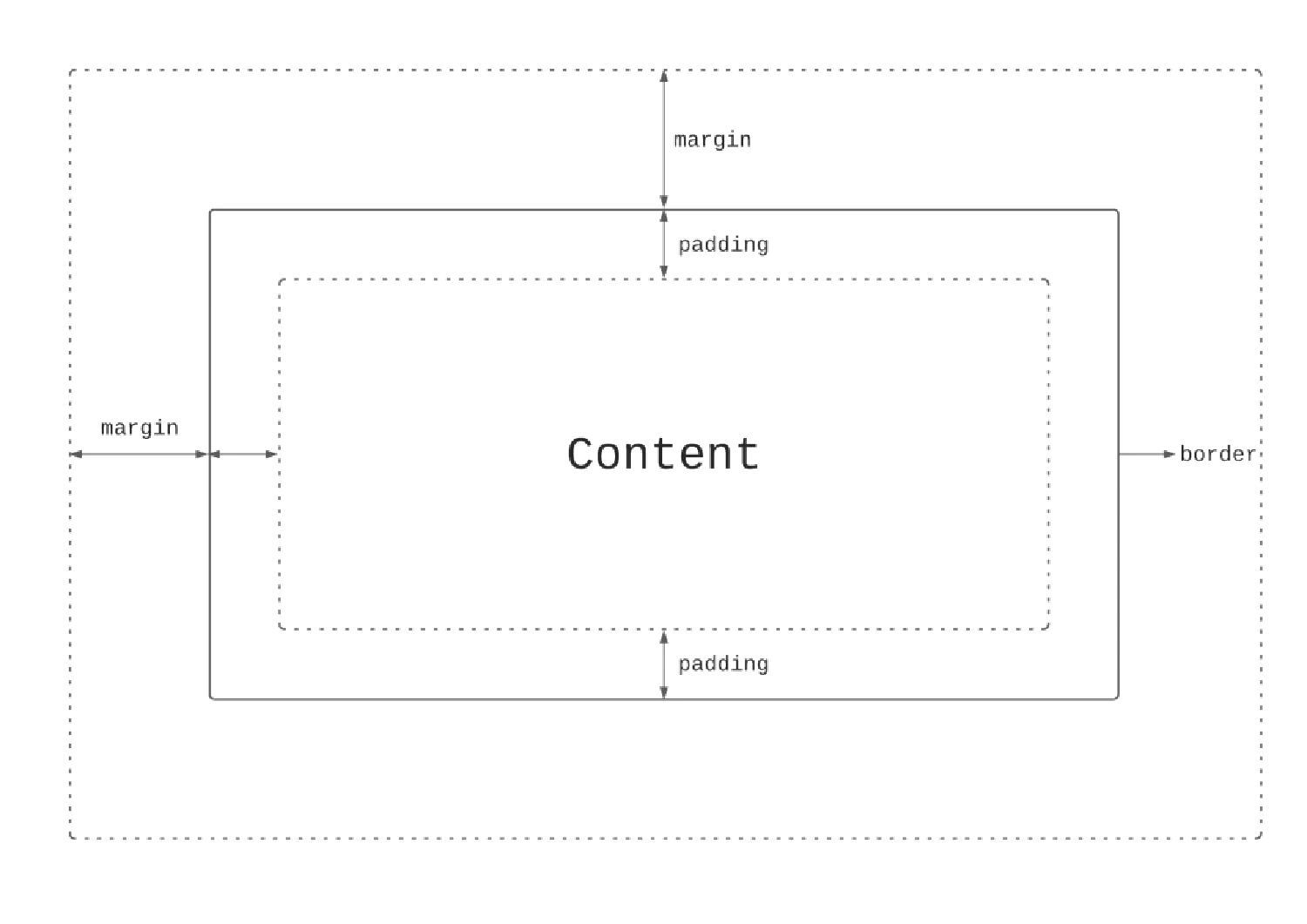
CSS treats all HTML elements like boxes, and each box has three components, border, margin, and padding. The border can be seen as the box itself, the margin is the space around the box, and the padding is the space between the box and its content.
Let’s take a look at some examples.
Border #
| |
| |
There are several other border properties we can use here. For example, border-width can define the thickness of the border and border-color can define the color of the border. Please note that these border properties will not have any effect unless the border-style property is set.
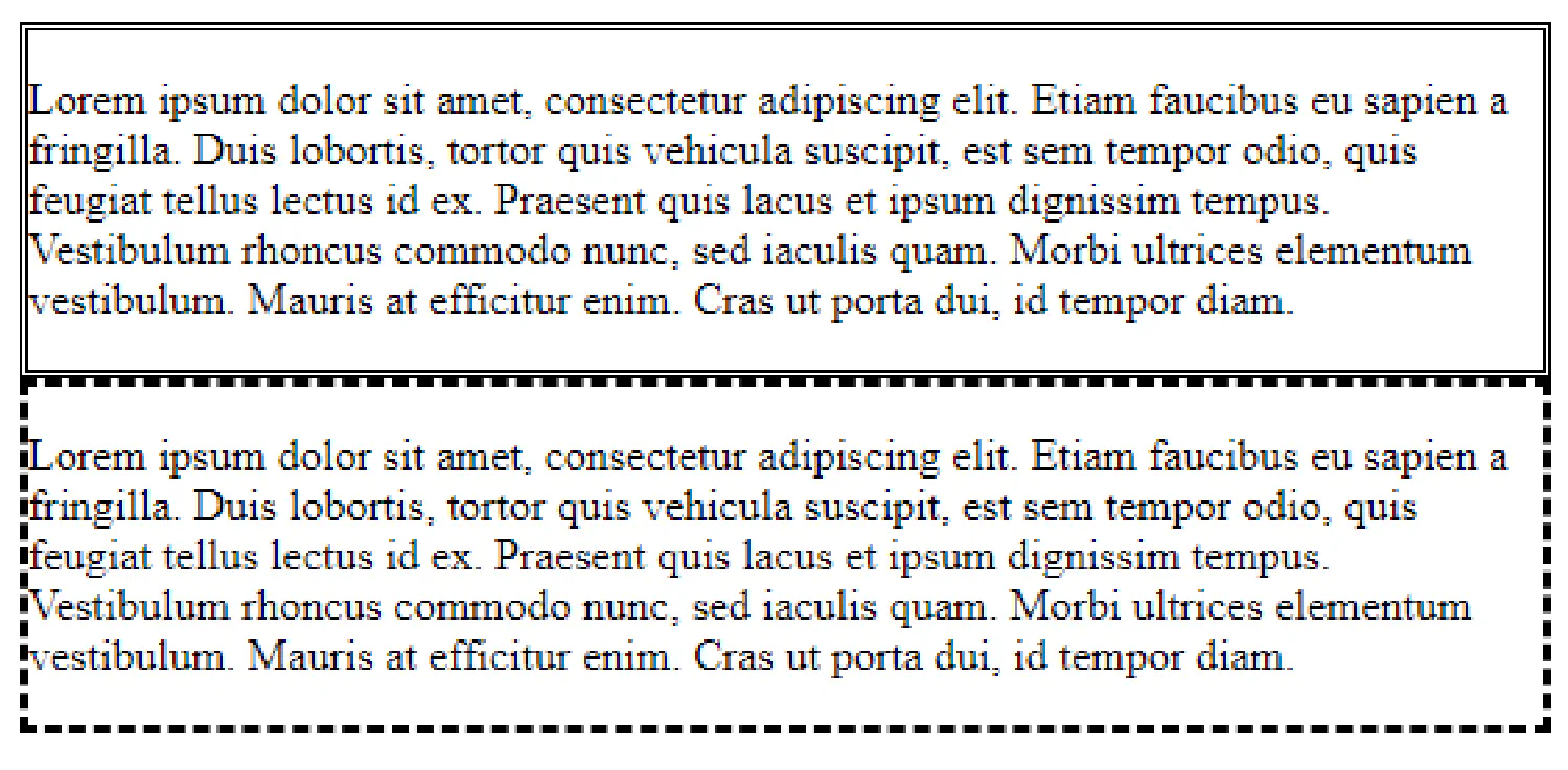
Margin #
| |
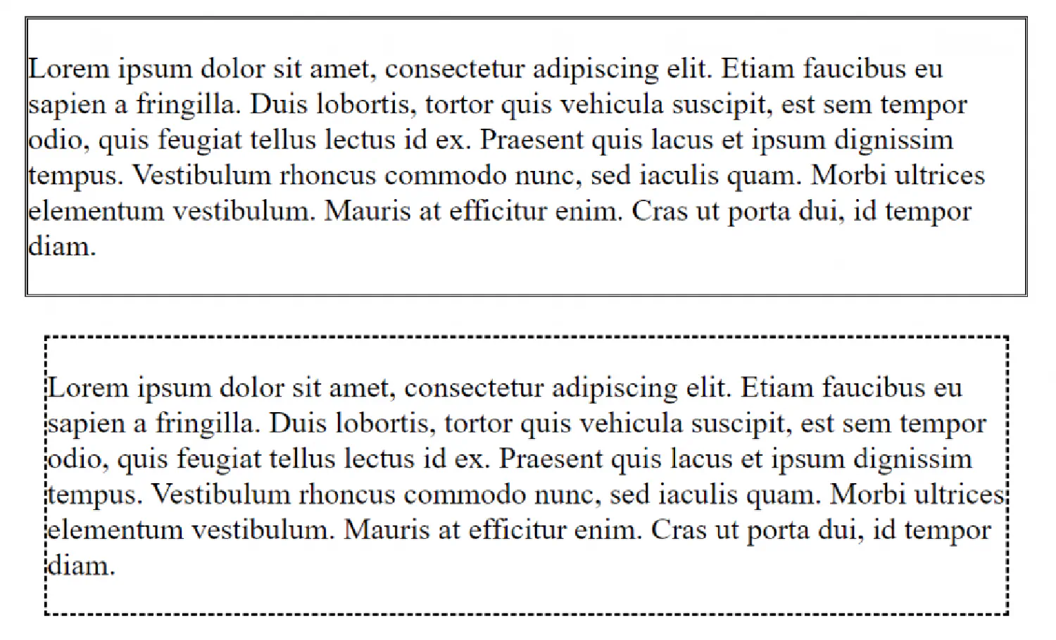
Padding #
| |
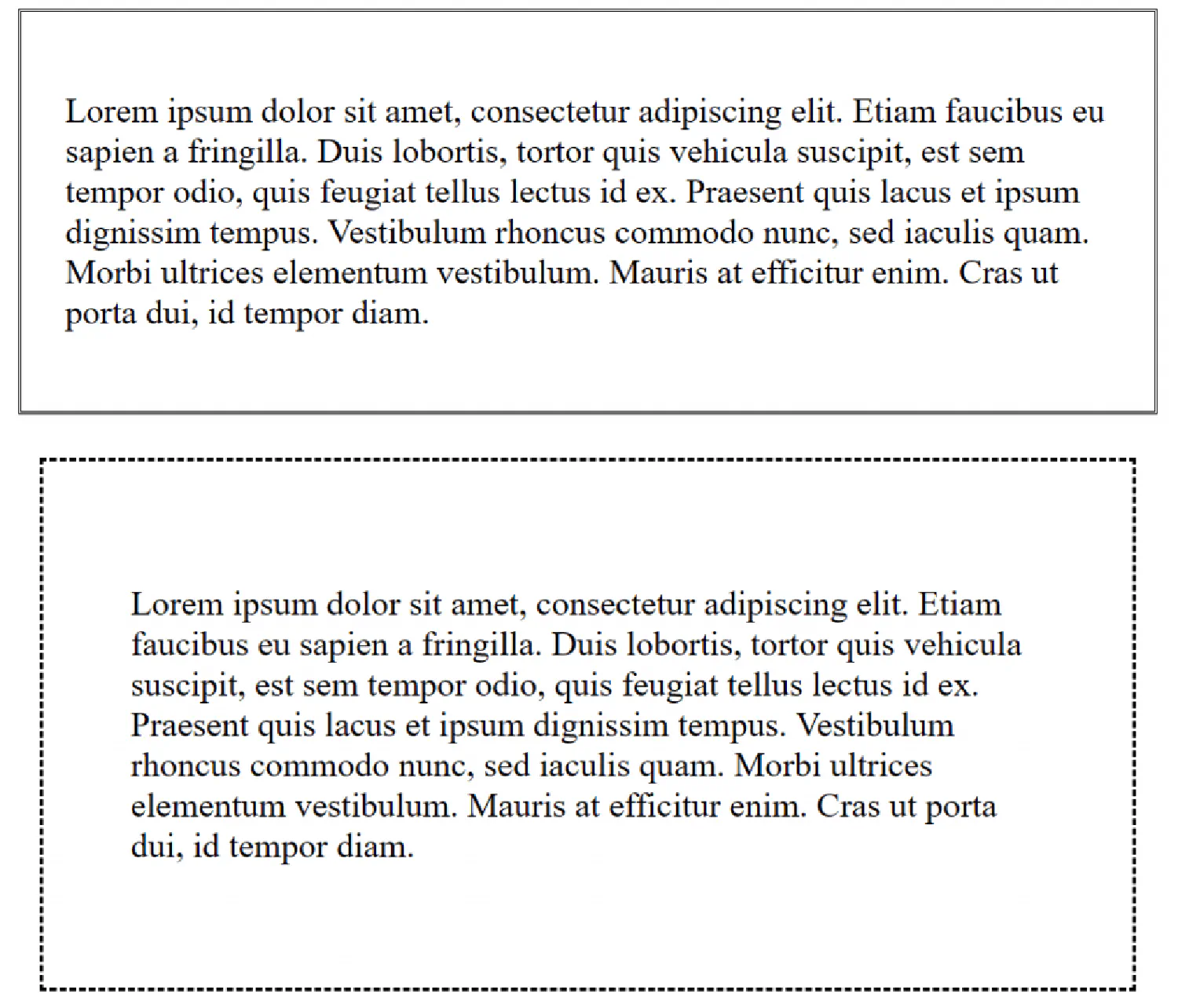
As you probably have noticed, after we added padding to the box, the vertical space between the box and the content is bigger than the horizontal space. That is because all the inline elements, in this case, the <p> element, have a default vertical margin even if you did not define it.
Position, overflow and alignment in CSS #
The position property #
The position property specifies the type of positioning method used for an element. There are five different position methods available:
staticrelativefixedabsolutesticky
Elements are then positioned using the top, bottom, left, and right properties. However, these properties will not work unless the position method is set first. They also work differently depending on the position value.
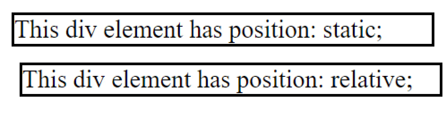
The static method is the default option and the element with the static method is not positioned in any special way.
The relative method positions an element relative to its normal (static) position, meaning you can add top, bottom, left, and right properties to adjust its position.
| |
| |
The fixed method places the element at a fixed location relative to the viewport. For example, those ads that pop up at the bottom right corner of your screen/browser, all have fixed position, because even if you scroll the page, it always stays at the bottom right corner.
The sticky method is the combination of the relative and the fixed method. A sticky element is, by default, positioned relatively, until a given offset is met in the viewport, then it will “stick” to the place.
It is difficult to demonstrate the fixed and the sticky method here, but if you are interested, there are some examples from w3schools .
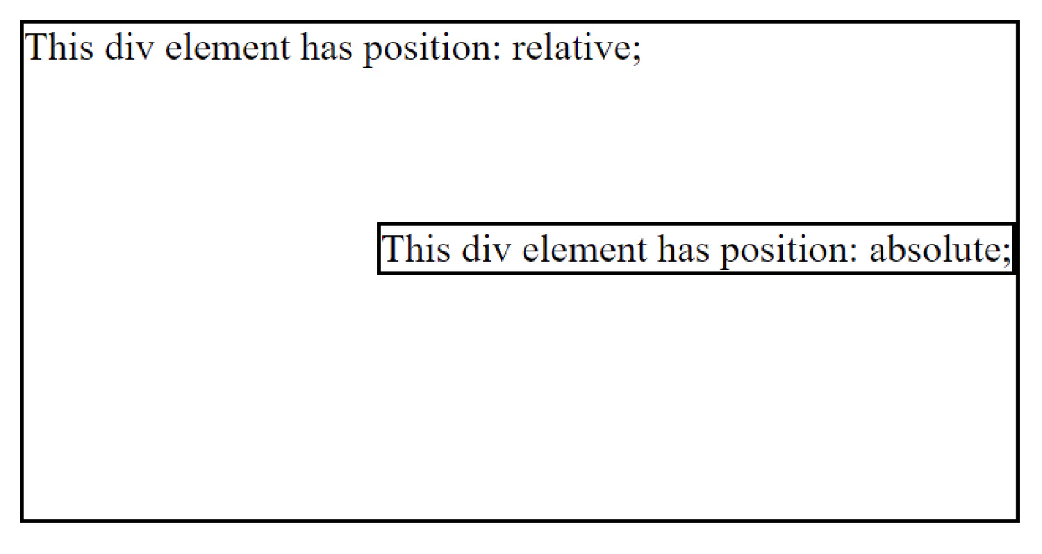
Finally, we have the absolute method. An absolute element is positioned relative to the nearest positioned element (anchor). A positioned element is one whose position is anything but static. For instance, in the following example, the absolute element is positioned relative to the relative element:
| |
| |
The overflow property #
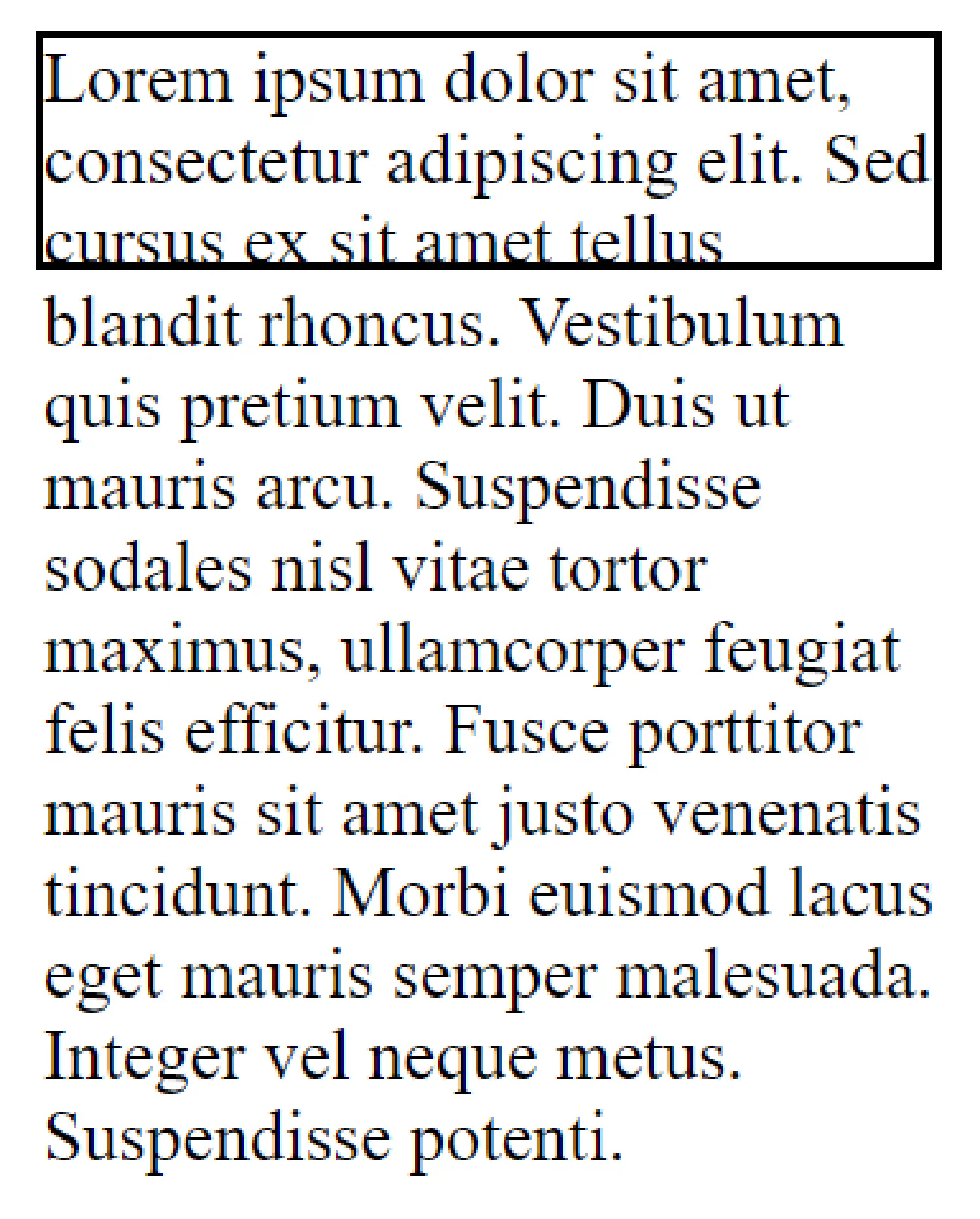
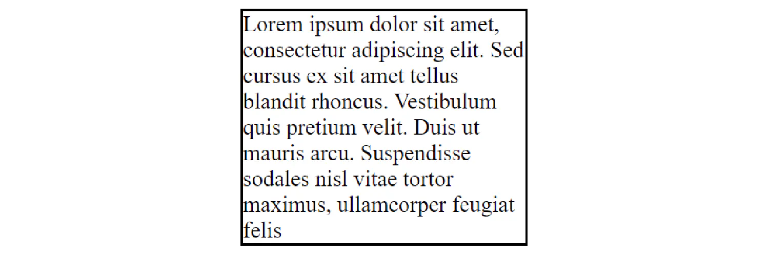
The overflow property controls what happens when the content is too big to fit into the box. The default value is visible. The overflow will be rendered outside of the box.
| |
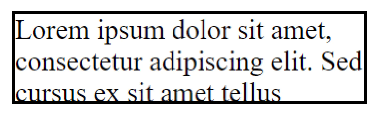
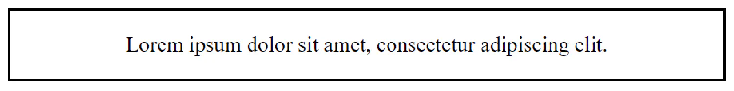
As for the hidden option, the content will be clipped, and the overflow will be hidden.
| |
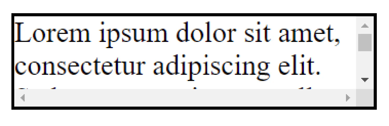
Setting the value to scroll, the overflow is clipped and a scrollbar is added to scroll inside the box. Note that this will add a scrollbar both horizontally and vertically (even if you do not need it):
| |
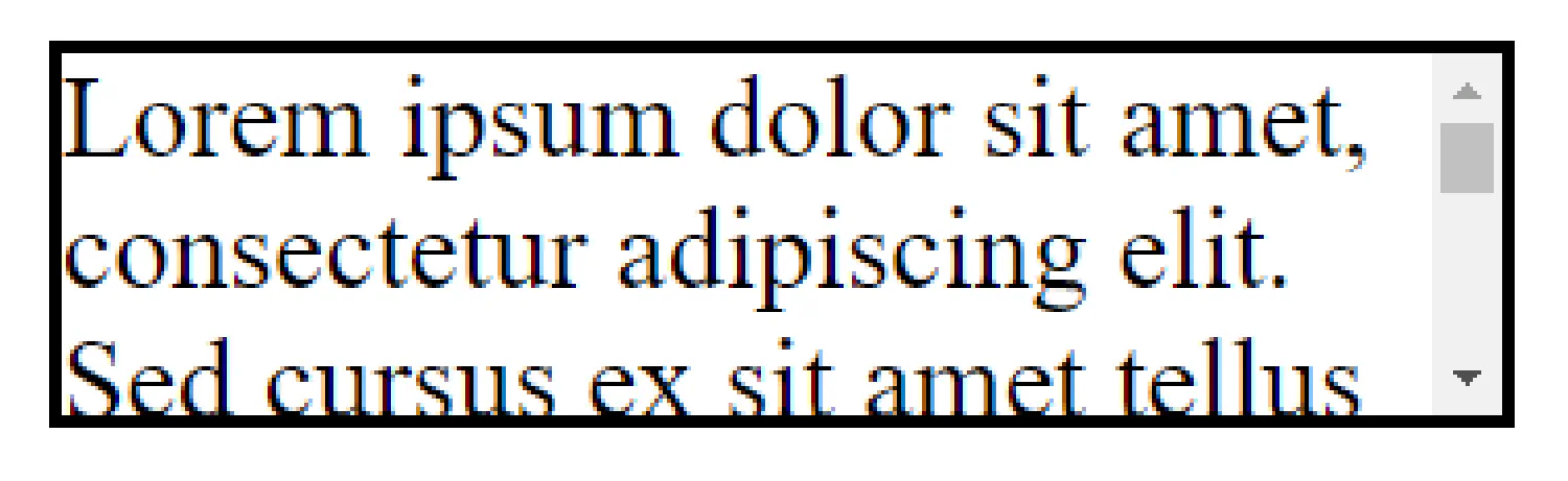
Finally, the auto option is very similar to scroll, but it adds scroll bars only when necessary.
| |
Alignment in CSS #
- Center Align Boxes
We can use margin: auto; to horizontally center a block element like this:
| |
We first set a width for the <div> element, so that it does not stretch out to the edges of the container. The element will then take up the specified width, and the remaining space will be split equally between the two margins.
- Center Align Text
What if we want the box to stretch out to the edges, and make its content/text center inside the box? To horizontally center the text, we can use text-align: center;. Let’s see an example:
| |
To vertically center the text, the easiest way is to use the top and bottom padding/margin:
| |
We can also use position and transform or the flexbox to position elements, but they are slightly more advanced topics in CSS. We’ll see how it works in the next article.
- Left and Right Align
Sometimes, instead of aligning a box at the center, we want it to stick to the left or the right side of the page. To do that, we can use the absolute position:
| |
| |

Exploring the grid layout #
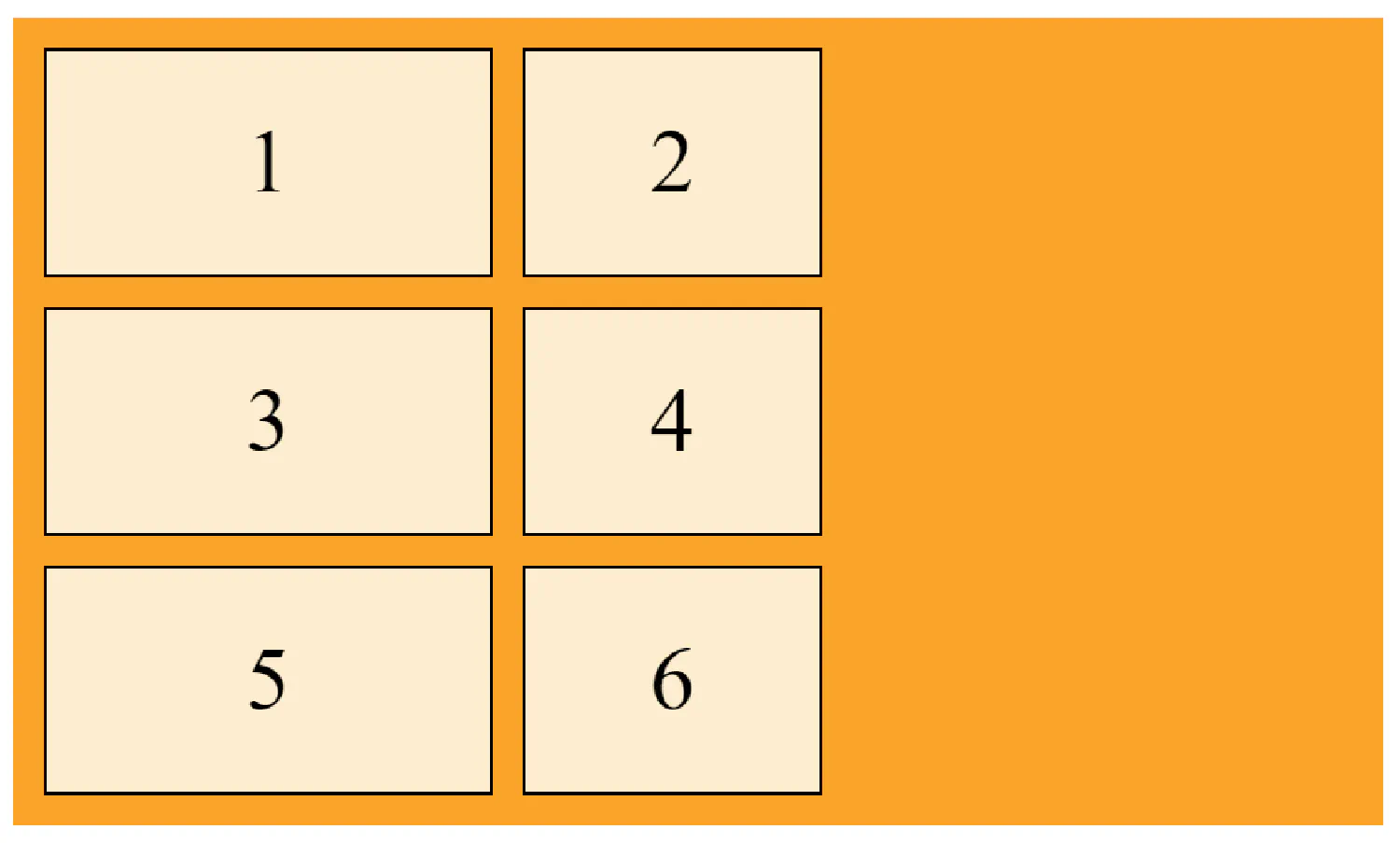
The grid system is a very important concept in CSS, it helps us design web pages without having to use float or position. A grid system consists of one parent element and several child elements like this:
| |
Of course, we should tell the browser that this is a grid by setting the display property to grid:
| |
This will set all elements with class="grid-container" as a grid container, and all direct children of the grid container automatically become grid items.
The vertical lines of grid items are called columns, and the horizontal lines of grid items are called rows. The spaces between each column/row are called gaps.
The grid gap can be adjusted using one of the following properties:
grid-column-gapgrid-row-gapgrid-gap
| |
For example, in this case, the column cap is 100px, and the row gap is 50px. And for this demonstration, we have to add a grid-template-columns property, I’ll explain what it means later in this article.
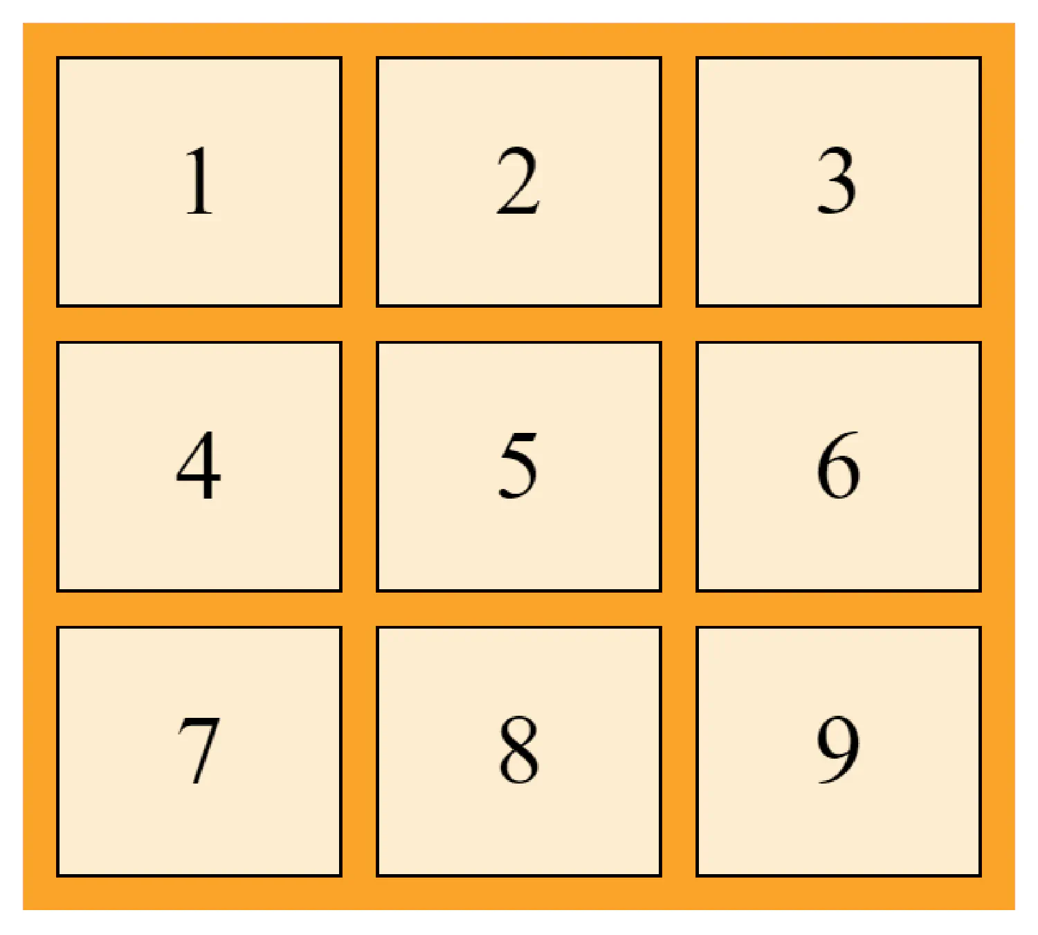
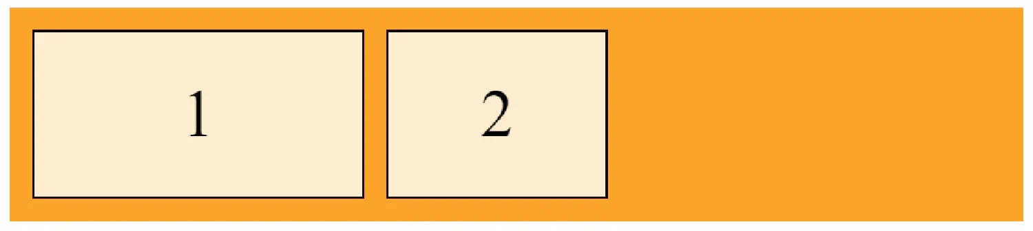
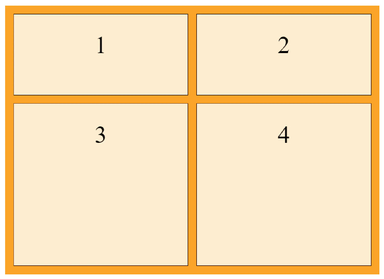
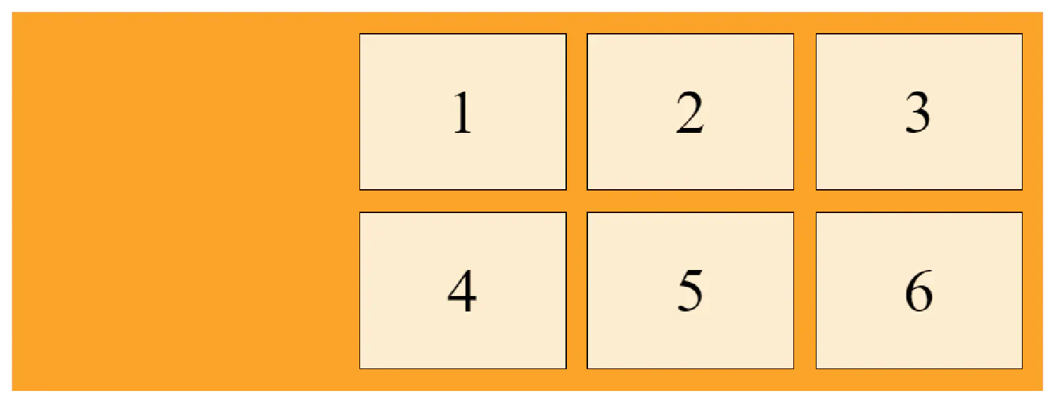
It is also possible to make one grid item span across multiple columns or rows:
| |
| |
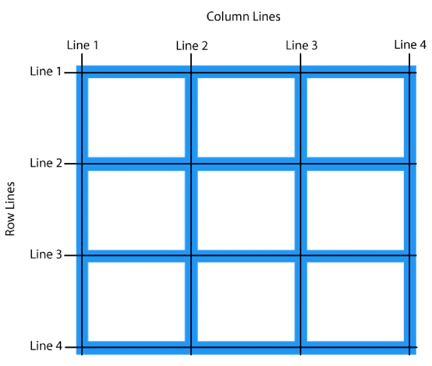
Pay attention to the numbers here. For grid item 1, it starts at line 1 and ends before line 3.
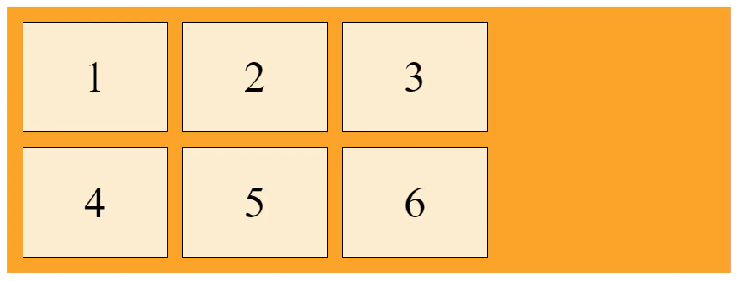
The grid container #
grid-template-columns
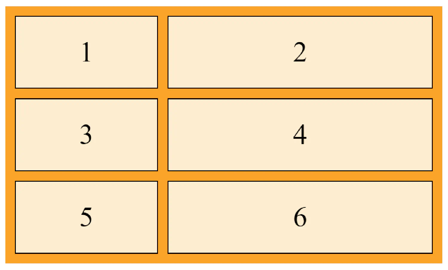
The grid-template-columns property defines the number of columns in our grid layout, and we can also use it to define the width of each column.
| |
| |
In this example, we defined two columns, the first one has a width of 150px, and the second one has a width of 100px. If we have more than two items in this two-column grid, a new row will be automatically added to put the items in.
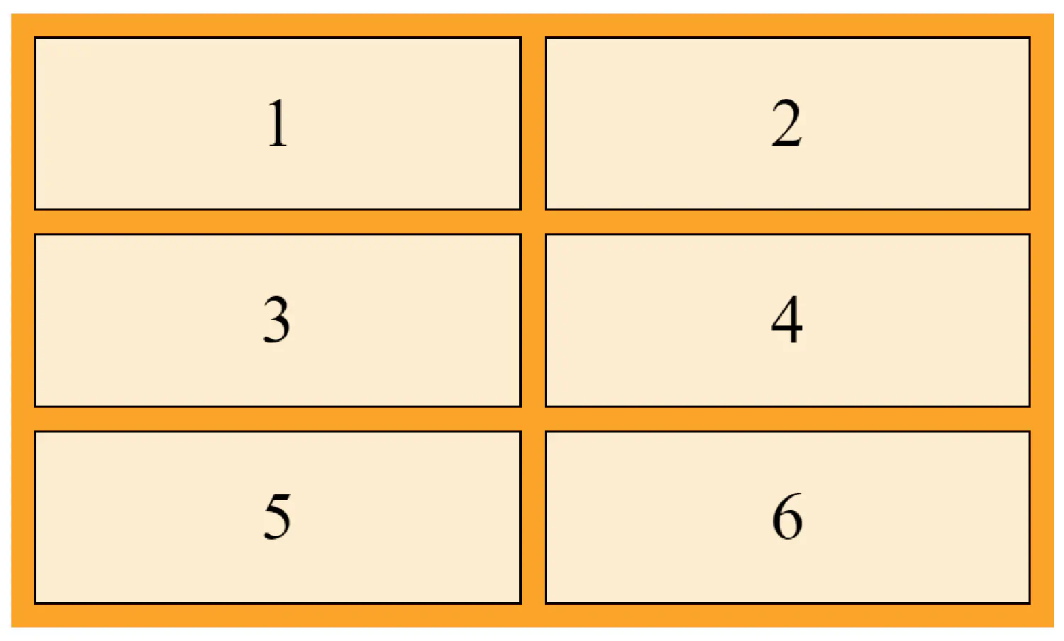
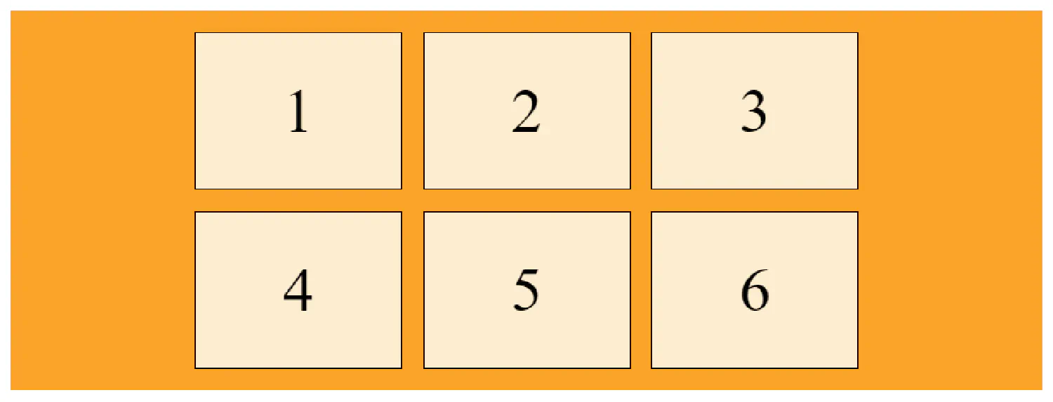
We can also set the width of the column to be auto:
| |
If both columns have the width="auto", then they should have the same width:
| |
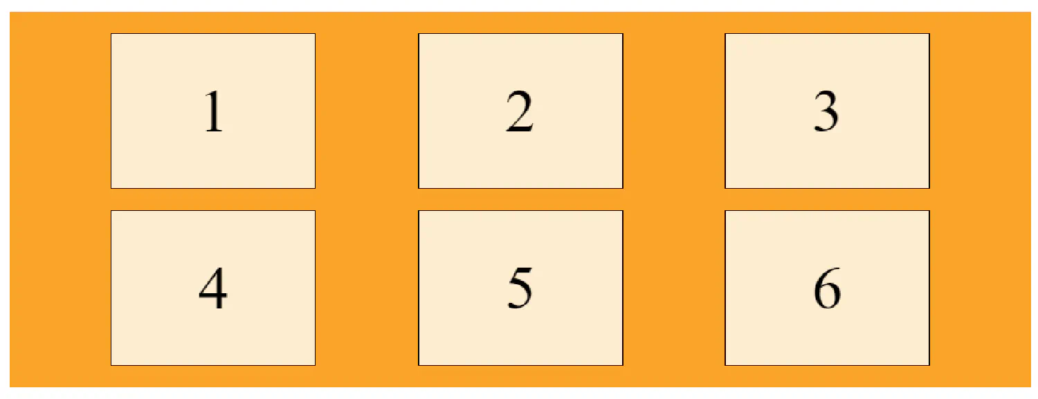
grid-template-rows
The grid-template-rows property defines the height of each row:
| |
justify-content
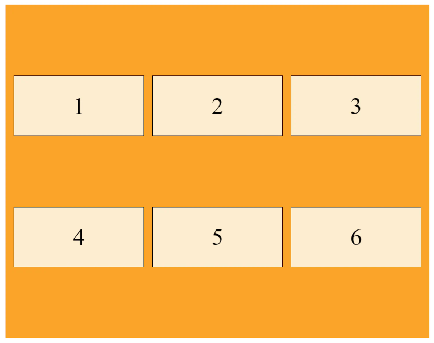
The justify-content property is used to horizontally align the whole grid inside the container. For this property to have any effect, the total width of the grid (all columns combined) must be less than the container’s width, like this:
With the justify-content property, we can align the columns differently.
| |
| |
| |
align-content
The align-content property is used to vertically align the whole grid inside the container, and it works just like the justify-content property.
| |
The grid items #
grid-column
The grid-column property is a shorthand property for the grid-column-start and the grid-column-end properties. It defines which column(s) CSS should use to place an item.
| |
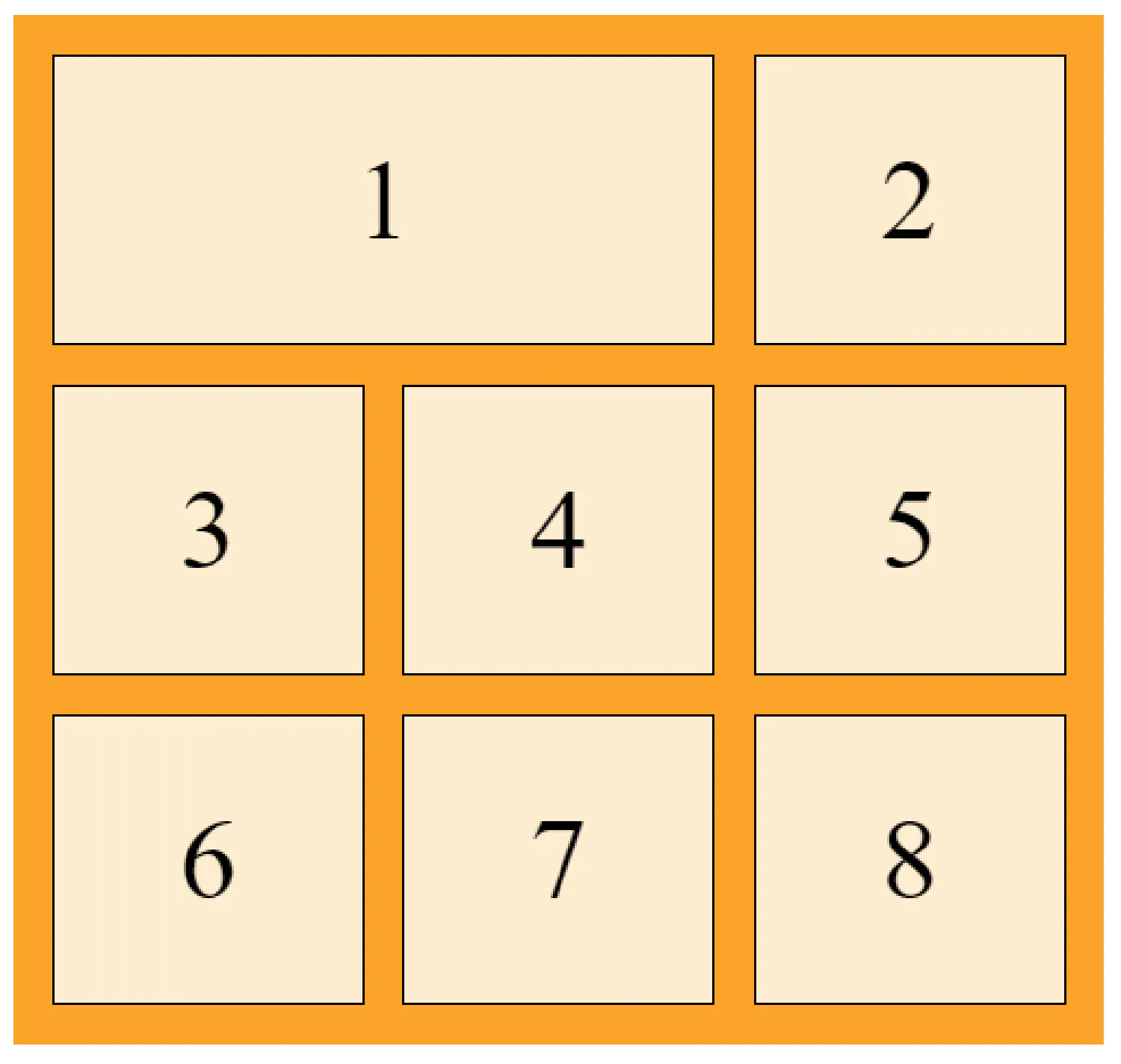
In this example, the first item starts from column 1 and ends before column 3.
grid-row
The grid-row property is a shorthand property for the grid-row-start and the grid-row-end properties. It defines which row(s) CSS should use to place an item.
| |
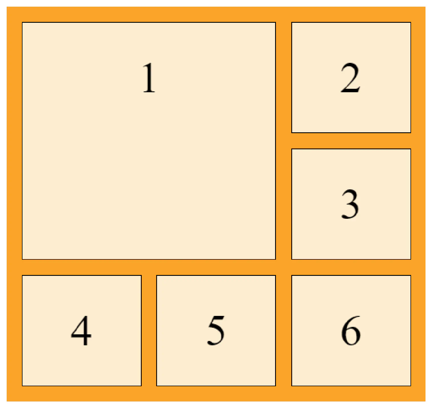
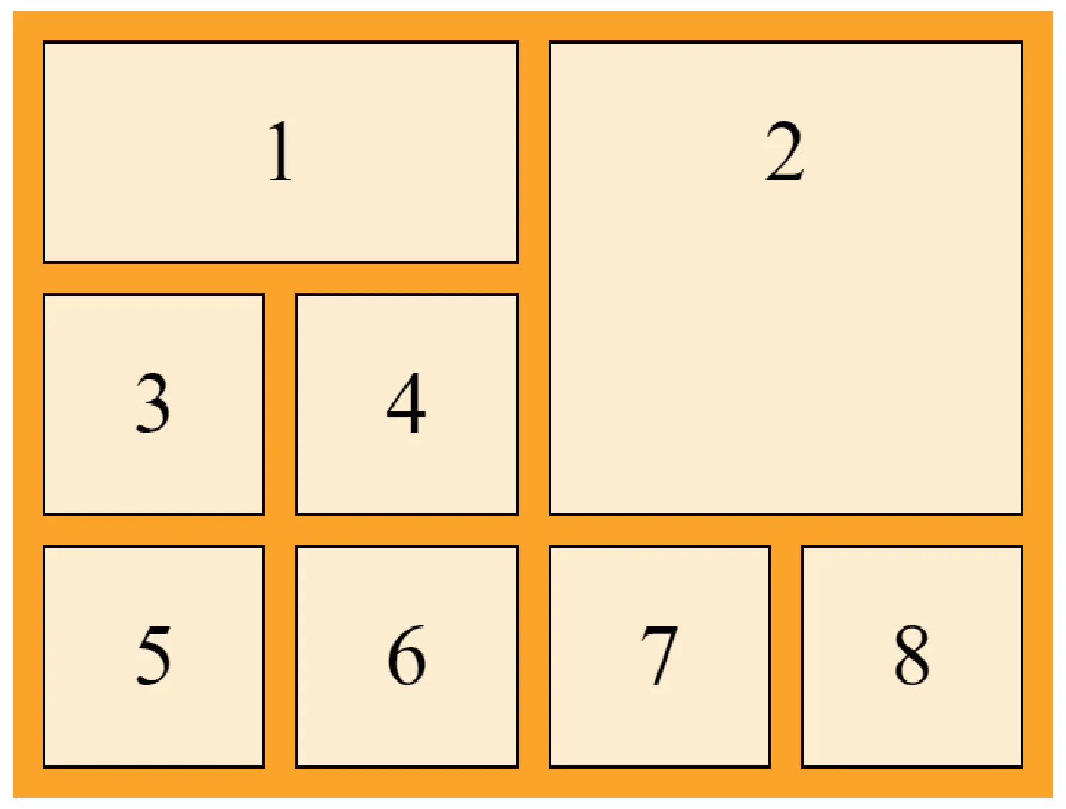
grid-area
The grid-area property is a shorthand property for the grid-row-start, grid-column-start, grid-row-end and the grid-column-end properties combined.
| |
This CSS rule specifies that item 1 will start on row 1 and column 1, and end before row 3 and column 3.
Creating a responsive layout #
As you know, the web pages that we design should be accessible on all kinds of devices, computers, tablets, and mobile phones, but they all have different sizes. This means the layout that looks well on one device will probably be either too big or too small for the others.
The responsive layout is designed to solve this problem. It is a web design concept that allows us to create a single layout that can adapt to different screens. To understand the responsive layout, we need to first talk about the grid view and media query.
The grid view #
The concept of grid view means that when we design our web page, we always divide the entire page into columns (usually 12 columns). These columns will have a total width of 100% and will shrink and expand as you resize your browser window.
First, we need to make sure that all HTML elements have the box-sizing property set to border-box. This is to make sure that the padding and borders are included in the calculation total width and height of the elements:
| |
We know that the total width of the page is 100%, and the page has 12 columns. Calculate the percentage for one column: 100% / 12 = 8.33%.
Then we can define the layout for this page:
| |
col-1 means this element takes 1 column, col-2 means it take 2 columns, and so on.
All of these columns should be floating to the left (we will discuss float in the next article), and should have padding:
| |
Let’s look at an example using this layout:
| |
Media queries #
Media query is another key concept in responsive design. It uses the @media rule to include a block of CSS properties only when certain conditions are met. Now we can design different layouts for desktops, tablets, and mobile phones. Let’s start with the easiest one, mobile phones:
| |
Because the screens on mobile phones are very small, we want all elements to take 100% of the width of the screen. Then we can add the layout for the tablet, but this time, we need to set a breakpoint:
| |
This means if the width of the screen is bigger than 600px, the second set of rules is activated.
And finally, we can define the desktop layout using the same method:
| |
Notice that the last two sets of rules are almost identical, the only difference is the name. One starts with col and the other one starts with col-s. Why do we do this at all if they are the same? Because it gives us the opportunity to decide how many columns each element will take at each breakpoint. For example:
| |
This <div> element will take 3 columns on desktops, but it will take 6 columns in tablet mode.
If you think my articles are helpful, please consider making a donation to me. Your support is greatly appreciated.