CSS Basics #3
This article is outdated. If you are interested in learning HTML and CSS, check out my new course ➡️ HTML & CSS: A Practical Guide.
In this article, we are going to talk about some relatively advanced topics in CSS, including float, transform, and flexbox, and in the end, we are going to briefly introduce two very popular CSS frameworks, Bootstrap and TailwindCSS.
The float property in CSS #
The float property is another CSS property used for positioning HTML elements. It specifies how an element should “float”. For example, an image could float left or right to the text in a container. The float property can have one of the following values:
left: The element floats to the left of its containerright: The element floats to the right of its containernone: The element does not float (will be displayed just where it occurs in the text). This is defaultinherit: The element inherits the float value of its parent
| |
| Float Type | Result |
|---|---|
none | 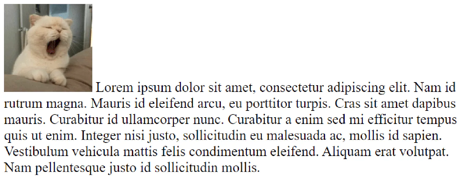 |
left | 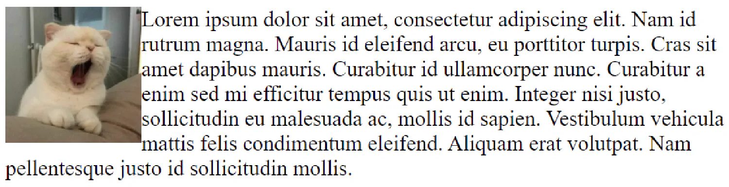 |
right | 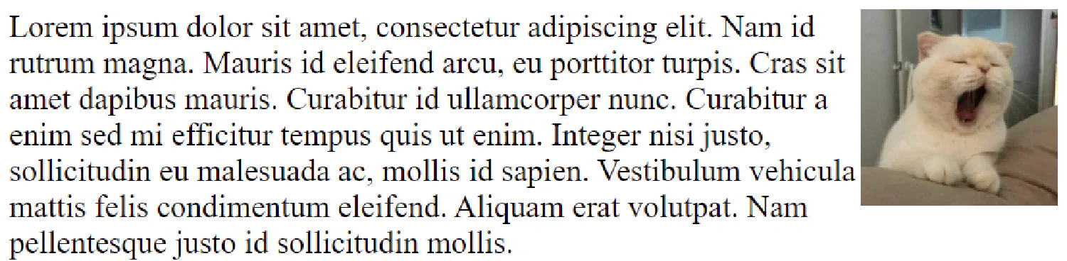 |
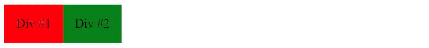
By default, two <div> elements will be displayed on top of each other. However, it is possible to make them float next to each other using float: left.
| |
| |
The transform property in CSS #
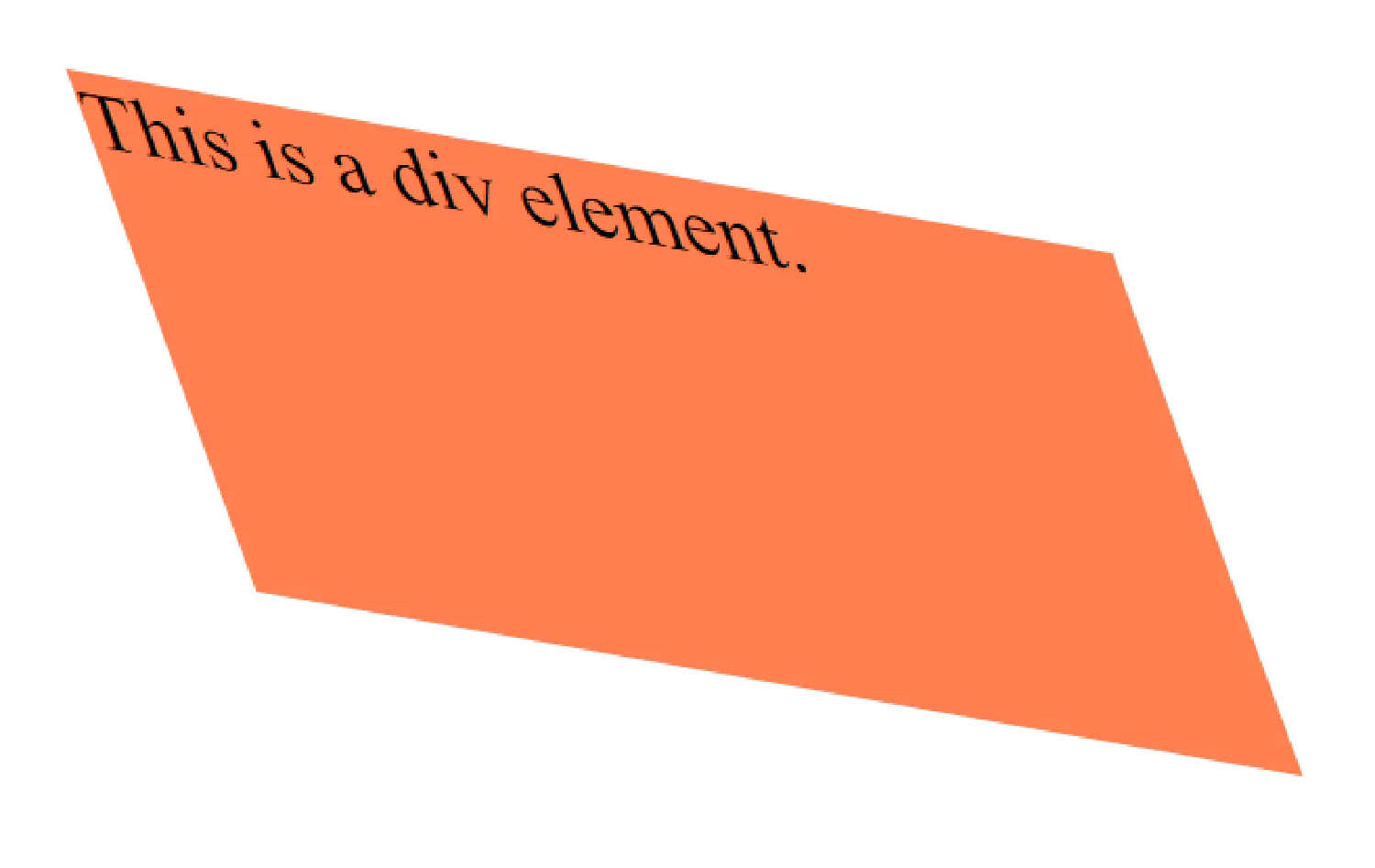
The transform property allows you to move, rotate, scale, and skew elements. It allows us to use the following transformation methods:
The translate() method moves an element from its current position (according to the parameters given for the X-axis and the Y-axis). For example, the following code will move the <div> element 50px to the right, and 100px down from its current position.
| |
The rotate() method rotates an element clockwise (positive) or counter-clockwise (negative) according to a given degree. In this example, the <div> element will rotate 20 degrees clockwise, and the <section> element will rotate 20 degrees counter-clockwise.
| |
The scale() method increases or decreases the size of an element. The first parameter corresponds to the width and the second parameter corresponds to the height. The above code increases the <div> element to be twice its original width and three times its original height.
| |
The skew() method skews an element along the X and Y-axis by the given angles.
| |
The matrix() method is the combination of all of the above methods. It takes six parameters, which allows you to rotate, scale, move (translate), and skew elements. The parameters are as follows: matrix(scaleX(),skewY(),skewX(),scaleY(),translateX(),translateY()), where X means around the horizontal axis and Y means around the vertical axis.
| |
Discussing the flexbox in CSS #
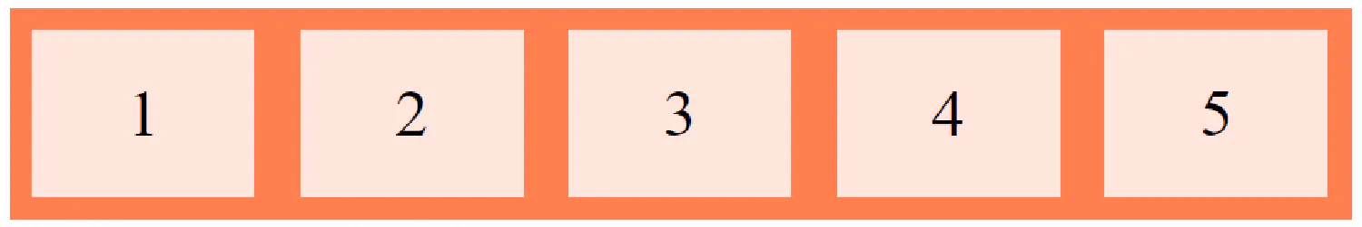
The flexbox is another layout module that makes it easier for us to design a responsive layout without using float or position. Just like the grid system, each flexbox has a flex container and several flex items.
| |
This <div> block becomes a flexbox (becomes flexible) by setting the display property to flex:
| |
The Flex Container #
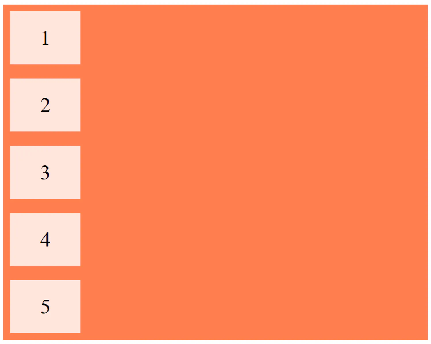
flex-direction
The flex-direction property defines in which direction the container wants to stack the flex items. The default value is row, which makes the items stack from left to right, like in the example above.
We can also stake them vertically:
| |
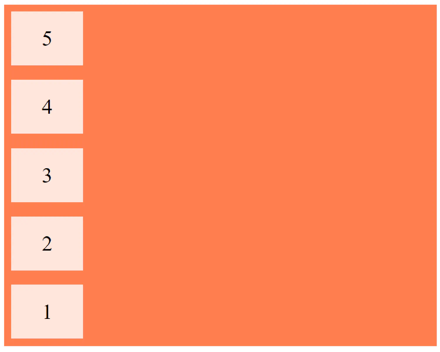
Or in the reversed order:
| |
flex-wrap
The flex-wrap property specifies whether or not the flex items should wrap (automatically put items in a new row when there is not enough space).
When flex-wrap is set to wrap:
When flex-wrap is set to nowrap:
- The Alignment Properties
Just like the grid system, there are also alignment properties in the flexbox, and they work exactly the same. The justify-content property is used to vertically align the flex items and the align-items property is used to horizontally align the flex items.
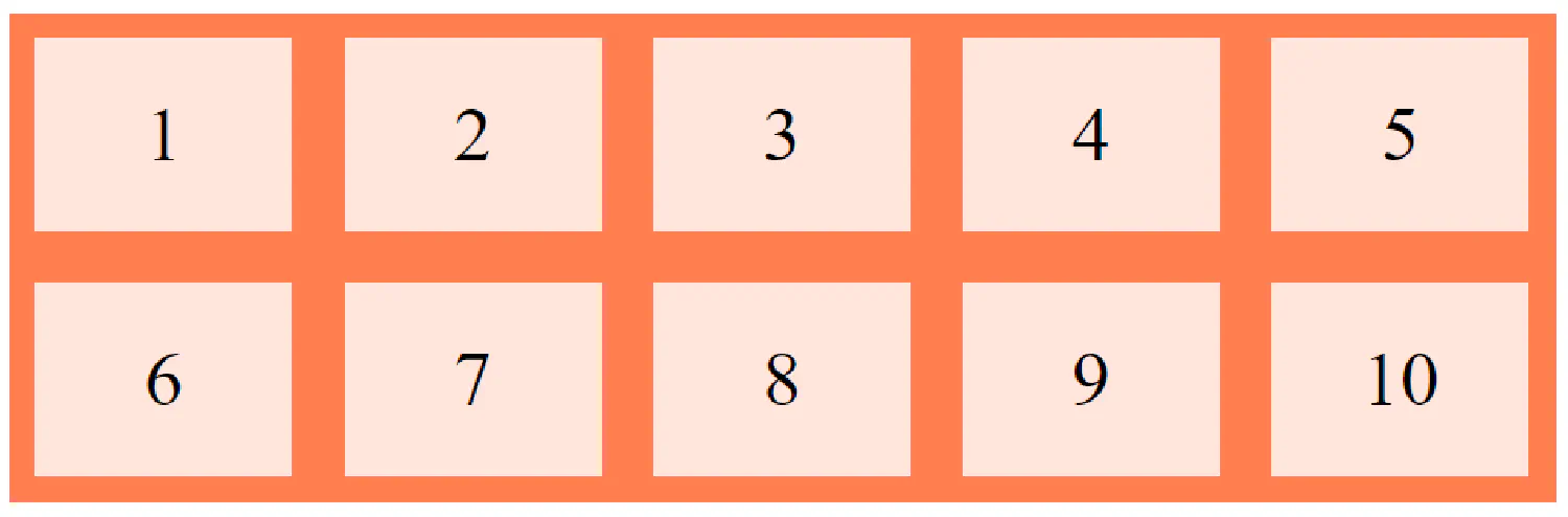
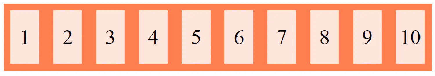
The Flex Item #
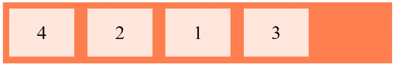
order
The order property specifies the order of the flex items.
| |
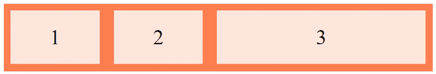
flex-grow
When the flex-grow property is set, the flex items will always stretch to the edge of the viewport as you resize your browser, and the number indicates how much faster the item grows relative to the other items in the flexbox.
| |
flex-basis
The flex-basis property specifies the initial length of a flex item.
| |
Image mask #
Consider this scenario, if you are designing a website, you want the users to upload images as their profile pictures. The profile pictures will be displayed as small squares, but the uploaded images come in different sizes. Simply setting the width and height of the image will result in a stretched and strange-looking profile picture. How can we solve this problem?
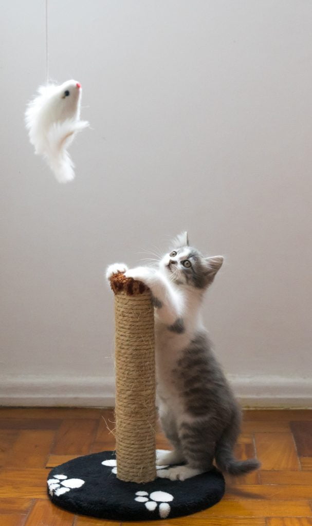
Here we have an image of an adorable kitten, and we can resize it into a 200px by 200px image using CSS:
| |

And as you can see, the image has been stretched and it doesn’t look very good.
Here is where the object-fit property comes in. The object-fit property can take one of the following values:
fill: This is the default. The image is resized to fill the given dimension. If necessary, the image will be stretched or squished to fitcontain: The image keeps its aspect ratio, but is resized to fit within the given dimensioncover: The image keeps its aspect ratio and fills the given dimension. The image will be clipped to fitnone: The image is not resizedscale-down: the image is scaled down to the smallest version ofnoneorcontain
object-fit Options | Result |
|---|---|
cover |  |
contain | 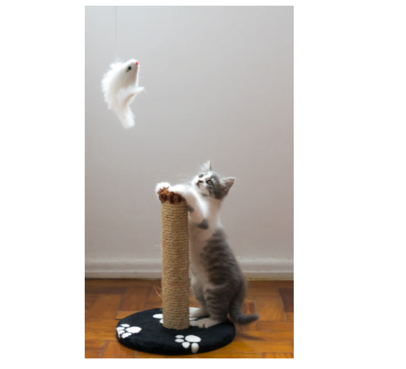 |
none |  |
scale-down |  |
If we want to use this image as a profile picture, the best option will be using object-fit: cover;.
However, now we face another problem, this option zooms in on the center of the image to fill the container, and it clips a part of the cat. What if we want to zoom in on the cat?
The object-position property can help us with this problem. It is used to specify how an <img> or <video> should be positioned within its container.
| |

The first parameter determines the position on the x-axis, and the second parameter determines the position on the y-axis.
Some useful CSS frameworks #
Finally, before we wrap up the CSS part of this tutorial, let’s briefly talk about some very useful CSS frameworks that could greatly accelerate the web page design process. A CSS framework is basically a predefined CSS file, which you can simply import into your web page and use the defined CSS classes inside your HTML document.
Bootstrap is one of the most popular responsive front-end frameworks in the world. Originally created by a designer and a developer at Twitter, it is now maintained by a small team of developers on GitHub.
To use Bootstrap, you can download the compiled code from their official website , and then load the files into your HTML document.
Or the easier way is to use a CDN like this:
| |
The CSS file should be imported in the <head> section as we talked about before, and the JavaScript file goes before the closing tag of <body> element. Yes, you do need to import JavaScript code for the framework to work properly, but luckily, for now, you don’t need to understand how it works.
To use the Bootstrap framework, you simply add the correct class names inside your HTML elements like this:
| |
In this example, the btn class defines a button, and btn-primary defines the button’s color.

There are lots of other components you could use, and they are all beautifully designed, you can find all of them on their official documentation .
The second framework I’d like to introduce is Tailwind CSS , it is relatively new in the field, but it has quickly gained a lot of the market recently. Unlike Bootstrap, it is a utility-first framework, it does not come with components that you can just copy and paste. If you want a button, you have to design it yourself.
| |

I know this seam like a lot more extra work, but the advantage is that it gives you a lot more freedom, you can design your elements however you want. But, you do need to have a decent understanding of CSS in order to use Tailwind.
Another advantage of Tailwind CSS is that if you install it using npm, as specified in the official documentation , Tailwind will be able to scan your entire project, see what CSS classes you are using, and generate a custom CSS file for you. This means the result CSS file will be a lot smaller compared to Bootstrap.
If you think my articles are helpful, please consider making a donation to me. Your support is greatly appreciated.