How to Center A Div in CSS
➡️ This tutorial is also published at www.thedevspace.io .
When it comes to designing a webpage, one of the most common problems we face is how to center or align different elements. In this article, we will explore three different methods that could help you center an element using CSS.
As we’ve explained in the HTML & CSS: A Practical Guide course, we usually utilize the block-level elements such as <div> to create webpage layouts. However, the problem with <div> is that the block is always anchored to the top left corner by default.
| |
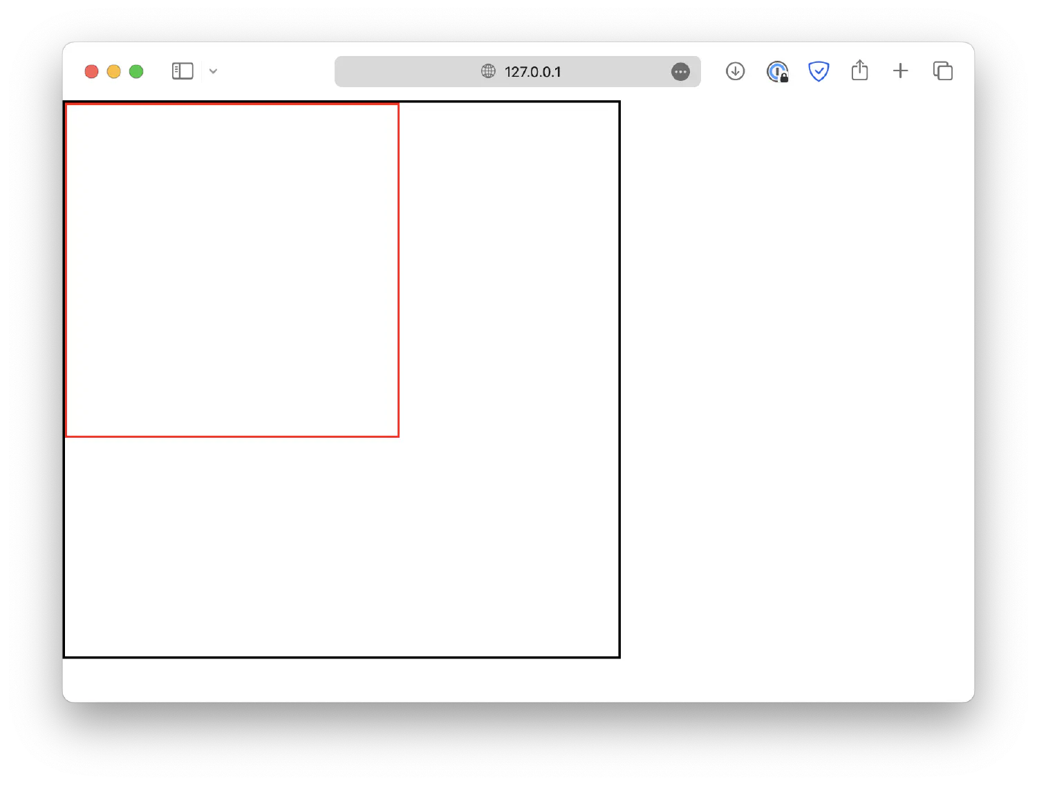
Use auto margin to center blocks horizontally #
There are many ways you could move the inner block. Let’s start with the horizontal direction. The easiest way to center the <div> block horizontally is by setting its margin to auto.
| |
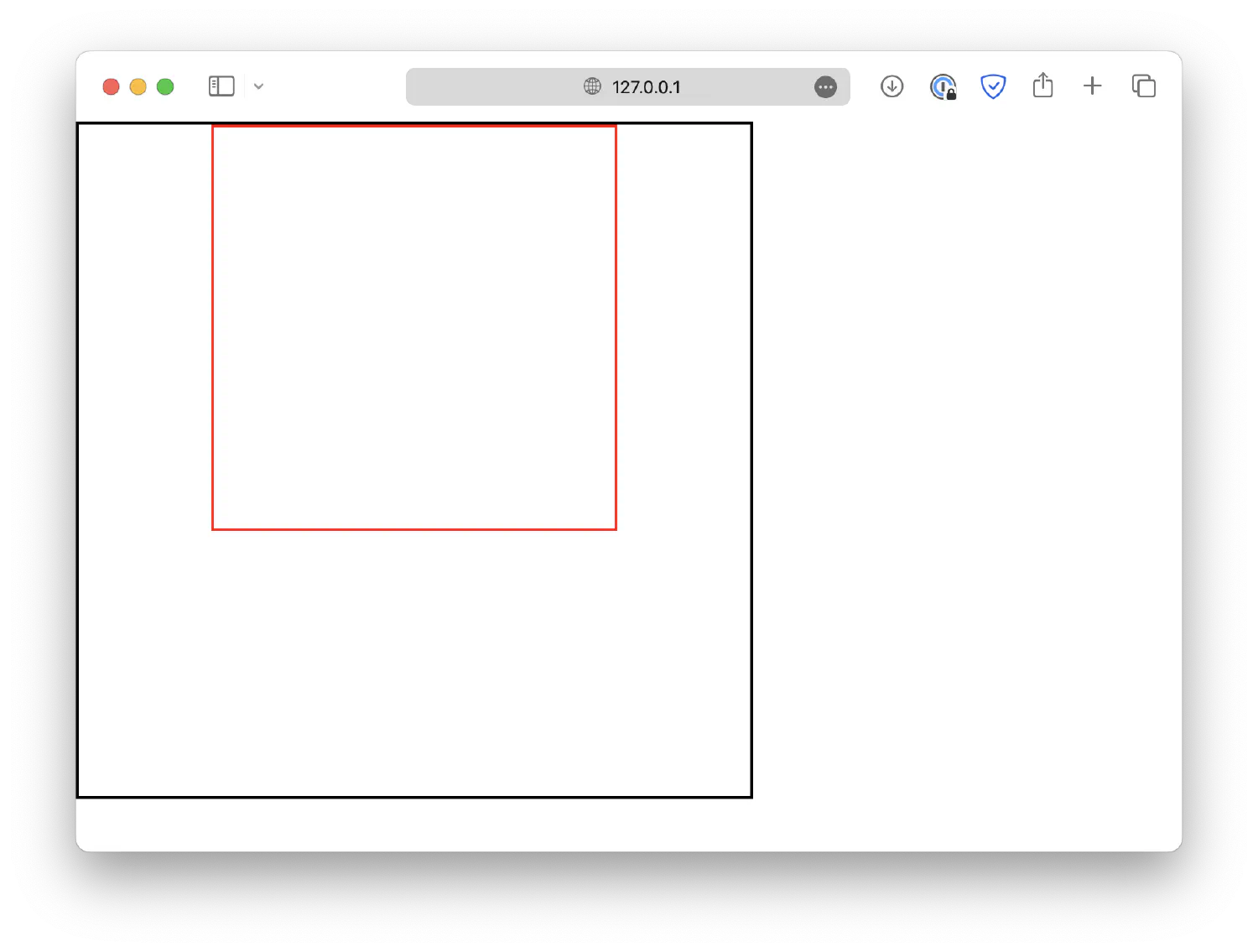
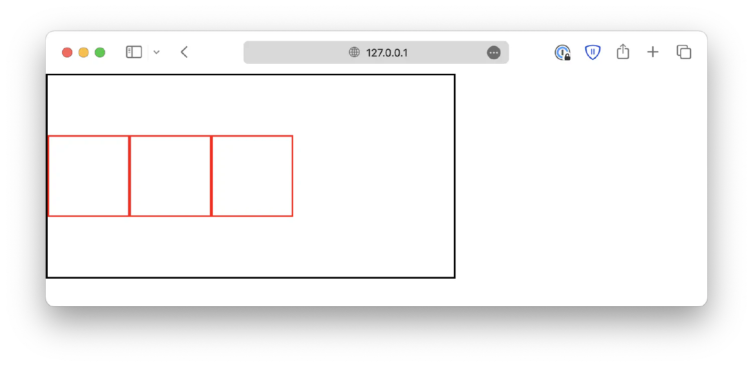
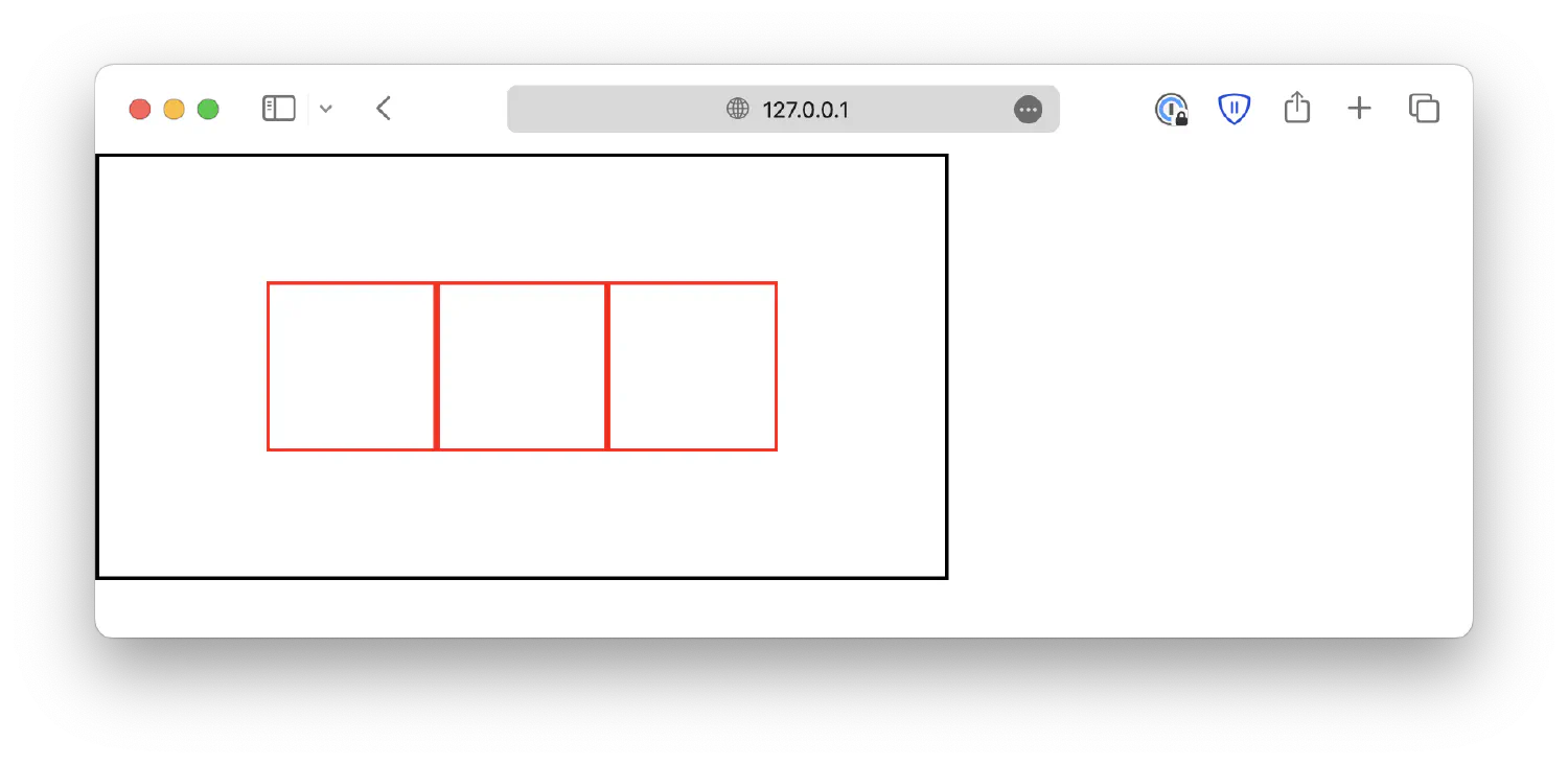
Use flexbox to center blocks horizontally #
Alternatively, you could utilize the flexbox or grid layout by setting the display property of the outer box to flex/grid. This allows you to easily configure the position and alignment of its child elements. For instance, you can center the inner block by setting justify-content to center.
| |
Although this method seems to be more complex, it does have its benefits, especially when you have a more complex layout. For example, you can center two or more blocks with the same CSS property.
For more information on creating layouts using grids and flexboxes, check out my article on How to Position and Arrange Content Using CSS.
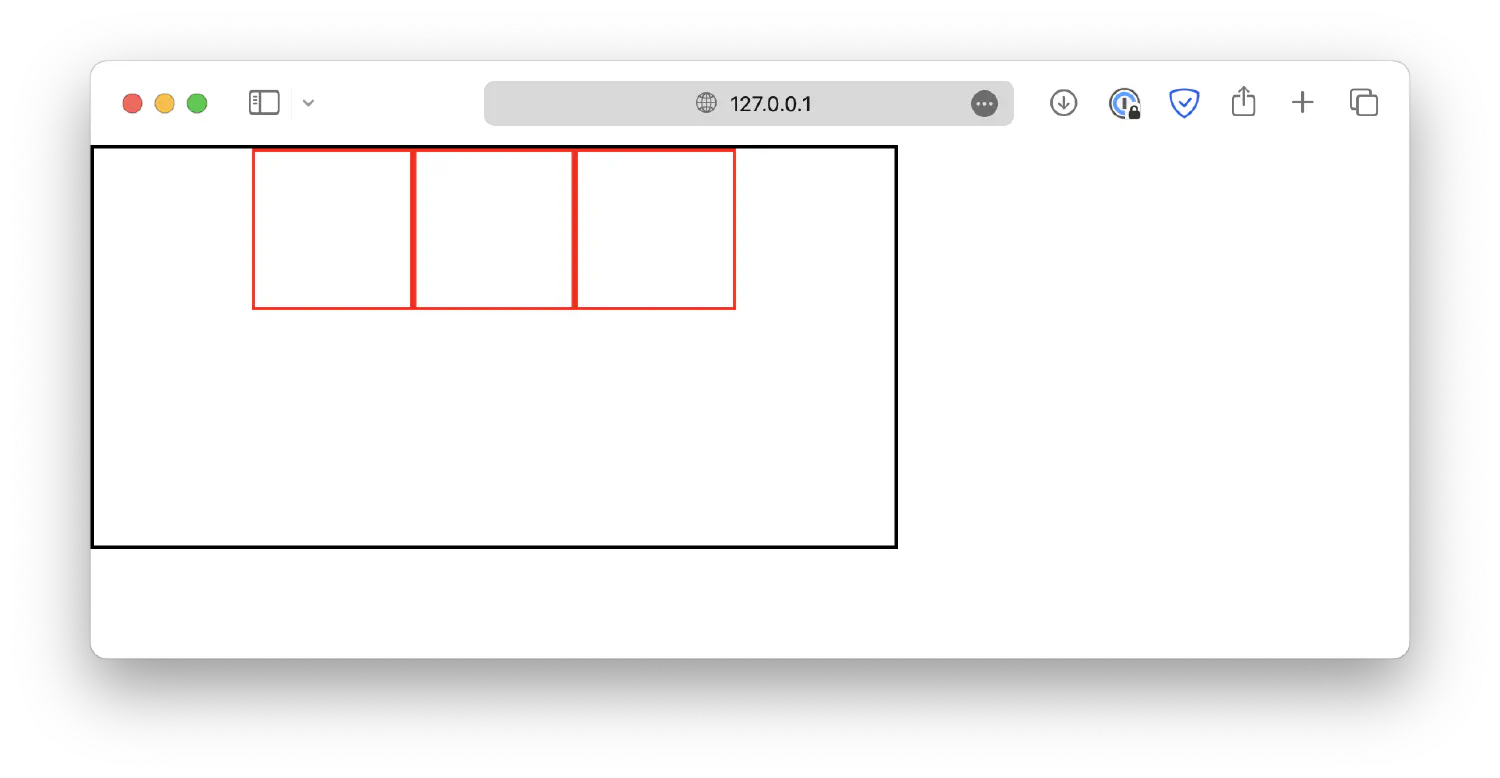
Use padding to center blocks vertically #
As for centering the block vertically, unfortunately, there is no easy way to do it. You could set a top padding for the outer block, but this method requires you to micromanage each element, and you need to know the exact size of the blocks.
| |
In this example, the outer block is 500px high, the inner block is 200px high, which means the center of the inner block aligns with the 100px point. If we push the inner block down by 150px, its center should align with the center of the outer block, which is at the 250px point.
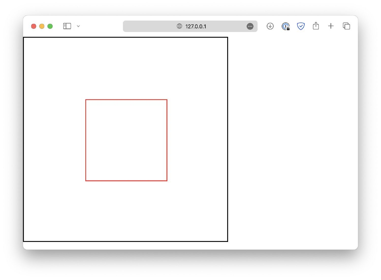
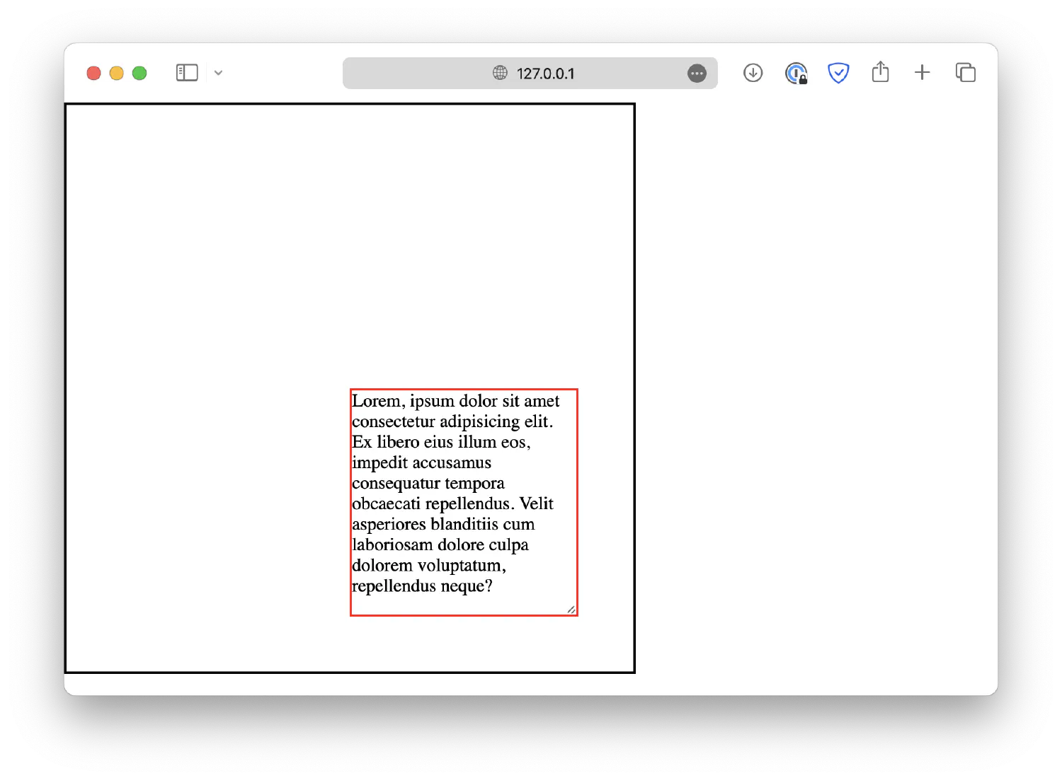
Use position and transform to center blocks #
Even though we successfully centered this block, but as you can imagine, it is not an effective method in practice. What if we don’t know the exact size of the blocks, or if the size of the block is adjustable?
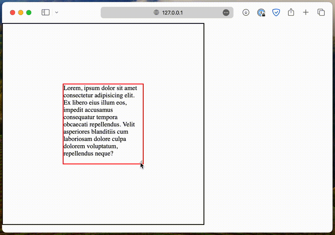
In this case, you could use position and transform like this:
| |
In this case, resize: both; makes sure the inner block is adjustable. The absolute position, along with top: 50%; and left: 50%; will place the top left corner of the inner box to the center point of the outer box.
And then translate(-50%, -50%) shifts the inner block’s position back by 50% of its own width and height, aligning its center point with the outer block’s center point.
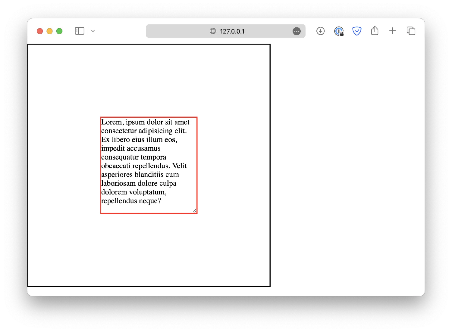
This technique ensures that the inner box will always be centered inside the outer box, even if its size changes.
Use flexbox to center blocks vertically #
Lastly, just like the horizontal direction, you can center the inner block vertically using the flexbox layout, along with the align-content property.
| |
Of course, you can combine the techniques we discussed above to center the blocks both horizontally and vertically using the flexbox layout. For example:
| |
Conclusion #
In this article, we went over three different methods to center an element within another element, including using margin and padding, position and transform, as well as the flexbox/grid layout.
These methods all have their own unique advantages and disadvantages. The auto margin method is the easiest to set up, but it can become impractical when you have multiple elements to center, and you’ll have to micromanage each of them.
Using the flexbox/grid layout, you will be able to center all of its child elements with one CSS property, but this method is more complicated. There are six different alignment properties available, each of them serves a different purpose. I’ve discussed all of them in the article How to Position and Arrange Content Using CSS, take a look if you are interested.
Lastly, the position and transform method is most suitable for elements that have varying sizes. However, it requires you to have a deeper understanding of these properties. If you’re interested in learning more about them, you can also refer to the previously linked article.
That’s all for this article. Happy coding!
If you think my articles are helpful, please consider making a donation to me. Your support is greatly appreciated.