How to Optimize Your Website
➡️ This tutorial is also published at www.thedevspace.io .
You’ve put weeks of hard work into building your website, and now it’s finally ready to go live! However, to ensure your website performs at its best, there are a few things you need to take care of. In this article, we will explore various ways to optimize your website for better user experience and faster loading times, which leads to higher search engine rankings.
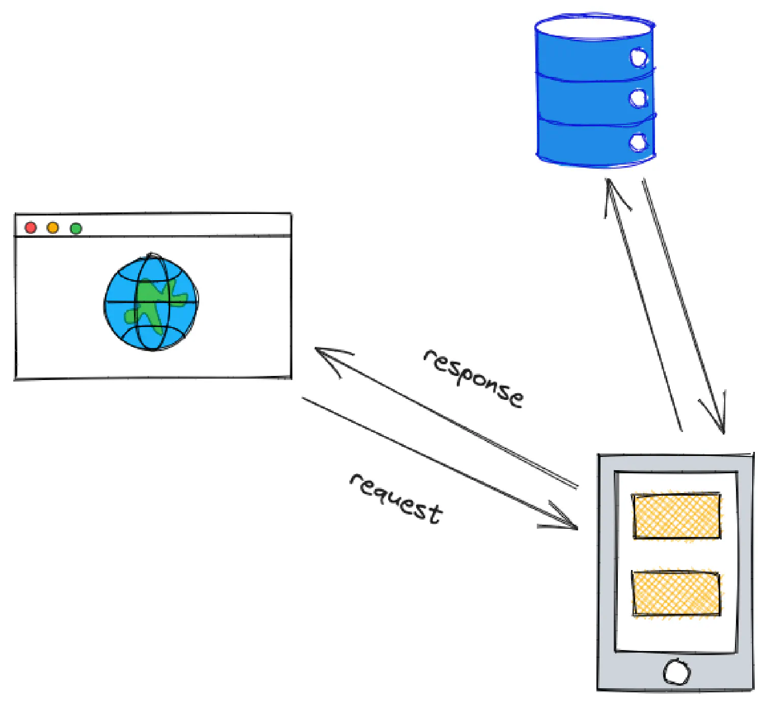
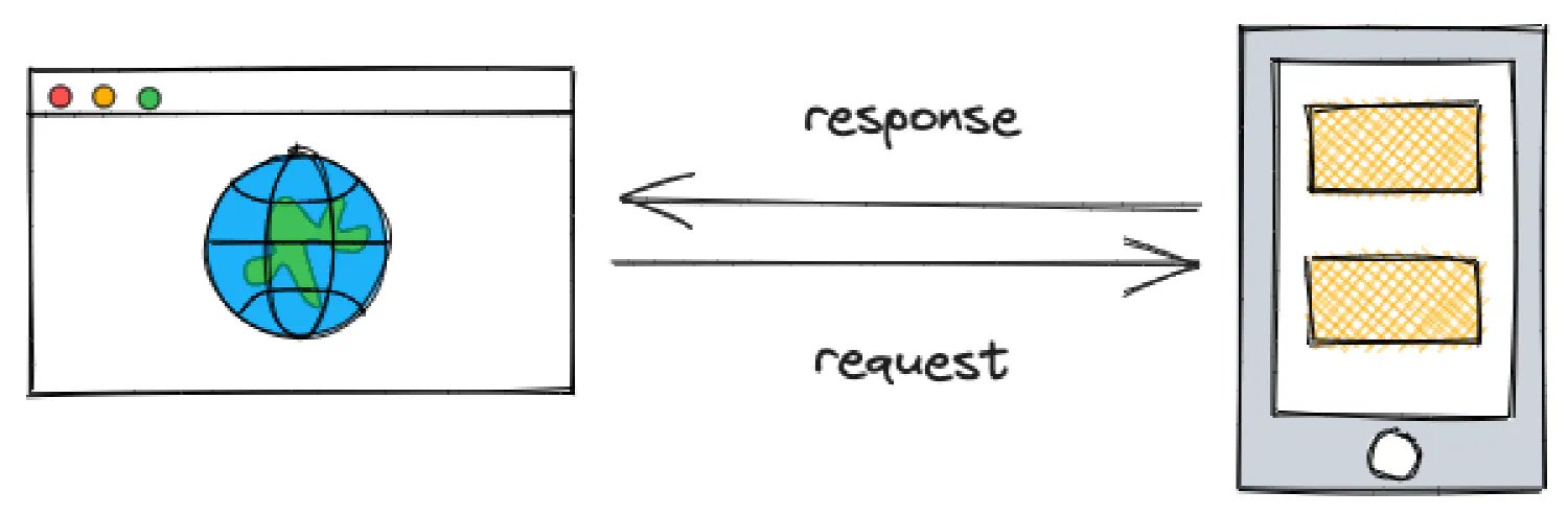
When the browser requests a webpage, it will first receive an HTML document. The browser will parse the document, and when the parser encounters an external file, the browser will send another request to retrieve it. For example, imagine you have a website with the following structure:
| |
To render the index.html file, your browser would have to make a total of 12 requests, including 1 HTML file, 3 CSS files, 3 JavaScript files, and 5 images. This process will consume a large amount of time and resources, leading to poor website performance.
Optimize your images #
Fortunately, there are some ways to enhance the loading speed of this website, such as combining and minimizing the static files, optimizing the images, caching the resources, and many more. We will explore all of these techniques in this article. But first, let’s start with the images.
Use modern web image formats #
To begin with, the images on this website are in either JPG or PNG format, which tend to have larger file sizes and poor performance compared to modern formats such as WebP and AVIF.
There are many cloud-based tools and websites that can convert your images, but the problem with these tools is that you usually have to upload the files for them to be processed, and some of their services are not free. In this article, I’d like to introduce a piece of software called FFmpeg , which allows you convert the images locally with one simple command.
If you are using Mac, you can install FFmpeg with Homebrew :
| |
If you are using Windows, use Winget instead:
| |
Alternatively, you can simply download the installer from FFmpeg’s official website .
After the installation process, open the terminal and change into the image directory.
| |
And then convert the images using the following command:
| |
If you are using Windows (CMD), run this command instead:
| |
For PowerShell:
| |
Of course, you may have to alter this command to fit your specific condition:
{jpg,png}lists all the image formats in the directory.-c:v libwebpspecifies the codec used for WebP. You don’t need to change this unless you know what you are doing.-q:v 80sets the compression level for the images. You can adjust the value between0(lowest quality, highest compression) and100(highest quality, no compression) as needed.
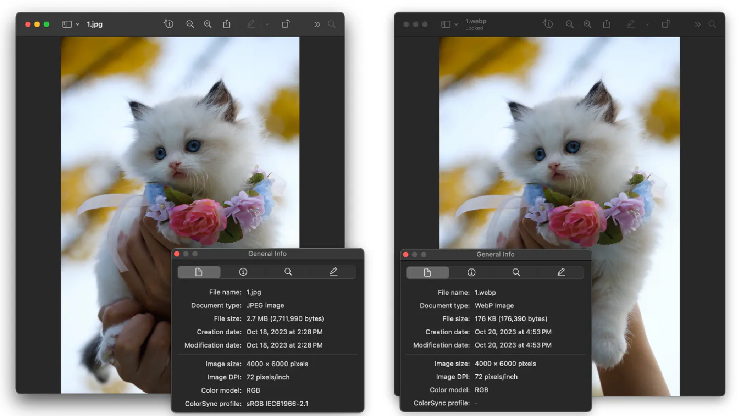
You can play around with the compression level, but in my experience, it is safe to set it to as low as 20 without affecting the image quality too much. Here is a comparison.
FFmpeg is a very powerful multimedia tool that can handle a wide range of tasks related to audio, image, and video processing. In fact, many of the world’s most famous websites and tools run on top of FFmpeg, such as YouTube, Twitch, VLC Media Player, and so on. Please refer to the official documentation for details.
Different images for different viewports #
In most cases, your website is created for devices with different screen sizes. For a small screen, it is usually best to use smaller images, and for larger screens, it is best to use large images. Ideally, you could create different versions of the same image using FFmpeg and then embed the images using the <picture> element instead of <img>.
The <picture> element allows you to define multiple sources for the same image, and then the browser can choose different sources based on the viewport size.
| |
In this example, the browser will render small.webp on a small screen (<600px), medium.webp on a medium screen (600px-1200px), and large.webp on a large screen (>1200px)
Lazy load your images #
Lastly, you should also lazy load the images if they are not needed immediately.
| |
This ensures that the browser only retrieves the image when the user scrolls down to its location. However, if an image is required for the webpage to render correctly during the initial load, then it is best to set load to eager, which tells the browser to retrieve it as soon as possible.
| |
Optimize your CSS and JavaScript files #
Secondly, notice that there are 3 CSS files and 3 JavaScript files for this project. It is best to separate the code into different modules during the development stage for more efficient file management, as we’ve discussed in the HTML & CSS Best Practices article. However, in the production environment, you’ll want your webpage to download as few external files as possible to improve user experience. And you’ll want the files to be as small as possible.
Combine and minimize CSS files #
There are many frontend tools available for this purpose. For example, PostCSS is a popular CSS processor that can combine and minimize your code. With the right plugin, it can even fix your code for compatibility issues, making sure your CSS styles work for all browsers.
PostCSS is built into the web bundlers, which we are going to discuss later. However, if you wish to use PostCSS independently, it can be installed into your project using the following npm command:
| |
Create a configuration file, postcss.config.js, under the project root directory. The configuration should include all necessary plugins.
| |
Create an input CSS file. This input file should import all other necessary CSS files.
| |
styles.css
| |
Combine and minimize the file using the following command:
| |
And in your HTML document, you only need to import the output dist/styles.css file.
| |
Alternatively, you can also separate the critical and non-critical CSS, load the critical CSS in the head section, and load the non-critical CSS at the end of the body section.
| |
Use web bundlers #
Nowadays, the complexity of web applications has grown exponentially. You cannot rely on a basic CSS processor to optimize and manage everything. Web bundlers are created to address this challenge. They are designed to process CSS, JavaScript, as well as images, allowing you to manage all of your static assets in one place.

Webpack is one of the most popular options, with 63.6k stars on GitHub. It packs modules (JavaScript, CSS, images, and so on) into bundled assets that can be executed by the browser. For demonstration purposes, this is how you can install Webpack into your project:
| |
Assume you have the following project structure:
| |
foo.js
| |
bar.js
| |
index.js
| |
In this case, index.js is the entry point of your project. Create a configuration file (webpack.config.js) under the root directory of your project, and make sure the entry option points to the index.js file.
| |
Next, you can run Webpack with the following command:
| |
A bundle.js file will be generated, containing the minimized version of all JavaScript code.
| |
By default, Webpack only deals with JavaScript files, but you can extend its capabilities by installing different loaders . For example, the css-loader enables Webpack to process your CSS files, and the postcss-loader makes it compatible with the PostCSS processor we just discussed. Please refer to the linked webpages for details.
Besides Webpack, there are many other popular web bundlers available, such as Parcel , Esbuild , Rollup , and more. They all have their own unique features and strengths, and you should make your decision based on the needs and requirements of your specific project. Please refer to their official websites for details.

Speaking of frontend tools, Vite is definitely one that we can’t afford to overlook. As your application grows increasingly complex, it is not uncommon for a single application to have hundreds or even thousands of modules. As a result, it often takes an unnecessarily long time for the web bundlers to process all of them before a dev server can be started.
Vite is created to address this issue by providing native support for Hot Module Replacement (HMR), which is a technology that allows developers to apply code updates in real-time without having to refresh the entire page. It also takes a unique approach when it comes to asset bundling. Instead of bundling everything together, it creates smaller bundles for each individual module, and then serves to the browser as needed. This approach allows Vite to have faster build and load times. If you are looking for a frontend build tool that is fast and reliable, definitely give Vite a shot.
Async vs. defer #
Nowadays, JavaScript files are getting more and more complex. They are often heavier than the HTML document, and takes longer to download and process, even when they are combined and minimized.
By default, the browser parses the HTML file line by line, and when it encounters a script, the parser will stop to download the file, read and execute it, and then continue processing the rest of the page.
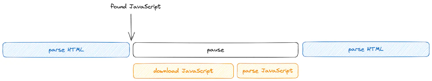
However, in most cases, it is safe for your JavaScript files to be loaded asynchronously without blocking the parser. To achieve that, you can use the defer or async attribute.
| |
| |
Both options instruct the browser to download the script in the background. Their difference is that async tells the browser to execute the script right after it is downloaded, while defer tells the browser to wait until the parser is completed.
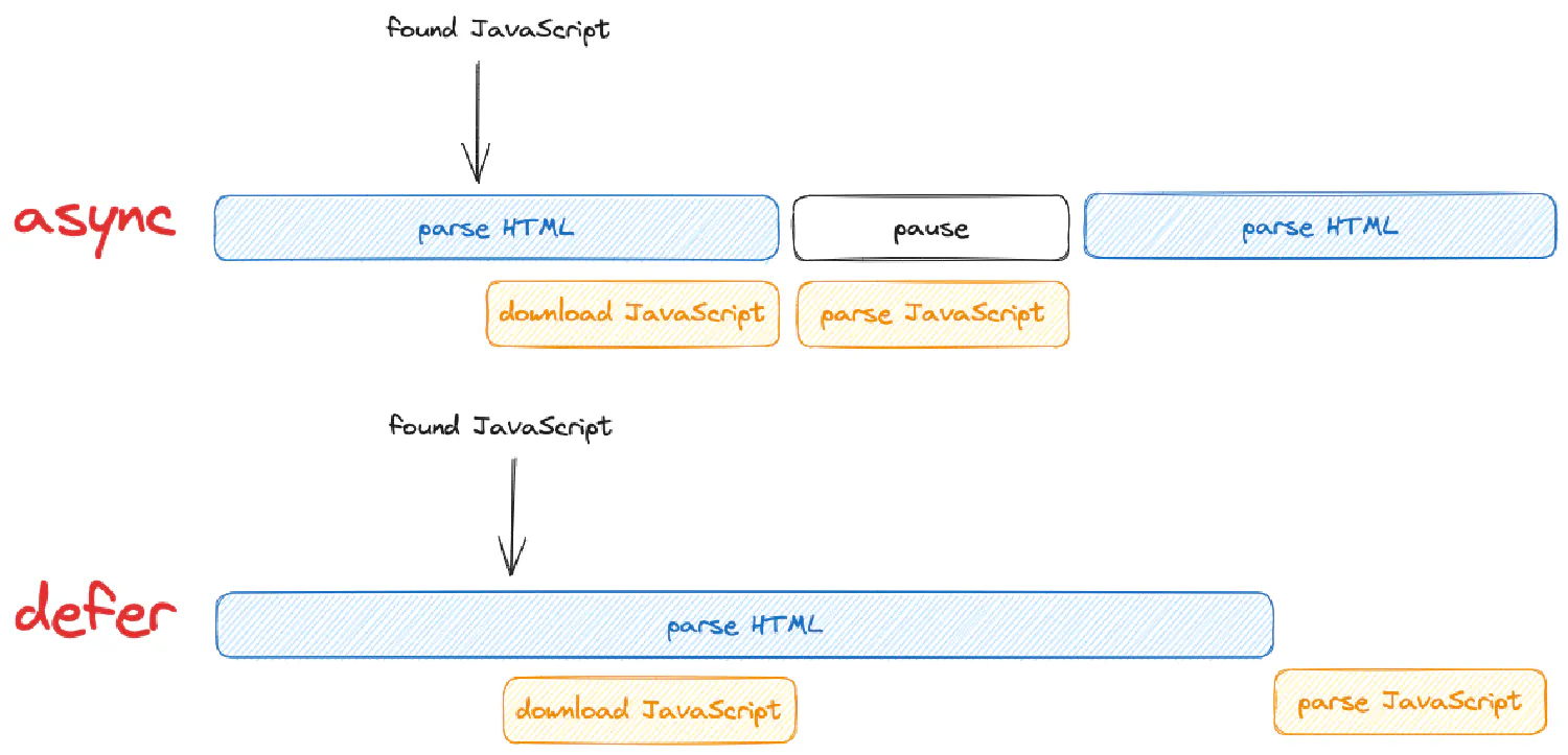
When your webpage contains multiple scripts, defer will execute them in their relative order, while async will execute the one that is downloaded first, regardless of their order.
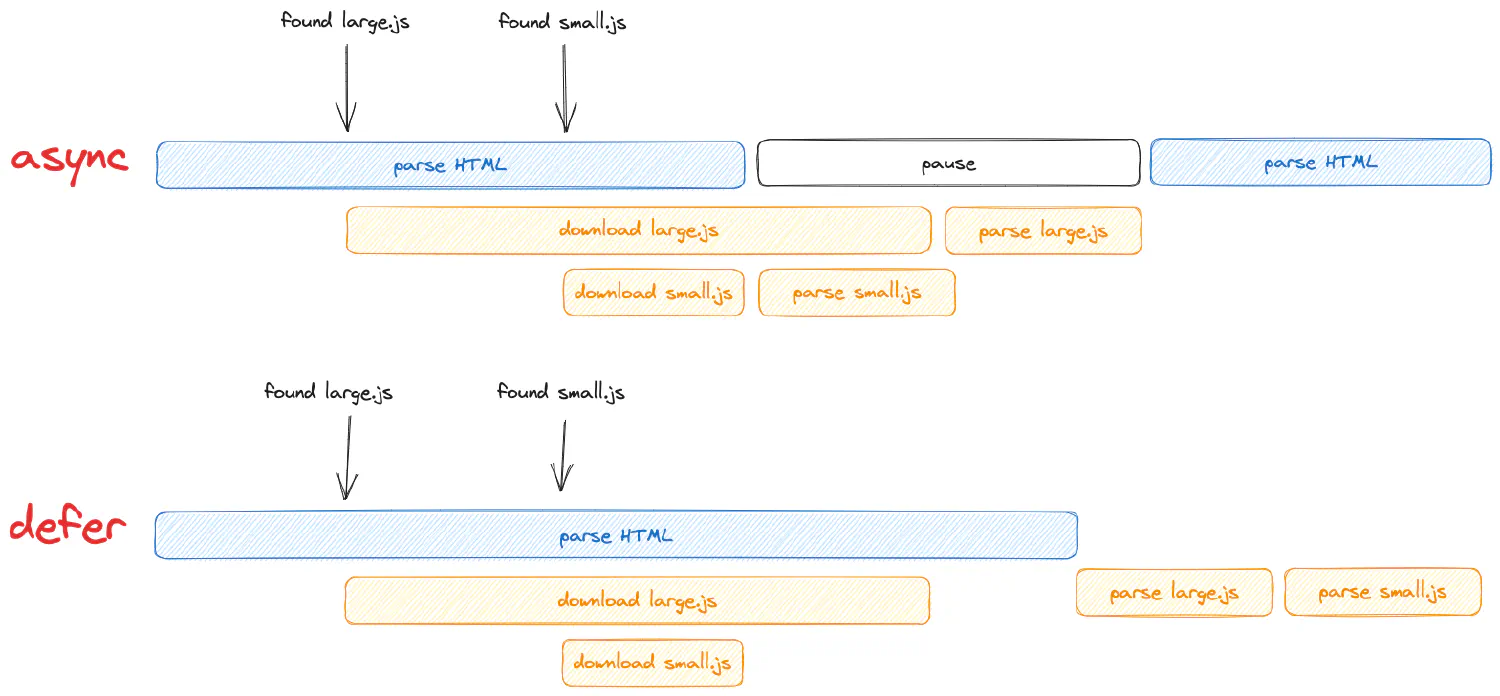
Generally speaking, if the script relies on the complete DOM tree, then you should use defer, which executes the file after the parser is complete. If the script needs to be executed sooner, use async. If the script relies on other scripts, which need to be executed in their relative order, use defer.
Boost webpage performance with resource hints #
Resource hints are a way for developers to tell the browser how to deal with the resource files on the current page, or the ones that might be needed in the future. Sometimes, the resource should be downloaded as soon as possible, while other times, they might be needed in the future, so it is OK to download them in the background. Resource hints tell the browser how to process these resources.
The resource hints are defined using the <link> tag and should be placed in the head section of the HTML file like this:
| |
This is an example of a dns-prefetch resource hint. When the browser visits a website, it will first go to a DNS server. A DNS server is like a phone book for the internet, which maps domains to IP addresses. The browser goes to the DNS server with a domain, and the DNS server returns the corresponding IP address, and then the browser can make a connection to that IP address. This process is called DNS lookup.
This resource hint basically tells the browser that the user is likely to take some actions which will require the browser to look up the IP address for https://style.example.com. As a result, the browser initiates resolving the domain name as soon as possible and caches the result locally. This caching enables the browser to directly pull the IP address from the cache when the user eventually makes a request.
Besides dns-prefetch, there are several more resource hints available, as shown in the list below:
preconnect1<link rel="preconnect" href="https://style.example.com" />preconnecttakes things one step further compared todns-prefetch, which asks the browser to make a connection to the host server (referred to as TCP handshake) after the DNS lookup is complete. The handshake happens once per server and could take up a long time if the network latency is high.preload1<link rel="preload" href="path/to/script.js" as="script" />preloadtells the browser how resources should be fetched for the current webpage. The specified resources (defined byhref) will be assigned high priority and will be downloaded as soon as possible.preloadalso allows you to specify an extraasattribute, which defines the type of resources . Different types of resources might be handled with different request headers and security policies.In practice, to achieve the best user experience, it is best to set your most important resources with
preload, such as your core CSS and JavaScript, fonts, as well as images that should be rendered during the initial load.prefetch1<link rel="prefetch" href="path/to/style.css" as="style" />prefetchis similar topreload, except it defines resources that the user might need in the future. The specified resources will be assigned low priority, and will be downloaded after the page load. The downloaded files will be stored in the cache and will be retrieved when the user actually requests them.prerender1<link rel="prerender" href="next_page.html" />prerendertells the browser to download the next page as well as all of its associated resources, and also render them in the background. When the user requests that page, it will be pulled from the background.
Use a content delivery network (CDN) #
A content delivery network (CDN) is a cluster of servers distributed across the globe. The servers store caches of your website, and when a user requests a webpage, instead of connecting to your hosting server, the data will be transmitted from the CDN server that is closest to the user.
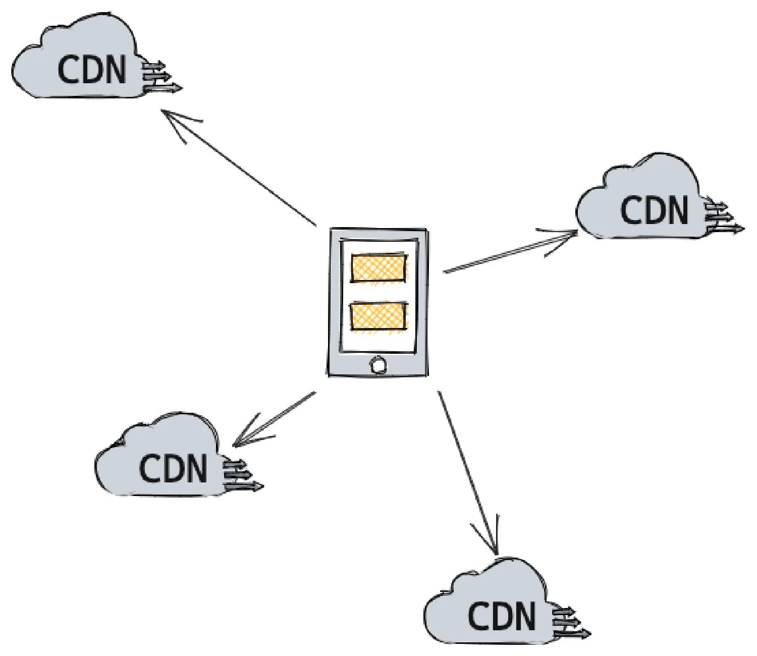
By using a CDN (Content Delivery Network), you can enhance the loading speed of your website, providing your clients with a better user experience. In addition, it can help you to minimize the bandwidth costs, since the data is transferred from the CDN server instead of your hosting server. Another advantage of using a CDN is that it can secure your server from DDoS attacks, thereby improving your website’s security.
Of course, there is no need for you to create this system on your own, there are plenty of CDN providers such as CloudFlare , Amazon CloudFront , Google Cloud CDN , Akamai , and so on. The process of setting up a CDN differs based on the provider you choose, you should check their specific documentations for details.
Set up caching #
Besides caching your webpages using a CDN, you could bring your content even closer to the users by caching the resources locally.
Just like how an HTML document has a <head> section, which is used to store metadata for the webpage, every HTTP request/response also has a header used to record metadata about the resources requested or retrieved.
The Cache-Control HTTP header is used to tell the user browser how to cache the retrieved resources.
Depending on how you are hosting your website, there might be different ways of adding custom HTTP headers. As an example, this is how you can set up the Cache-Control header when using AWS Amplify.
Go to App settings > Custom headers, and edit the customHttp.yml file:
| |
In this example, all of your .js and .css files will be cached. public indicates that the response can be cached by public caches (such as a CDN). max-age=31536000 sets the maximum time (in seconds) the file can be cached in the browser’s cache. s-maxage=86400 sets the maximum time (in seconds) the file can be cached in public caches. And finally, immutable indicates that the file content is immutable and won’t change over time. This is important for optimizing cache behavior.
If your website has a .htaccess file, then try generating the corresponding code with this .htaccess Generator .
Time to ditch Google Analytics #
Everyone hates GA4, so let’s ditch it.
There are many good, lightweight, and open-source alternatives to Google Analytics, such as Plausible , Matomo , Fathom , Simple Analytics , and so on. Many of these options are open-source, and can be self-hosted.
By using these open-source options, you’ll get a significantly smaller tracking script. Take Plausible as an example, its script is only 1KB, while Google Analytics is over 300KB.
However, it is worth noting that while these open-source options are great, it is possible that Google Analytics provides some unique features that are not currently offered by the alternatives. Therefore, it may be a good idea to try them out first and see if they meet your requirements before making the migration.
Do you really need a fully-featured website? #
Many people opt for a full CMS such as WordPress, Squarespace or Wix when they are building their first website. However, these platforms are often more bloated than necessary due to their need to cater to a variety of use cases. For example, if you just want to build something simple, such as a basic personal blog or a portfolio, it is better to use a static site generator, such as Hugo or Jekyll instead.
Their main difference is that WordPress creates a fully-featured website with the frontend, backend, and database. When a user requests a page, the backend fetches the necessary data from the database, compiles it into a webpage, and serves it to the frontend.
While a static site generator does not require a database, it simply generates all the static webpages during the build stage, and when a user makes a request, it simply serves the pre-built page to the frontend. As a result, a static website requires significantly less resources to host.
However, the downside of a static site generator is the steep learning curve. These tools generally don’t come with a user-friendly drag-and-drop features that are available in WordPress and Wix, and they do require you to have some programming skills for frontend customization.
This may sound challenging, but there is no need to worry. I’ve created a complete course on HTML and CSS to provide you with the necessary skills needed to begin using these site generators. Come check it out! ⬇️
🔗 HTML & CSS: A Practical Guide
Next steps #
In this article, we explored several ways to optimize your website to achieve faster loading speed and better user experience. However, it is important to note that this guide does not contain every detail. There might be other optimization methods available depending on the specific requirements of your project. If you’re aware of additional website optimization methods, please don’t hesitate to share them in the comments below. I’ll gladly incorporate them into this guide for the benefit of our readers.
Furthermore, during my research for this article, I came across some valuable sources that I believe can provide further assistance to you:
- 🔗 Page Speed Checklist
- 🔗 Optimizing Performance With Resource Hints
- 🔗 What is Caching and How it Works
Thanks for reading!
If you think my articles are helpful, please consider making a donation to me. Your support is greatly appreciated.