Creating an Image Slider with HTML, CSS, and JavaScript
➡️ This tutorial is also published at www.thedevspace.io .
In this article, we are going to discuss how to build an image slider using HTML, CSS, and JavaScript. I will demonstrate two different ways to create the slider, one opacity based and the other transform based.
➡️ Get the source code for FREE!
Prerequisites #
This tutorial assumes you understand the basics of HTML, CSS, and JavaScript. Specifically how to position HTML elements, how to use the transform property, as well as how to create a flex layout.
Creating HTML #
Let’s first start with the HTML code:
| |
.slideract as the container for the entire image slider.- Individual slide is enclosed in a
.slidecontainer along with the image. - The slider navigation is controlled by two links,
.prevand.next.
We also have the onclick event listener set up for the navigation links, and when they are clicked, the corresponding JavaScript functions will be activated.
Adding styles #
For easier styling of elements, it is recommended to remove the default paddings and margins of all elements, and set box-sizing to border-box. This allows the elements to be sized based on their border-box dimensions rather than content-box.
| |
And then add the styles for the .slider.
| |
As well as individual .slide.
| |
The highlighted lines are used to center .slide inside the .slider container. For details on how to center a <div>, please refer to the linked article.
Lastly, we’ll also place the navigation links on the left and right side of the .slider container.
| |
Here is a detailed tutorial on how to place and arrange content using CSS if you need more assistance.
Adding JavaScript code #
Now, let’s take a closer look at the styles for each individual .slide.
| |
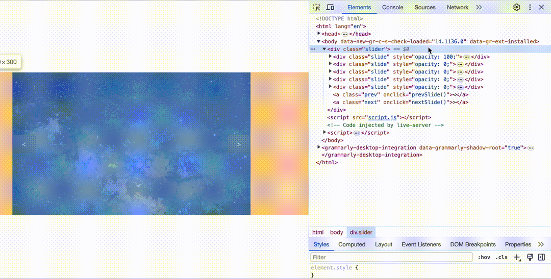
By using the absolute position, we placed all individual .slides in one location, stacked on top of each other. You can verify that using the developer tools in your browser.
To reveal the image underneath, all we need to do is setting the opacity of the current slide to 100, while setting the opacity of all other slides to 0. And to achieve the slideshow effect, we can write our JavaScript code so that whenever a navigation link is clicked, the “current slide” adjusts accordingly.
We’ll start by setting the opacity of all slides to 0 by default.
| |
And then add the following JavaScript code.
| |
Line 1 selects all .slides, and assigns them to the variable slides.
Line 2 initiates the variable currentSlide to be 0, which points to the first slide in the image slider.
Now, let’s take a look at the nextSlide() function.
| |
In this case, slides.length gives the total number of slides in the slider, and when this function is executed (by clicking the .next link), the currentSlide will be adjusted accordingly.
For example, when the function is executed the first time, assuming there are 5 slides in total:
| |
But when it is executed the fifth time, currentSlide will reset back to 0.
| |
The prevSlide() function works similarly.
| |
When currentSlide is 4, which points to the fifth slide:
| |
When currentSlide is 0, which points to the first slide:
| |
The currentSlide variable will then be passed to the showSlide() function as the index.
| |
This function iterates over all slides stored in slides, and if the iteration index (i) matches the currentSlide index (index), then that slide will have its opacity set to 100. If not, its opacity will be 0.
This will be the final result ⬇️

Sliding with CSS transform #
We called it an image slider, but as you can see from the final result, there is not much sliding because the transition is based on opacity. How can we adjust our code so that when the navigation link is clicked, the image actually slides over to the next?

There are two alterations you must make. First, the .slides must be arranged horizontally behind the .slider container, instead of stacked on top of each other. You can think of the .slider container as a window. Every time a link is clicked, the .slides get shifted left or right to reveal the previous or the next image.
| |
We are using a flex layout to achieve this effect. flex: 0 0 100% set the width of each .slide to be 100% of the .slider.
Next, adjust the showSlide() function.
| |
Again, assuming there are five slides in total, and each slide is 500px wide. When index is 3, index * slideWidth would be 1500, and translateX(-1500px) will shift all .slides to the left by 1500 pixels, revealing the fourth image.
Conclusion #
In this article, we demonstrated two ways to build an image slider, one opacity-based, and the other transform-based. I hope this article has been helpful to you. If you need more assistance regarding HTML and CSS, check out my course HTML & CSS: A Practical Guide.
That’s all for this article. Happy coding!
If you think my articles are helpful, please consider making a donation to me. Your support is greatly appreciated.